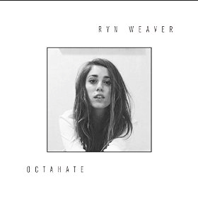
CD cover plans
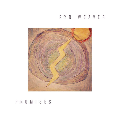
- The original album art has a black and white photo of Ryn, but we feel this doesn't represent the song
- Her album covers are very simple, and we feel like it doesn't conform to the colourful indie pop style
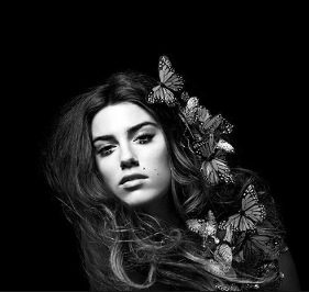
- The black and white photo from her album photos is what we are
most inspired by as we think the butterflies and makeup makes it
more interesting to look at
-
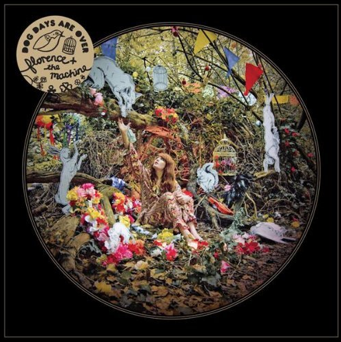
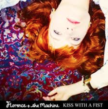
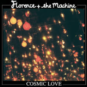
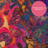
We prefer the layout of these covers by Florence + The Machine and Tame Impala
-
We feel that the colours are more suitable for indie pop because it is usually bright and vivid
- We will have to consider if we want actual artwork, a scene from the video, a photo of our artist or a creative picture
Our drawing plans
These plans focus on the opening scene of my music video and the theme of nature. We also thought about the composition and fonts. We decided the text would look best in the center as it breaks up the image.
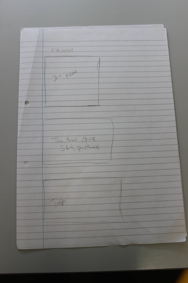
Our drawing plans
The first image we would have to create ourselves using photoshop, the second is a photo we have to take ourselves.
Our drawing plans
This plan is experimenting with fonts. We have to use photoshop to create this so that it looks clean and neat.
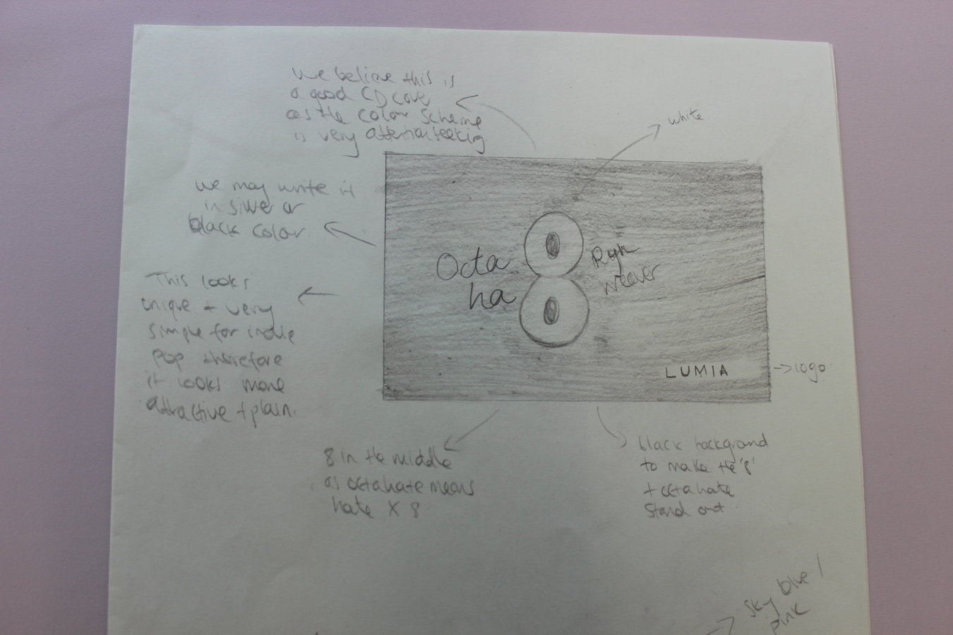
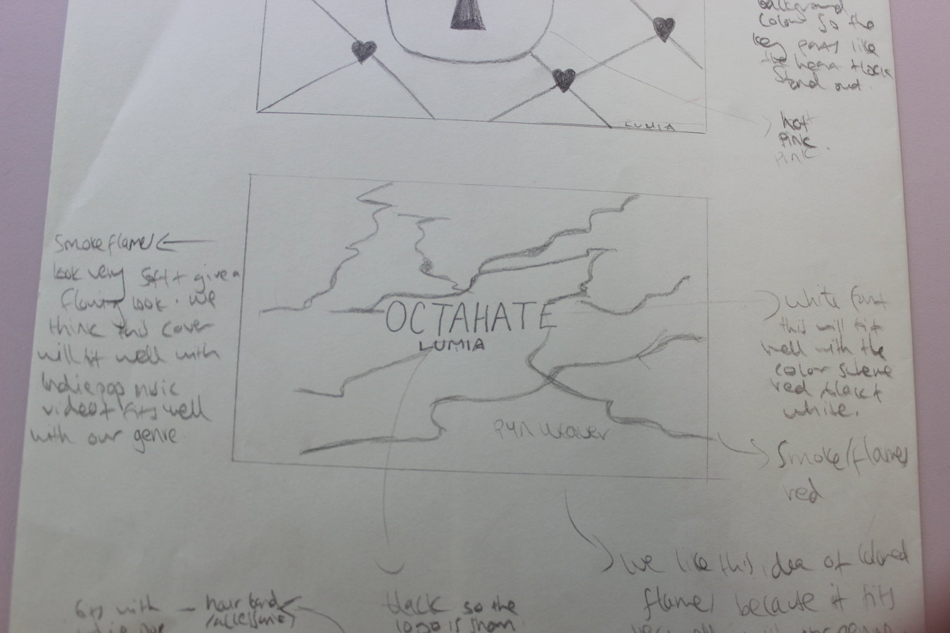
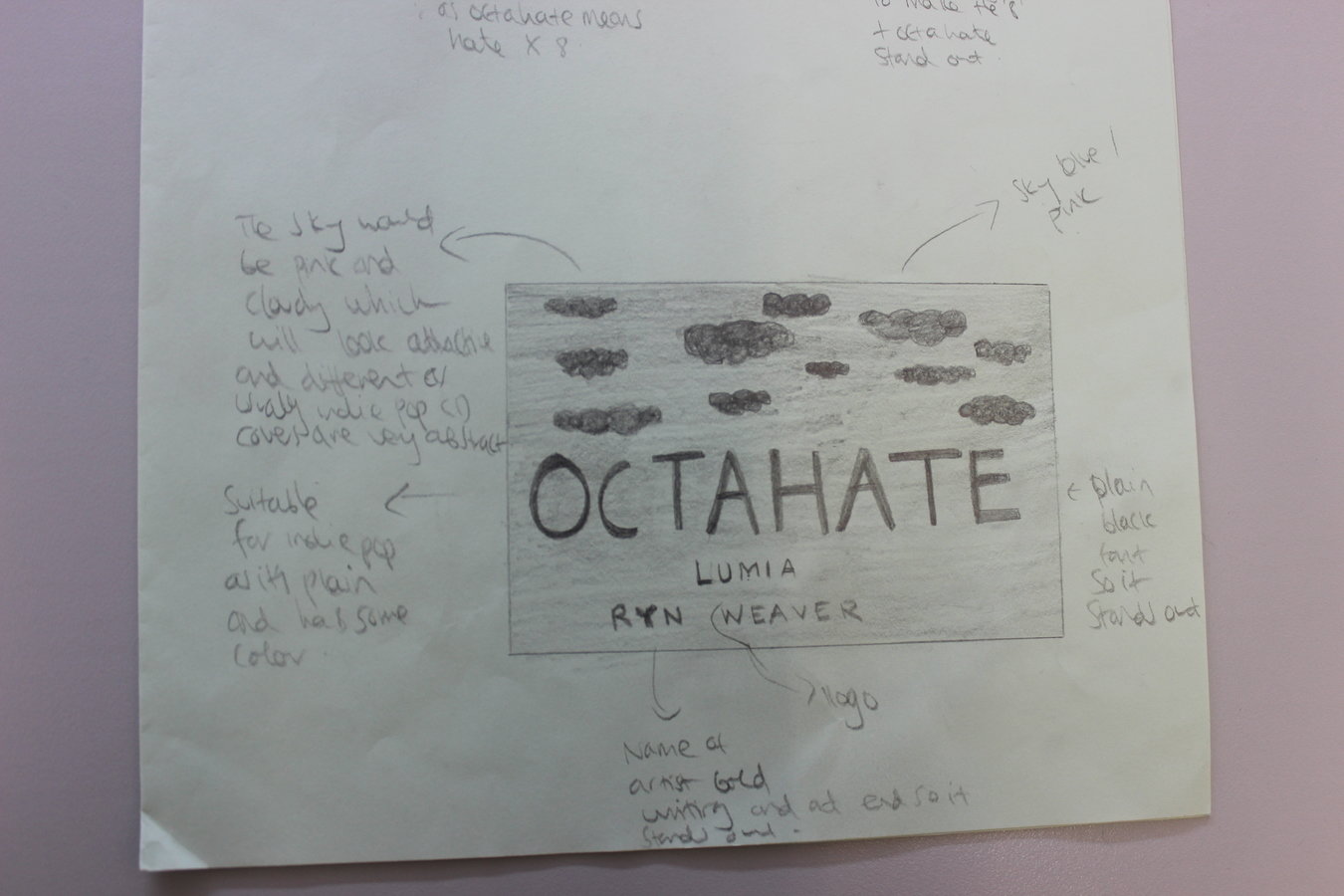
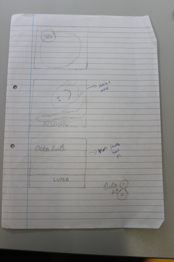
Our drawing plans
These plans are for the layout of the cover. Most covers either have one image or they have shapes. The font is usually quite organic or bold and simple
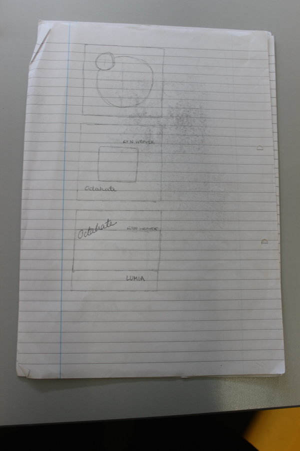
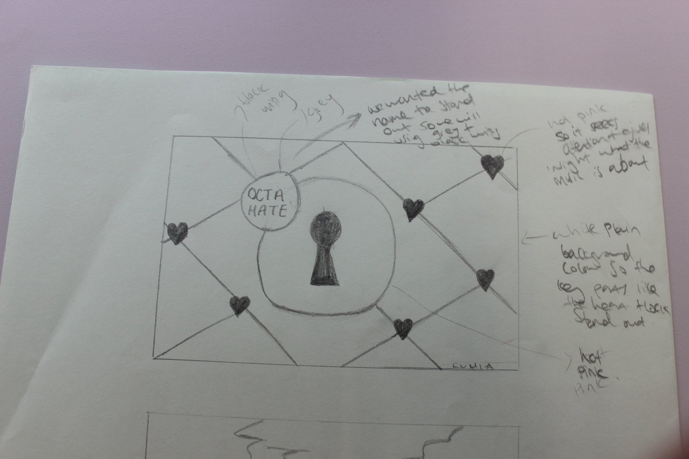
Our drawing plans
These are more plans, here we thought about different compositions based on the previous slide. We thought about separating text from images to give a neater look
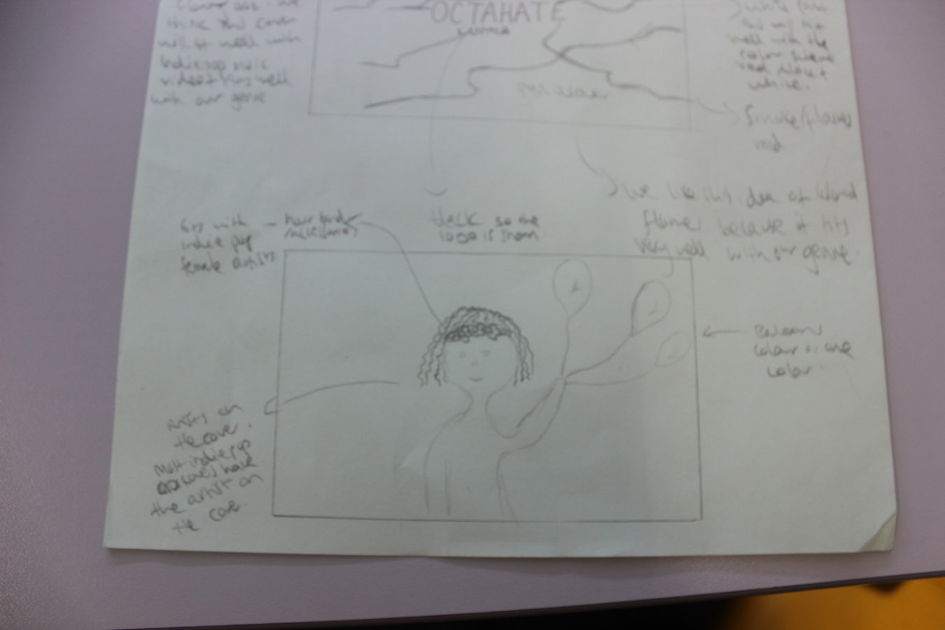
Our drawing plans
These are some scenes from the video that we thought would be interesting to feature on our cover
deck
By devikamaharaj


