HOW EFFECTIVE IS THE COMBINATION OF YOUR MAIN PRODUCT AND ANCILLARY TEXTS?
Title Text
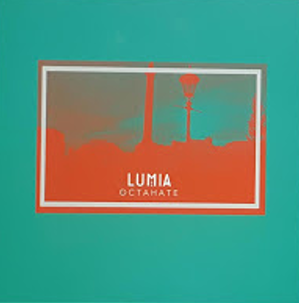
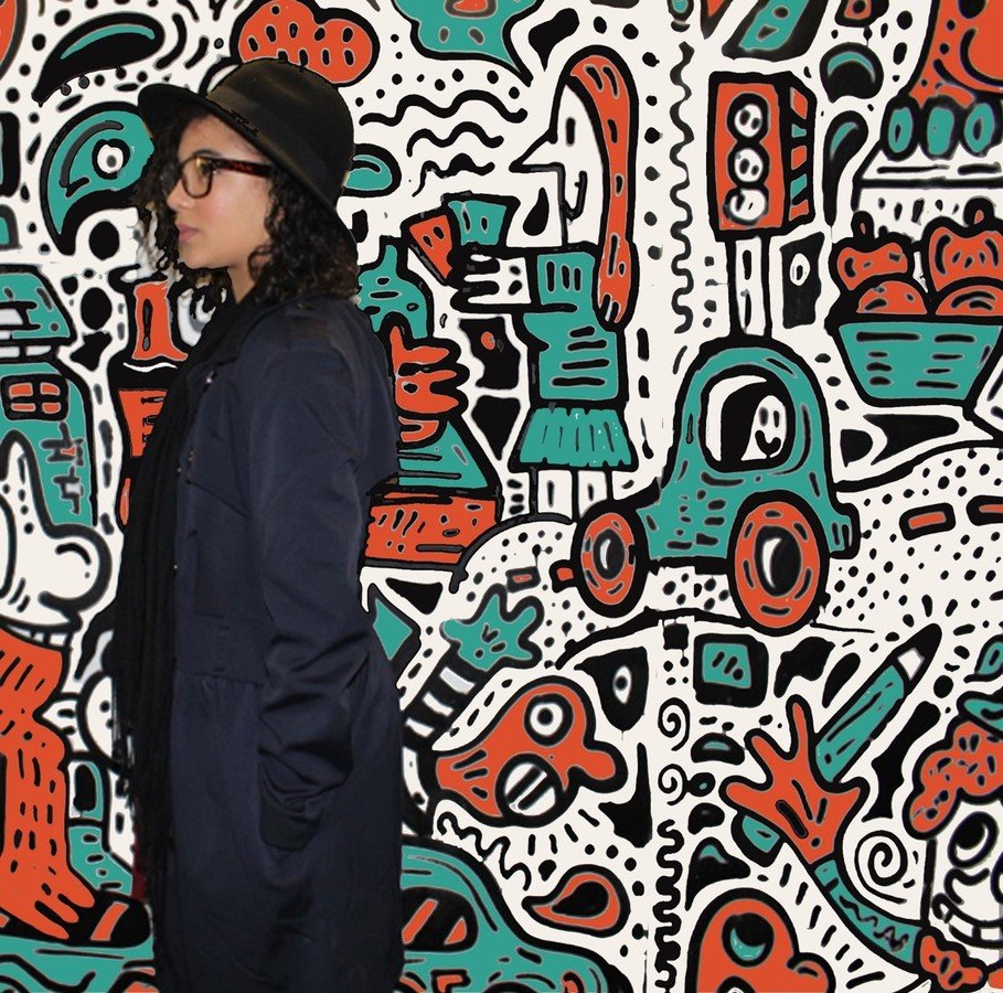
The digipack and poster clearly shows correlation to each other through the orange and turquoise colours. Although the central theme is creativity. These are not prominent colours in the video, but the street art and the effect that she is looking away from the text creates the effect that she is always looking for something because she is positioned towards the side of the poster. We made the decision not to use stills from the video as we wanted it to represent the genre as a whole, not confined to the video. We chose orange and turquoise as they're contrasting colours which are usually used in indie pop and appeal to both sexes. As these colours contrast this challenges mainstream colour palettes and appeals to someone who is interested in art.

"Researched indie pop music magazines, covers, albums, posters, tour promotions
We researched indie pop music magazines, covers, albums, posters and tour adverts to find what worked well. In the end we discovered colour schemes and simple text combined with a photo and reviews was the most effective for creating our ancillary task. We mostly looked at artists whose work we were using as inspiration to see how interlinked their pieces were but in the end decided to use a still from our video on the cover in the style of the original Octahate cover because we felt it should pay a homage to the original.
Digi pack
Our digipack was inspired mostly by our video. We chose not to have the artist on the cover because we felt like it was not a convention of indie pop. When an artist was featured it was usually if they were a band, but as 'Ryn Weaver' is alone we chose scenic imagery. During our research we found that drawings was a theme so we edited a gradient with orange and turquoise and this gave an artistic look to our piece. This colours are contrasting and non gender binding so we felt it would appeal to a larger audience. The condensed layout was a choice as it is what was used in the original cover. We found that geometric shapes and circles were favoured for artwork by indie pop artists and decided to use this in our piece too because it offered a chance to explore creativity which is a theme in our video, and the poster.
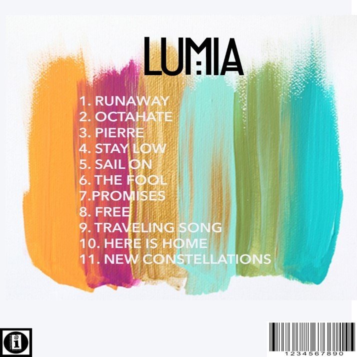
The CD itself was hand drawn by my co-partner Hazal, and we uploaded it to Photoshop and edited the colours to match the poster and cover. We chose the mandala style design because it fit with the festival look that we had during the performance parts of our video (her orange makeup design). The paint swatches was also to build on the creative theme and we felt this suited the simplicity of the genre.
Poster
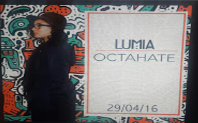
The theme of the poster was based on the travelling that she does throughout the video. We had taken some photos at a location we passed while we were filming one day and when we looked back on them we found an opportunity to incorporate the orange
and turquoise colours into it by filling in each piece of the graffiti drawing with the eyedropper tool then fill the image with the paint bucket tool.
We chose a large font with LUMIA, OCTAHATE and the release date. We chose black for the font on a white background and an orange frame with an orange line to create symmetry.
The poster is intended to look like she is looking at something as we positioned her image at the left of the page and this suggests she is always searching for her love (like the video). The place where it was taken is likely to be familiar to some people, and the text we chose was bold and simple. Thus, attracting attention from the target audience. We wanted to create something memorable so we edited the brightness, increased the vibrance and changed the saturation as well as editing some imperfections from the image to improve the overall quality.
Video
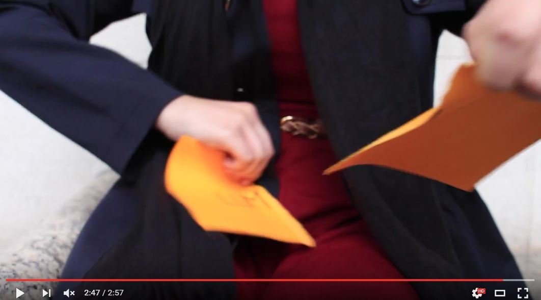
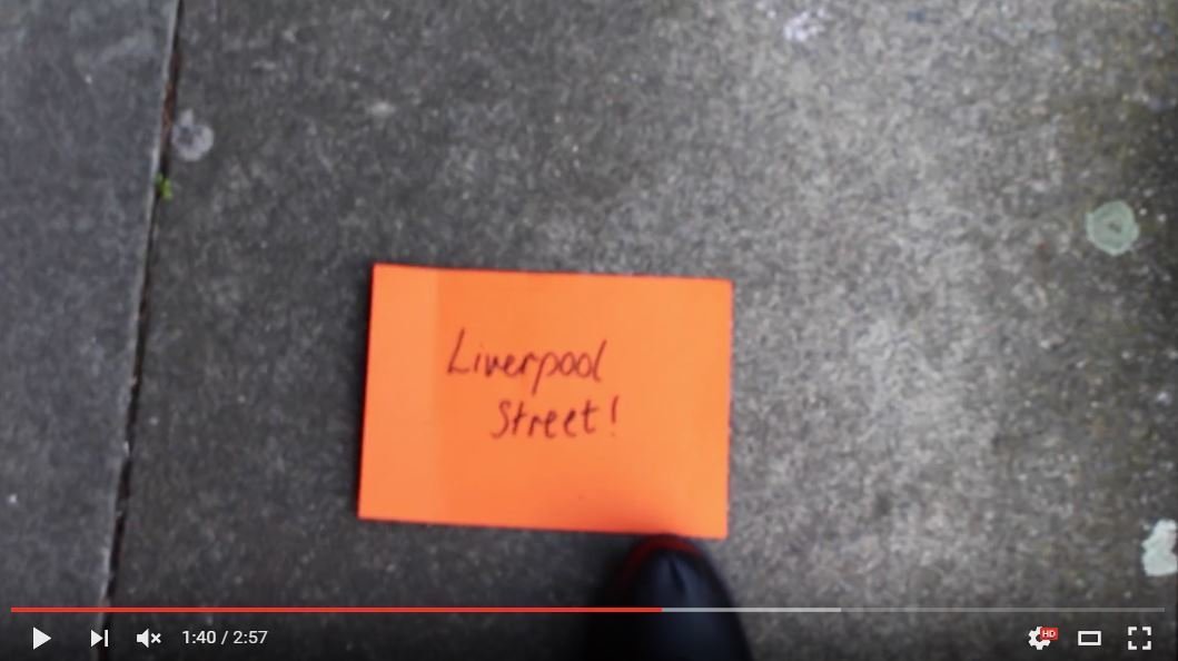
Our video, digipack and poster all share similarities which make them complement each other. The video was the main inspiration that we bounced our ideas off and we found that by developing less obvious themes within the ancillary task this highlighted them more when the video was rewatched. For example, the orange notes do not seem that important until the final scene, and the orange makes a feature in our ancillary texts. I think that in consideration, our three pieces do complement each other well and exemplify conventions of the indie pop genre, while conveying our themes of creativity, youth and adventure.
deck
By devikamaharaj


