HTML/CSS 2
Position, Flex-box, and Overflow


Position Properties
Position properties in CSS allow us to specify the position of a selected element. There are five position property values we'll cover:
Static (positions default value)
Relative
Fixed
Absolute
Sticky
Position Properties: Relative
Relatively positioned elements are positioned relative to where they would normally be placed in the document flow.
.relative-example {
    position: relative;
    top: 5px;
    left: 5px;
}
Original position
New position
Viewport
Position Properties: Fixed
Fixed positioned elements are positioned relative to the viewport. The fixed element remains in that portion of the viewport, regardless of scroll.
.fixed-example {
    position: fixed;
    top: 0px;
    right: 0px;
}
Fixed
Viewport
Position Properties: Absolute
Absolute positioned elements are positioned relative to their nearest positioned ancestor.
If there are no positioned ancestors, the element positions relative to the viewport.
.ancestor-example {
    position: relative;
}

.absolute-example {
    position: absolute;
    top: 0px;
    right: 0px;
}
Absolute
Ancestor
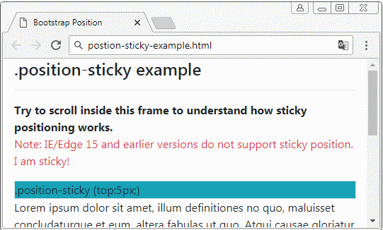
Position Properties: Sticky
Sticky toggles between fixed and relative, based on scroll position. The sticky element remains relatively positioned until the scroll hits a specified position, then toggles to fixed.
While working with positioned elements, you may have noticed a positioned element layered beneath another element and thought:

When working with position, we can use the z-index property to determine how we want to layer our positioned elements. The higher the z-index value, the more priority it has to the front of the view.
Z-index
.bottom-layer {
    position: relative;
    z-index: 1;
}

.top-layer {
    position: relative;
    top: 5px;
    left: 5px;
    z-index: 2;
}
bottom-layer
top-layer
Display Properties
Specifies the display behavior of an element
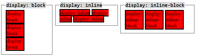
block - Stacks vertically and takes full width available, unless otherwise specified. Can change height and width.
inline - allows horizontal stacking. Size is only what it needs for its content. Can't change height or width.
inline-block - allows horizontal stacking. Can change height and width.
Flexbox
Flexbox allows more flexibility for how a parent element arranges its contents.
Games that teach flexbox:
Flexbox Properties
We have access to many properties with flexbox
flex-example {
    /*initialize flexbox*/
    display: flex;

    /*available properties*/
    flex-direction: row;
    justify-content: center;
    align-items: center;
    flex-wrap: wrap;
}
Flex Direction
flex-direction determines the direction content should flow
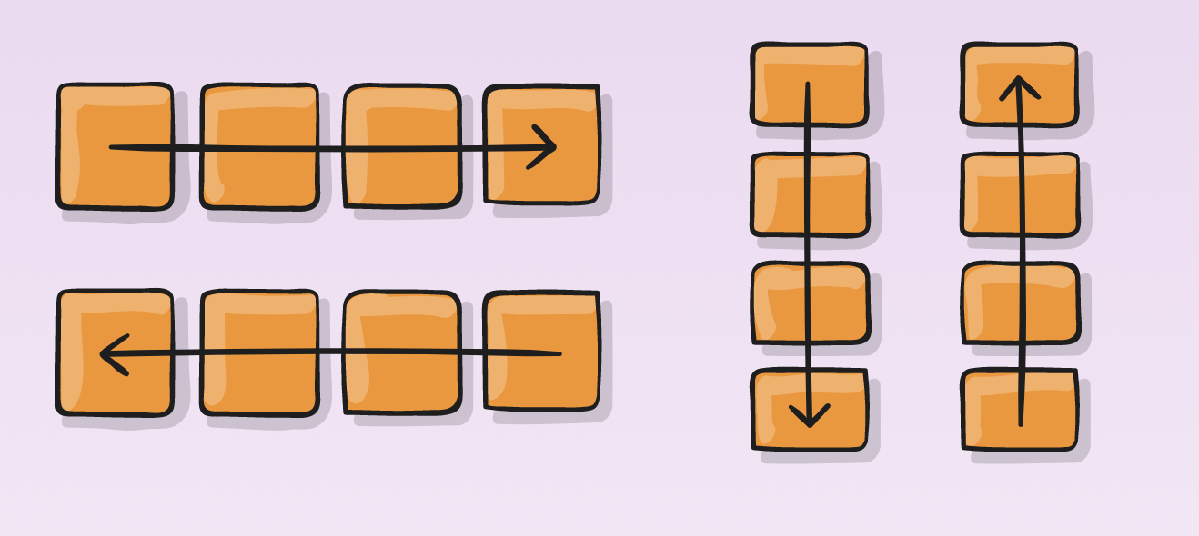
flex-direction: row; (default value)
flex-direction: row-reverse;
column
column-reverse
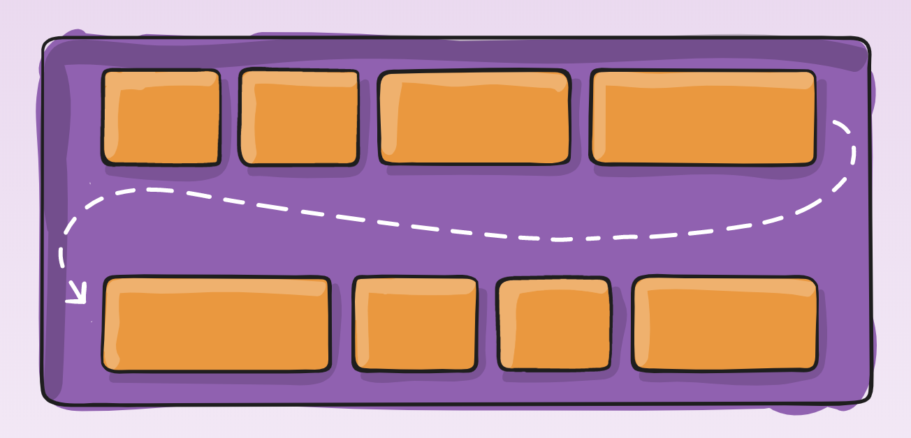
Flex Wrap
flex-wrap determines whether or not the content can wrap in the parent element.
Flex-wraps default value is no-wrap;
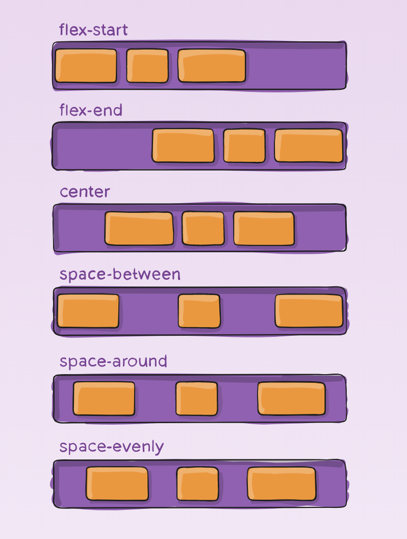
Justify Content
justify-content determines where to place content in the container, and how much space is between that content.
Default value is flex-start.
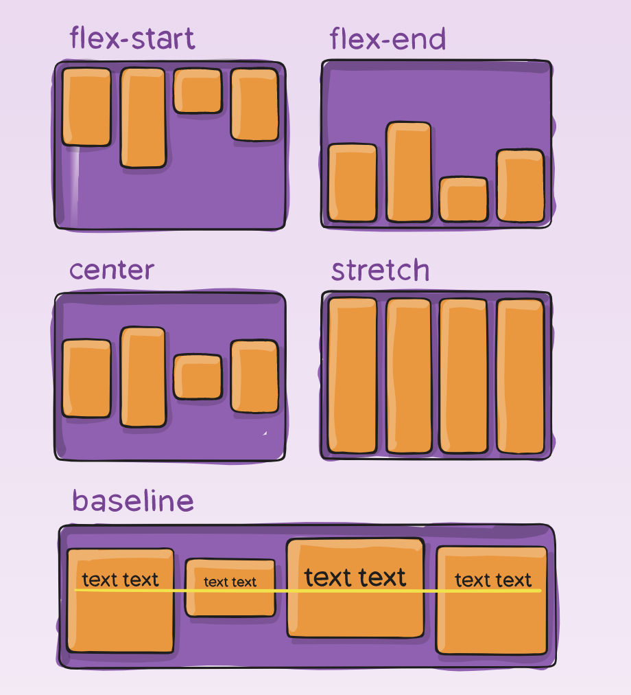
Align Items
align-items determines how content is laid out along the cross axis of the container
(vertically if flex-direction is row, horizontally if flex-direction is column)
Default value is flex-start.
Overflow
The overflow property in CSS determines how content that overflow's its element is handled. Overflows main values are:
overflow: visible—default value, shows overflowing content
overflow: hidden—hides overflowing content
overflow: scroll—makes content scrollable with its element
More about overflow here:
Box-shadow
The box-shadow property can add a 'shadow' to an existing element. This can create a 3D looking effect for elements.
More about box-shadow here:
.shadow-example {
    box-shadow: 3px 3px 0px 0px black;
}
Horizontal Offset
Vertical Offset
Blur Radius
Spread Radius
color
shadow example
HTML/CSS 2
By Devmountain
HTML/CSS 2
Position, Flex-box, Overflow


