Web Design Principles
Why web design?
- give you a foundation for understanding design
- these principles should help you in designing your projects and portfolio (and impressing employers!)

Agenda
- background on user experience (UX) and usability
- interaction design principles
- visual design principles and "design-along"

What is user experience?
User Experience is how a person feels while interacting with a product or interface. The goal is to help users interact with a product that is useful and easy to use resulting in a positive and meaningful experience.
This creates loyalty and trust increasing return customers and sales.
What is usability?
When a product or service is truly usable, the user can do what he or she wants to do the way he or she expects to be able to do it, without hindrance, hesitation, or questions.
When you're designing, ask yourself: will users be able to complete this task accurately and without frustration?
In large part, what makes something usable is the absence of frustration in using it.
–Dana Chisnell
UX Misconceptions
- same as user interface design
- just a step in the process
- only about technology
- only about usability
- only about the user
- expensive
- easy
- the role of one person
- a single discipline
- a choice

UX Misconceptions Cont.
As developers, it can be easy to think about UX only in the context of the web or other technology. But that's not true - everything is designed and everything has an experience.
Can you think of something that has a good user experience that doesn't involve a computer or screen?
Interaction Design
Consistent


Visible

Learnable

Predictable

Feedback
Consistent
C
Why: people are sensitive to change, and we want a system of design that allows users to be comfortable
Example: Street signs & signals in America, you can expect the same system no matter what state you're in
Consistent
C
In Web Design: Items that have a similar behavior should have a similar appearance
Good Example: keeping button design the same across an app
Bad Example: using what looks like a button to just highlight static text
Consistent
C
We should strive for making things useful above consistent.
–Scott Berkun
Visible
V
Why: users can't interact with content or design if they aren't aware that it exists
Example: Stores put the items they're selling on display so that customers know what to expect
Visible
V
In Web Design: users should be able to infer that an opportunity for interaction exists, don't make them guess/search for it
On the left screen, it's very apparent that users can delete messages.
On the right, it's not clear. Should they right click? Double click? Can they even delete from this view?


Learnable
L
Why: the easier something is to learn, the more enjoyable it is to use and the more likely users will continue to use it
Example: a game like Tetris is easily understood and the controls are simple to learn, almost anyone can play and it's remained popular for nearly 40 years
Mental Models
L
Mental models are what the user believes about a system and how it will function, we all have mental models based on experiences we've had previously, physically and digitally
Mental Models
L
It can seem more interesting to create something new instead of using things you've seen before. But ultimately, using mental models and other common design cues helps users know what to do.

Predictable
P
Why: similar to the previous principles - lends to even more usability, makes it easier to learn
Example: we expect that when we turn a doorknob, we'll be able to open a door, it would be very confusing to encounter a door where turning the handle locked the door

Predictable
P
Set accurate expectations before the interaction -- what to do, what will happen, where the user might go, how the interface will respond.

Feedback
F
Why: so the user is aware of what's happening -- their progress, the success of an action
Example: other people provide feedback to us all the time, you could think of the feedback you send to users as you coaching them in using the website

Feedback
F
When you provide feedback to users, make sure that it's helpful and not overwhelming (no need to alert them that navigating to a new page worked, they'll be able to tell by the page loading).
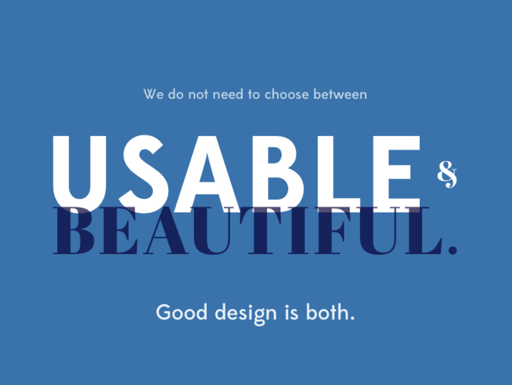
Visual Design
Visual Design is all about what our websites look like -- what users are actually seeing on the screen. This is where User Interface design comes into play.
We are going to talk about 4 principles of visual design: contrast, repetition, alignment, and proximity.

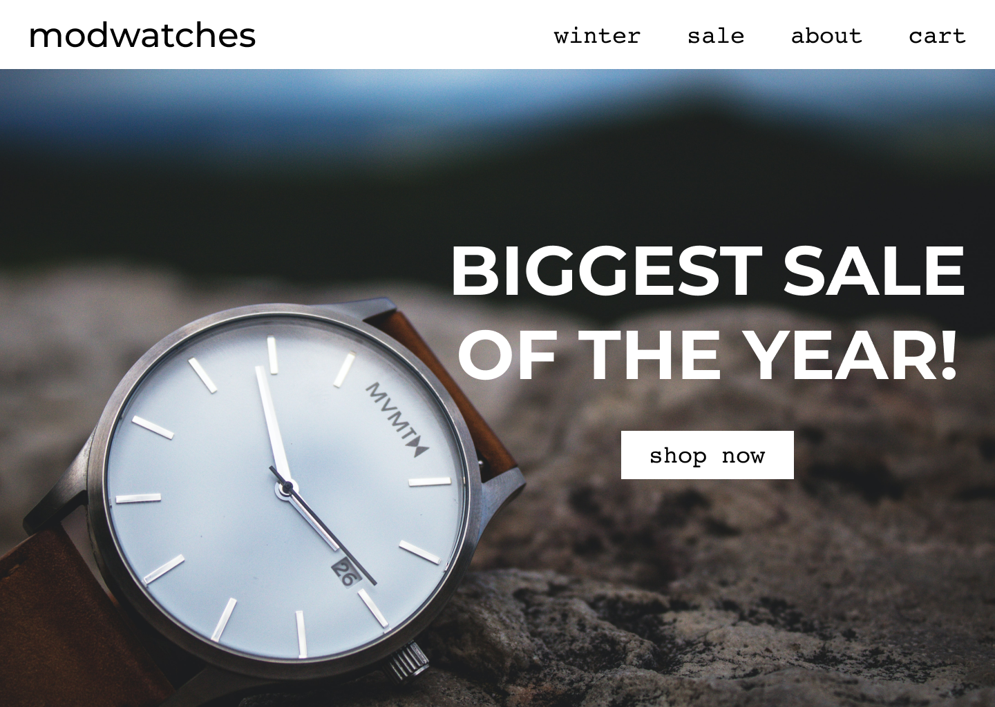
Contrast can be very effective as long as it's not overbearing.
Creates more interest in a design.
Can be used to organize information, establish hierarchy, and provide a guide or focus to the design.
Contrast can be established using size, color, shape, type, and other elements.


Edison bulb fashion axe single-origin coffee trust fund tattooed pork belly distillery freegan. Synth cred hot chicken keffiyeh, vaporware tattooed tumeric.
Title
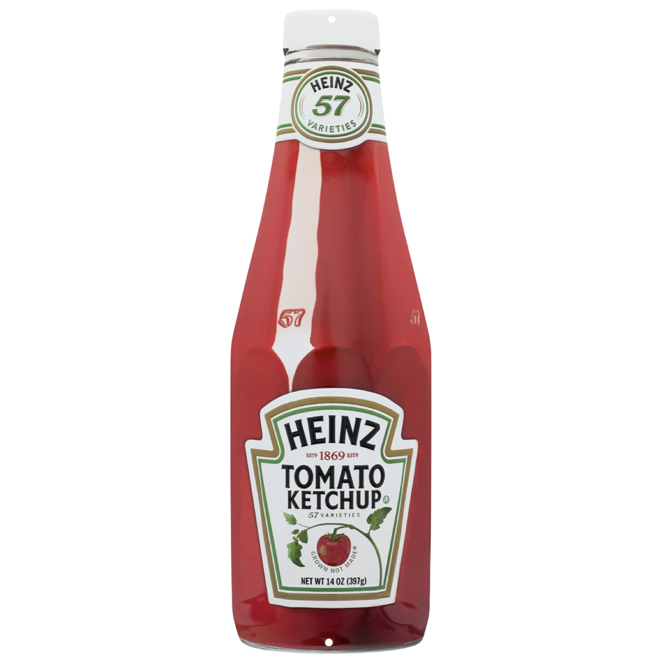
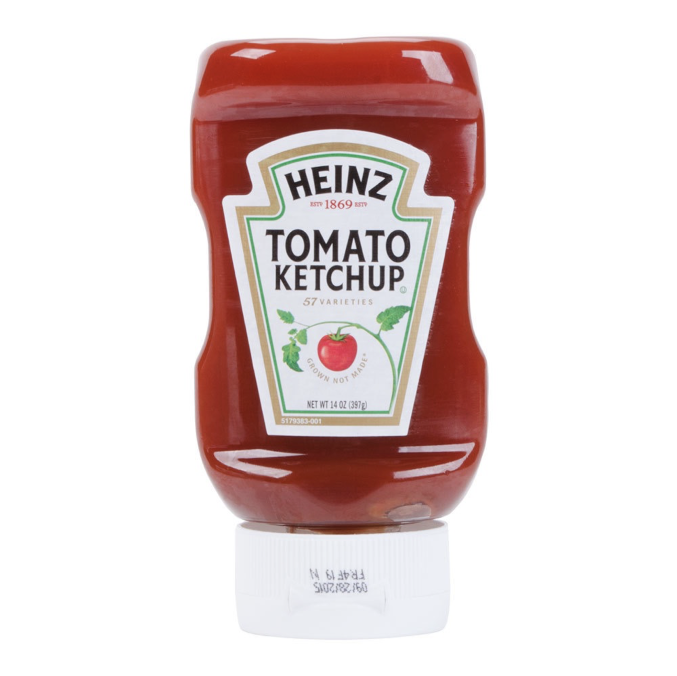
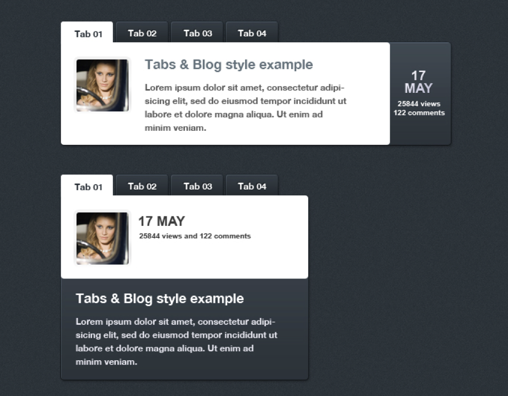
Repetition is the conscious decision to repeat some element throughout the entire design.
- helps clarify and unify
- having obvious repetition allows us to break it to add visual weight or emphasis
- establishes continuity
- makes things look like they belong together
Writing reusable components makes repetition easy!

Sometimes repeated objects are not exactly the same but are closely related
These icons have the same line weight, they use rounded corners, and they're outlines. They're not the exact same, but they repeat some of the same design.
Time to try it out!
Let's put these principles into practice. You can choose to work on this in Figma or CodePen, it's the same design in either app.
For either one, you're going to go in and update the design provided using the principles we've talked about. There isn't one right way to do this, so change whatever you'd like!
Every element in the design should have a visual connection to something else. Always find something to align to in the design, even if it is far away.
Good alignment creates unity and unity is very important in visual design.
Avoid using more than one text alignment on the same design (left justified text in one paragraph and centered text for headlines).

Proximity is how close or far apart things are from one another.
Items placed close together indicate a group or association and vice versa.
The basic function of proximity is to organize information.
Information organization leads to better understanding and retention.

Proximity also is referred to as visual hierarchy. Visual hierarchy is the organization of content in a way that emphasizes what the most important thing to look at first, second and so on.

Grids bring order to the information and content presented and provides visual anchors to elements in the design.
Columns give proportion to the design. (Think main content and side navigation).
We generally align all elements on the page to the columns.

In grids, gutters are the negative space surrounding columns, they remain constant in size regardless of the width of the columns.
Another important part of proximity is whitespace. It doesn't have to be white, the term just refers to the empty space between elements.
Designs need some of that negative space, don't fill up the whole page. Conversely, don't leave so much space that it feels empty.

Color Harmony
Color harmony is when the arrangement of colors used are pleasing to the eye. Color harmony delivers a sense of balance and order.
When something is out of harmony it is either bland or obnoxious.
There are lots of different theories about colors and choosing good ones. We recommend using a tool like https://coolors.co/
to help you when choosing colors. Remember what you know about consistency, contrast, etc. and keep it simple.
Typography
Choosing fonts can seem overwhelming (or like a chore if this isn't your thing) but it doesn't need to be. There are websites like https://fontpair.co/ that can help if you need ideas. It's a good idea to just stick to one or two fonts in a project.
Typography helps with visual hierarchy -- think sizing and weight. Type also provides visual interest and helps make a website look more intentional than if you use the defaults.
A Quick CSS Font Family Note
In CSS, we usually write a "backup" font family in case our fonts don't load. There are 5 of these generic families.
body {
  font-family: 'Andika New Basic', sans-serif;
}
backup generic family
Sans-serif and serif fonts are best for web design (sometimes monospace) because they are the most accessible. It's usually a good idea to stay away from overusing cursive or fantasy fonts.

Go Big
This is a simple rule that tends to override other rules, guides and principles. It is what it sounds like: make something big to draw attention to it. Readers notice and read big things first.
Time to try it out!
Open up your CodePen or Figma files and continue making changes to improve the design.

Web Design Principles
By Devmountain
Web Design Principles
Web Design for Developers


