Geographical Information Systems and Science with Python:
Case studies, city, energy, environmental and buildings research
Ed Sharp:
ed.sharp@ucl.ac.uk | www.esenergyvis.wordpress.com | @steadier_eddy
Overview
- A quick introduction to GIS and Python,
- with a few options on access etc.
- Case studies
- How to use these tools for spatial analysis, energy and environmental modelling
- Intended to also introduce city and energy data along the way ...
Geographical Information Systems and Science
Why should you care?
-
GIScience is seen by many as simply a way to visualise spatial information
- This is an important element of the field, but somewhat misses the point
-
There is a lot of work that goes on behind the ability provided to low level users to create these visualisations
- The science encapsulates this work, done by researchers, software engineers and business peope
- The summary of information visually is a very powerful way of understanding potentially very complex data or analysis
- The next most powerful aspect, for me, is the ability to harmonise data that otherwise may be unrelated, since most things have some spatial aspect.
- A small amount of learning can provide access to a very powerful and constantly evolvign set of tools.
Geograhical Information Systems
-
Desktop
-
ArcGIS
- Comprehensive & Intuitive,
- Industry standard
- ArcPy
- Expensive
-
Opensource
- QGIS
- Grass
- Free
- Less comprehensive & Intuitive
-
Command line
- Python – Basemap etc
- R – gg plot
-
ArcGIS
-
Bespoke
- Possible to write many processes into e.g python
- Web – e.g. Google
- Remote sensing
- Databases
- CAD?
The first definition of a GIS is an information system. Often the first thing people think of, which concerns the software and hardware
Geographical Information Science
-
Processes surrounding the systems
- Algorithms
- Software design
- Application or processes
- Data storage
- Standards
- Covered in many UG courses and Masters
- Research/Development
-
Incorporates
- Geography
- Maths
- Physics
- Computer Science
- Cartography
Users
- The definitions above depend on the person/ user
- Students
- Professionals ……
- Developers
- Scientists/academics
Underpinning the systems there is the science, which encapsulates everything that makes the software work.
Python
In the context of GIS Python provides the ability to create hugely more complex and powerful models and analyses and beyond that infinite possibilities for research etc.
- Fundamentally Python is a programming language. It can also be viewed as a tool which can be used to carry out ..
- GIScience
- Data analysis
- Visualisation
- Database management
- Data Extraction
- Model development
- Graphical interface development, including web based
Python
- As well as the versatility there are a number of reasons to use Python
- Easy to learn (verbose feedback and sensical structure)
- Open Source (therefore free and easy to change source code)
- Updated and Maintained (by large community)
- Internal (to organisation) and External communities for advice
- Cross platform
- Excellent data structures
- Great for GIS
- There are also reasons not to use it ....
- Some difficulties with installation and maintenance
- Slow compared to e.g. C (though can be combatted)
- Not really designed for powerful machines (e.g. many processors)
- There are Python packages that work around this, e.g. Intel. But there are other, possibly more appropriate modern choices, e.g. GO.
Pros and Cons ..............
Python
- Distributions and platforms
- Anaconda or Enthought
- Jupyter Notebooks or Lab
- A good text editor, e.g. Sublime
- Tools and Modules
- Learn some command line tools
- Numpy, Scipy, Matlplotlib, Pandas ...............................
- Data types
- Integer,Floats, strings, lists, tuples, arrays, dictionaries, pandas dataframes .........
- Learning Python is much better done on your own time. UCL has an intensive course for students and there are lots of online resources, YouTube and Stackoverflow are my first choices
Where to start .............
Python + GIS
Python and GIS together create a powerful combination
- Advantage of increasing the data handling capability, automating tasks and incorporating them in to a much wind range of projects
-
If starting from a GIS background the first step is to use Python Scripting in the GUI
- All the functions can be scripted using the ArcPy package (also QGIS and pyQGIS)
- The package can be used outside of the GUI, but a license is required, therefore has to be on windows
- Lots of choice and good option for automating recurring tasks or looping through something
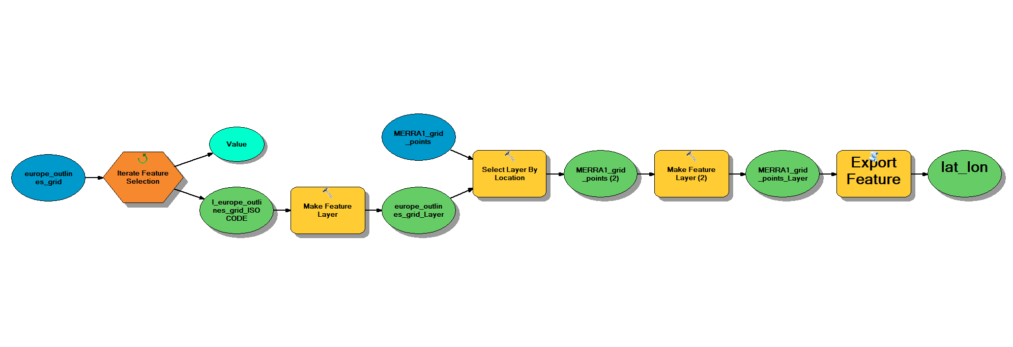
- Lots of processes are simpler to carry out using the gui or ModelBuilder - a graphical way of creating pseudo code, e.g. plot
- Modelbuilder can be exported to Python script, but some changes will be necessary
-
Data Handling
- GDAL/OGR - process vector and raster information
- pyQGIS - QGIS functions
- ArcPy - ArcGIS functions
- pyshp
- pyproj - cartographic transformations
- geojsonio - loading geojson data
- rtree - spatial indexing
- fiona - read and write spatial data
- geopy - geocoding e.g. coordinates to address
- RSGISLib - remotes sensing
-
Analysis
- shapely - manipulate and analyse planar objects
- GeoPandas - geospatial data in pandas framework
- PySAL - Spatial analysis fucntiosn
- Rasterio - raster i/o
- Networkx - network analysis and routing
- scipy.spatial - algorithms
-
Plotting
- matplotlib - plot data on boundaries
- descartes - plotting geometries
- cartopy - plotting spatial data
- geoviews - interactive web maps
Python + GIS
There are an increasing number of Python modules which do some aspect of Spatial Analysis or Mapping. Non exhaustive and evolving list:
Python + GIS
Bespoke spatial frameworks and and analysis created or carrying out using Python can also be called a GIS.
- Numpy - scientific computing, including complex arrays
- Scipy - numerical algorithms and domain specific toolboxes
- Pandas - data structures and analysis (eg.g excel)
- scikit-leanr - scikit-image
More Code
To do more complex visualisations there are better languages and tools......
- javascript - necessity for web based vis
- HTML - containers and layouts for web vis
- D3.js - variant of Javascript, designed for visualising data
- Mapbox - slippy mapping platform
- Leaflet - javasript library for interactive maps - has python versions
- Google maps and Bing - map apis, my maps very sueful for quickly sharing data
Case Studies :
Gridded wind generation, data, modelling and visualisation
PhD: Gridded modelling of wind generation, using GIS
The power of using GIS and Python in this case was the ability to create a bespoke framework and adapt data and simulation methods to it.
- Numpy arrays used to create model grid
- conceptual as did not need to be spatially accurate
- Only a common key necessary
- Looping, slicing and mathematical operation become trivial
- Assigning data to this conceptual framework, using a geographical grid was done in ArcGIS
- Spatial referencing necessary


PhD: Gridded modelling of wind generation, Census data to grid

Very few datasets are in the correct framework, therefore considerable work done harmonising to grid. ArcGIS outputs.
PhD: Gridded modelling of wind generation, GIS analysis of available land


- Layers of spatial restrictions on development merged
- Land use of GB wind farms examined - only common types used.
- Plots show uses of onshore turbines and the evaluation of the exclusion analysis - very few farms built in exclusion zones
- ArcGIS and matplotlib
PhD: Gridded modelling of wind generation - analysis and visualisation using Python
Matplotlib 3d wireframes, animated using a video editor
Hourly variability in wind generation, electricity demand and residual demand. Matplotlib and ArcGIS

Increased variability in both scenarios, higher capacity factors throughout the later in years under Gone Green on the left, especially in the colder months.
Predictable variability under both scenarios for all years. Little evidence of the impact of heat pumps on the temporal patterns of electricity demand.
The Gone Green scenario experiences greater variability as a result of more wind capacity, particularly offshore.
Wind Generation
Electricity Demand
Residual Demand


PhD: Gridded modelling of wind generation - analysis and visualisation using Python

Hourly variability in residual demand - matplotlib images (adapted)
PhD: Gridded modelling of wind generation - analysis and visualisation using Python
See Sinden (2007) for original method

PhD: Gridded modelling of wind generation - analysis and visualisation using Python
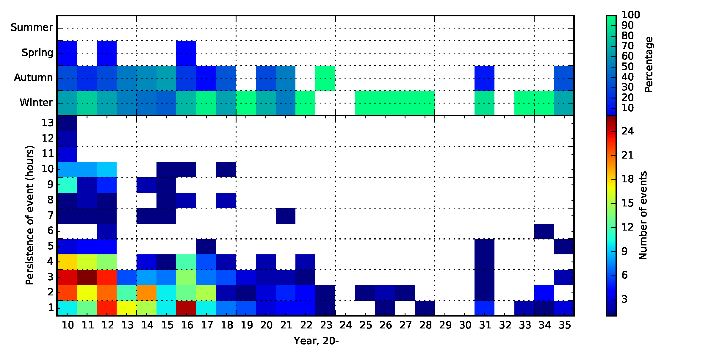
- Correlation coefficient between timeseries of generation from pairs of grid squares under different scenarios
- Demonstrating that in terms of increasing spatial diversity, much can be achieved using onshore only farms in GB
- Due to the long thin nature of the land mass and the weather patterns.
- Matplotlib 2d histograms
PhD: Gridded modelling of wind generation - analysis and visualisation using Python

Blog: Animated maps of renewable energy modelling
PhD: Gridded modelling of wind generation - animated output
Blog: Animated maps of renewable energy capacity
Animated map of historical wind capacity
ArcGIS mapping, Python plotting and a video editor
Blog: Animated maps of renewable energy capacity
Animated map of historical wind capacity
ArcGIS mapping, Python plotting and a video editor
Case Studies :
Air Pollution
DEFRA Gridded background pollution projections


- DEFRA gridded 1km x 1km 2011 - 2030 projections of NOx and PM
- Disaggregated by source including roads, domestic, commerical, rail, vehicles and point sources
- Internal and external
- Current year tethered to relaity, projections = scenarios
- Can be used in environmental modelling
- Rasters visualised using ArcGIS - harmonised legend values, export to image, gif through photoshop
- Photoshop good for small gifs
- Larger number of images = after effects
- Significant levels of background pollution come from outside of the country
- Move to Northern Scotland for clean air!


The 5 worst polluted areas in the country
- Using the same data and visualisation only, it is possible to examine some of the aspects of the projections
- E.g. road pollution clearly reduces significantly through electrification in these scenarios
- But pollution from other forms of transport, includign air and sea becomes proportionally more significant
- Can you tell which areas are the worst?

GB Boroughs ranked by background NOx pollution : 2011 - 2010
- Using a GIS the gridded air pollution data was joined with census geographies representing boroughs - a fundamental GIS process.
- That data was then exported to a spreadsheet (this could be done in Python, including internally in ArcGIS)
- The mean NOx value by borough was calculated each year and the boroughs ranked each year
- The result is a simplification of some spatiotemporal data into a much easier to understand form
-
The plot shows interestign artefacts of the scenarios
- London boroughs remain the most polluted
- There are significant improvements for boroughs with high levels of transport pollution (e.g. Lewisham)
- Boroughs with airports and sea ports nearby clearly fall
Gridded Air Pollution
Gridded Air Pollution
The London Atmospheric Emissions inventory provide data on background air pollution on a 20 m grid
Roadside air pollution
- DEFRA also provide estimates of roadside air pollution, estimated from traffic counts and emissions factors as well as measured pollution and dispersion modelling.
-
This dataset was combined with data on schools to identify establishments within 150 m of roads exceeding the EU limit value of 40 µg/m3 of NO2.
- Used in the poisoned playgrounds campaign
- A GIS was used to calculate euclidean distances to all roads in the dataset
- Results presented in a web GIS

Case Studies :
Buildings
Estimating non domestic energy demand

- Building footprints from Ordnance Survey Mastermap
- Building heights from OS
- More data from e.g. Lidar
- Derive simple volume
- Non domestic building use from OS Addressbase premium
- Assign to built form
- Handle multiple uses
- Energy intensity by use from academic research
- Energy demand = floor area * intensity
- Simple method, but uses data that covers whole of GB and requires very little in model computation
- Significant imorvements are available thourgh better data, e.g. VOA, Metered data and Lidar
- Massive increase in complexity
- see simstock and 3d stock
Mastermap vs. Openstreetmap


LIDAR point cloud to building extrusion - UCL


Lidar data continued
There are LIDAR derived building height datasets available from EMU analytics, or the raw data from the environment agency

Case Studies :
People
Gridded population data
- Datasets vary in scope and resolution and also in spatial referencing
- All are based on census data, redistributed to a grid
- Therefore represent evening domestic population
- Some datasets use ancillary data, e.g. nighttime lights or surveys of workplaces to improve representation
- Work to be done on day time population, therefore not the best option for all questions
- 1 km x 1 km longitudinal data for Europe available via geostat
- 1 km x 1 km data for GB via Centre for Ecology and Hydrology - same grid as air pollution, useful for modelling
-
Global data available from multiple sources, the most popular is the Global Rural Urban Mapping Project (GRUMP).
- 30 arc second grid, close to 1 km, but causes a grid mismatch with regional coordinate systems (see plot)

Population data

- Gridded population densities can be used in conjunction with projections of population for simulation models etc.
- Need to be careful of data artefacts in many cases due to calibration etc
- e.g. plot
Population data
Much of the analysis done on datasets which include geotagging is essentially population mapping, albeit at a potentially high temporal resolution, for example google location services
Here a Python mapping modules were used to show all of the location data my phone collected (before I turned it off, because it is creepy)
Case Studies :
Transport
Roads
-
Department for Transport produce vehicle km data for major roads from measurements of Annual Average Daily flow
- by vehicle type
- by road
- these can cut city boundaries, so a GIS is needed to estimate what proportion is in the city (see plot)
- Minor road data is not attributed to roads, but there are a subset of measurements which can be used
- See also, OS opendata for roads shapefiles and sub national road consumption statistics


Minor roads - Birmingham
Major roads - Birmingham
Rail

- Passenger km data are available from the Office for Rail Regulation (ORR), dis aggregated by operator
- The General Transit Feed Specification (GTFS) provides data on route, stations, stops and operators
- The two data were joined
- A simplified rail network describing trips between stations by operator was created (see plot)
- The network was cliipped around cities and a proportion of the passenger km assigned to travel within the city boundaries
- The GIS provides the ability to make more reasonable assumptions on data allocation to different geographies.
- Freight data are available by operator from ORR, but GTFS aggregate these trips to a single code so assignment must be done on a land based proportion
Case Studies :
Mapping
Different ways of representing GIS data - Cartograms
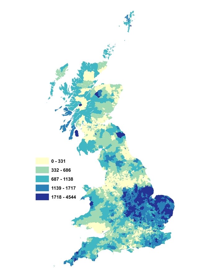

- The size of the census area is adapted to represent the relative number of economy 7 meters
- Here this means that the different original size of the census areas are counteracted (less densely populated census geographies are usually bigger)
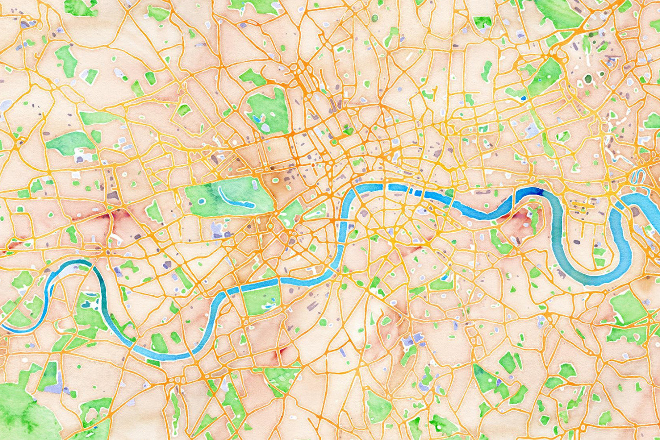
Aesthetically pleasing base Mapping: good options exist
GIS and Python for Energy and Buildings Research
By Ed Sharp
GIS and Python for Energy and Buildings Research
A summary of the use of GIS for research in Energy and builidngs
- 984


