CSS Session 2
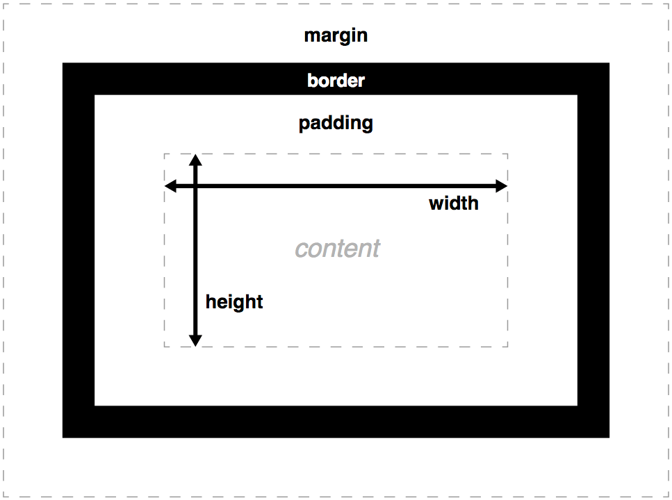
Box Model
each element represented as a rectangular box, with content, padding, border, and margin.
box properties :
- width & height : sets the width & height of content box (text and nested children)
- max-width, min-width, max-height, min-height sets size constraints rather than an absolute size.
- padding : inner margin of a box, the layer between outer edge of the content box and the inner edge of the border.
- border : between the outer edge of padding and the inner edge of the margin. default size is 0.
- margin : outer area surrounding CSS box, which pushes up against other CSS boxes in the layout. behaves rather like padding
Advanced Box Manipulation
- auto : if there is too much content, the overflowing content is hidden and scroll bars are shown to let user scroll to see the content
- hidden : if there is too much content, the overflowing content is hidden
- visible : if there is too much content, the overflowing content is shown outside of the box (default behaviour)
overflow : when you set the size of a box with abs. values, the content may not fit in the allowed size, in which case the content overflows
Advanced Box Manipulation
background-clip : box bgs are made up of colors and images, stacked on top of each other (bg-color, bg-image). they are applied to a box and drawn under that box. by default, bgs extend to the outer edge of the border. this can e adjusted by setting background-clip property of the box.
<div class="default"></div>
<div class="padding-box"></div>
<div class="content-box"></div>


div {
    width  : 60px;
    height : 60px;
    border : 20px solid rgba(0, 0, 0, 0.5);
    padding: 20px;
    margin : 20px 0;

    background-size    : 140px;
    background-position: center;
    background-image   : url('https://mdn.mozillademos.org/files/11947/ff-logo.png');
    background-color   : gold;
}

.default     { background-clip: border-box;  }
.padding-box { background-clip: padding-box; }
.content-box { background-clip: content-box; }
Advanced Box Manipulation
outline : looks like a border but which is not part of the box model. it behaves like the border but is drawn on top of the box without changing the size of the box (drawn outside the border-box, inside the margin area)
Advanced Box Manipulation
Types of CSS boxes
block : content before / after appears on a separate line, and can have width and height set on it. the whole box model we talked about applies to block boxes!
inline : opposite of block box; flows with the document's text (appears on the same line as surrounding text and other inline elements, and content breaks with the flow of the text).
width and height settings have no effect on "inline" boxes, any padding, margin and border set on inline boxes will update the position of surrounding text, but will not effect the position of surrounding block boxes
inline-block : mix of two; it flows with surrounding text without creating line breaks before/after it like an inline box, but it can be sized using width and height and maintains block integrity like a block - not broken across paragraph lines
CSS Positioning
a positioned element is an element whose computed position property is either relative, absolute, fixed
a relatively positioned element is an element whose computed position is relative.
an absolutely positioned element is an element whose computed position property is absolute or fixed.
default position value is static.
top, right, bottom, and left properties specify the position of positioned elements.
/* Keyword values */
position: static;
position: relative;
position: absolute;
position: fixed;

/* Global values */
position: inherit;
position: initial;
position: unset;
CSS Positioning
static : lets element use the normal behaviour. that is, it is laid out in its current position in the flow. top/right/bottom/left and z-index properties do not apply.
relative : lays out all elements as though the element were not positioned, and then adjusts the element's position, without changing the layout (and thus leaving a gap for the element where it would have been had it not been positioned)
absolute : do not leave space for the element. instead, position it at a specified position relative to its closest positioned ancestor if any, otherwise relative to the initial containing block. absolutely positioned boxes can have margins, and they do not collapse with any other margins.
fixed : do not leave space for the element. instead, position it at a specified position relative ti the screen's viewport and don't move it when scrolled. this value always creates a new stacking content.
CSS Positioning
Relative Positioning
<div class="box" id="one">One</div>
<div class="box" id="two">Two</div>
<div class="box" id="three">Three</div>
<div class="box" id="four">Four</div>

.box {
    display: inline-block;
    background: red;
    width: 100px;
    height: 100px;
    margin: 20px;
    color: white;
}

#two {
    position: relative;
    top: 20px;
    left: 20px;
}
CSS Positioning
Absolute Positioning
<div class="box" id="one">One</div>
<div class="box" id="two">Two</div>
<div class="box" id="three">Three</div>
<div class="box" id="four">Four</div>

.box {
    display: inline-block;
    background: red;
    width: 100px;
    height: 100px;
    margin: 20px;
    color: white;
}

#two {
    position: relative;
    top: 20px;
    left: 20px;
}
Elements that are positioned relatively are still considered to be in the normal flow of elements in the document. In contrast, an element that is positioned absolutely is taken out of the flow and thus takes up no space when placing other
elements.
CSS Positioning
Fixed Positioning
<div class="outer">
    <p>
        Lorem ipsum dolor sit amet, consectetur adipiscing elit. Nam congue tortor eget pulvinar lobortis.
        Vestibulum ante ipsum primis in faucibus orci luctus et ultrices posuere cubilia Curae; Nam ac dolor augue.
        Pellentesque mi mi, laoreet et dolor sit amet, ultrices varius risus. Nam vitae iaculis elit.
        Aliquam mollis interdum libero. Sed sodales placerat egestas. Vestibulum ut arcu aliquam purus viverra dictum vel sit amet mi.
        Duis nisl mauris, aliquam sit amet luctus eget, dapibus in enim. Sed velit augue, pretium a sem aliquam, congue porttitor tortor.
        Sed tempor nisl a lorem consequat, id maximus erat aliquet. Sed sagittis porta libero sed condimentum.
        Aliquam finibus lectus nec ante congue rutrum. Curabitur quam quam, accumsan id ultrices ultrices, tempor et tellus.
    </p>
    <div class="box" id="one">One</div>
</div>

.box {
    background: red;
    width: 100px;
    height: 100px;
    margin: 20px;
    color: white;
}

#one {
    position: fixed;
    top: 80px;
    left: 10px;
}

.outer {
    width: 500px;
    height: 300px;
    overflow: scroll;
    padding-left: 150px;
}
Fixed positioning is similar to absolute positioning, with the exception that the element's containing block is the viewport. This is often used to create a floating element that stays in the same position even after scrolling the page. In the example below the "One" box is fixed 80px from the top of the page and 20px from the left:
CSS Positioning
NOTES
For relatively positioned elements, the top or bottom property specifies the vertical offset from the normal position and the left or right property specifies the horizontal offset.
For absolutely positioned elements, the top, right, bottom, and left properties specify offsets from the edge of the element's containing block (what the element is positioned relative to). The margin of the element is then positioned inside these offsets.
Most of the time, absolutely positioned elements have auto values of height and width computed to fit the contents of the element. However, non-replaced absolutely positioned elements can be made to fill the available space by specifying
(as other than auto) both top and bottom and leaving height unspecified (that is, auto).
CSS Positioning
NOTES
Except for the case just described of absolutely positioned elements filling the available space :
If both top and bottom are specified (technically, not auto), top wins.
If both left and right are specified, left wins when direction is ltr (English, horizontal Japanese, etc.) and right wins when direction is rtl (Persian, Arabic, Hebrew, etc.).
Centering Things
centering lines of text
centering a block of text or an image
centering a block or an image
Centering lines of text :
most common and easiest type of centering is that of lines of text in paragraph or in a heading :
p, h2 {
    text-aling: center;
}
renders each line in a p or h2 centered between its margins.
Centering Things
Centering a block or image :
phrased differently: we want left and right margin to be equal. the way to do that is to set the margins to "auto". this is normally used with a block of fixed width, because if the block itself flexible, it will simply take up all the available width
p.blocktext {
    margin-left: auto;
    margin-right: auto;
    width: 6em;
}

<p class="blocktext">This rather ...</p>
this is also the way to center an image : make it into block of its own and apply the margin properties to it :
img.displayed {
    display: block;
    margin-left: auto;
    margin-right: auto;
}

<img class="displayed" src="..." alt="...">
Centering Things
Centering vertically :
CSS2 does not have a property for centering things vertically. but even in CSS2 you can center blocks vertically, by combining a few properties :
div.container {
    min-height: 10em;
    display: table-cell;
    vertical-align: middle;
}


<div class="container">
    <p>this is small paragraph...</p>
</div>
CSS3 offers other possibilities. a good way to center blocks vertically without using absolute positioning (which may cause overlapping text) is still under discussion. but if you know that overlapping text is not a problem in your document, you can use transform property to center an absolutely positioned element
Centering Things
Centering vertically :
<div class="container">
    <p>This paragraph..</p>
</div>

div.container {
    height: 10em;
    position: relative; // 1
}

div.container p {
    margin: 0;
    position: absolute; // 2
    top: 50%; // 3 - 50% refers to 50% of height of the container
    transform: translate(0, -50%); // 4 - 50% refers to the height of the element itself
}
in 2015, another technique has also become available in several CSS implementations :
div.container {
    height: 10em;
    display: flex;
    align-items: center;
}
Centering Things
Centering vertically&horizontally in CSS3 :
<div class="container">
    <p>centered!</p>
</div>

div.container {
    height: 10em;
    position: relative;
}

div.container p {
    position: absolute;
    top: 50%;
    left: 50%; // new
    margin-right: -50%; // new
    transform: translate(-50%, -50%); // edited

}
we can extend both methods to center horizontally and vertically at the same time. A side effect of making the paragraph absolutely positioned is that it is then only as wide as it needs to be (unless we give it an explicit width) :
Centering Things
Centering vertically&horizontally in CSS3 :
div.container {
    display: flex;
    align-items: center;
    justify-content: center;
}
when the css formatter supports flex, it's even easier :
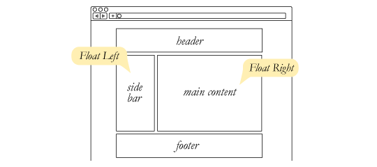
CSS Float
the float css property specifies that an element should be placed along the left or right side of its container, where text and inline elements will wrap around it. this way, the element is taken from the normal flow of the web page, though still remaining a part of the flow, contrary to absolute positioning!
floating element is one where the computed value of float is not none (initial value : none)
as float implies the use of the block layout, it modifies the computed value of the display values in some cases :
| specified | computed |
|---|---|
| inline | block |
| inline-block | block |
| flex | flex (no effect on such el.) |
CSS Float
float: left;
float: right;
float: none;
float: inline-start;
float: inline-end;

/* Global values */
float: inherit;
float: initial;
float: unset;
values:
left : is indicating that the element must float on the left side of its containing block.
right : is indicating that the element must float on the right side of its containing block.
none : is indicating that the element must not float.
CSS Float
CSS Float
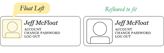
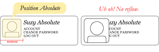
This same layout could be accomplished using relative positioning on container and absolute positioning on the avatar as well. In doing it this way, the text would be unaffected by the avatar and not be able to reflow on a size change.
CSS Float
Float's sister property is clear. An element that has the clear property set on it will not move up adjacent to the float like the float desires, but will move itself down past the float. Again an illustration probably does more good than words do.
Clearing the float
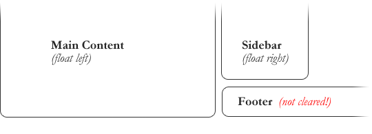
In the above example, the sidebar is floated to the right and is shorter than the main content area. The footer then is required to jump up into that available space as is required by the float. To fix this problem, the footer can be cleared to ensure it stays beneath both floated columns.
CSS Float
Clearing the float
footer {
  clear: both;
}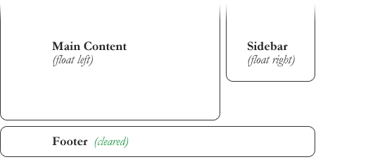
CSS Float
Clearing the float
Clear has four valid values as well:
both is most commonly used, which clears floats coming from either direction.
left and right can be used to only clear the float from one direction respectively.
none is the default, which is typically unnecessary unless removing a clear value from a cascade
CSS Float
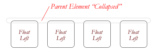
Collapse
One of the more bewildering things about working with floats is how they can affect the element that contains them (their "parent" element). If this parent element contained nothing but floated elements, the height of it would literally collapse to nothing.
This isn't always obvious if the parent doesn't contain any visually noticeable background, but it is important to be aware of.
CSS Float
Techniques for clearing floats
The empty div method :
The overflow method :
relies on setting the overflow property on a parent element. If this property is set to auto or hidden on the parent element, the parent will expand to contain the floats, effectively clearing it for succeeding elements
The easy clearing method :
uses a clever pseudo selector (:after) to clear floats. Rather than setting the overflow on the parent, you apply an additional class like clearfix to it.
<div style="clear: both;"></div>CSS Float
Techniques for clearing floats
The easy clearing method (continued)
.clearfix:after {
   content: ".";
   visibility: hidden;
   display: block;
   height: 0;
   clear: both;
}
This will apply a small bit of content, hidden from view, after the parent element which clears the float
useful reading https://css-tricks.com/all-about-floats/
CSS - Session 2 : Basics
By erdi taner gökalp