


federica bianco PRO
astro | data science | data for good
dr.federica bianco | fbb.space | fedhere | fedhere
Scientific Visualizations
a few historical plots and why they made history
A common problem: too many points
plt.plot(Teff, logg, 'k.')The problem with big data
the larger the data, and especially the higher the number of dimensions, the harder to design a visualization that is effective
The importance of visualizations:
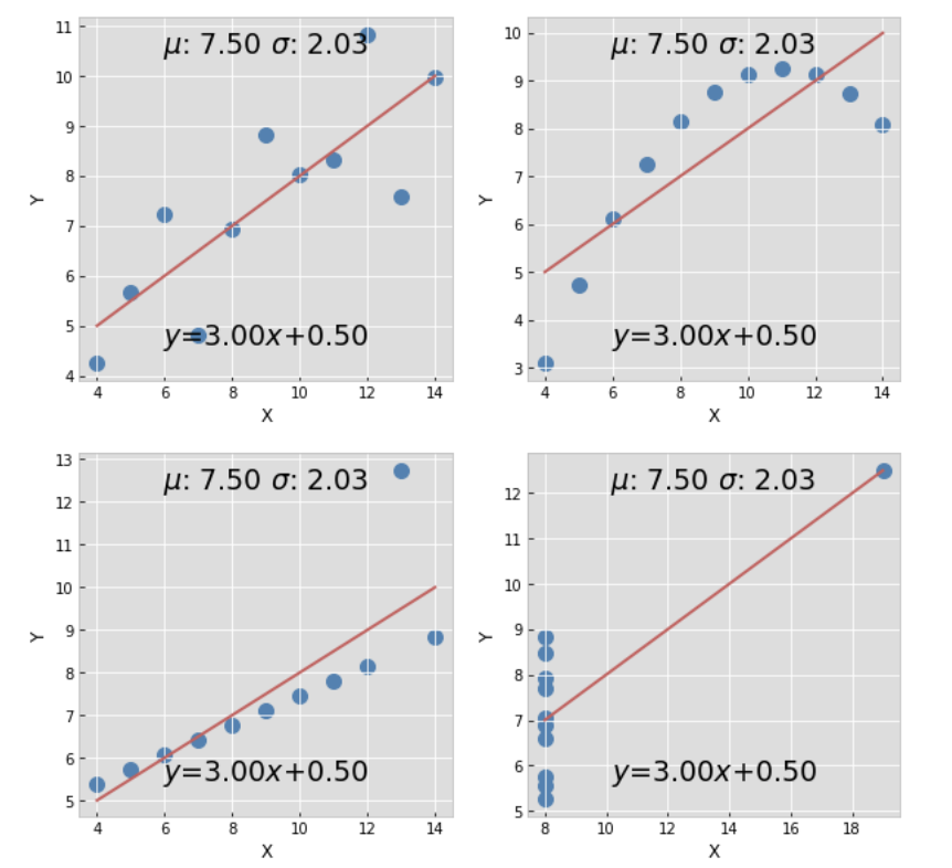
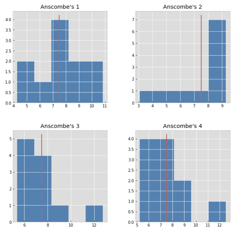
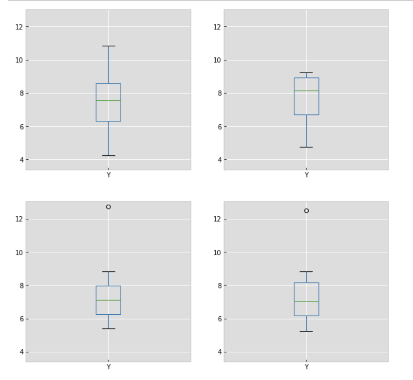
Anscombe's quartet
(Francis Anscombe, 1973) comprises four datasets that have nearly identical simple descriptive statistics, yet appear very different when graphed. Each dataset consists of eleven (x,y) points.
https://github.com/fedhere/MLPNS_FBianco/blob/main/viz/Anscombe's_Quartet.ipynb
Visualization of derived data products may be effective
the larger the data the harder it is to collectively understand the descriptive statistics
a few historical plots and why they made history
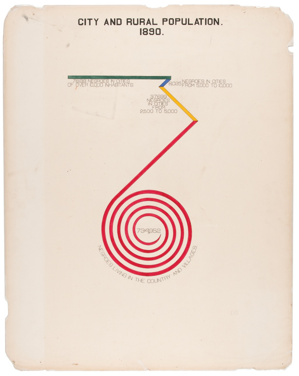
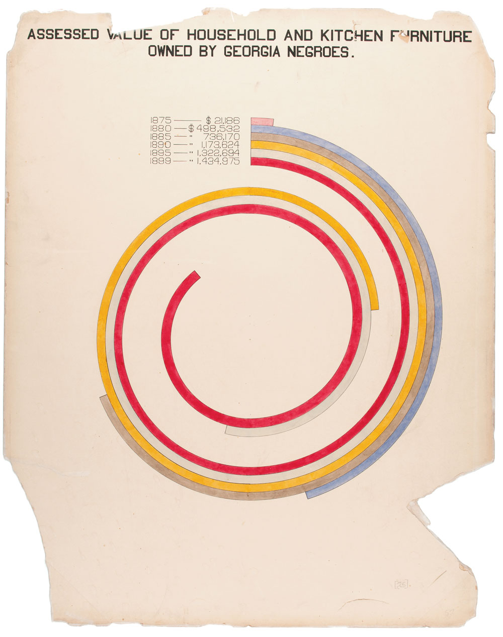
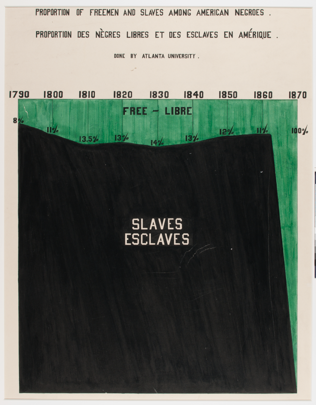
W.E.B. Du Bois
February 23, 1868 – August 27, 1963
American sociologist, socialist, historian, civil rights activist, Pan-Africanist, author, writer and editor
https://inspirehep.net/record/1082448/plots
“Du Bois was aware that while unmoving prose and dry presentations of charts and graphs might catch attention from specialists, this approach would not garner notice beyond narrow circles of academics,” Aldon Morris writes in the essay “American Negro at Paris, 1900.” “Such social science was useless to the liberation of oppressed peoples. Breaking from tradition, Du Bois was among the first great American public intellectuals whose reach extended beyond the academy to the masses.”
https://hyperallergic.com/476334/how-w-e-b-du-bois-meticulously-visualized-20th-century-black-america/
a few historical plots and why they made history
a few historical plots and why they made history
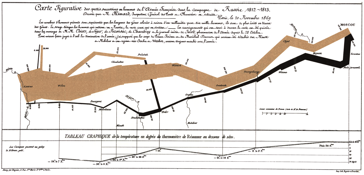
Figurative Map of the successive losses in men of the French Army in the Russian campaign 1812-1813. Charles Joseph Minard (November 20th, 1969)
The numbers of men present are represented by the widths of the colored zones in a rate of one millimeter for ten thousand men; these are also written beside the zones. Red designates men moving into Russia, black those on retreat. — The information used for drawing the map were taken from the works of Messrs, Chiers, de Ségur, de Fezensac, de Chambray and the unpublished diary of Jacob, pharmacist of the Army since 28 October.
In order to facilitate the judgment of the eye regarding the diminution of the army, I supposed that the troops under Prince Jèrôme and under Marshal Davoust, who were sent to Minsk and Mobilow and who rejoined near Orscha and Witebsk, had always marched with the army.
a few historical plots and why they made history
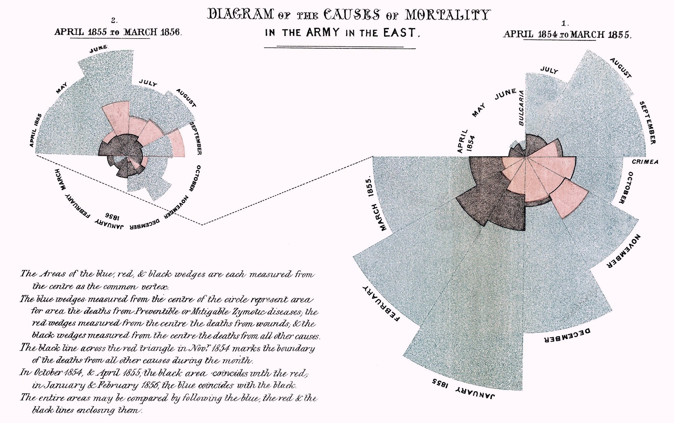
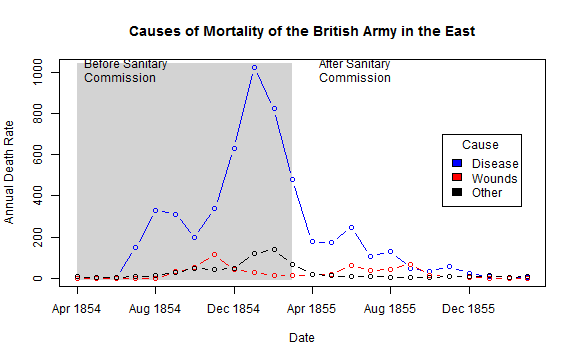
Florence Nightingale Coxcombs
Diagram of the causes of mortality in the army in the East,
a few historical plots and why they made history
Florence Nightingale Coxcombs
After graduating with a Ph.D. in history from Harvard University, W.E.B. Du Bois, the prominent African-American intellectual, sought a way to process all this information showing why the African disapora in America was being held back in a tangible, contextualized form.
“The colorful charts, graphs, and maps presented at the 1900 Paris Exposition by famed sociologist and black rights activist W. E. B. Du Bois offered a view into the lives of black Americans, conveying a literal and figurative representation of 'the color line'."
W.E.B. Du Bois 1868-1963, sociologist, black right activist, graphic designer ante litteram
a few historical plots and why they made history
W.E.B. Du Bois
February 23, 1868 – August 27, 1963
American sociologist, socialist, historian, civil rights activist, Pan-Africanist, author, writer and editor
https://inspirehep.net/record/1082448/plots
a few historical plots and why they made history
W.E.B. Du Bois
Smithsonian Magazine
a few historical plots and why they made history
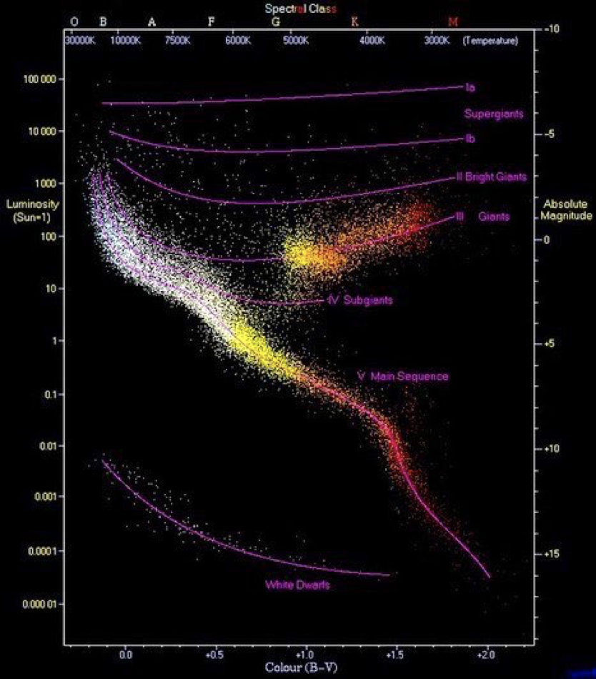
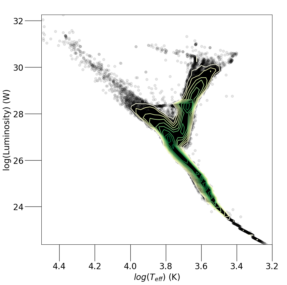
H-R diagram:
the life of a star
https://en.wikipedia.org/wiki/Hertzsprung%E2%80%93Russell_diagram
a few historical plots and why they made history
Fynman Diagrams
https://inspirehep.net/record/1082448/plots
Exchange of one quantum between two electrons.
a few historical plots and why they made history
Fynman Diagrams
https://inspirehep.net/record/1082448/plots
Exchange of one quantum between two electrons.
SPACE
I would argue R. Fynmann had the first "science outreach" program that driving a van with the Faynmann diagrams on it. THe visual effectiveness of the se diagram is what made them suitable for this.
The dark part of his legacy is his well-documented, blatant misogyny and sexism: please do read this to get a complete picture of the person. https://thebaffler.com/outbursts/surely-youre-a-creep-mr-feynman-mcneill .
Faynmann
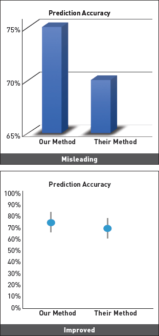
Ambiguity | distortion | distraction.
Ambiguity | distortion | distraction.
Prof. Vern Lindberg
6 wrong things with this plot…
Prof. Vern Lindberg
6 wrong things with this plot…
An example of ambiguity in visualizations that is common in peer review physics
different stretch
Ambiguity | distortion | distraction.
Ambiguity | distortion | distraction.
((=misleading)
Ambiguity | distortion | distraction.
Ambiguity | distortion | distraction.
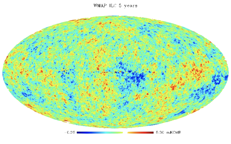
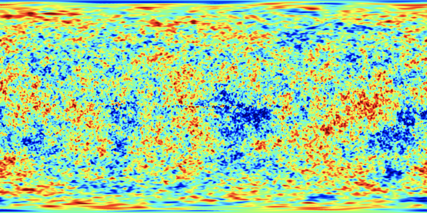
ordinary matter
Exactly this plot is in the front page of the Plank collaboration website! Plank is am $800M mission to study the earliest Universe
Dark Matter
Dark Energy
An example of ambiguity in visualizations that is common in peer reviewed physics
duplication of data: commonly planet transit and eclipsing binary dataset are repeated twice (consecutively along the x axis)
A highly unequal-mass eclipsing M-dwarf binary in the WFCAM Transit Survey
Nefs, S.V. et al. MNRAS. 431 (2013) 3240 arXiv:1303.0945 [astro-ph.SR]
Mollweide projection
equirectangular projection
necessary distortions
Hajime Narukawa, a Tokyo-based architect and artist, broke the globe up into 96 regions and folded it into a tetrahedron and then a pyramid before finally flattening it into a two-dimensional sheet. This won him the 2016 Japan’s prestigious Good Design prize.
Ambiguity | distortion | distraction.
Sometime the distraction is a consequence of the complexity of the data.
data-ink ratio (Edward Tufte)
Tufte's rules
Edward Tufte
Tufte’s rules:
Lie factor =
size of the effect in the graphic
size of the effect in the data
Tufte’s rules:
Lie factor =
size of the effect in the graphic
size of the effect in the data
Tufte’s rules:
effect size ~ 1
data/ink -> large
no chart junk
use small-multiples
avoid redundancy in communication
Tufte’s rules:
Keep lie factor ~1
size of the effect in the graphic
size of the effect in the data
Tufte’s rules:
Data-ink ratio =
amount of data
amount of ink
Tufte’s rules:
Data-ink ratio =
amount of data
amount of ink
Tufte’s rules:
effect size ~ 1
data/ink -> large
no chart junk
use small-multiples
avoid redundancy in communication
Tufte’s rules:
Chart Junk
the excessive and unnecessary
use of graphical effects
Tufte’s rules:
Chart Junk
the excessive and unnecessary
use of graphical effects
Tufte’s rules:
Chart Junk
the excessive and unnecessary
use of graphical effects
Tufte’s rules:
effect size ~ 1
data/ink -> large
no chart junk
use small-multiples
avoid redundancy in communication
Tufte’s rules:
Small multiples
encourage comparison
sparkline graph
Tufte’s rules:
Small multiples
encourage comparison
sparkline graph
Tufte’s rules:
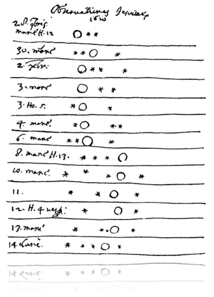
Small multiples
Galileo Galilei, Jupiter moons, 1610
Tufte’s rules:
Small multiples
work really well with maps!
https://mahb.stanford.edu/whats-happening/167-tiny-maps-tell-major-story-climate-change/
Galileo Galilei, Jupiter moons, 1610
Tufte’s rules:
Small multiples
... missing the point.
https://vividmaps.com/comparing-metropolitan-form-density/
Tufte’s rules:
Galileo Galilei, Jupiter moons, 1610
Tufte’s rules:
effect size ~ 1
data/ink -> large
no chart junk
use small-multiples
avoid redundancy in communication
Tufte’s rules:
every feature should be associated with only 1 graphical element
(here color is redundant with length)
Tufte’s rules:
effect size ~ 1
data/ink -> large
no chart junk
use small-multiples
avoid redundancy in communication
last round, including animation and interactivity:
Tamara Munzner's rules
Rules of thumb for a good visualization
Tamara Munzner
Chapter 6
Function first, Form next
no unjustified beauty
(Tufte's no chart junk)
Get it right in Black & White
no unjustified color
consider designing your plot in BW first
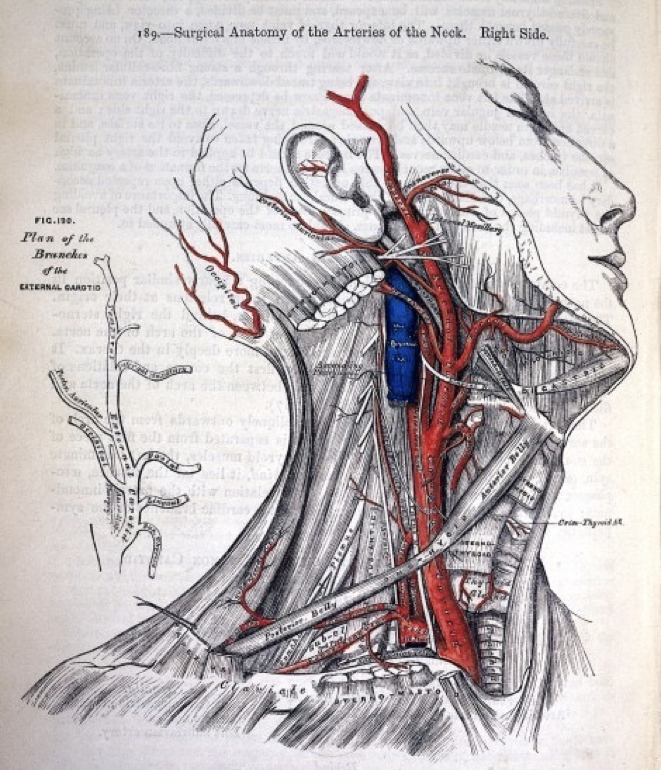
Examples of functional use of color (and distortion)
functional use of color is the standard in anatomy drawings
- Image:Gray507.png
Examples of functional use of color (and distortion)
functional use of color
functional use of deformation
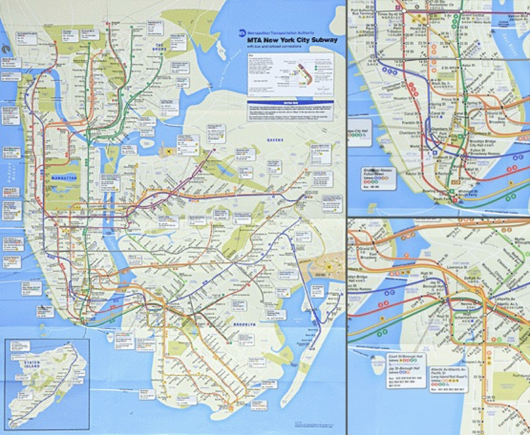
(the boroughs' size is changed to make the distance between subway stops similar.
but consider the psychological and social implications of blowing up Manhattan...
MTA NYC subway map
No Unjustified 3D
use 3D only if your 3rd dimention cannot be reduced.
Alternatives:
color,
small multiples,
animation
from Tamara Munzner chapter 6
obstruction
clutter
deformation
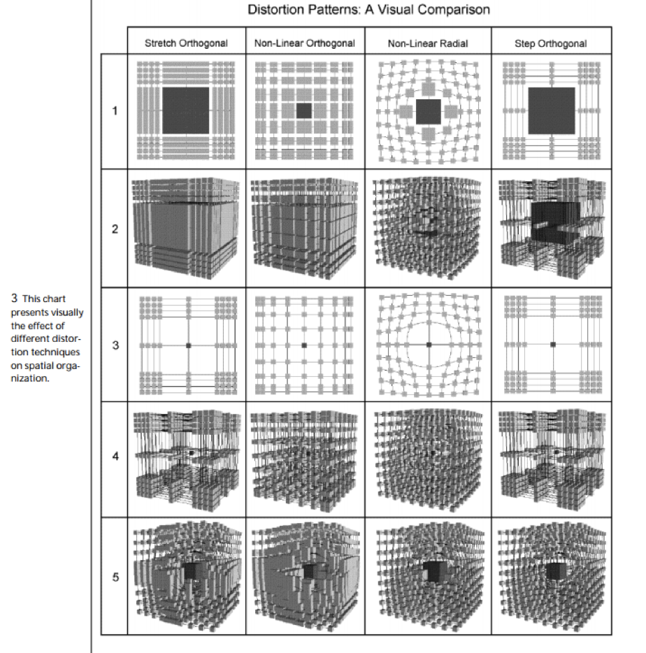
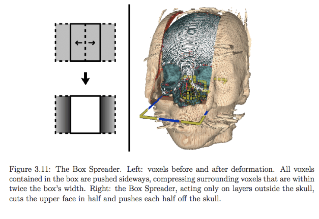
No Unjustified 3D
from private communication...
No Unjustified 3D
distortion
techniques
to overcome obstruction
downside: distortion, clutter
from Tamara Munzner chapter 6
No Unjustified 3D
transparency
to overcome obstruction
Zosia Rostomian, LBNL; Nic Ross, BOSS Lyman-alpha team, LBNL; and Springel et al, Virgo Consortium and the Max Planck Institute for Astrophysics
No Unjustified 3D
An Investigation of Issues and Techniques in
Highly Interactive Computational Visualization
Michael John MCGuffin
No Unjustified 3D
Anatomical drawing style deals with obstruction while preserving the context
No Unjustified 3D
Also:
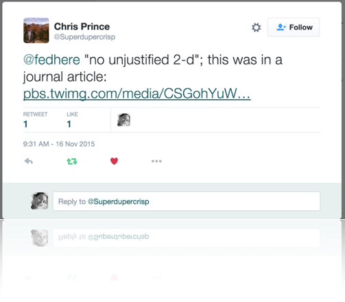
No Unjustified 2D!
Also:
No Unjustified 2D!
Eyes over Memory
no unjustified animation
Eyes over Memory
no unjustified animation
Interactivity
interactive visualization rules of thumb:
Resolution over immersion
Details on demand
Avoid latency
Interactivity
interactive visualization rules of thumb:
Resolution over immersion
Details on demand
Avoid latency
Interactivity
interactive visualization rules of thumb:
Resolution over immersion
Details on demand
Avoid latency
A true story of a plot created for in clusion in a paper of mine
A true story of a plot created for in clusion in a paper of mine
A true story of a plot created for in clusion in a paper of mine
A true story of a plot created for in clusion in a paper of mine
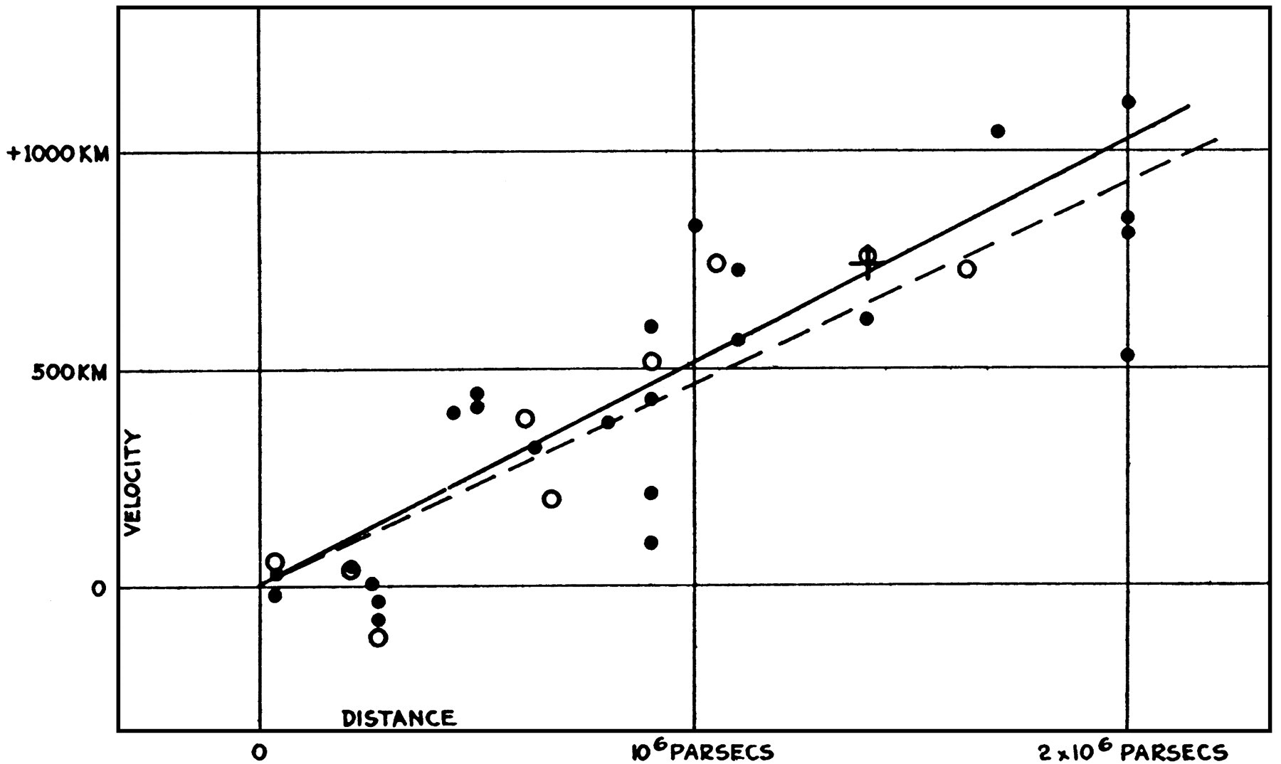
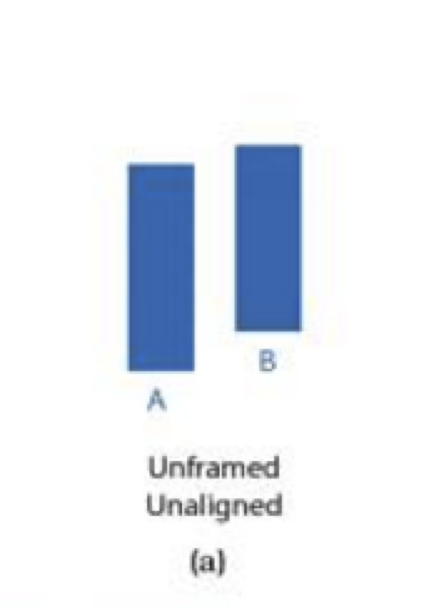
Plot A
E. Hubble 1929
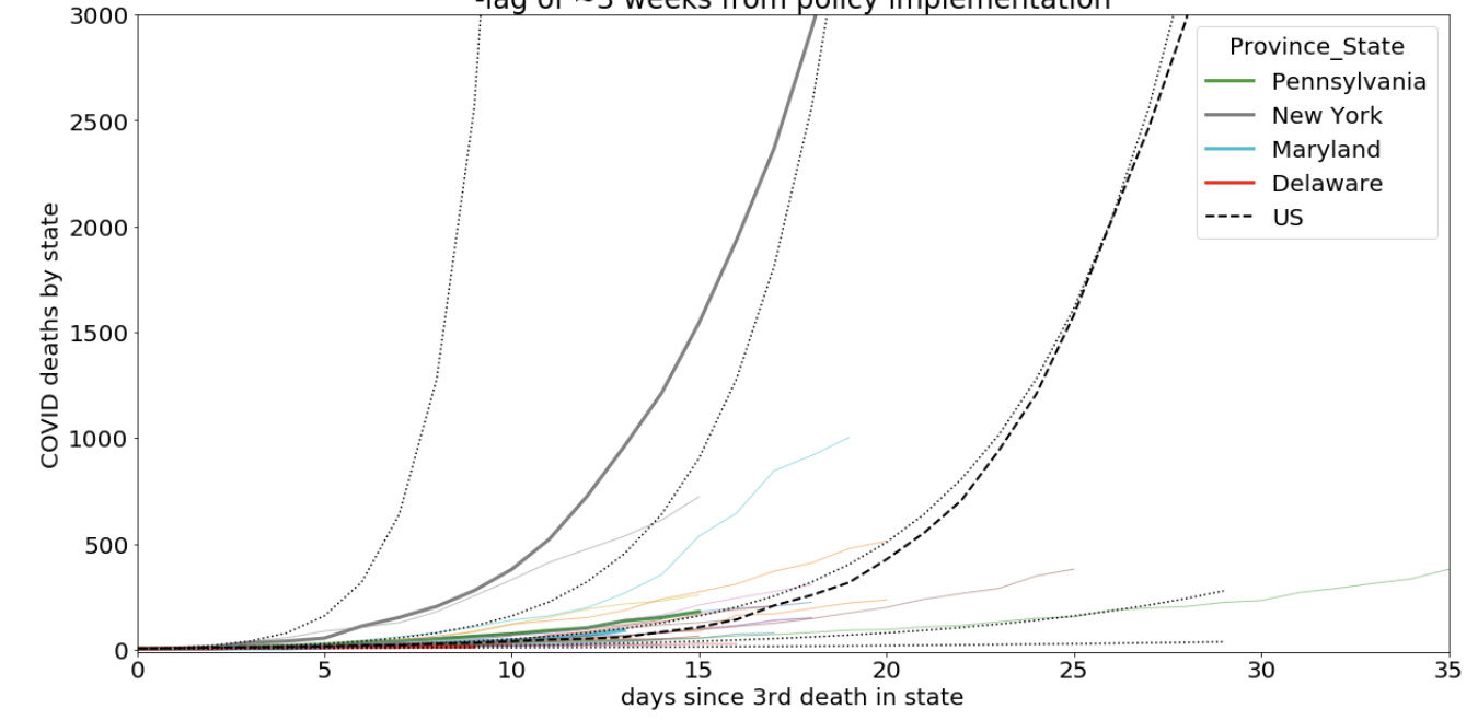
Plot B
2020
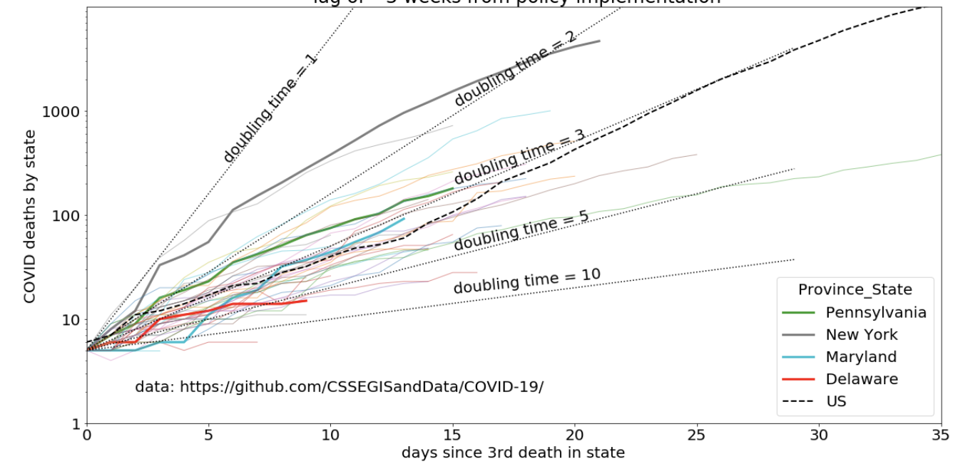
(an option: log scale)
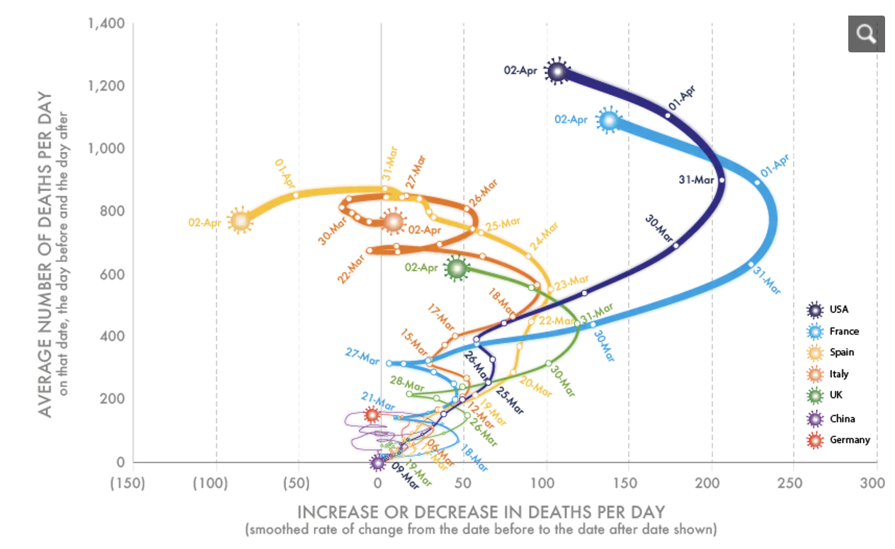
Plot C
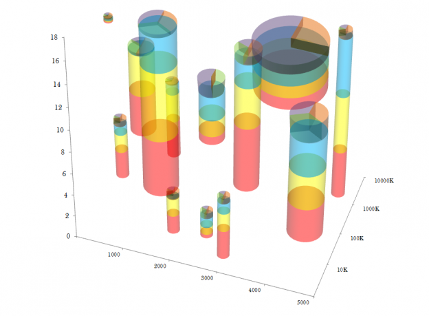
I would say this plot is at the limit of confusion (information saturation)
Plot D
(no author, no need to shame, but this was published in a peer reviewed journal)
Plot E
Plot F
Plot G
Plot H
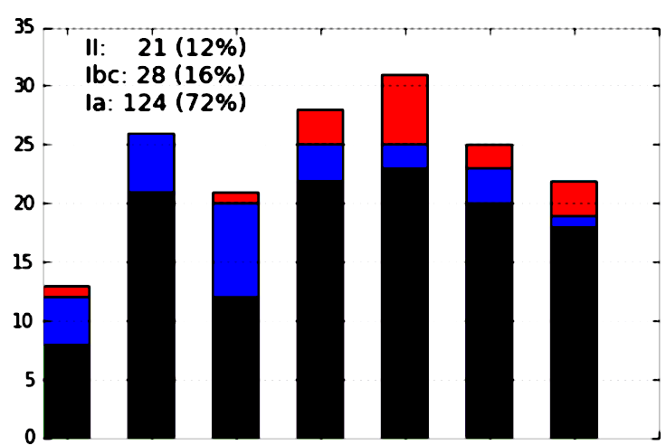
Tufte’s rules:
Tufte’s rules:
chart junk
2 graphical elements for frequency
(color and position)
low data/ink ratio
no comparison
Tufte’s rules:
chart junk
2 graphical elements for frequency
(color and position)
low data/ink ratio
no comparison
comparison but scale out of context
high effect-size due to the choice of color map (more on this later)
Tufte’s rules:
chart junk
2 graphical elements for frequency
(color and position)
no comparison
Tufte’s rules:
chart junk
2 graphical elements for frequency
(color and position)
no comparison
Tufte’s rules:
Tufte’s rules:
consider this:
a better alternative
https://github.com/fedhere/DSPS/blob/master/lab8/badPlotgoodPlot.ipynb
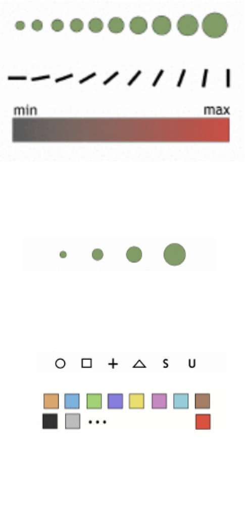
What graphical elements are available and what elements are appropriate to convey certain information?
The ideal of all research is:
1. precise investigation of each individual phenomenon — in isolation,
2. the reciprocal effect of phenomena upon each other — in combinations,
3. general conclusions which are to be drawn from the above two divisions.
My objective in this book extends only to the first two parts. The material
in this book does not suffice to cover the third part which, in any case,
cannot be rushed.
The investigation should proceed in a meticulously exact and pedantically
precise manner. Step by step, this "tedious" road must be traversed — not
the smallest alteration in the nature, in the characteristics, in the effects
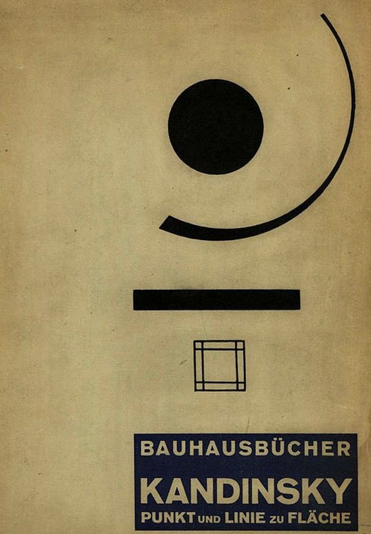
Point, Line, and Plane, Wassily Kandinsky, 1926
Jacques Bertin: Semiology of Graphics, 1967 Gauthier-Villars, 1998 EHESS
point
plane
line
Continuous data may be:
Discrete data may be:
Data may also be:
graphical elements work differently on different data types
graphical elements work differently on different data types
The study of human perception
why do we visualize? cause our brain is best suited to receive visual sitmuly (compared to tactile or auditorial for example)
alternatives:
sonification https://en.wikipedia.org/wiki/Sonification
tactile maps
https://www.nasa.gov/audience/foreducators/a-feel-for-astronomy.html
why do we visualize? cause our brain is best suited to receive visual sitmuly (compared to tactile or auditorial for example)
alternatives:
sonification https://en.wikipedia.org/wiki/Sonification
tactile maps
https://www.nasa.gov/audience/foreducators/a-feel-for-astronomy.html
exploring these alternative is important as a social justice issue to make science and data science accessible to vision impaired people but also: can the different ways in which we process information can give new insight?
e.g.: we process visual stimuli but sound stimuli holistically (we hear a chord, not the notes in it)
The study of human perception
here limited to visual stimuli
The apparent magnitude of all sensory channels follows a power law based on the stimulus intensity
S sensation, I intensity
Psychophysical power law
Stevens 1975
Stevens 1975
response to length:
when shown something 4x as long we perceive it as being 4x as long
response to brightness:
when shown something 4x as bright we perceive it as being 2x as bright
response to saturation:
when shown something 4x as saturated we perceive it as being 11x as saturated
Stevens 1975
response to electroshock:
when given an electroshock 4x as strong
we perceive it as 128x as strong
(personally, I do not know of any electroshock based visualizations)
Heer and Bostock 2010
modern version gets uncertainties to these quantities by crowdsourcing the tests
Stevens 1975
Heer and Bostock 2010
The detectable difference in stimulus intensity is a fixed percentage of the object magnitude
δI / I = K
I intensity, K constant
Weber law
We judge based on relative differences
theory
(and good practice)
Borkin et al. 2011
Borkin et al. 2011
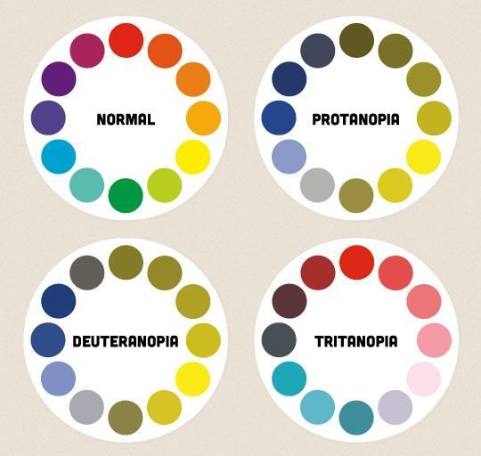
Eye Physiology and color perception deficiencies
Color blindness (color vision deficiency, CVD) affects approximately
1 in 12 men (8%) and 1 in 200 women
in the world.
Worldwide, there are approximately 300 million people with colour blindness, almost the same number of people as the entire population of the USA!
Protanopia
Protanopia (red-blind)
Protanopia (green-blind)
Tritanopia (blue-blind)
Rods | Cones
Brightness | Color
R
G
B
small differences can still be percieved as colors are also associated to brightness
31%
59%
10%
brightness:
use the http://colororacle.org/ app to test your plots for color-blindness
Kelly 1965 designed a list of 22 maximally contrasting colors for colorblind compliance (the “Kelly colors”):
"#023fa5", "#7d87b9", "#bec1d4", "#d6bcc0", "#bb7784", "#8e063b", "#4a6fe3", "#8595e1", "#b5bbe3", "#e6afb9", "#e07b91", "#d33f6a", "#11c638", "#8dd593", "#c6dec7", "#ead3c6", "#f0b98d", "#ef9708", "#0fcfc0", "#9cded6", "#d5eae7", "#f3e1eb", "#f6c4e1", "#f79cd4"
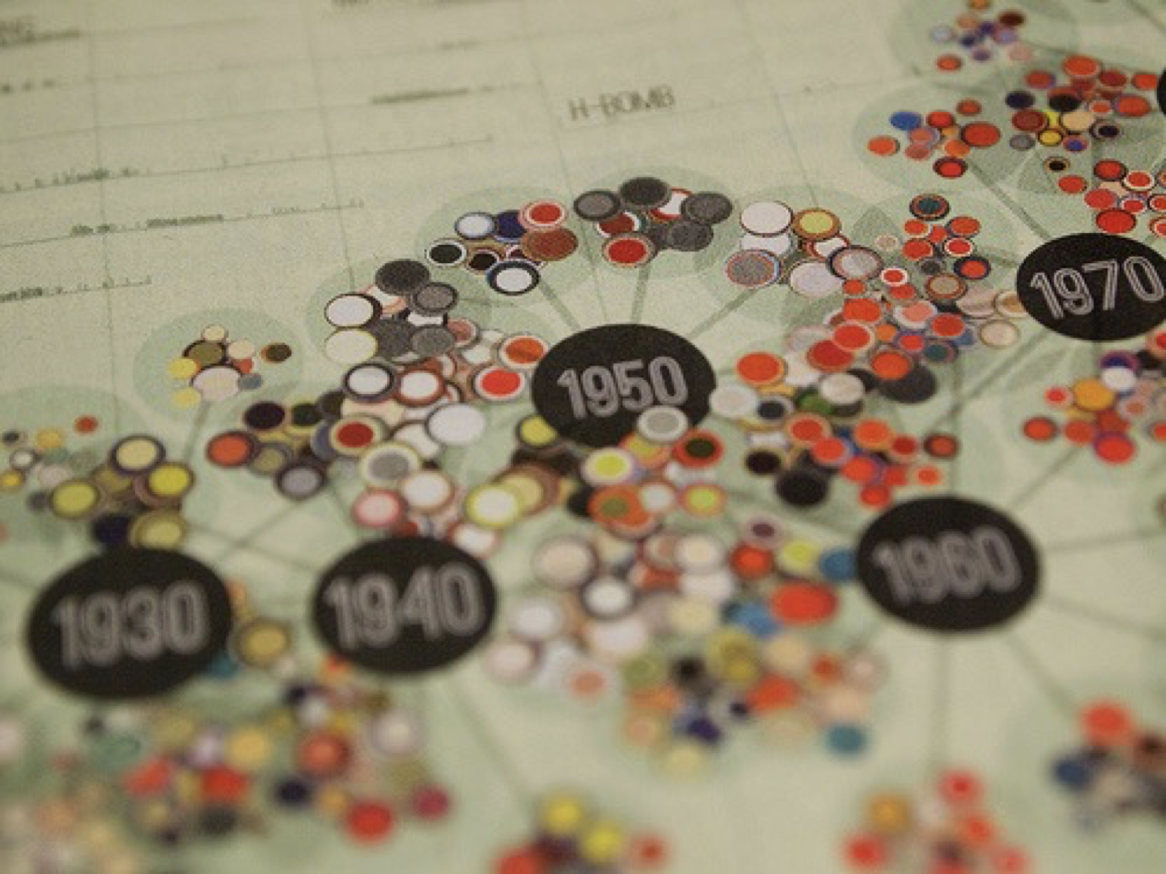
Jer Thorp
Jer Thorp
there definitely are historical precedents:
John Snow's map of cholera,
considered the first
"data science project"
uses "clustering" to drive causal inference
Using visualizations to understand the data, not to communicate a result
- Published by C.F. Cheffins, Lith, Southhampton Buildings, London, England, 1854 in Snow, John. On the Mode of Communication of Cholera, 2nd Ed, John Churchill, New Burlington Street, London, England, 1855.
Jer Thorp
Using visualizations to understand the data, not to communicate a result
why the paradigm shift?
but only recently visualizations to aid science exploration became a well developed and active field of research
increased data volume
Big data:
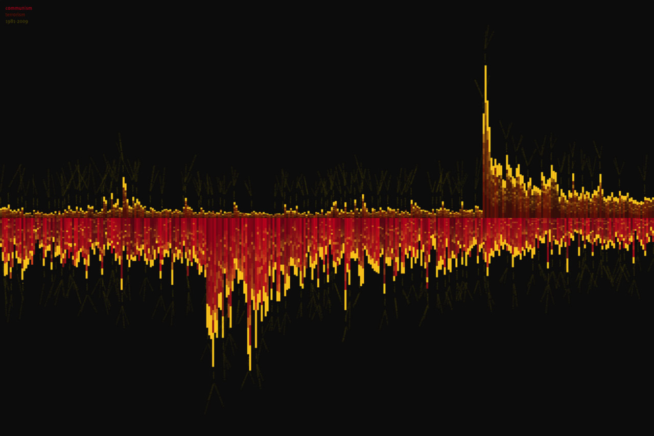
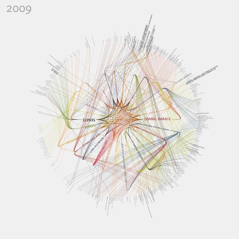
One of Thorp’s projects is a visualization of the number of times the terms “communism” (bottom) and “terrorism” (top) appeared in The New York Times, from 1981 until 2009. The spike for “terrorism” is the reflection of 9/11. As the word “terrorism” is used more and more, the use of the word “communism” decreases. (Image courtesy Jer Thorp; flickr.com/photos/blprnt/)
increased data complexity
Big data:
https://www.flickr.com/photos/blprnt/3291268016/in/album-72157614008027965/
These visualizations show the top organizations and personalities for every year from 1985 to 2001. Connections between these people & organizations are indicated by lines.
Data is from the newly-released NYTimes Article Search API: developer.nytimes.com
For more information, and source code to access the NYTimes API, visit my blog: blog.blprnt.com
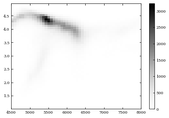
A common problem: too many points
solution: subsample
plt.plot(Teff[::10], logg[::10], 'k.')plt.plot(Teff, logg, 'k.')plt.plot(Teff, logg, 'k.', alpha=0.1)solution: alpha
A common problem: too many points
solution: density histograms
plt.hist2d(Teff, logg, bins=(50, 50), cmap=plt.cm.Greys)
plt.plot(Teff, logg, 'k.')plt.plot(Teff, logg, 'k.', alpha=0.1)solution: scatter contours
A common problem: too many points
Bad Color Choice!
A common problem: too many points
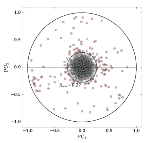
A common problem: too many dimensions
Solution: dimensionality reduction to 2 dimension
Bianco et al 2015 https://arxiv.org/abs/1611.04633
e.g. Principal Component Analysis
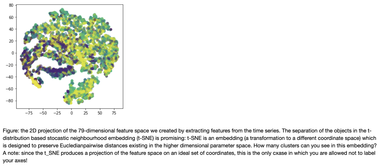
A common problem: too many dimensions
Solution: dimensionality reduction to 2 dimension
e.g. t-SNE
A common problem: too many dimensions
Solution: dimensionality reduction to 2 dimension
e.g. t-SNE
The t-distributed Stochastic Neighbor Embedding (SNE) method, (Maaten & Hinton, 2008), improving upon SNE (Hinton & Roweis 2003). SNE works by embedding multidimensional Euclidean distances with conditional probabilities. The similarity between x_i and x_j is the conditional probability Px_j |x_i that x_i will choose xj as a neighbor under the normal distribution. Do the same in the full dimensional and lower dimensional space, SNE then attempts to minimize the Kullback-Leibler (KL) divergence between the two probability. However, SNE is computationally very expensive; t-SNE attempts to resolve this issue by looking at a “symmetric” SNE and redefines the lower dimensional distribution using a Student t-distribution.
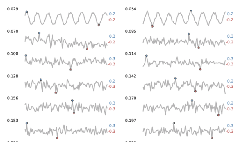
too many time series
too many time series
Tufte's small multiples and
spakrlines
enable comparison by giving the data center stage
too many time series
Time series heatmaps
enable comparison by giving the data center stage
Minard's russian campaign : so why is this plot so good?
Figurative Map of the successive losses in men of the French Army in the Russian campaign 1812-1813.
The numbers of soldiers present are represented by the widths of the colored zones in a rate of one millimeter for ten thousand soldiers; these are also written beside the zones. Red designates men moving into Russia, black those on retreat. — The information used for drawing the map were taken from the works of Messrs. Chiers, de Ségur, de Fezensac, de Chambray and the unpublished diary of Jacob, pharmacist of the Army since 28 October. In order to facilitate the judgement of the eye regarding the diminution of the army, I supposed that the troops under Prince Jèrôme and under Marshal Davoust, who were sent to Minsk and Mobilow and who rejoined near Orscha and Witebsk, had always marched with the army.
so there is a thing called "the rule of 7": you cannot put more than 7 pieces of information in your plot because that his the maximum number of things a person can remember. Well, that 7 comes from a test where people are told several words and asked to repeat them back. On average people remember 7... +/-4 ...
The number of information elements that are shown in a plot depends on how effectively you can show them. This plot contains (at least) the following features:
space (distance, however approximate), time, size of the army, rate of lives lost (highly covariant with size of the army), purpose (going on the attack toward Moskow or retreating, indicated by the color), topography (changes of direction, rivers), temperature, the last 2 are conveying a causal connection by showing the lives lost (decrease in width of the army size) in conjunction with critical temperatures and rivers)
Tufte's rules
Munzner's rules
Be thoughtful and make sure your visualizations are (in this order):
honest
clear
convincing
beautiful
Identify the purpose of your visualization:
visualize to communicate results
visualize to understand data and guide analysis
Edwaed tufte (anything)
Tamara Munzner
Visualization Analysis & Design, 2014
(link to a talk slide-deck about her book: http://www.cs.ubc.ca/~tmm/talks/minicourse14/vad15london.pdf)
Wassily Kandinsky, Point, Line, and Plane, 1926
Six Lessons from the Bauhaus: Masters of the Persuasive Graphic
http://blog.visual.ly/six-lessons-from-the-bauhaus-masters-of-the-persuasive-graphic/
7 Great Visualizations from History
https://web.archive.org/web/20171114145335/http://data-informed.com/7-great-visualizations-history/
Using preattemptive processing elements
https://pdfs.semanticscholar.org/0456/bc9cdf02c3a446e252cf2e6b83145e17749a.pdf
Any of these papers:
Create a plot, of whatever data (and models if you want) you choose from open data (if you have doubt about whether your dataset is relevant for this homework please email me.)
You can make the plot in any coding language you want (e.g. python, javascript, R...), as long as you upload the code that generates the plot onto your repo (which means no tableau, or any other non reproducible).
Create a directory HW8_<firstLast> in your DSPS repo. The plot neads to be uploaded onto the HW8 folder in your github DSPS repo and be embedded in the README.md. That means: when I click on the HW8 link the plot must be rendered in the front page of the repo. Your readme must contain the plot, and a brief caption. If it is an interactive graphic, upload a static image of it in the README and provide a link to the interactive version.
Please make an effor to make it a good, compelling graphic. Put though into the esthetic of the plot, how clearly the content is communicated, avoid clutter, avoid misleading elements, mind your choice of colors accordingly to what was discussed in class.
Each of you needs to upload their own plot, no group submissions.
If your plot shows up as I described above in the repo and the code is also uploaded you will get 100% of the HW points. (Next week you will be tasked to review 3 plots of your classmates and you will be graded on the quality of the review.)
Follow scheleton notebook to create an H-R diagram visualization with datapoints and contours
EC: make your visualization interactive so that rolling on any datapoint provides information about the data
By federica bianco
some notes on visualizations


