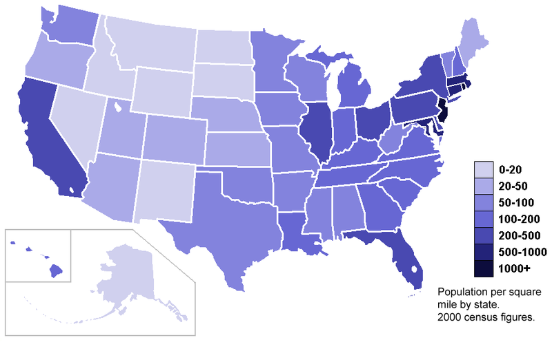
Choropleth maps
and common methods
@JacopoOttaviani

www.aljazeera.com/ewasterepublic
elpais.com/especiales/2015/basura-electronica/
What we have in play
- A topic
- Some research questions
- A dataset loaded on Carto, with:
- a location column
- a geo-referenced geometry column
- A simple Carto map with points and infowindows
We will learn to
- Transform the locations into geometric areas (a.k.a. polygons, such as regions or municipalities)
- Merge tables
- Make choropleth maps (with coloured areas)
Geometry is a data type
- The location column consists of a string (e.g., country name) or numbers (latitude/longitude)
- Carto needs to transform the location column into «geometry» so that it can place points, lines or polygons on the map
- Geometry is a data type that represents points, lines and polygons (e.g., areas)
- The geometry column in Carto is very important.
- It is named by default the_geom and has an orange GEO tag

'Maps' formats
- 'Maps' come in different formats: GeoJSON, KMZ (Google Earth), and Shapefiles
- When we say 'maps' here, we mean boundaries of administrative areas
- Such files are necessary to explain Carto what areas you want to colour in the map
- More info on the formats: http://gadm.org/country

States of India
GeoJSON, KMZ, Shapefiles...
- These files are available online in geographic portals for most “administrations” in the world
- e.g., Spanish municipalities, CCAAs, Italian regions, Irish counties, United States of America, Asian countries, World countries, etc.
- Imagine them like tables with text representations of administrative areas
-
To find them:
- Global Administrative Areas DB: gadm.org
- National Bureaus of Statistics
- Google Fusion Tables search


courtesy of Jens Finnäs
A gift for you
http://j.mp/regalo-para-mi

Now we have
- A dataset loaded on Carto (the one about topic/research questions)
- Downloaded a shapefile with the geometry of the administrative areas you want to colour – and loaded it on Carto
- It's time to put things together!

Merging tables: the concept
Let's merge
You want to merge two tables:
- The table with your data
- The table with the map (e.g., the shapefile of CCAAs)
- Once merged, from your new table you'll be able to create your first choropleth map

A choropleth map (from Greek χώρο ("area/region") + πλήθος ("multitude")) is a thematic map in which areas are shaded or patterned in proportion to the measurement of the statistical variable being displayed on the map, such as population density or per-capita income. [source: Wikipedia]
Questions?
Exercise #2. Choropleth map
Merge two tables and visualise the resulting table on a choropleth map:
- Download this dataset about early school leaving in Spain: http://bit.ly/abandon-escolar
- Upload it and check data types
- Upload the shapefile of the administrative areas
- Merge the tables:
- Select the column in common to merge the tables
- Include the right the_geom column
- Exclude the columns you don't need
- Visualise the new (merged) table on a map (use wizards)
- Play with the choropleth map (colours, info-windows, title, headline, legend, etc.)
#3 - Choropleth maps
By jottaviani
#3 - Choropleth maps
- 941


