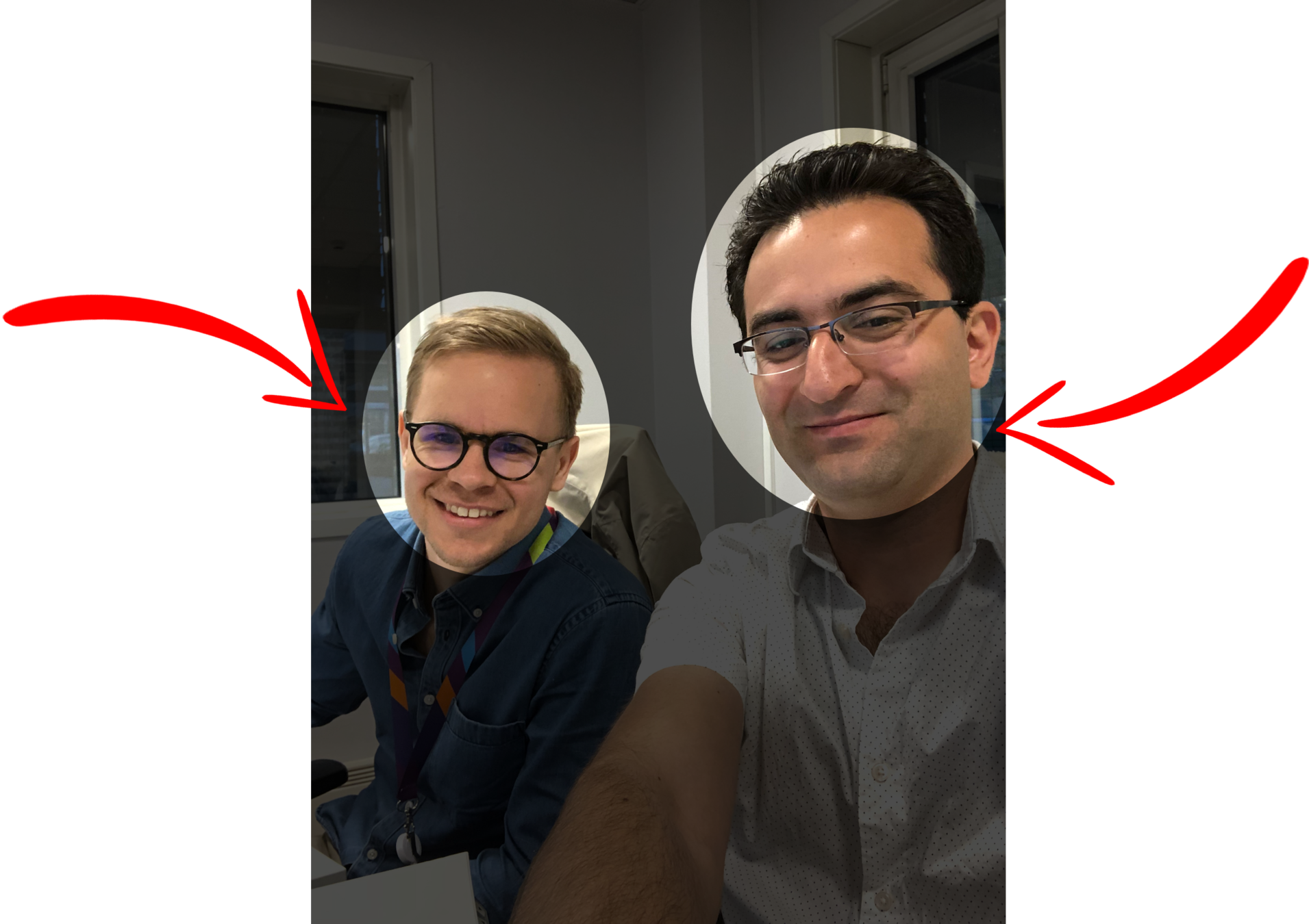


Majid Hajian
Majid Hajian is a passionate software developer with years of developing and architecting complex web and mobile applications. He is passionate about web platform especially flutter, IoT, PWAs, and performance.
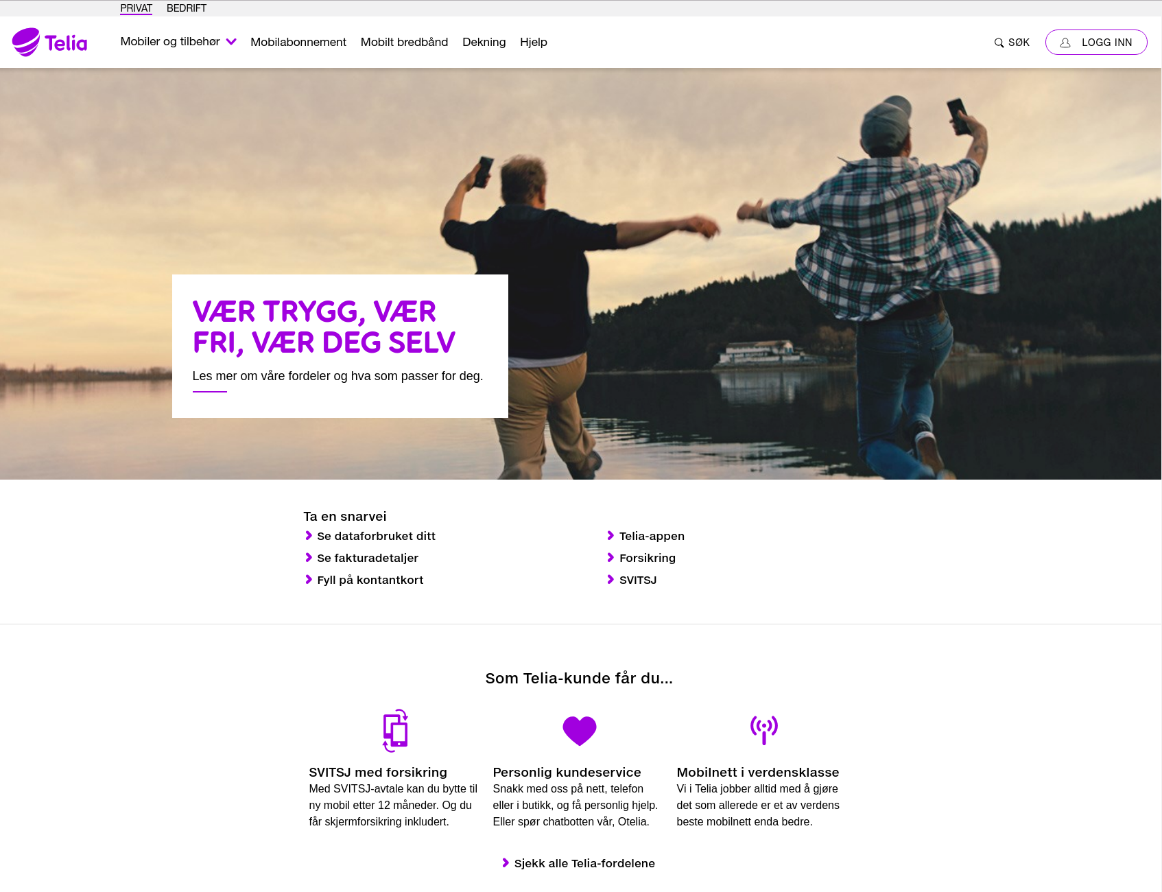
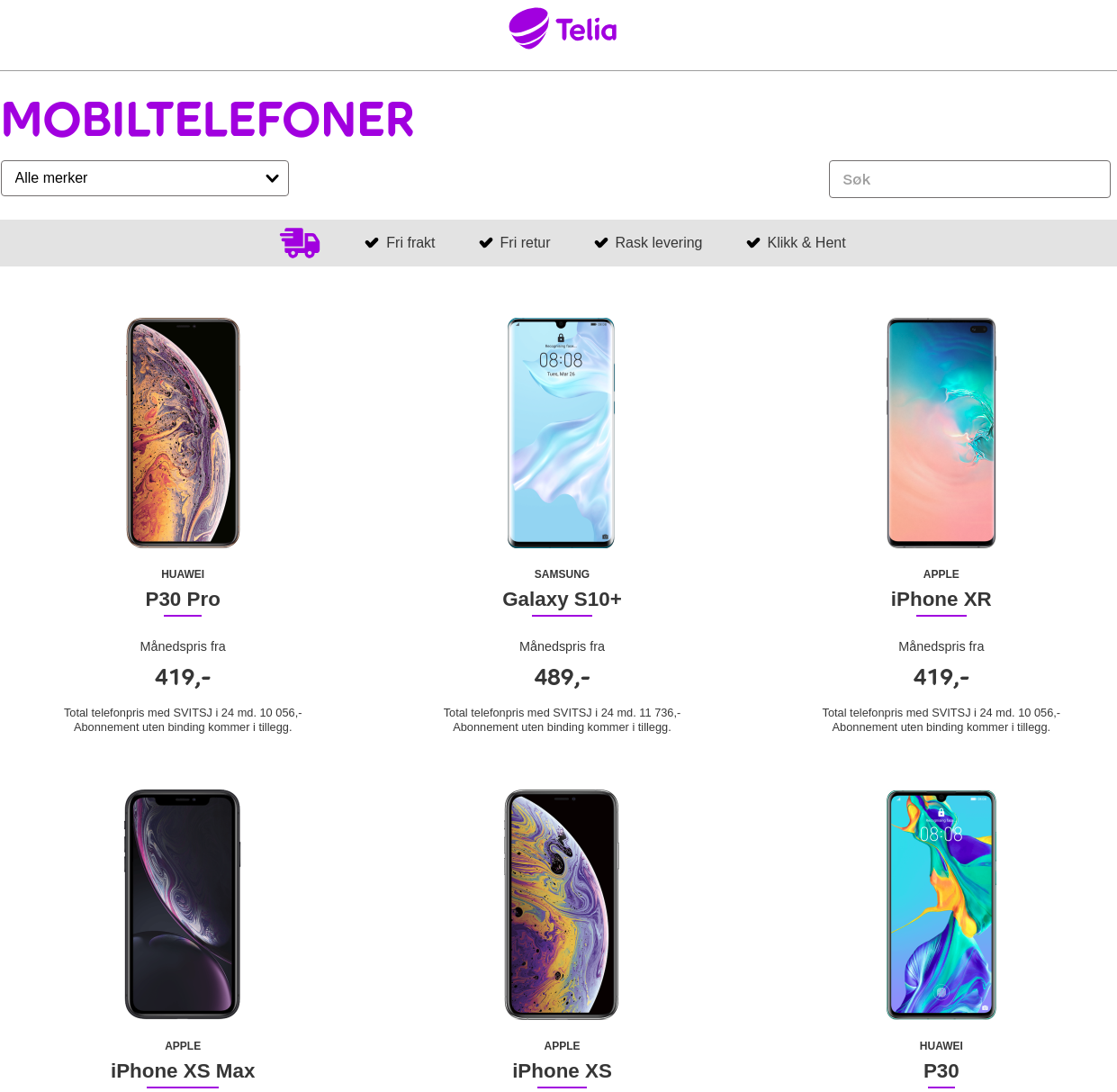
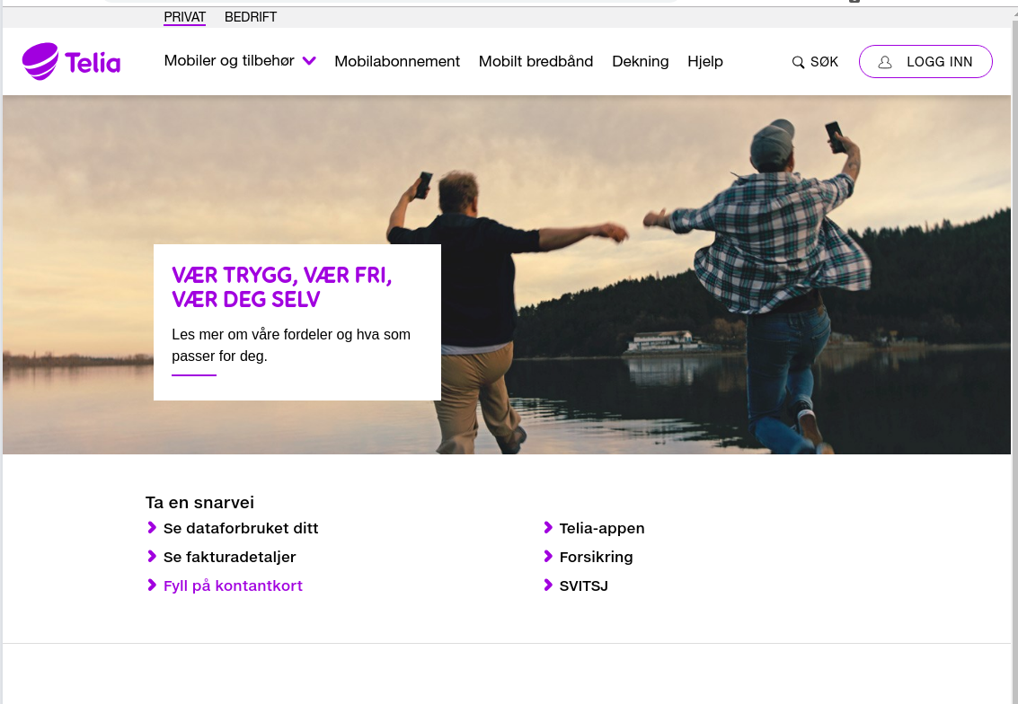
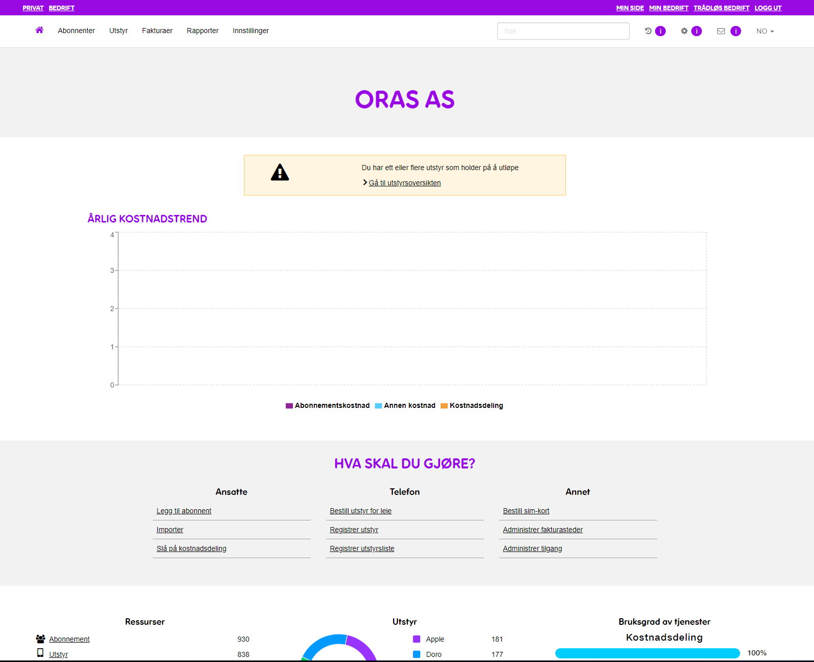
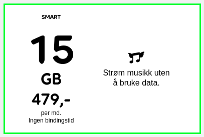
Telia.no
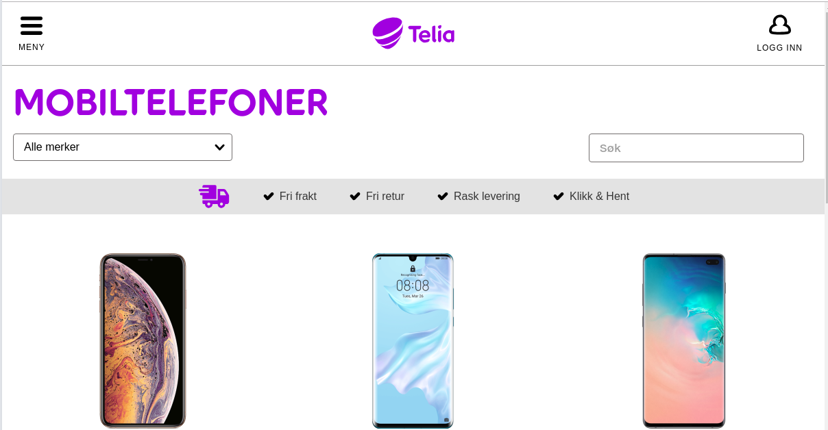
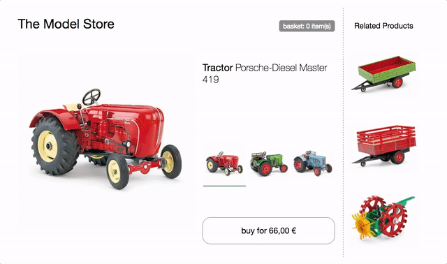
Webshop
App
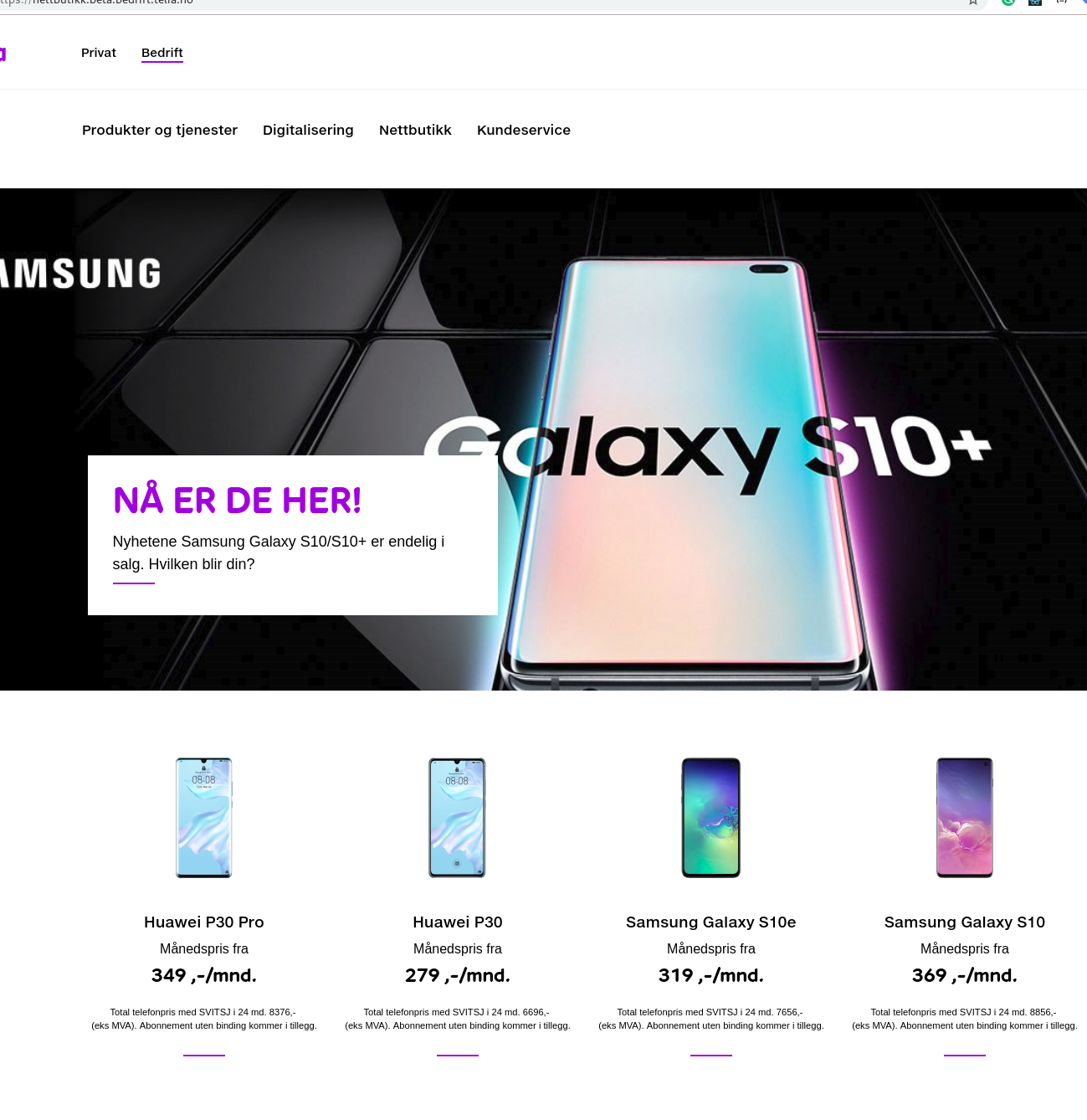
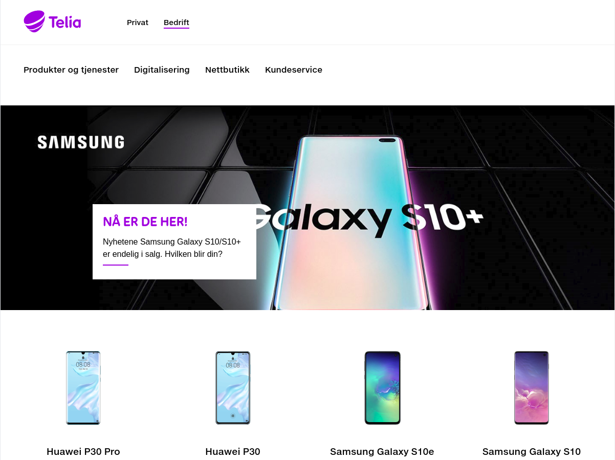
Webshop B2B
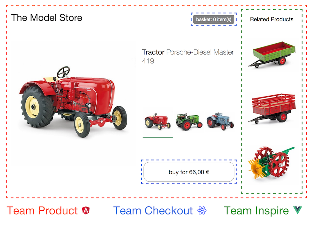
Many apps and teams
One look-and-feel
Min Side
Min Bedrift
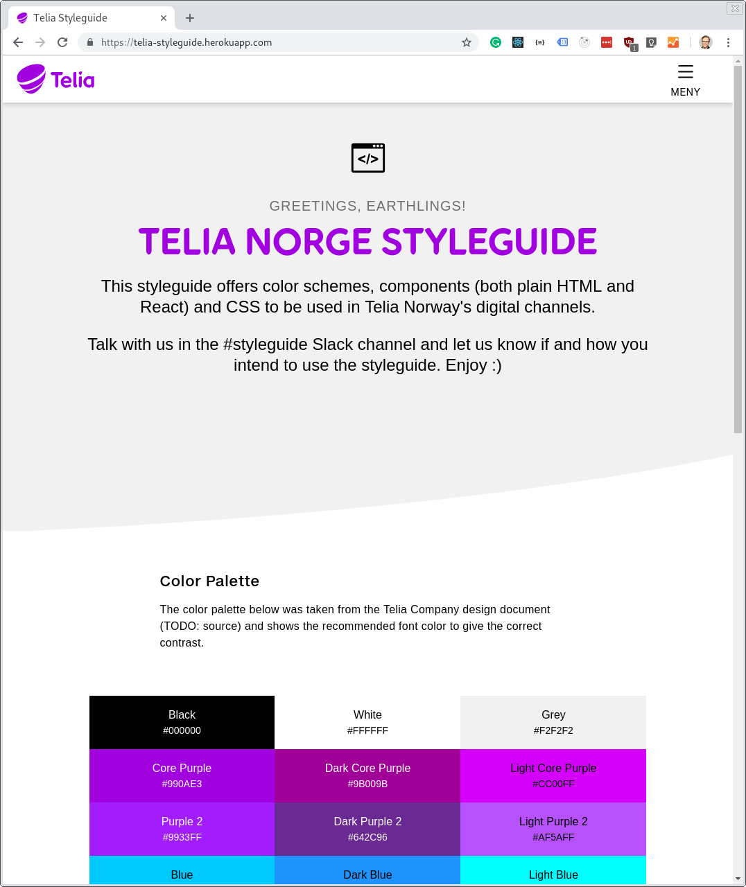
1. Styling: CSS, icons and fonts
The styleguide is two things
2. A react library
CSS
React presentational components
React container components
Javascript logic / unit tests
Hosting and opsing
CI/CD pipeline
A complete app
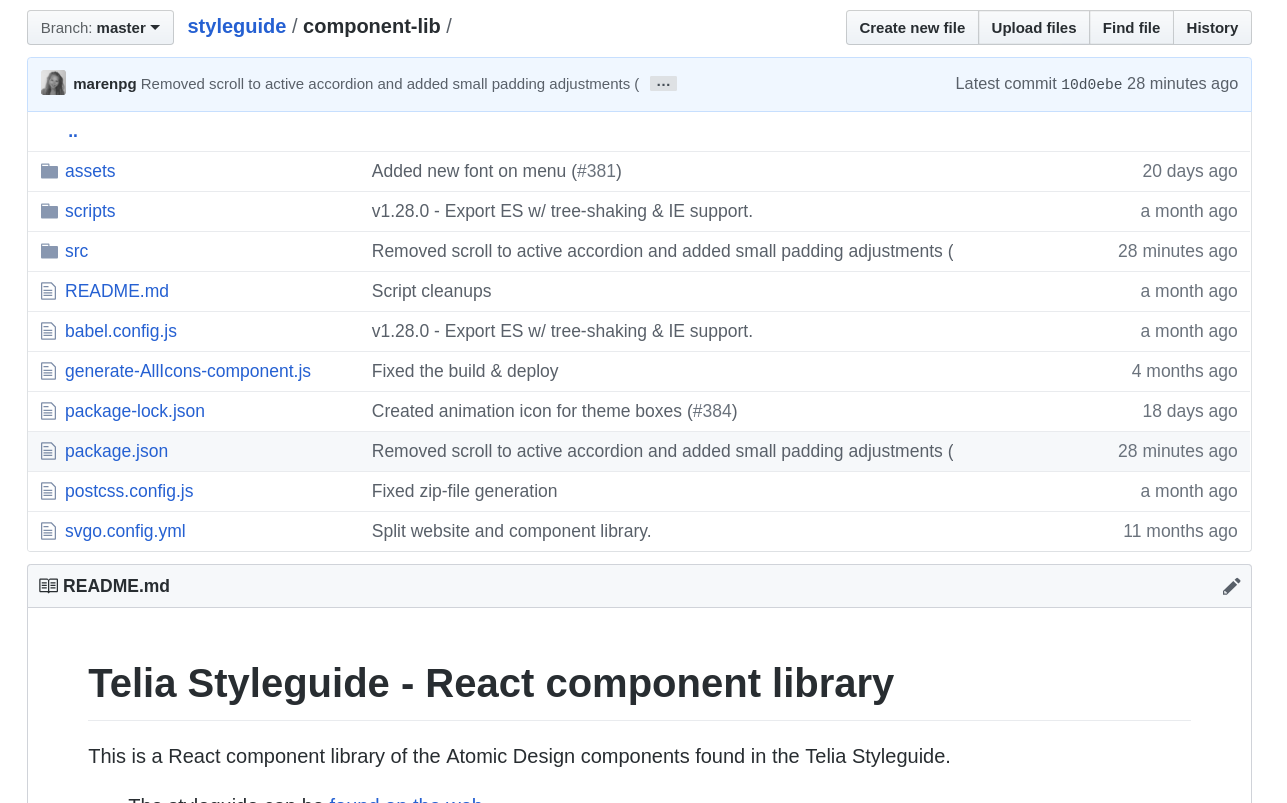
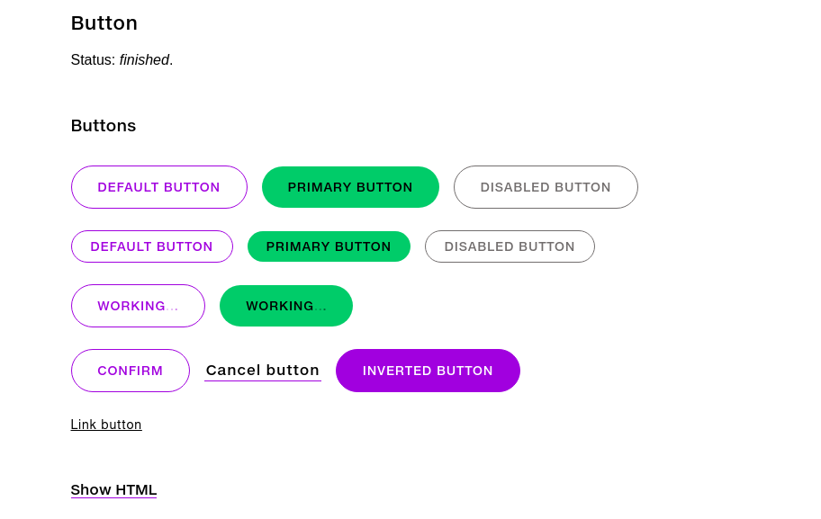
Styleguide
Every channel
have to code
CSS
React presentational components
React container components
Javascript logic / unit tests
Hosting and opsing
CI/CD pipeline
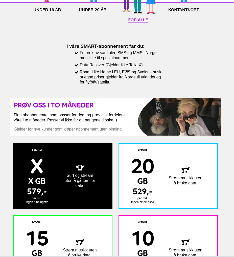
webshop
Requirements:
Min bedrift
1. Separate web app. Redirect to webshop and then back again to min bedrift
2. Develop in min bedrift code base
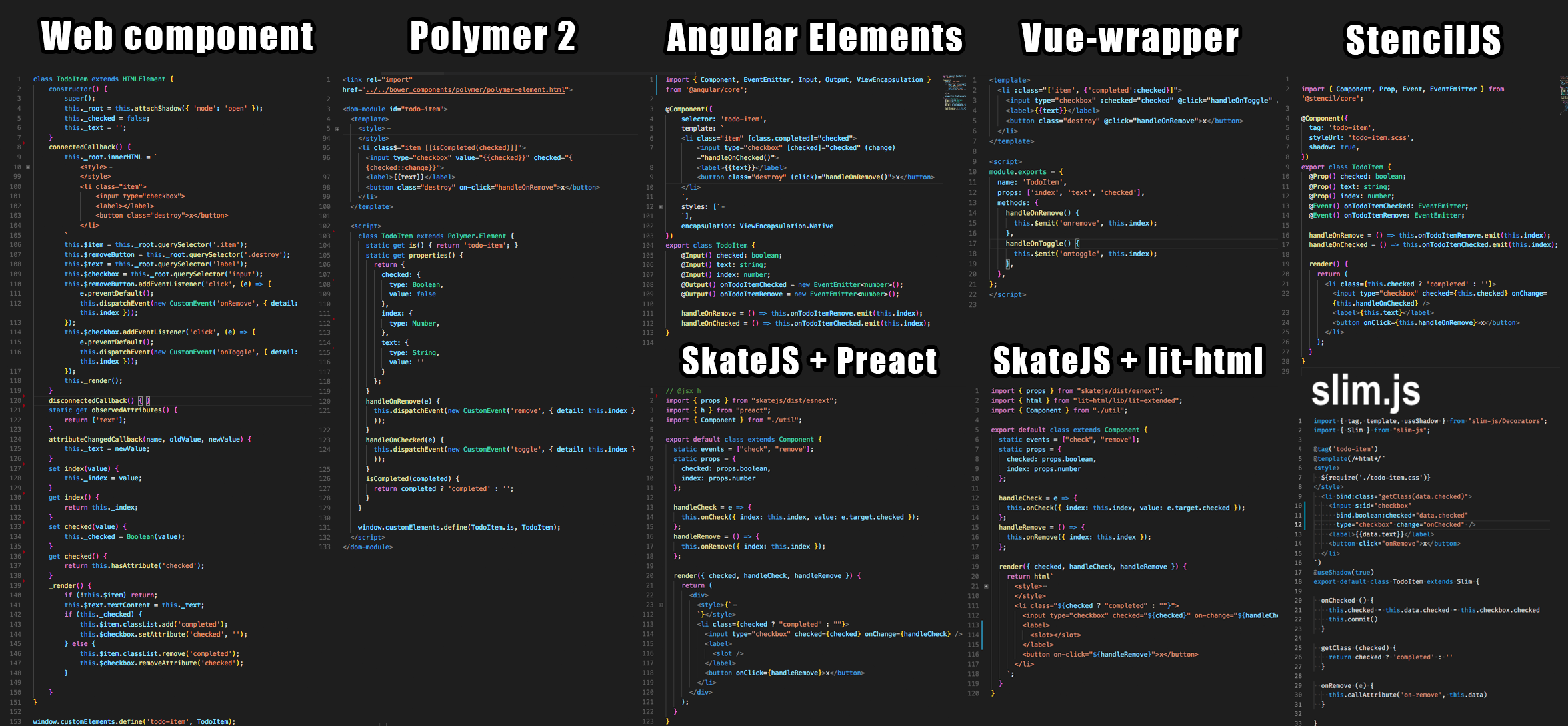
4. Web components
3. "React library"
Winner!
<telia-b2b-shop name="Minbedrift netbuttik"></telia-b2b-shop><body>
<telia-b2b-shop name="Minbedrift netbuttik"></telia-b2b-shop>
<script src="/telia-b2b-shop.js" type="module"></script>
</body>With web components every component is a complete self hosted mini app
CSS
React presentational components
React container components
Javascript logic / unit tests
Hosting and opsing
CI/CD pipeline
CSS
React presentational components
React container components
Javascript logic / unit tests
Hosting and opsing
CI/CD pipeline
CSS
React presentational components
React container components
Javascript logic / unit tests
Hosting and opsing
CI/CD pipeline
Styleguide
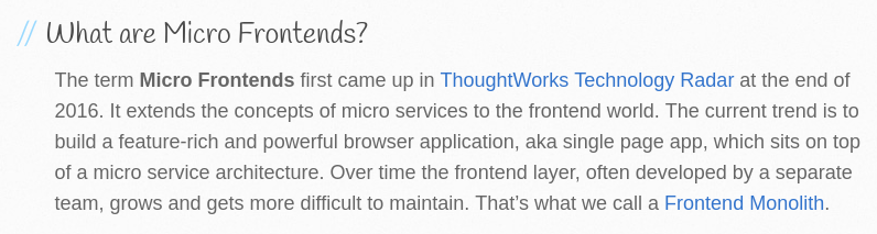
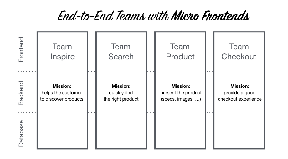
https://micro-frontends.org/
Organisation in Verticals
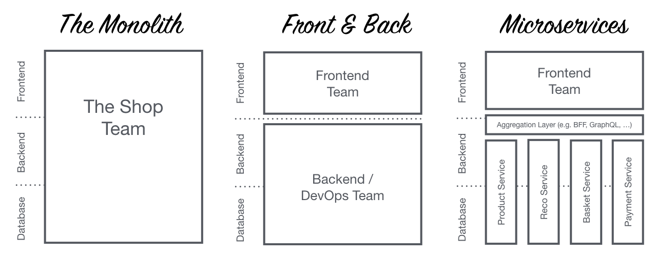
Monolithic Frontends
let's dive into the details
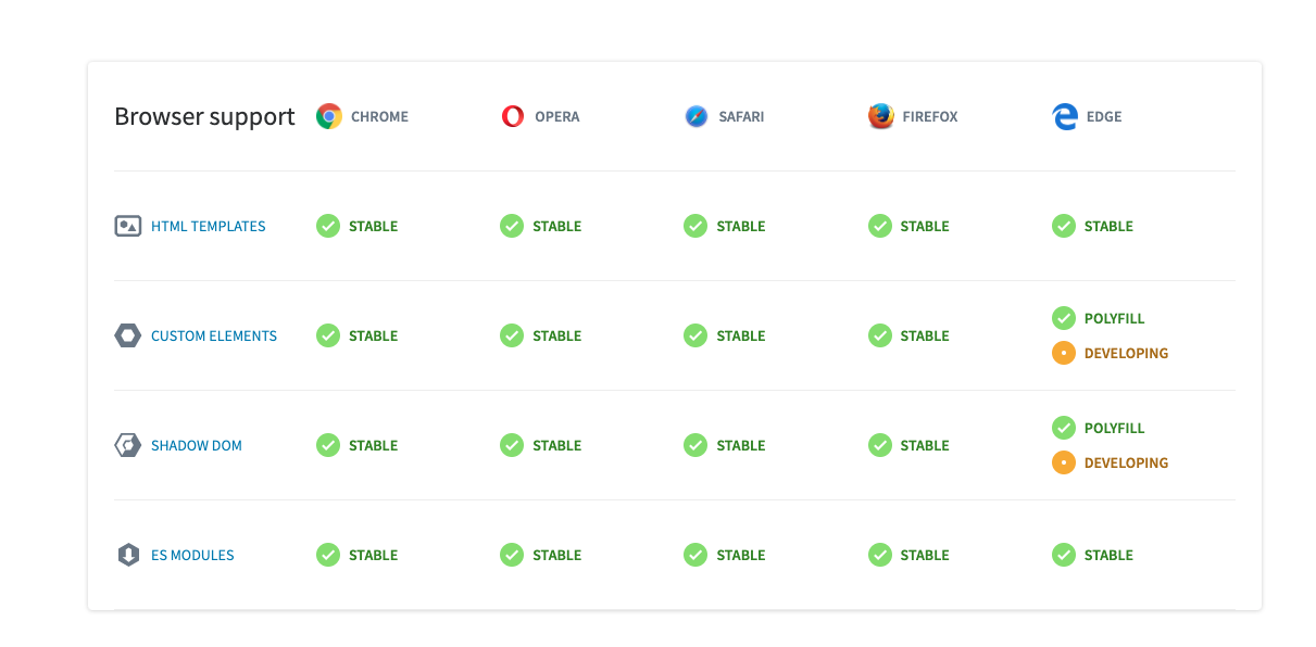
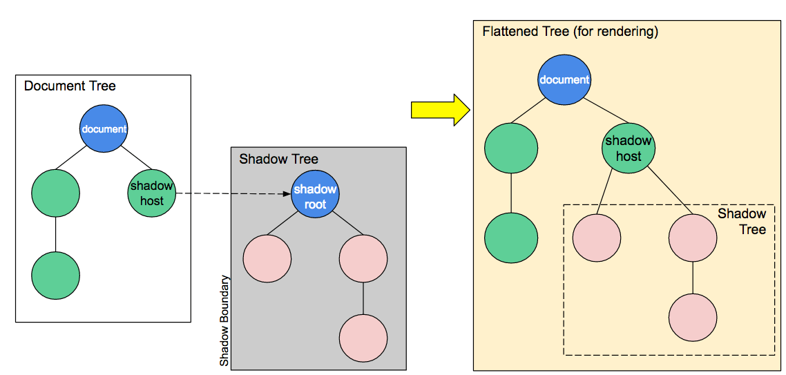
HTML Template
Custom Element
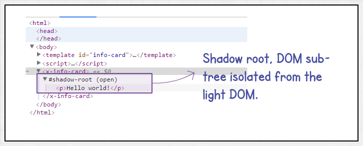
Shadow DOM
ES Modules
Previously, HTML imports were also a part of it, but with ES6 modules, HTML imports became deprecated.
  <template id="template">
    <div id="container">
      <img class="webcomponents" src="logo.svg">
    </div>
</template>var template = document.querySelector('#template');
var clone = template.content.cloneNode(true);
var host = document.querySelector('#host');
host.appendChild(clone); <template id="template">
<div id="container">
<img class="webcomponents" src="logo.svg">
</div>
</template>var template = document.querySelector('#template');
var clone = template.content.cloneNode(true);
var host = document.querySelector('#host');
host.appendChild(clone);Will not render until it is activated
Has no effect on other parts of the page - scripts won’t run, images won’t load, audio won’t play - until activated
Will not appear in the DOM
const header = document.createElement('header');
const shadowRoot = header.attachShadow({mode: 'open'});
shadowRoot.innerHTML = '<p>Hello world!</p>'; class CustomButton extends HTMLElement {...}
window.customElements.define('custom-button', CustomButton);
<custom-button></custom-button>
class CustomButton extends HTMLButtonElement {...}
window.customElements.define('custom-button', CustomButton, {extends: 'button'});
<custom-button></custom-button>
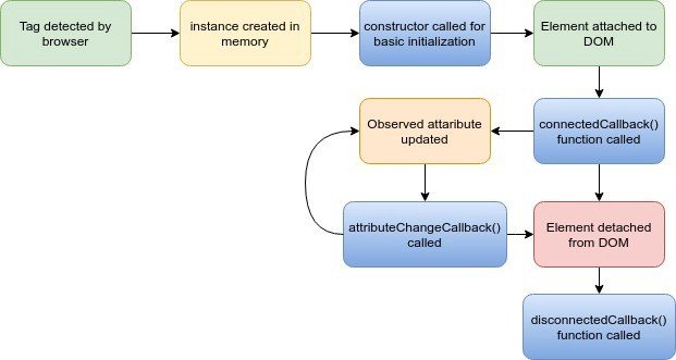
connectedCallback()
disconnectedCallback()
attributeChangedCallback()
adoptedCallback()
class Custom-component extends HTMLElement {
  constructor() {
    super(); // always call super() first in the ctor.
    ...
  }
  connectedCallback() {
    this.addEventListener("mouseover", e => {
      this.setAttribute("style", "color:pink; font-style: bold;");
    });

    this.addEventListener("mouseout", e => {
      this.setAttribute("style", "color:black; font-style: bold;");
    });

    this.addEventListener("click", e => {
      this.target="_blank";
    });
  }
  disconnectedCallback() {
    ...
  }
  attributeChangedCallback(attrName, oldVal, newVal) {
    ...
  }

}<script type="module" src="telia-custom-component.js"></script>
<telia-custom-component></telia-custom-component><script>
document.querySelector('custom-input').dispatchEvent(new CustomEvent('customevent', {
detail: { prop: true }
}));
customElements.whenDefined('progress-bar').then(() => {
document.querySelector('progress-bar').addEventListener(
'customevent', function () {
// do something
}
});
});
</script>Text
class TeliaContactElement extends HTMLElement {
  constructor() {
    super();
    const template = document.querySelector('#contact-card-template');

    // Shadow DOM
    this.attachShadow({ "mode": "open" });
    this.shadowRoot.appendChild(template.content.cloneNode(true));
  }

  static get observedAttributes() {
    return ["name", "email"];
  }

  attributeChangedCallback(name, oldValue, newValue) {
    this[name] = newValue;
  }

  connectedCallback() {
    this._$name = this.shadowRoot.querySelector("#name");
    this._$email = this.shadowRoot.querySelector("#email");
    this._render(this);
  }

  _render({ name, email, avatar }) {
    this._$name.textContent = name || 'N/A';
    this._$email.textContent = email || 'N/A';
    const figcaption = document.createElement("figcaption");
    figcaption.textContent = name;
    figcaption["aria-label"] = "contact name";
  }
}

customElements.define("telia-contact", TeliaContactElement);
<template id="contact-card-template">
	<style>
		.card {
			height: auto;
			max-height: 299px;
			width: 200px;
			overflow: hidden;
			background-color: #FFFFFF;
			border-radius: 10px;
			box-shadow: 0 5px 10px rgba(0, 0, 0, 0.1);
			text-align: center;
			-webkit-transition: .1s ease-in-out;
			transition: .1s ease-in-out;
			margin: 30px;
			padding: 10px;
		}
		.card:hover {
			box-shadow: 0 15px 20px rgba(0, 0, 0, 0.1);
		}
	</style>

	<div class="card">
		<h3 id="name"></h3>
		<span id="email"></a>
  </div>
</template>
<h1>⚡️ Telia Contact ⚡️</h1>
<telia-contact
  name="Majid"
  email="majid@telia.no">
  loading...
</telia-contact>
<telia-contact
  email="Jakob@Lind.com">
  loading...
</telia-contact>
import { LitElement, html, property, customElement } from 'lit-element';

@customElement('simple-greeting')
export class SimpleGreeting extends LitElement {
  @property() name = 'World';

  render() {
    return html`<p>Hello, ${this.name}!</p>`;
  }
}By Majid Hajian


