Working with Data
for small museums, independent researchers, and public historians
Researching New York 2018
Maeve Kane
https://slides.com/mkane/working-with-data
@MaeveKane | mkane2@albany.edu
Finding Data
National Historic Geographic Information Systems (NHGIS): Historic county map files & ward and county-level census data
IPUMS: individual-level census data (incomplete, may not be used for individual research, does not include names)
MEAD Magazine of Early American Datasets: collected by scholars
SOME museums and libraries
Anything that can be made into a spreadsheet: museum and library collections, addresses, letter collections, church registers, account books, membership rolls
Understand your data
Content model: how the data is organized
Table:
the whole spreadsheet
Columns contain one
content type: the individual parts of the data
Rows contain one record: an individual unit described by the content types
Data best practices
- Keep an original, clean version
- Keep a backup off-site
- Keep your data in a non-proprietary format (csv good, Excel and Access bad)
- One sheet, one purpose
- One column, one purpose
- Zero is not the same as absent
- Formatting is not data
- Break up dates
BAD
GOOD
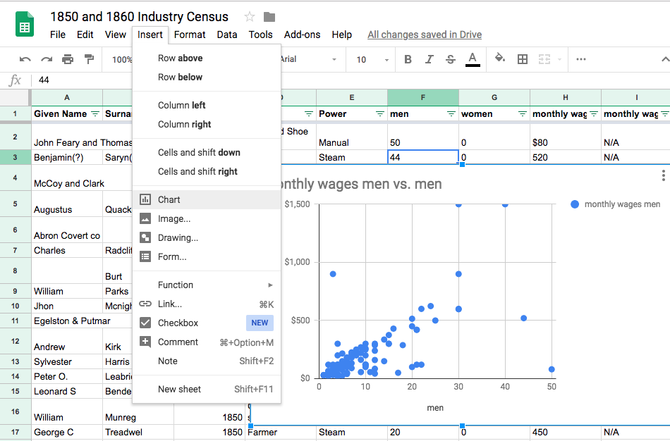
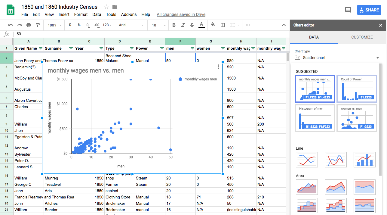
Working with Spreadsheets
Basic Charts
Most spreadsheet programs can make basic charts, and this might be all your project needs
Content type
Discrete: a category or type of thing. Industry, power type, occupation, educational level, and material are all discrete data because there are separate sub-types which do not overlap
Continuous: a spectrum which is connected. Dates, ages, counts, and money are all continuous data because data can fall on any arbitrary point of a spectrum.
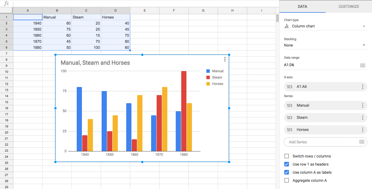
Continuous data can sometimes be treated as discrete data
For example: A count of types of power per year uses Year as discrete data because it is used as a category
Content type determines your visualization options
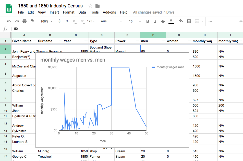
Discrete data should not be displayed with a line or area graphs because it implies a relation that does not exist
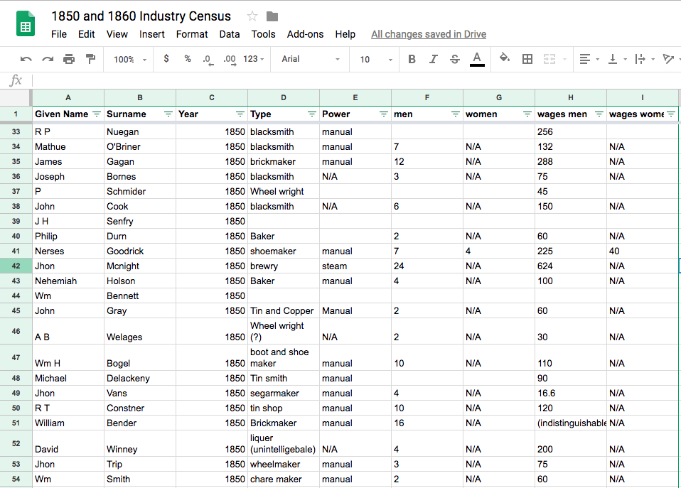
The problem of messy data
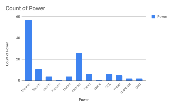
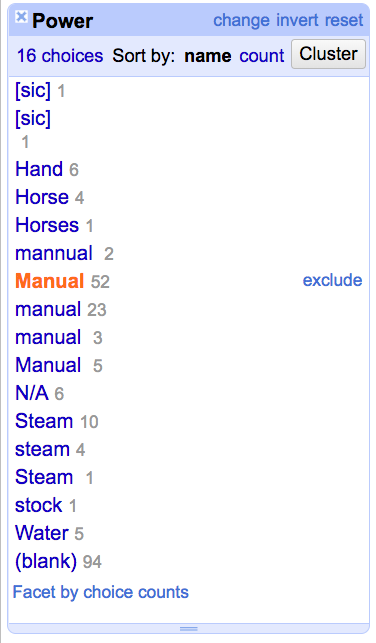
Manual vs. manual vs. mannual vs. Hand
Steam vs. steam
Horses vs. Horse vs. stock
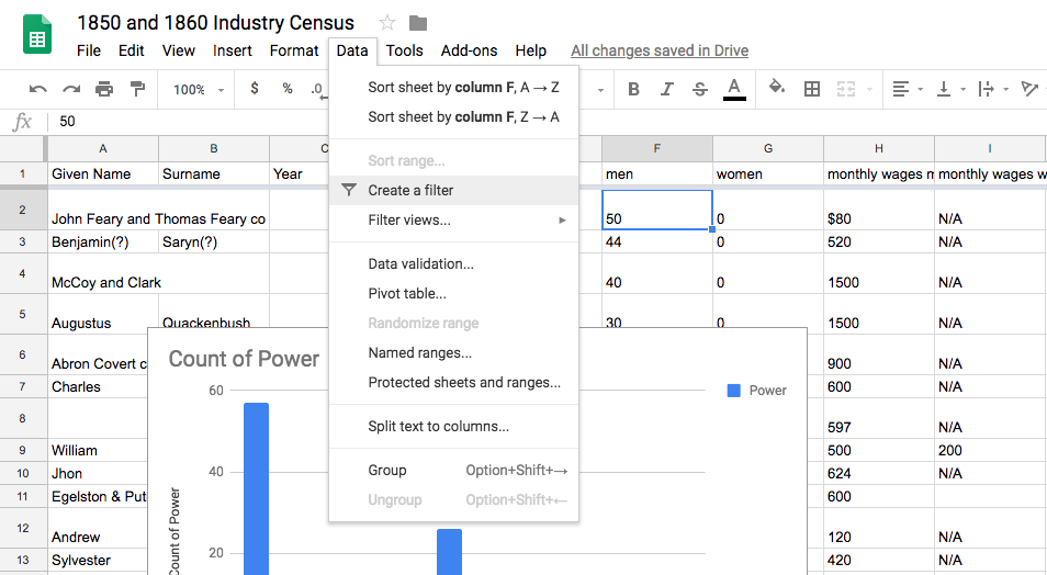
Filtering Data
This is available under the "Data" tab in most spreadsheet programs
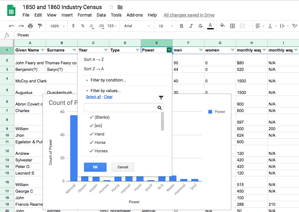
We could use a filter to select only the misspelled records and hand-correct them
Right Tool for the Right Job
Spreadsheets:
good for data entry, bad for data cleaning and analysis
OpenRefine:
good for data cleaning, bad for data entry and analysis
Tableau:
good for analysis, bad for data entry and data cleaning
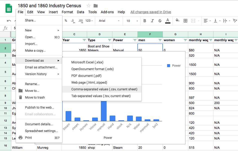
Download
And put it somewhere safe to work with again!
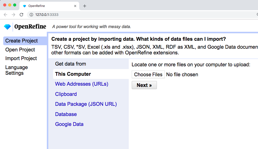
OpenRefine
OpenRefine runs on your computer but displays in Chrome or Firefox. If you open OpenRefine and it doesn't immediately open a browser window, type in 127.0.0.1:333
Then open the file we just downloaded!
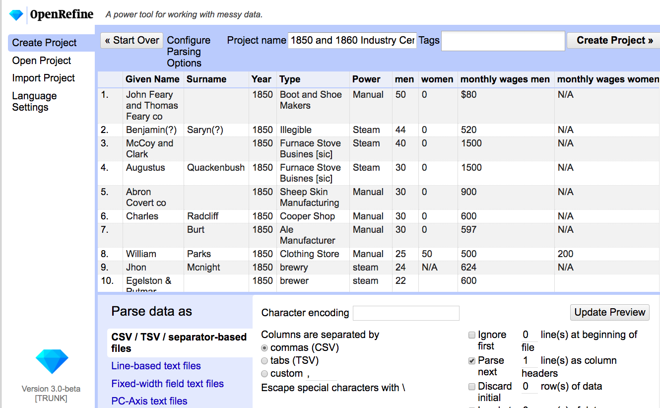
OpenRefine will preview your data to make sure everything looks good (usually you don't need to change anything here)
Give the project a nice name and "Create Project"
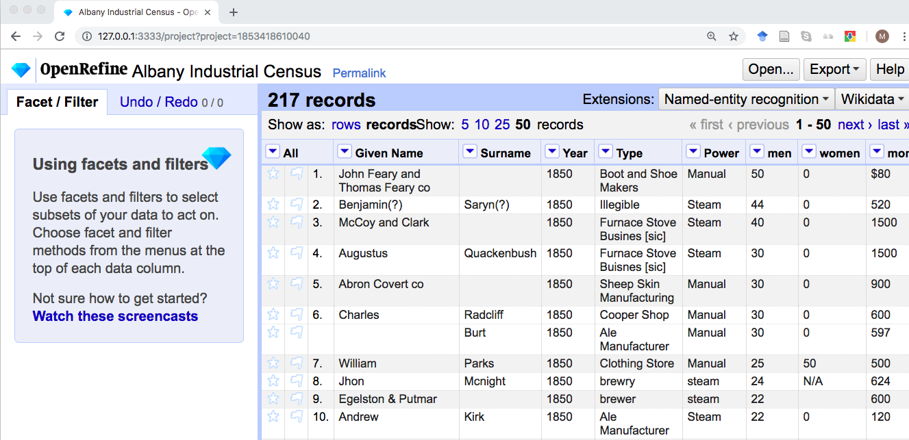
This looks like a spreadsheet but it's not!
OpenRefine is very bad at data entry--it's very difficult to add a record or enter lots of new data in a column
OpenRefine is very good at cleaning up existing data
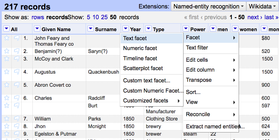
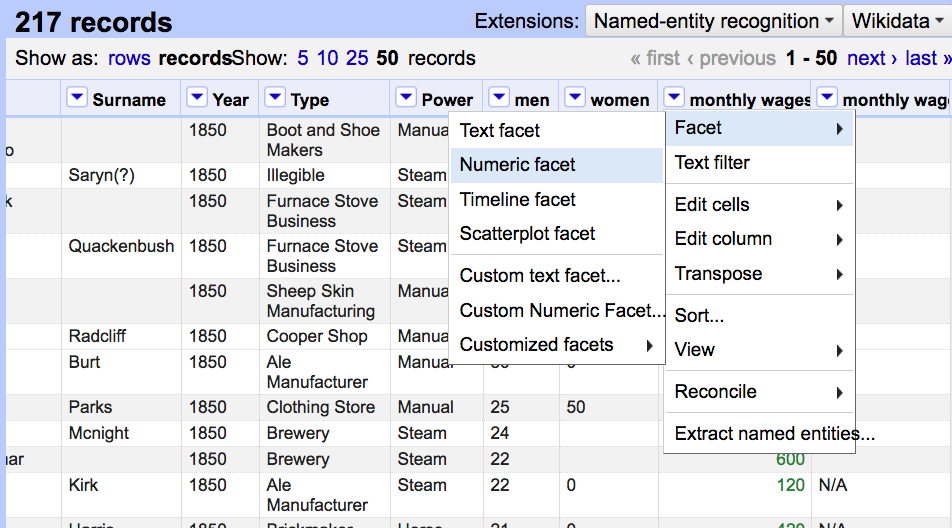
It does this by faceting data. Let's facet the Power column
A facet shows all possible choices within a column, and how many records use that choice
A facet is very similar to a filter and can be used to filter by clicking one of the options
A facet can also be used to edit--hover over "manual" until you see "edit" to the right, and then correct it to read "Manual"
This merges those options and makes it easier to make clean charts in the future!
Faceting Data
For some of these items like [sic] and N/A, that data may not be relevant and we can delete it
(This is why you should always keep an unmodified original transcript!)
What about Steam vs Steam and manual vs manual?
These look the same, what's the difference?
Faceting Data
Historical data often has invisible formatting or trailing spaces that people can't see but a computer interprets as an extra character! OpenRefine can automatically clean these up
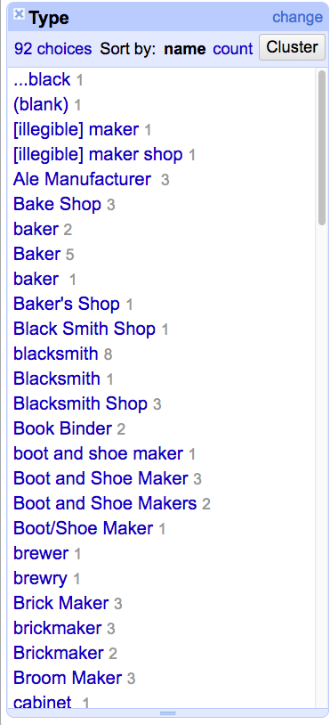
Clustering Data
What if there are so many items it's difficult to edit them in the facet?
A cluster will automatically detect similarities between choices and ask us to approve them
Text facet the Type column and then hit Cluster in the upper right
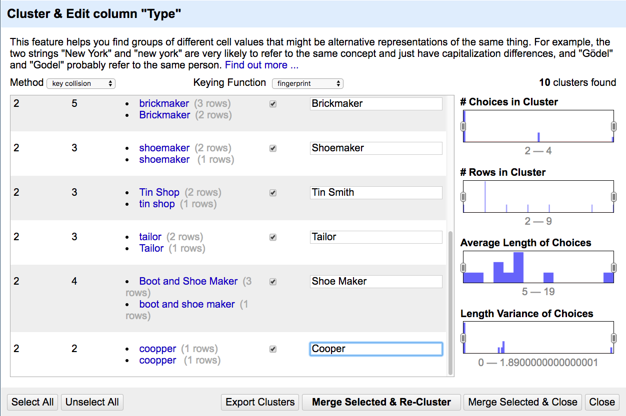
You need to use your historian's judgement--is a boot and shoemaker the same as a shoemaker?
Sometimes the suggestions are misspelled--"coopper" needs to be corrected before being approved!
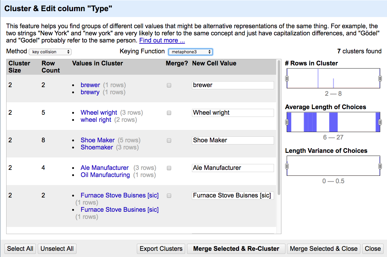
OpenRefine can run several different algorithms that will give different results--not all of them correct!
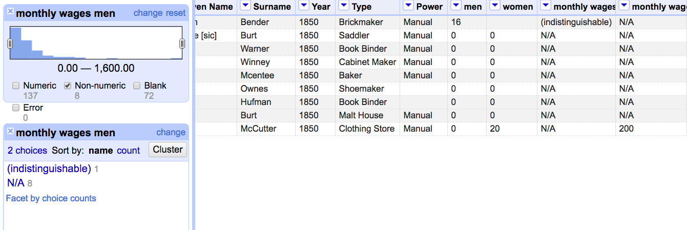
Sometimes data isn't just text
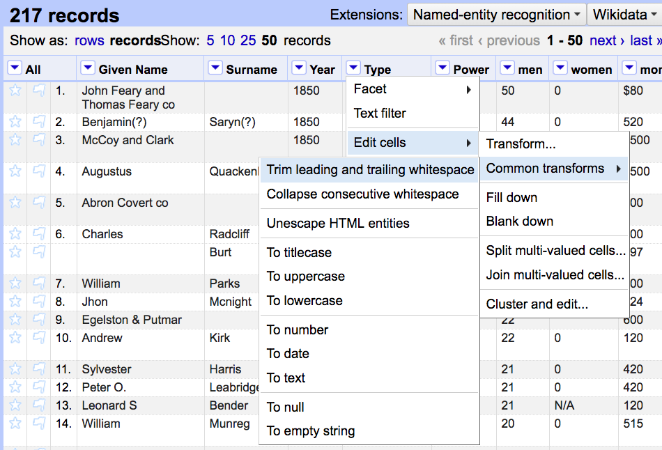
Let's change "monthly wages men" to numbers (Edit cells > Common transforms > To number) and then make a numeric facet
If we pair a numeric facet and a text facet, we can uncheck everything except for "Non-numeric" and see what's left
Using the text facet, we might edit (indistinguishable) and N/A to be just blank
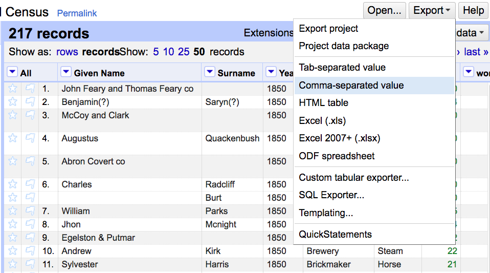
Once we're done, export as a csv
(For the purposes of this workshop, don't export your own csv! Download this copy so everyone is working with the same data for the next step)
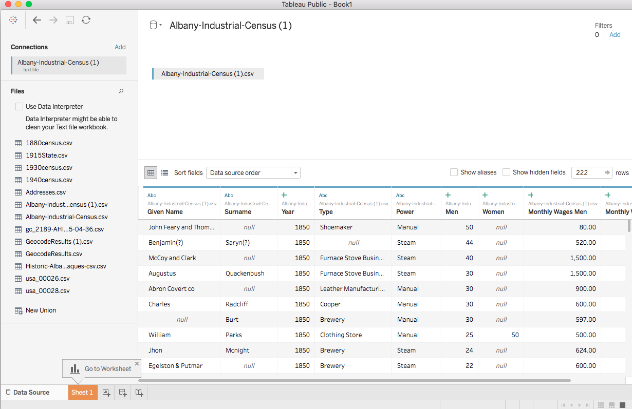
Like OpenRefine, Tableau will preview the data to make sure everything looks good, and like OpenRefine, this looks like a spreadsheet but is very bad for data entry!
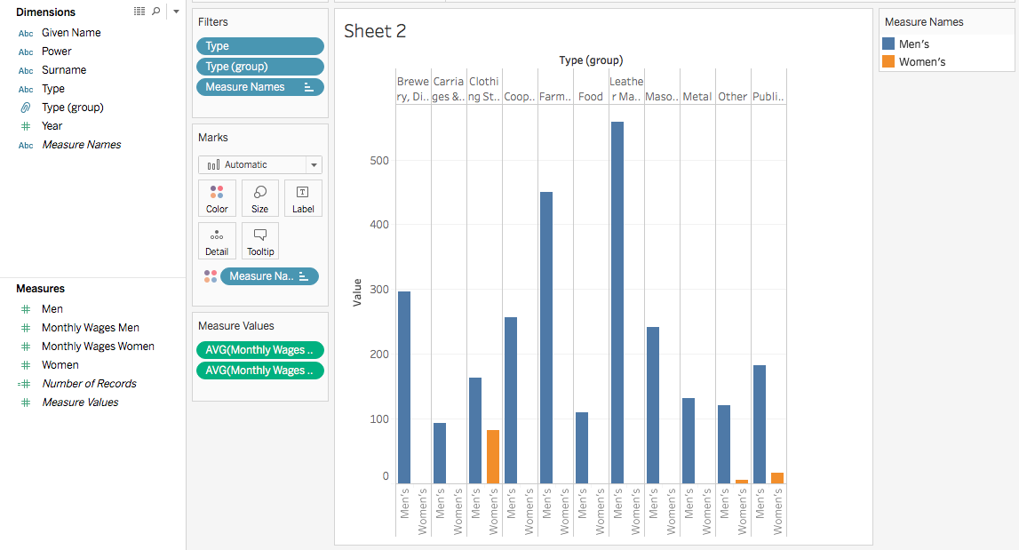
In addition to discrete and continuous data, Tableau divides data into dimensions and measures
A dimension is descriptive and is usually discrete.
A measure counts something and is usually continuous
Sometimes a dimension can be continuous, like Year! Sometimes a measure needs to be changed to dimension if we want to use it to describe something instead of count it!
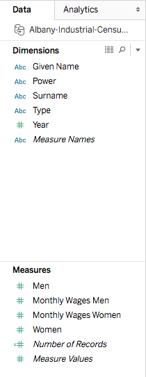
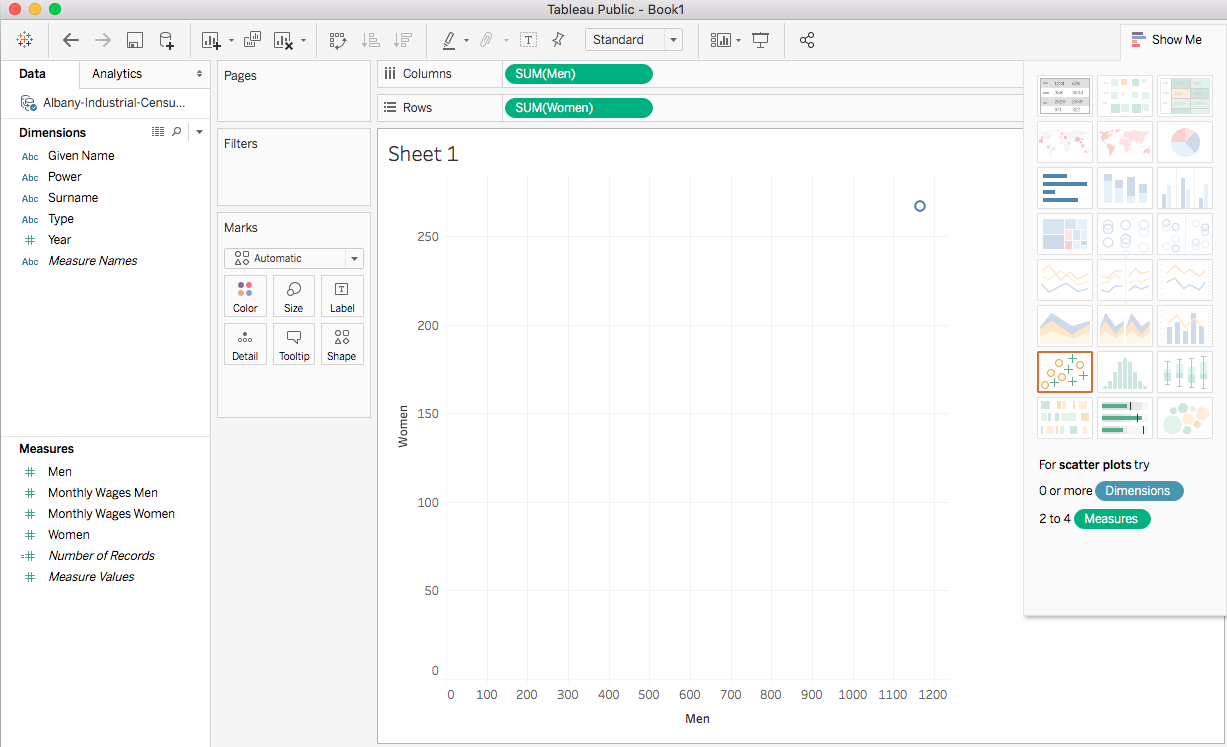
Tableau is not very smart. If you just drag your measures over, it tries to make a guess
With measures, it will usually try to count them
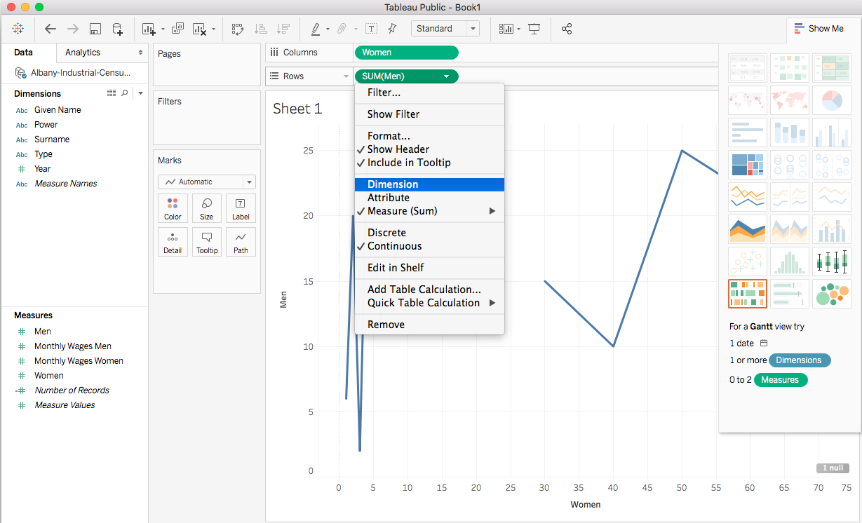
If we change Women and Men from Measure to Dimension, we can compare how many men shops employed vs. how many women they employed
Think of dimension vs measure as an instruction to Tableau:
Dimension says I want to compare two qualities that happen to be numeric, measure says I want to count up the values in this column

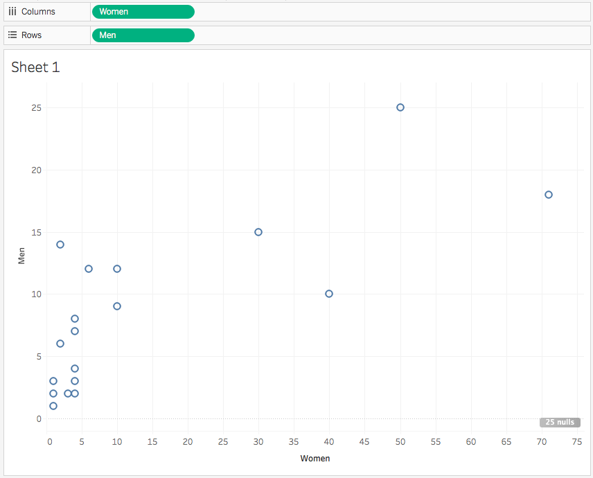
By default, Tableau excludes records with no data. Sometimes this is what we want, sometimes it's not. Click "25 nulls" at the bottom right to include shops with no women employees
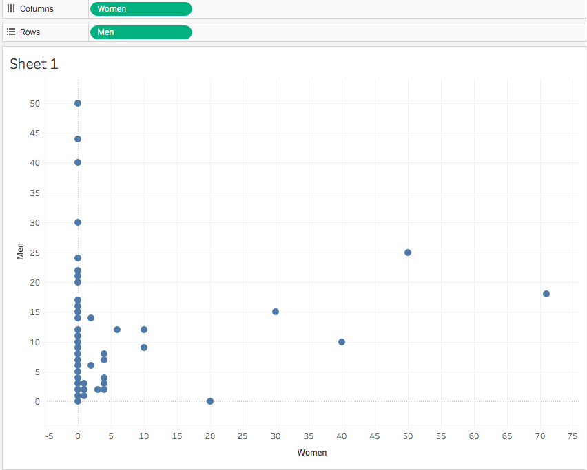
Including null data can make a big difference! We have to use our historian's judgement to determine if showing shops with no female employees matters to the story we're telling
For now let's say it doesn't matter and hit the back arrow at the top left to undo
To see the trend in our data, click the Analytics tab and drag "Trend Line" over the chart, dropping it on "Linear"
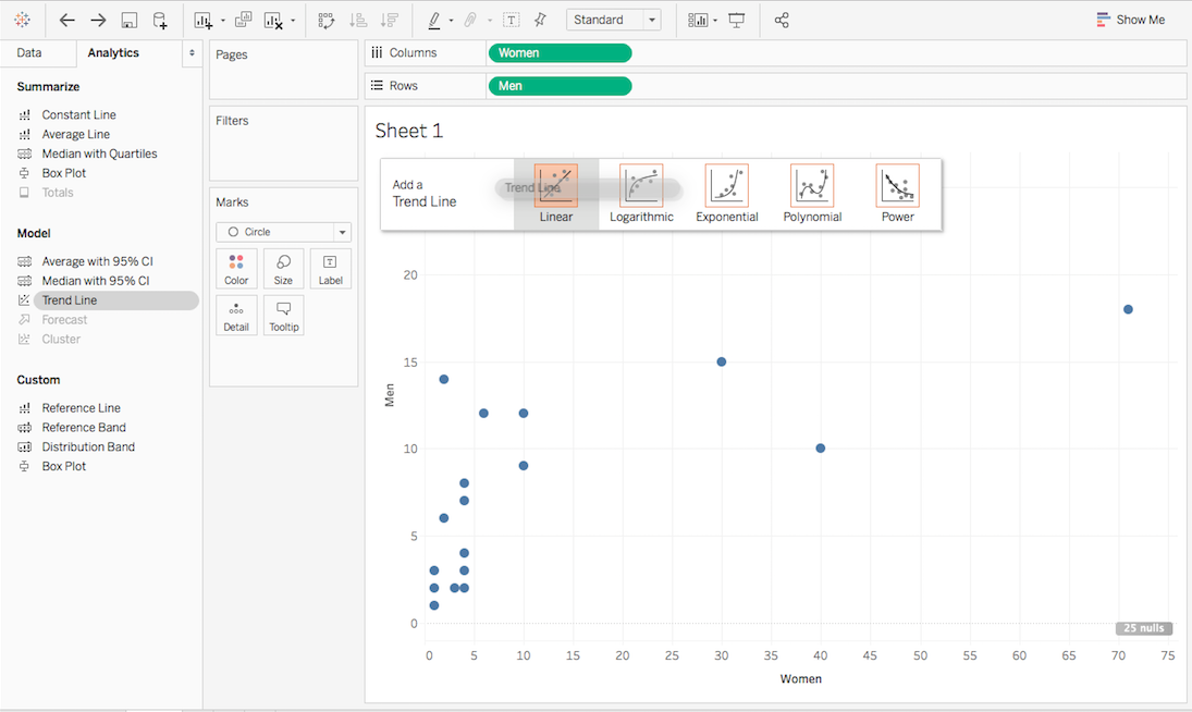
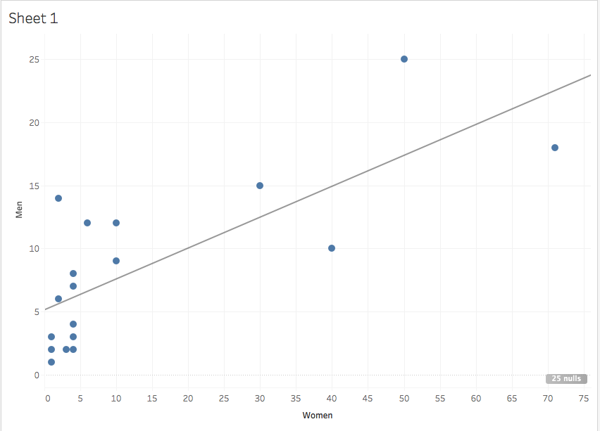
This helps us see that in shops that employed both men and women, the trend was to employ roughly equal proportions of men and women
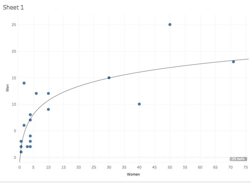
Logarithmic trend line
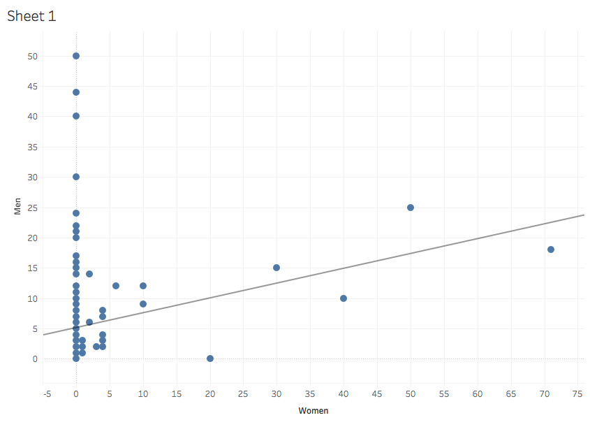
Linear with null values
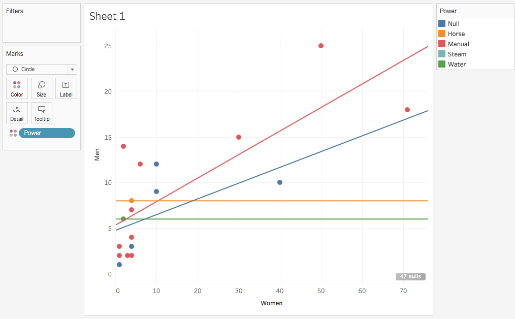
If we drag Power from dimensions to Color, we can see that there are different trends in different kinds of shops
(This might not be significant, though, because there's only one Horse and Water shop each in the data!)
Tableau has multiple sheets like a spreadsheet program. Let's add another by clicking the little chart icon next to "Sheet 1" in the lower left
These sheets can be renamed to keep them straight! Just right click to rename

Drag Type to Columns and Monthly Wages Men to Rows to make a bar chart
This is adding together all the wages paid
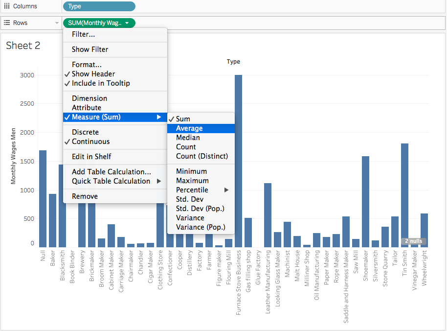
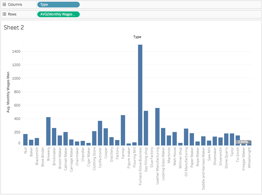
Instead of adding together the wages paid, let's get the average per shop
You have to use your historian's judgement: what's the story you want to tell? Is it about the amount spent on wages in an industry or the average spent on wages in certain shops?
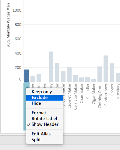
Sometimes we don't want to show some data. Let's get rid of nulls by right clicking and selecting Exclude.
This will add a filter similar to a spreadsheet filter or OpenRefine facet
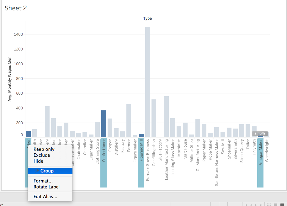
Grouping data
To group columns together, command-click/Windows-click on several columns (try all food-related shops) and then right-click one to select Group
This creates a new dimension in the Data tab
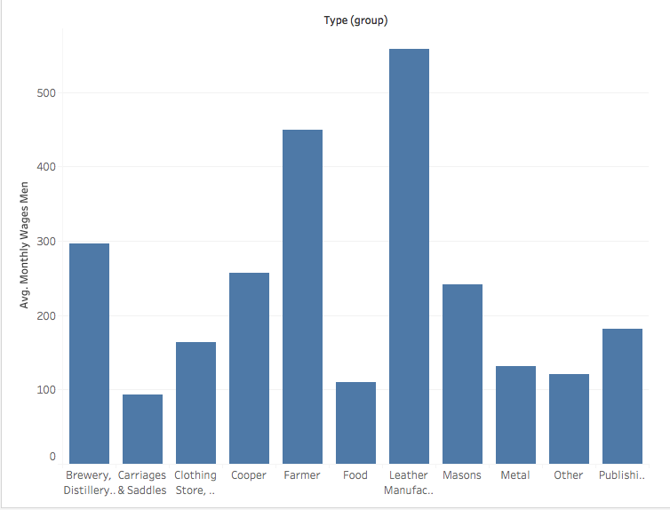
Grouping several shops together into industries and excluding the outlier Furnace Stoves gives us a better idea of the average
Groups can be renamed by right-clicking the bar and selecting "Edit Alias"
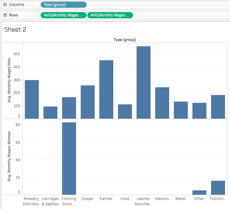
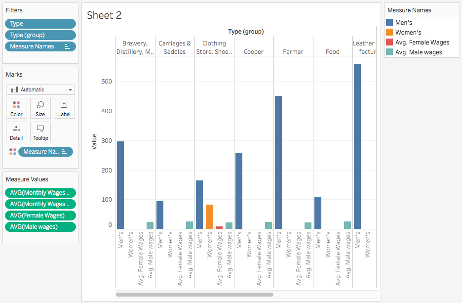
To compare men's and women's wages, we could just drag Monthly Wages Women to Rows, change Sum to Average, and compare the two charts visually
But this doesn't look good and is hard to read--the labels are far from the data, and it's hard to compare men's and women's wages
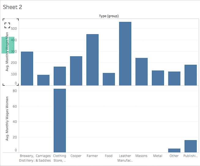
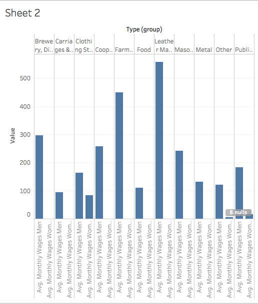
To combine the charts, hover over the Avg. Monthly Wages Women until a small triangle appears, grab the triangle, and drag it up into the Avg. Monthly Wages Men pane
To color the bars by gender, drag "Measure Names" from the Dimensions pane to the Color card in the Marks pane
This will create a legend, where you can right-click to Edit Alias
Right now our chart looks good but it doesn't actually tell us much--shops with more employees pay more wages, because our data only reports wages paid to all employees per month. How much did each employee make?
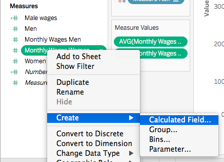
Time for some math. Right click "Monthly Wages Women" and select Create > Calculated Field
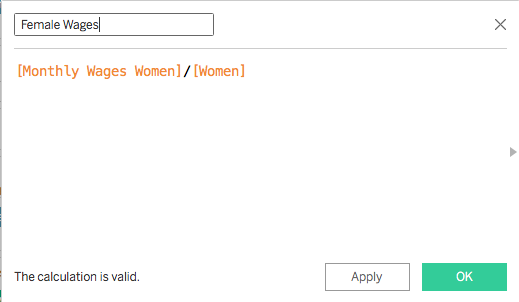
To get wages per person, we need to divide the total wages paid by the number of employees in a shop. Start typing for a measure name and Tableau will find all matches and correctly format the formula if you click on the correct name.
Give the new Calculated Field a nice name and hit OK. Do the same for men's wages.
If we drag the new fields over to "Measure Values", this makes for a bad comparison of apples to oranges. Let's get rid of AVG(Monthly Wages) for men and women by right-clicking and selecting Remove
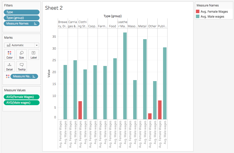
Now we can see that female employees on average were paid less than male employees in the same shop, and that men employed as masons made much less than brewery workers
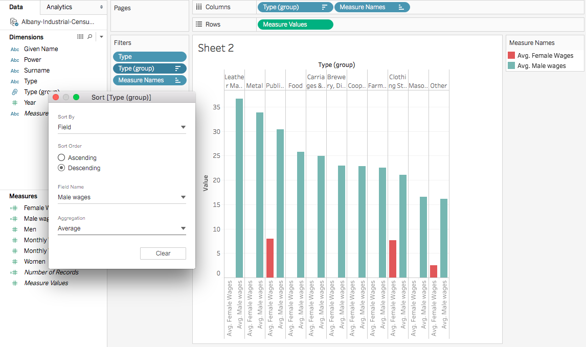
To make our chart more readable, let's right-click Type (group) in the filter pane, then Sort by Field, descending, with Field Male Wages and Average
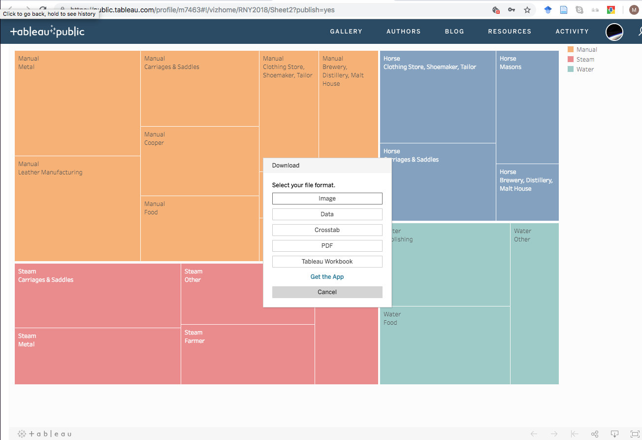
The major downside of Tableau is it stores all your data online and you have to download images or embed the interactive graph in a web page
Mapping Data
Download the Historic Albany Foundation plaque list file and create a new Tableau project
This dataset was cleaned with OpenRefine and the Latitude/Longitude coordinates obtained using the free software QGIS. QGIS is beyond the scope of this workshop, but ask if you're interested!
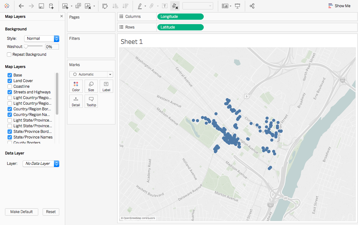
If we drag Longitude to Columns and Latitude to Rows, we get a nice map!
We might need to select Map > Map Layers and customize to get roads to show up
With so many points, it's hard to see individuals
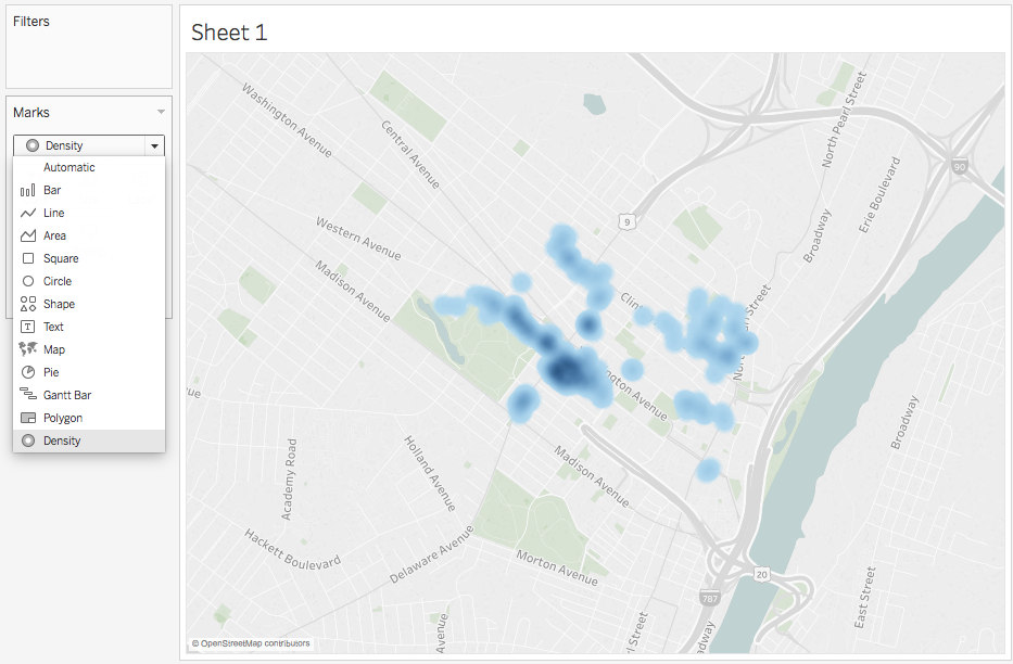
If we select Density under Marks, we can see where there are more plaques clustered
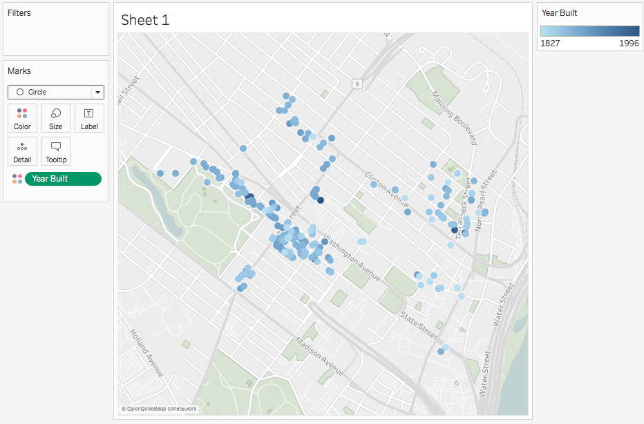
Or if we change Mark to Circle, we can drag Year Built to Color and see where older homes cluster
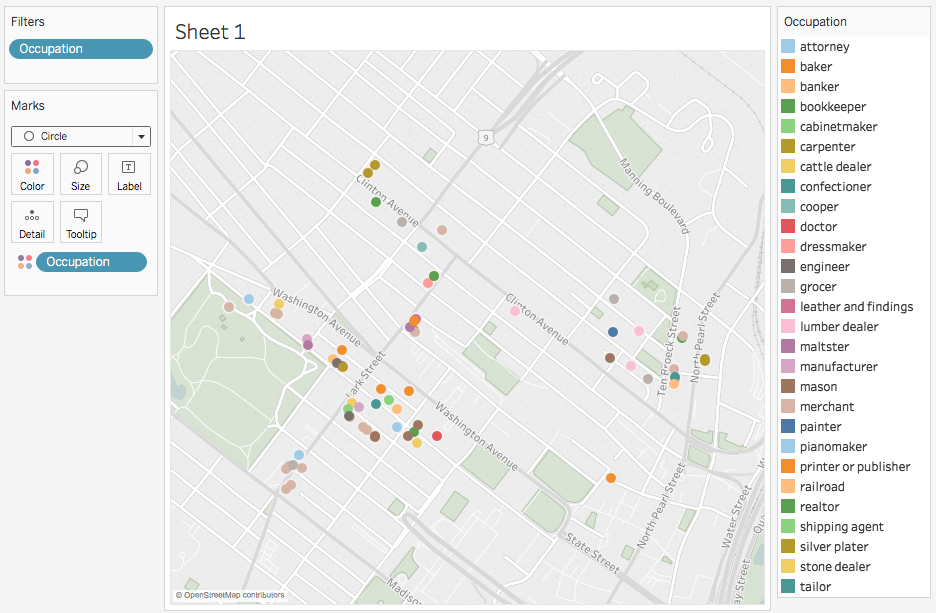
We could also drag Occupation to Color and exclude Null to see if homes cluster by profession
Further Reading
AHIS596 Syllabus: Scholarly articles and how-to
(If you're interested in enrolling or auditing, please see me!)
The Curious Journalist's Guide to Data: General concerns in collecting and analyzing data. Sections on statistics are less useful for historians
Fundamentals of Data Visualization: In depth discussion of visualizing data in different ways and for different purposes
Data to play with
- Albany census 1850-1940 (this is a MASSIVE file, do NOT try to open this with OpenRefine or a spreadsheet program!)
- University of Pennsylvania Museum of Archaeology and Anthropology – collections 1500-1900
- 1815 Albany City Directory
- Second Great Awakening Revivals in NY State
- 8th Albany Militia Muster Rolls
- National Archives Founders Papers Metadata
- Dutch Reformed Church Baptisms 1683-1724 Try this on Google Fusion Tables network chart
Working with Data
By mkane


