Magazine Development and Final
Front Cover
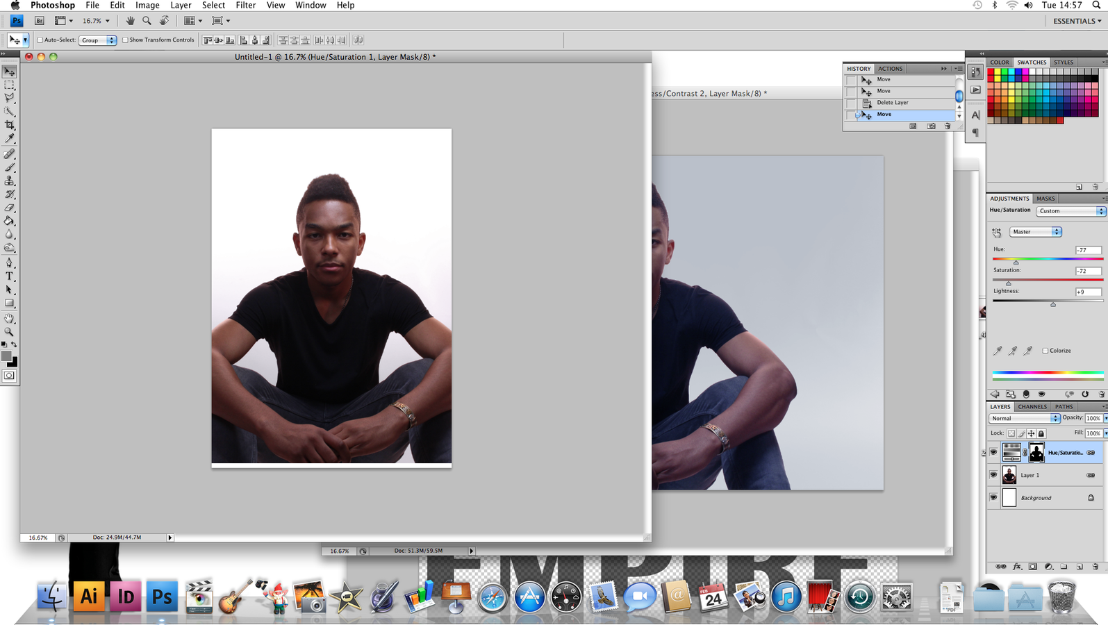
I chose this image for my front cover as the model had clear eye contact with the camera and the clothing and pose was suitable for my genre of magazine which is RnB. As shown in the image on the left hand side, the size of my magazine is A4 which cut the sides of the image. I used the blur tool to go over my model's skin to give it a smoother look.

I made this masthead on photoshop for my magazine. I used the font Britannic Bold and added effects to the letter 'R' such as decreasing the opacity so that the 'B', which I added a drop shadow to, can stand out more. I decided to leave the 'empire' plain black and bold so the colours mesh well together.
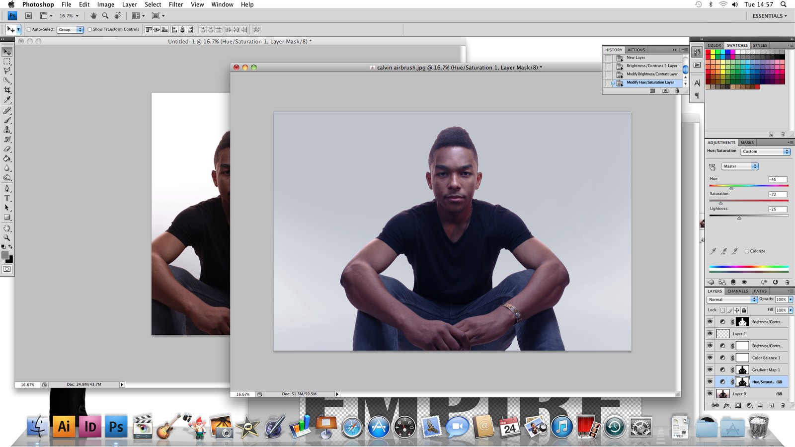
Before I added anything on to my magazine, i decided to edit the background of my image more as i felt like the white background looked too plain. I played around with the colours, brightness and contrast to see what looked the best.
After editing the image more, i placed it back on the A4 template and added the masthead onto it aswell to see how it all looked together.
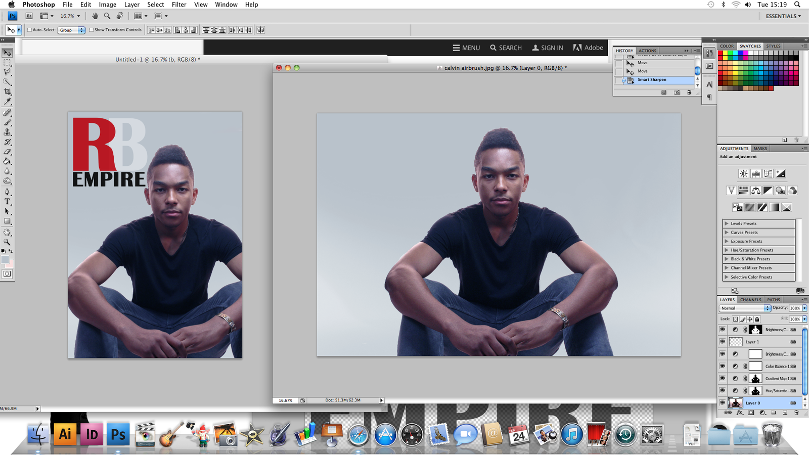
I did not like the look of the image in the previous slide as it looked like a tint of purple all over the magazine which didn't fit my genre therefore i added a different color to the background and kept the skin tone of my model neutral.
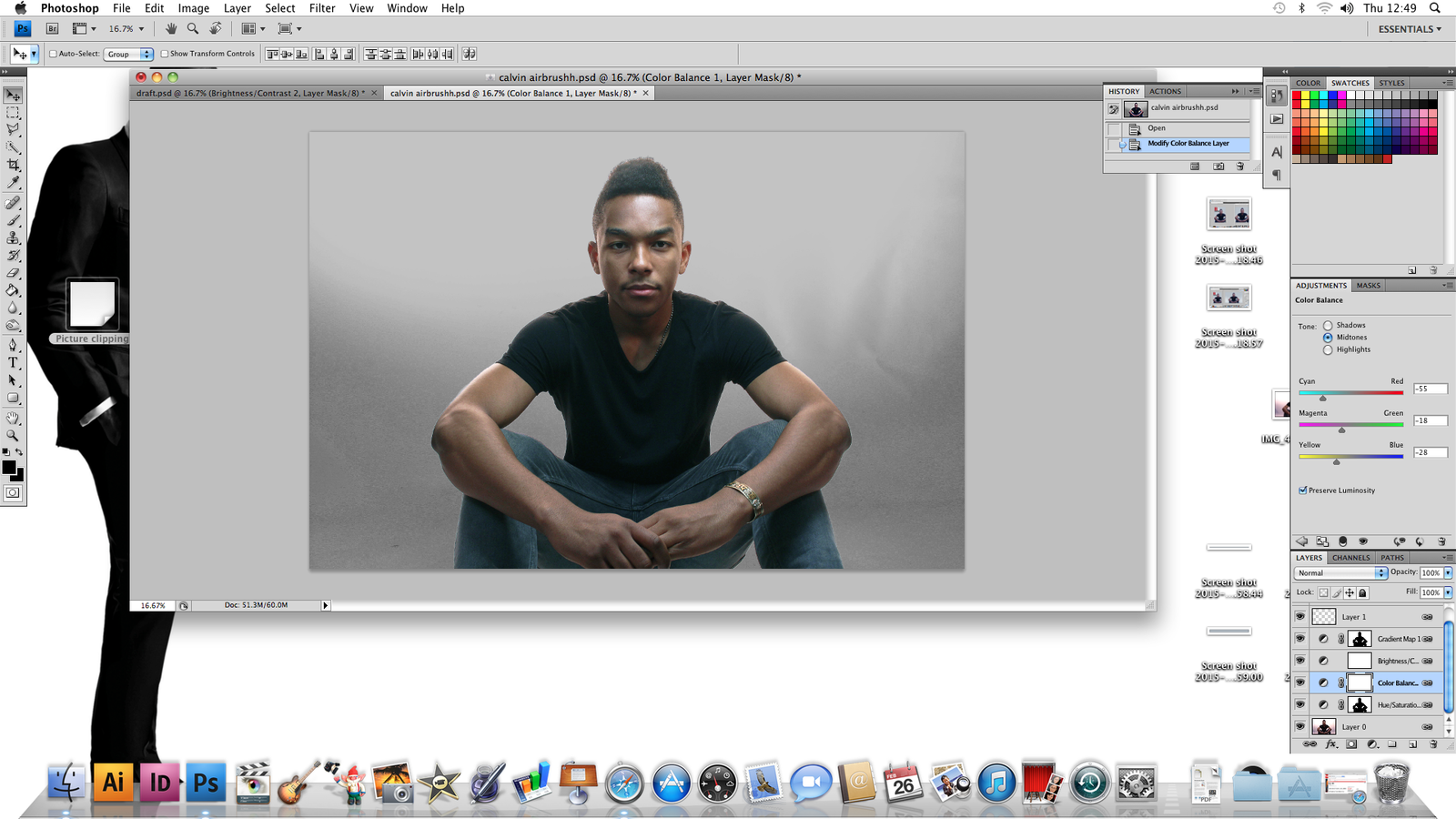
I finally edited the picture the way i liked, which i placed back onto the template. I added the masthead on it and a barcode to follow the conventions of a magazine. I wrote out the model's name which is 'Calvin Prince' with a simple font. I decided not to use the fonts i had originally planned to do as it did not look like i had hoped.
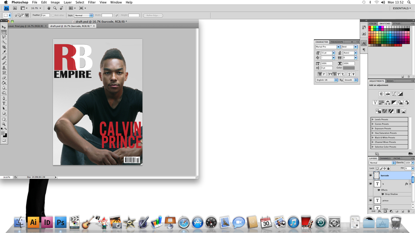
I finally edited the picture the way i liked, which i placed back onto the template. I added the masthead on it and a barcode to follow the conventions of a magazine. I wrote out the artists name which is 'Calvin Prince' with a simple font. I decided not to use the fonts i had originally planned to do as it did not look like i had hoped. Using the artists name as a coverline made the name stand out completely which other RnB magazines did when i conducted some research as it attracts the audience.

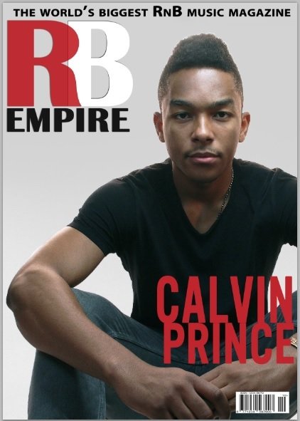


These images show the process I went through while creating my magazine by adding skyline texts and plugs onto my magazine to get the layout similar to other professional magazines while sticking to a red, white and black color scheme.
This was my final front cover after adding the final touches of other artists names to appeal to the RnB audience. However, After getting feedback from my class, they said there were a lot of blank spaces on my magazine which is why i decided to add a sticker on the top right hand side of my cover to make it look more exciting.
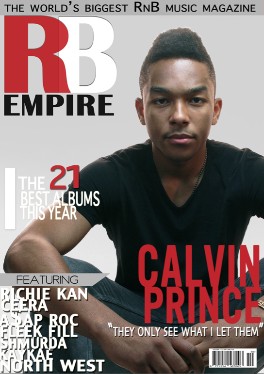
FINAL FRONT COVER
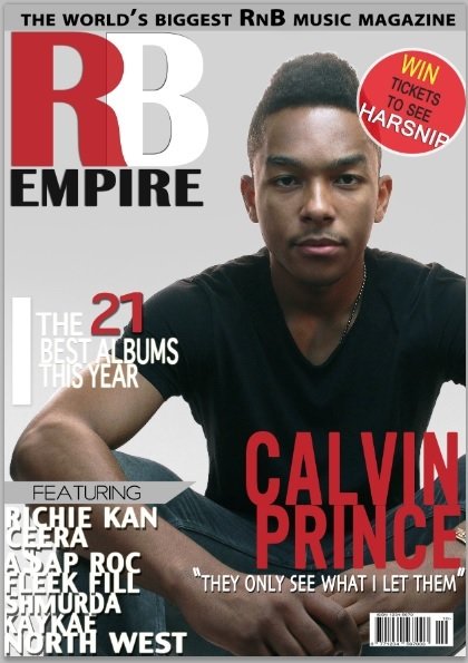
This is my final design of my front cover as it is eye-catching and the model used represents the genre of my magazine which is RnB really well with the pose and costume worn. The use of simple but attractive fonts and colors makes the magazine to stand out. The names I have used as artists have been inspired by actual real RnB artists which relate back to the genre. The simplicity of the layout gives the front cover professional and appealing.

Contents Page
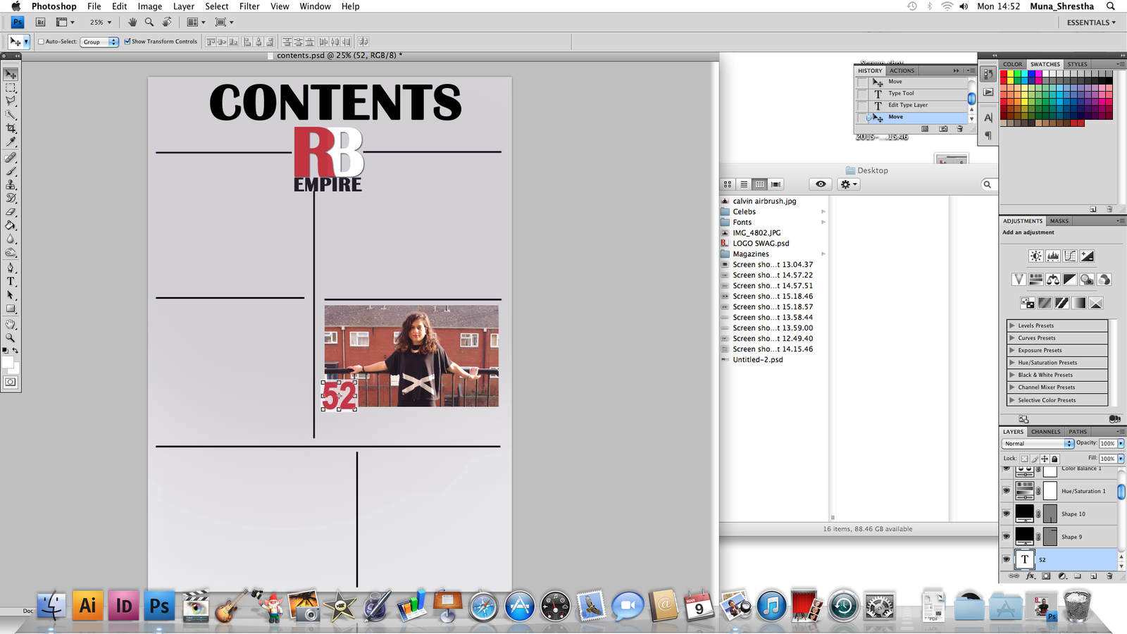
For the background, i decided to use the same grey to white gradient which is what I used for the front cover so that there is a consistent theme within the magazine. The color is simple and effective enough to allow the text and pictures on my page to stand out. For the layout of my contents page, i added a border of lines to where i would add my images in. Adding the masthead logo on the contents page allows a reminder to the audience of what magazine this is.
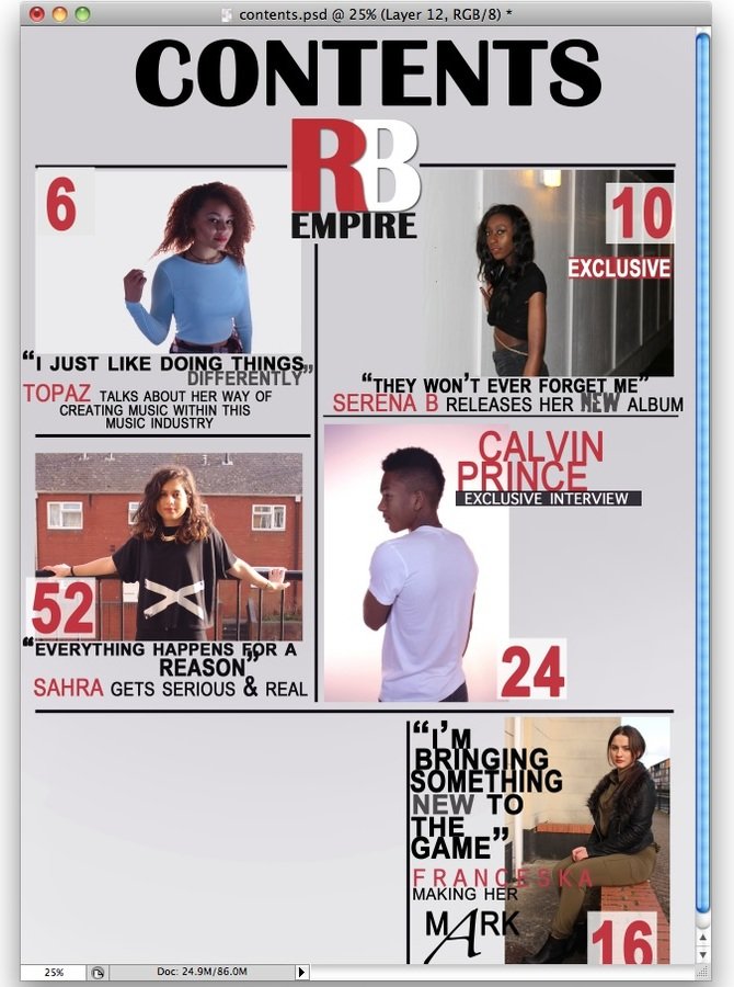
I tried to add my images into the boxes with different types of text styles and fonts, however after nearly completing this layout, I realized everything just looked so overcrowded and it didn't look like a proper contents page therefore i decided to change it up.
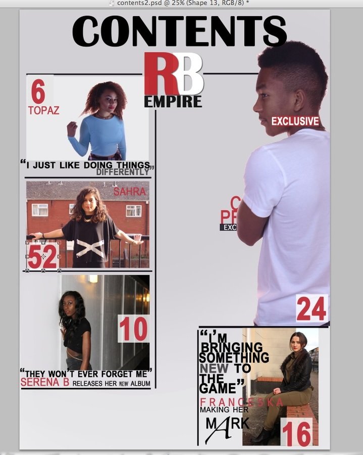
I decided to change how i laid out my images and text. As the main artist on my front cover was Calvin Prince, I edited him to stand out more on the contents page also. Using this layout style allowed me to have more space to have more page numbers so it starts to look more like a contents page.
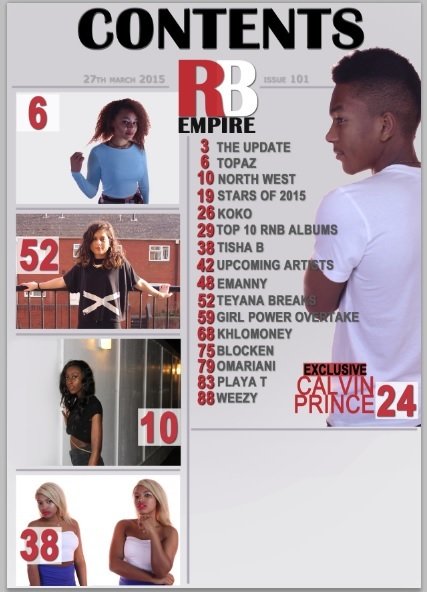
I got rid of all the extra description text altogether and put it in like a list on the right have side of the page to make it more neater to attract the audience. This gives the them a clear look of the artists image and then read the list of what other artists is included. I stuck with the main color scheme of red, black and white as the colours contrast really well together.

To make it look more like a real magazine, i added a subscribe box and offer on the bottom right hand of the contents page.
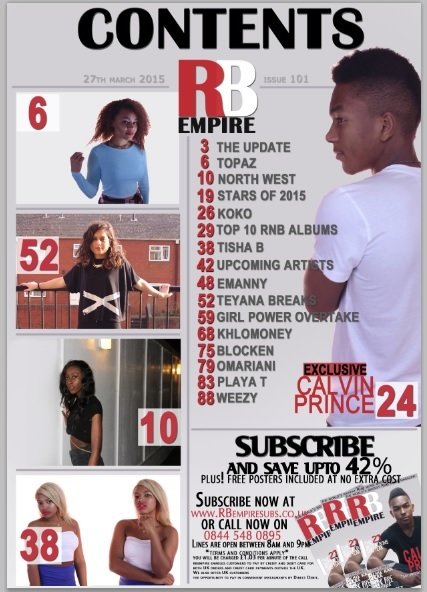
FINAL CONTENTS PAGE

This is my final design as the layout is similar to real magazines. I used mostly images to appeal to the audience as each image i added relate to conventions of how RnB artists are through their poses and costumes, and also the location they're posing at so I wanted to show the audience that which should appeal to them. The font used are all simple but bold enough to stand out. As the genre RnB can not be distinguished by colors, I used a mixture of colours such as red, white and black as they all contrast but mix really well together where the colours are able to match with everything else on the page.
Double Page Spread
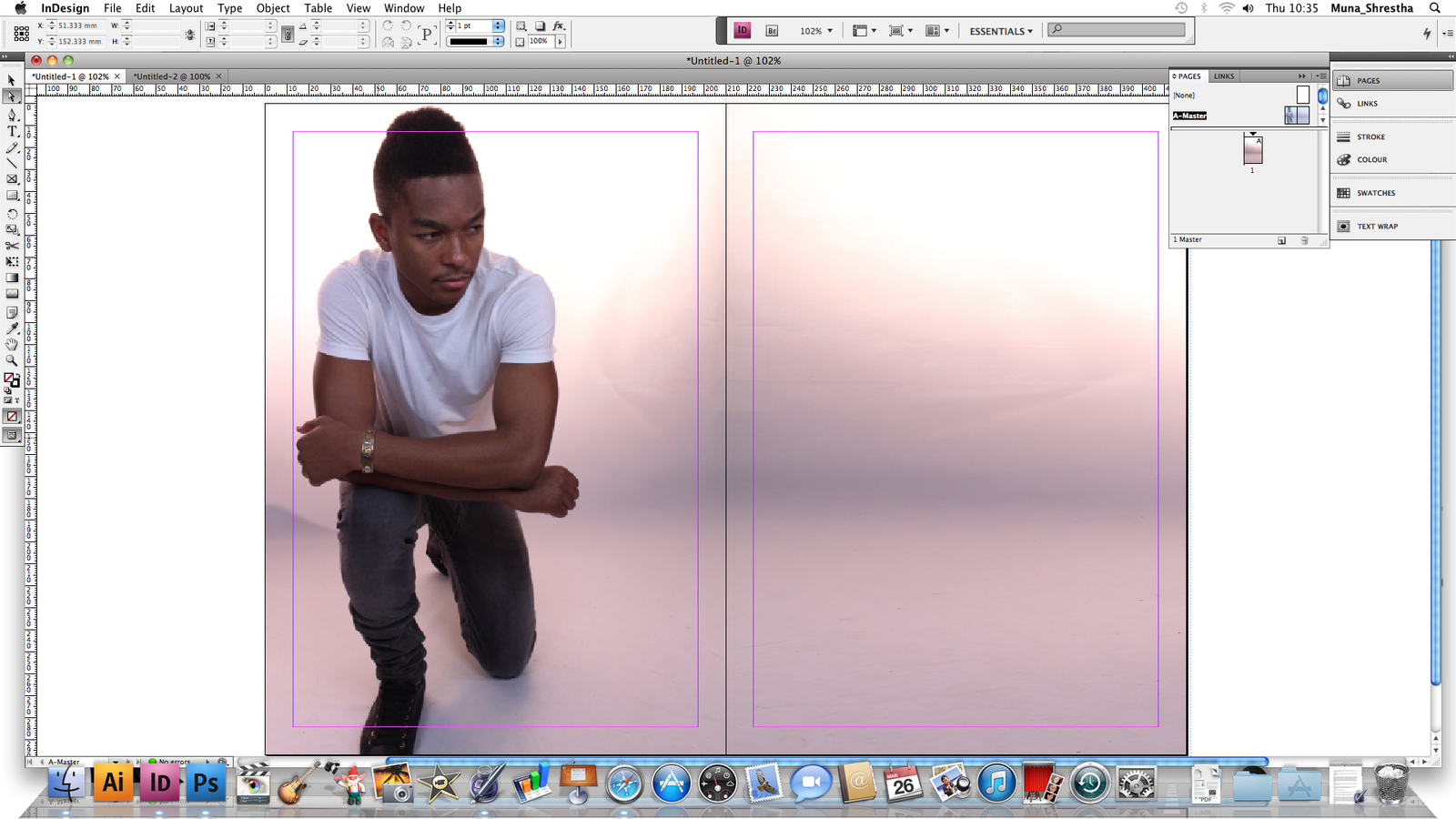
For my double page spread, I used InDesign instead of Photoshop as it enabled me to create better text layout and columns. For the image, I chose a clear picture where the model is seen wearing minimal jewelry but giving a model like pose which fits with my magazine genre really well. To create the background on the right hand page, I cropped a separate piece from the original image of the model, pasted and flipped it and stretched it out so it looks like it was originally a wide landscape image.
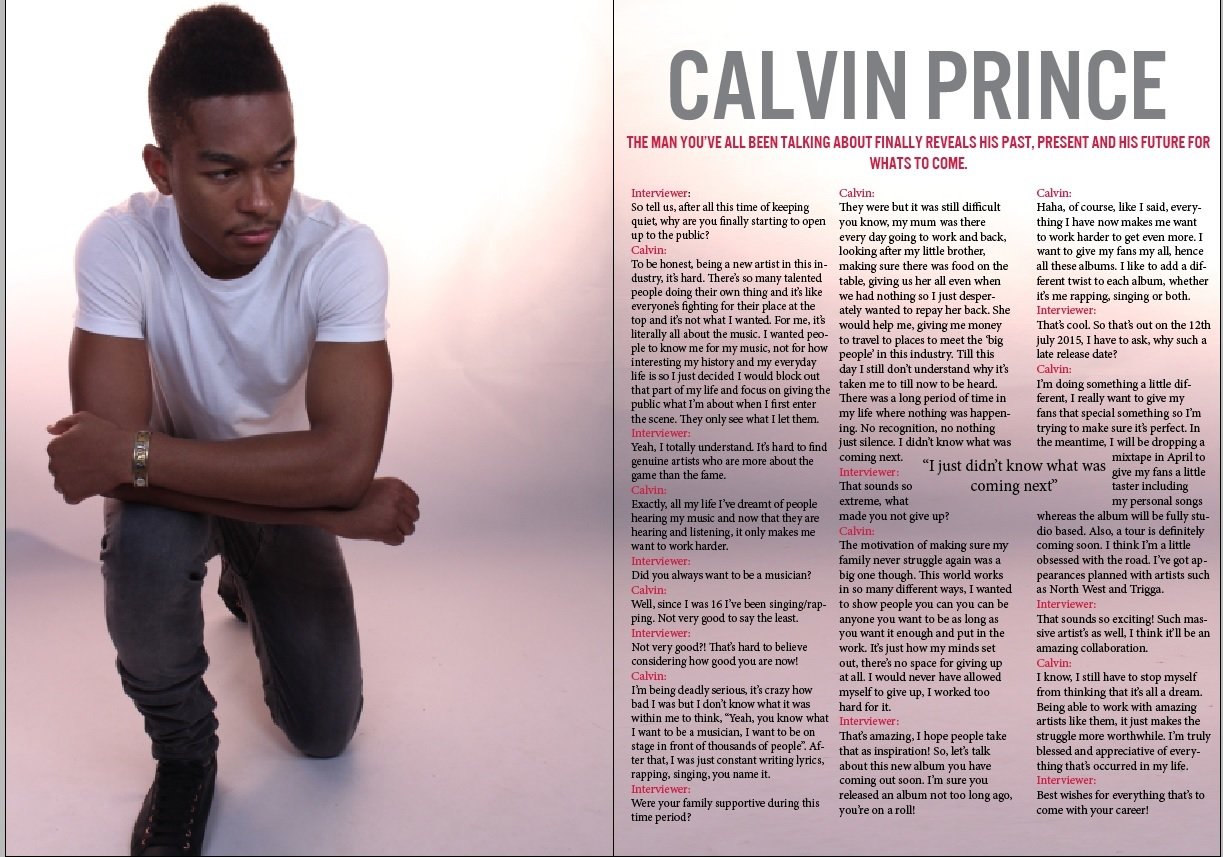
I added my title which is the artists name and made sure to make it stands out as the article is all about him. I added a sub intro/ title in the same font but smaller sized and in a different color. This follows the conventions of a magazine double page spread. I had prepared an interview article beforehand therefore i just pasted it into 3 different colomns. I added another text to create a pull quote in the article and used the text wrap tool and placed it where it was appropriate.
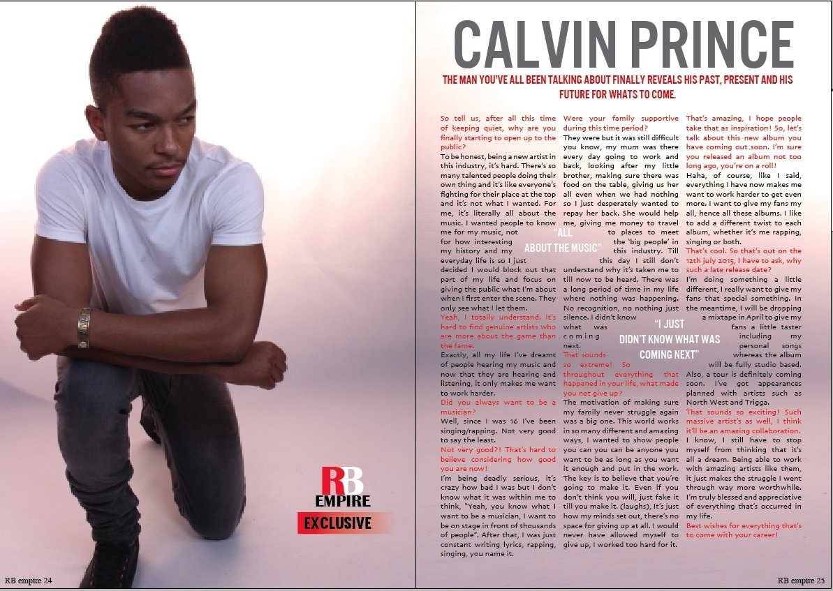
I played around with different fonts and stuck with this final one as it was clear and simple enough for my double page spread. I changed the color of the questions in the interview to show the audience the clear difference between the interviewer talking and the artist talking to avoid any confusions. I added another pull quote and made the color of it white to make it stand out from the text aswell as using a different font from the article.

I made the text wrap a circle instead of a square as it looked better in my opinion. I also added little details like page numbers and the masthead logo to keep the consistent theme of the music magazine. This was my final DPS but after receiving some feedback from my class, i added changes such as using a different font of the page numbers and added more text to make my columns have near enough the same length to make it look professional.
Continued
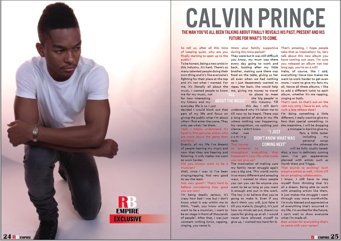
FINAL DOUBLE PAGE SPREAD

This is my final design as it is simple but because of the title and image, it stands out and appeals to the RnB target audience. The use of bright red of the left page lets the audience know that this interview is exclusive therefore attracting them to the article. The content of the article has been referred back to real RnB artists stories making it more appropriate to my RnB genre as inspiration has come from them to make this double page spread.
Magazine construction
By mshresthaa
Magazine construction
- 1,120


