Accessibility
Topics
- Overview
- Main principles
- Standards
- Guidelines Design
- Guidelines Dev
- ARIA
- Tools, resources
Overview
Accessibility means the ability of everyone regardless of their condition to have access to something
(e.g internet, transport system)
Accessibility refers to the design of products, devices, services, or environments for people who experience disabilities
Overview
A disability is any condition of the body or mind (impairment) that makes it more difficult for the person with the condition to do certain activities (activity limitation) and interact with the world around them (participation restrictions).
Different examples: deaf, color blind, broken mouse, slow internet connection
Overview
Why does it matter?
1/5 of the population has one type of disability or another
Goodwill - equal access and equal opportunity to people
Laws & Policies
Overview
Main principles
Perceivable
Information and user interface components must be presentable to users in ways they can perceive.
This means that users must be able to perceive the information being presented
(it can't be invisible to all of their senses)
Principles
Operable
User interface components and navigation must be operable.
This means that users must be able to operate the interface (the interface cannot require interaction that a user cannot perform)
Principles
Understandable
Information and the operation of user interface must be understandable.
This means that users must be able to understand the information as well as the operation of the user interface (the content or operation cannot be beyond their understanding)
Principles
Robust
Content must be robust enough that it can be interpreted reliably by a wide variety of user agents, including assistive technologies.
This means that users must be able to access the content as technologies advance (as technologies and user agents evolve, the content should remain accessible)
Principles
Principles
Standards
Web Content Accessibility Guidelines (WCAG)
Standards
W3C - https://www.w3.org/WAI/standards-guidelines/wcag/
WCAG 2.0 - https://www.w3.org/TR/WCAG20/
WCAG 2.1 - https://www.w3.org/TR/WCAG21/
WCAG is primarily intended for:
- Web content developers (page authors, site designers, etc.)
- Web authoring tool developers
- Web accessibility evaluation tool developers
Standards
The WCAG 2.0 is organized in three different levels:
Standards
Level A: the most basic Web accessibility features;
Level AA: the most common barriers for disabled people;
Level AAA: the highest level of accessibility.
Policies
Standards
Voluntary Product Accessibility Template (VPAT)
Standards
Where is ADAPT here?
Standards
ADAPT has been certified as compliant with Web Content Accessibility Guidelines (WCAG) 2.0 Levels A and AA, the Revised Section 508 standards as published by the U.S. Access Board, and EN 301 549 Accessibility requirements suitable for public procurement of ICT products and services in Europe.
Standards
It’s important for product teams to understand that, while clearly establishing a solid foundation, implementing the ADAPT framework alone does not guarantee your product is 508 compliant. Additionally, a partial implementation of ADAPT, or overriding ADAPT components with customizations, may negatively impact 508 compliance already established within the framework.
Once the ADAPT framework has been integrated, an independent 508 compliance analysis specific to the product may be required by BMC customers as part of the sales process. BMC works with Level Access, a third-party accessibility consultancy, for these needs. Level Access is an approved BMC vendor.
Guidelines
ADAPT checklist:
https://github.bmc.com/pages/bmc-ux/adapt-angular/#/guidelines/508
General checklist:
Guidelines
Guidelines
Design related areas
Guidelines
Don’t use presentation that relies solely on color
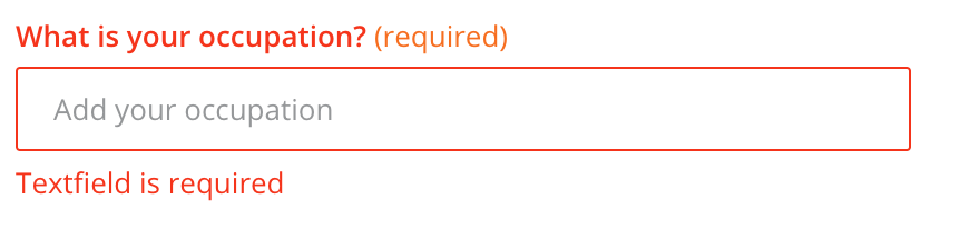
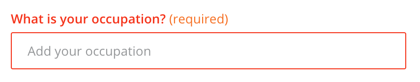
Guidelines
Colorblindness
Guidelines
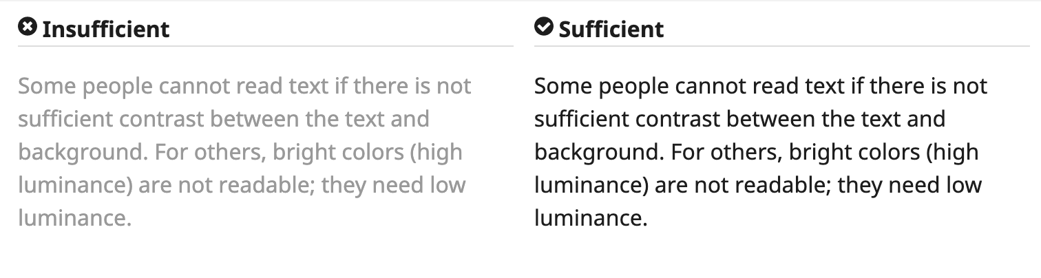
Contrast ratio
Contrast ratio between text and background is at least 4.5:1
Guidelines
Keep it simple
Guidelines
Keep it simple 2
Guidelines
Content should be in logical order
Guidelines
Links:
Dev related areas
Device-dependent event handlers
Dev guidelines
<!-- Not good -->
<div onclick="validate()">Get price</div>

<!-- Better -->
<div onkeypress="validate()" onclick="validate()">Get price</div>

<!-- Angular way -->
<button (click)="validate()">Get price</button>
Keyboard navigation
Dev guidelines
Tab indexes
Dev guidelines
tabindex="1" (or any number greater than 1) defines an explicit tab order. This is almost always a bad idea.
tabindex="0" allows elements besides links and form elements to receive keyboard focus. It does not change the tab order, but places the element in the logical navigation flow, as if it were a link on the page.
tabindex="-1" allows things besides links and form elements to receive "programmatic" focus, meaning focus can be set to the element through scripting, links, etc.
Skip to the content
Dev guidelines
<body>
<a href="#maincontent">Skip to main content</a>
...
<main id="maincontent">
<h1>Heading</h1>
Dev guidelines
<!-- 0. Regular -->
<a class="btn" href="#">Link</a>
<button class="btn" type="submit">Button</button>
<input class="btn" type="button" value="Input"/>
<input class="btn" type="submit" value="Submit"/>
<input class="btn" type="reset" value="Reset"/>

<!-- 1. Customs -->
<div
    onclick="makeMeSandwich();"
    onkeypress="makeMeSandwich();"
    tabindex="0"
    role="button">Make Me Sandwich.</div>


<!-- 2. Going outside -->
<a target='_blank' href='sandwiches.com'>
  Check all sandwiches!
  <span class='sr-only'>(Link opens in a new tab)</span>
</a>
Interactive elements
Buttons, links and other clickable elements
What to use?
Dev guidelines
Buttons vs Links
-
Does the Control Take Me to Another Page? Use an Anchor
-
Does the Control Change Something on the Current Page? Use a Button
-
Does the Control Submit Form Fields? Use a Submit
-
Don’t use a <div>, <span>, or some other non-interactive element.
Note: All links and buttons are tab-able, but pressing the Space key or Enter triggers a button, whereas pressing the Enter key only triggers a link.
Just icon is not enough
Dev guidelines
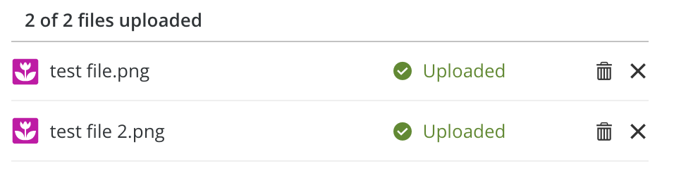
<button
    class="adapt-uploader-item-delete d-icon-trash_adapt btn"
    type="button"
    aria-label="Delete from the server test file.png">
</button>

<button
    class="adapt-uploader-item-remove d-icon-cross_adapt btn"
    type="button"
    aria-label="Remove file test file.png">
</button>

<!-- alternative -->

<button
    class="adapt-uploader-item-remove d-icon-cross_adapt btn"
    type="button">
    <span class="sr-only">Remove file test file.png</span>
</button>
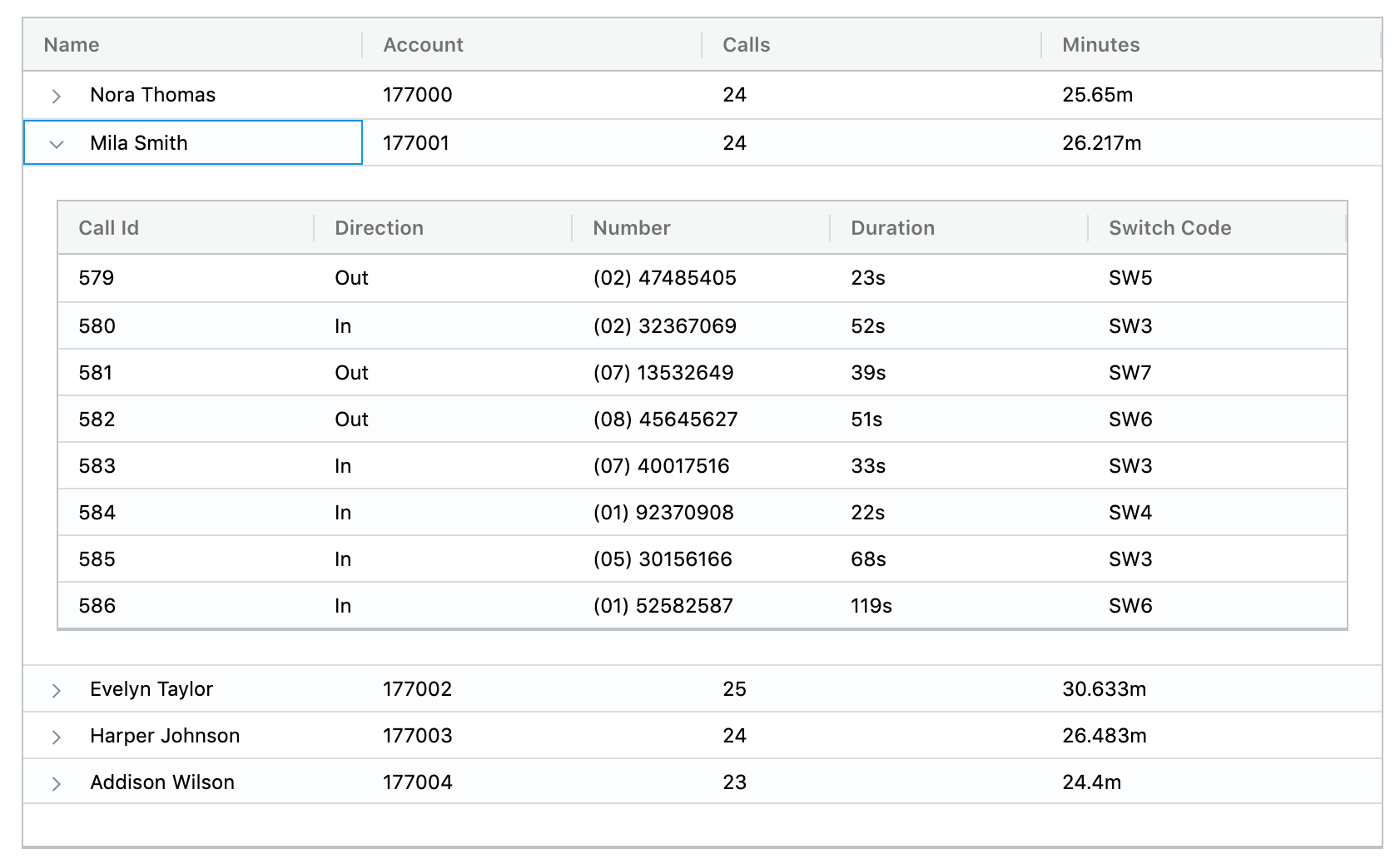
Tables
Dev guidelines
Dev guidelines
Professors for current classes. Optional # First Name E-mail Max Enrollment Room Number Start Time 1 Robert Noyce Mayor@SiliconValley.com 10 629 10:30 2 Richard Feynman bongoDrumsMaster@Quantum.field 15 43 9:30 3 Dr. Frank N. Furter mad_scientist@transylvania.com 4 90-B 11:11
How screen reader will read it for you:
Dev guidelines
  <table aria-labelledby="gridLabel" role="grid" class="table">
    <caption>Professors for current classes. Optional</caption>
    <thead>
    <tr>
      <th scope="col">#</th>
      <th scope="col">First Name</th>
      <th scope="col">E-mail</th>
      <th scope="col">Max Enrollment</th>
      <th scope="col">Room Number</th>
      <th scope="col">Start Time</th>
    </tr>
    </thead>
    <tbody>
    <tr>
      <th scope="row">1</th>
      <td>Robert Noyce</td>
      <td>Mayor@SiliconValley.com</td>
      <td>10</td>
      <td>629</td>
      <td>10:30</td>
    </tr>
    <tr>
      <th scope="row">2</th>
      <td>Richard Feynman</td>
      <td>bongoDrumsMaster@Quantum.field</td>
      <td>15</td>
      <td>43</td>
      <td>9:30</td>
    </tr>
    <tr>
      <th scope="row">3</th>
      <td>Dr. Frank N. Furter</td>
      <td>mad_scientist@transylvania.com</td>
      <td>4</td>
      <td>90-B</td>
      <td>11:11</td>
    </tr>
    </tbody>
  </table>
Dev guidelines
- Use the Simplest Table configuration possible
- Tables should not be used for layout purposes
- Proportional Sizing, Rather than Absolute Sizing
- Content can be presented in different ways (lists, cards)
- Styling even and odd rows
Tips
Forms
Dev guidelines
General principles
- Ensure Forms are Logical and Easy to Use
- Ensure Forms are Keyboard Accessible
- Associate Form Labels with Controls
Dev guidelines
Examples
Dev guidelines
<!-- 0. just a label, one-to-one -->
<label for="address">Enter your address:</label><br>
<textarea id="address" name="addresstext"></textarea>

<!-- 1. groupping logical parts -->
<fieldset>
  <legend>Choose a shipping method:</legend>
  <input id="overnight" type="radio" name="shipping" value="overnight">
  <label for="overnight">Overnight</label><br>
  <input id="twoday" type="radio" name="shipping" value="twoday">
  <label for="twoday">Two day</label><br>
  <input id="ground" type="radio" name="shipping" value="ground">
  <label for="ground">Ground</label>
</fieldset>

<!-- 2. aria labels -->
<label for="fname">
<input aria-labelledby="fname"/>

<!-- 3. inputs in tables, one-to many -->
<th id="namelabel" scope="col">Name</th>
<input type="text" name="name1" aria-labelledby="namelabel">

<!-- Note: If a control has both an associated <label> and aria-labelledby,
     the referenced aria-labelledby text will override and be read of
     instead of the associated <label> -->
More examples
Dev guidelines
<!-- 4. aria-describedby -->
<label for="resetpass">Reset Password:</label>
<input type="password" name="resetpass" id="resetpass" aria-describedby="newpass">
<br>
<span id="newpass">
    New password must be 8-15 characters and include letters and numbers
</span>

<!-- 5. hidden label -->
<label class="sr-only" for="s">Search Terms</label>
<input type="text" id="s" name="s">

<!-- 6. title -->
<input id="s" type="text" name="s" title="Search Terms">

<!-- 7. Or aria-label -->

<input id="s" type="text" name="s" aria-label="Search Terms">

<!-- Note: Only one of these recommendations should be implemented.
     Using two or more together (e.g., a hidden <label> and a duplicate title attribute)
     can cause information to be repeated by a screen reader. -->
Dev guidelines
- Use <label> element when you can. It has excellent browser and screen reader support, and users can click on the label to select the associated form control
- Use aria-labelledby to overcome the 1:1 limitations of <label>
- Use aria-describedby in addition to a label when you need to associate descriptive text to the form control
- Use a hidden <label> or title or aria-label when a visible text label is not available
Images
Dev guidelines
Dev guidelines
<!-- 0. Informative images -->
<img src="pune.jpg" alt="Pune City map"/>

<!-- 1. Decorative images: Provide a null text alternative (alt="") -->
<img src="decoration.png" alt=""/>

<!-- 2. SVG usage in img-->
<img src='/images/blue-triangle.svg' role='image' alt='Blue Triangle'/>

<!-- Note: this is a decorative image, it's better to put alt="" -->

<!-- 3. Inline SVG -->
<svg aria-labelledby="title">
  <title id="title" lang="en">Bar chart</title>
  <desc>Bar chart showing company sales by country, in millions of dollars (US).</desc>
  <g>
    <rect x="0" y="0" width="100" height="50" fill="red" />
  </g>
</svg>

<!-- 4. Iconfont -->
<i class="d-bicycle" aria-hidden="true" title="Time to destination by bike"></i>
<span class="sr-only">Time to destination by bike:</span>
ARIA
(Assistive Rich Internet Applications)
ARIA
ARIA has no effect on how elements are displayed or behave in browsers
ARIA
Role does not ever change for an element once it is set
- landmark
- document
- widget
- abstract
4 categories of ARIA roles:
role="<ROLE TYPE>"
ARIA
Landmark ARIA Roles
better way to navigate and identify the different parts of a web page
<nav class='mobile-nav' role='navigation' aria-label='Mobile Menu'> List of Links </nav>
- banner
- complementary
- contentinfo
- form
- main
- navigation
- search
ARIA
Document ARIA Roles
describe the structure of the content on the page, as opposed to the structure of the whole page, which landmark roles describe
- article
- columnheader
- definition
- img
- math
- heading
- toolbar
- list
- note
ARIA
Widget ARIA Roles
are used to describe what are often javascript-based interfaces
- alert
- alertdialog
- button
- checkbox
- dialog
- radio
- tab
- tabpanel
- textbox
ARIA
ARIA States & Properties
Properties often describe relationships with other elements, and for the most part, do not change once they’re set.
States are more dynamic and are typically updated with JavaScript as a user interacts with a page.
- aria-autocomplete
- aria-describedby
- aria-disabled (state)
- aria-expanded (state)
- aria-hidden (state)
- aria-label
- aria-labelledby
Tools, resources
- https://material.angular.io/cdk/a11y
- http://wave.webaim.org/
- https://developers.google.com/web/tools/chrome-devtools/accessibility/reference
- https://github.com/collections/web-accessibility
- http://www.freedomscientific.com/Downloads/#JAWS
- https://www.3pillarglobal.com/insights/accessibility-testing-using-jenkins-google-accessibility-developer-tools
- https://github.com/liip/TheA11yMachine
- ARIA http://whatsock.com/training/matrices
- ARIA https://github.com/accdc/visual-aria
Tools
Event handlers
https://webaim.org/techniques/javascript/eventhandlers
Buttons vs Links
http://www.webaxe.org/proper-use-buttons-links/
http://adrianroselli.com/2016/01/links-buttons-submits-and-divs- oh-hell.html
https://www.smashingmagazine.com/2019/02/buttons-interfaces/
Tables
https://www.w3.org/WAI/tutorials/tables/
https://webaim.org/techniques/tables/
Forms
https://designsystem.digital.gov/components/form-templates/
Tools
Accessibility
By Nicholas Sorokin


