Simple components creation workflow
with Storybook


Agenda
1. Intro
2. Typical story structure
3. Args
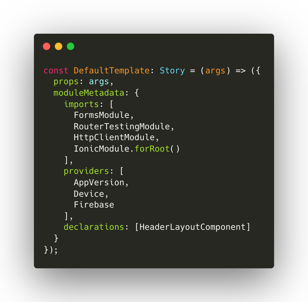
4. moduleMetadata
5. Formats (TS vs MDX)
6. Live coding

Intro
- is a tool for UI development
- makes development faster and easier by isolating components
- You can develop entire UIs without needing to start up a complex dev stack, force certain data into your database, or navigate around your application


Typical story structure

// Imports
import { Meta, Story } from '@storybook/angular';
import { action } from '@storybook/addon-actions';

import { HBChildTogglePhotoComponent } from './hb-child-toggle-photo.component';

// Meta
export default {
  title: 'JS Stories/components/HBChildTogglePhotoComponent',
  component: HBChildTogglePhotoComponent,
} as Meta;

// Template
const DefaultTemplate: Story = (args) => ({
  props: args,
});

// Stories
export const Default = DefaultTemplate.bind({});

Default.args = {
  picture: 'https://loremflickr.com/640/640',
  clickListener: action('clickListener'),
};


Args


- What do you mean by "Args"?
- Story level
- Component level
moduleMetadata


Now a bit of a live coding


Contacts

oleksandr.hutsulyak@techmagic.co


kami_lviv
Useful Links
- React testing library docs:
https://testing-library.com/docs/ - Jest documentation:
https://jestjs.io/docs/getting-started - Arrange-Act-Assert: A Pattern For Writing Good Tests: https://automationpanda.com/2020/07/07/arrange-act-assert-a-pattern-for-writing-good-tests/

- What if I don't have a time for all of those?
- What to cover in a first place?
- TDD or BDD (before or after?) or both?
- TheOutplay - BDD+TDD based on QA test runs and acceptance criteria
- Storybook as example of Visual component testing
Simple components creation workflow with Storybook
By Oleksandr Hutsulyak
Simple components creation workflow with Storybook
- 561


