Introduction to Material Design
"Quantum Paper"
Material Design
If every pixel on the screen somehow lived in a virtual world – what would the rules of that world be like?
- Physical Surfaces
- Light/Shadow
- Elevation
- Motion
- Transformation
Environment
- A world in which all objects have dimension in 3D space (orthographic, not perspective)
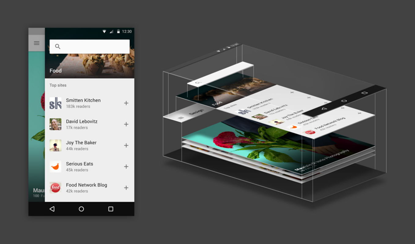
- Material has X, Y, and Z dimensionality
- Material is solid and does not overlap in X and Y
Dimensionality
- Screen density = screen pixels wide / screen width in inches
- or pixels per inch (aka DPI - dots per inch)
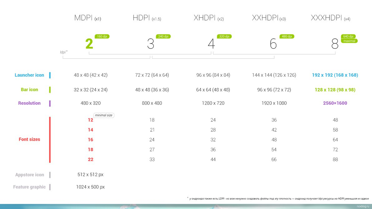
Dimensionality
- Screen density = screen pixels wide / screen width in inches
- or pixels per inch (aka DPI - dots per inch)
- Density-independent pixels (dp)
- width in pixels * 160 / screen density
- UI elements and images
- Scaleable pixels (sp)
- dp * scaling factor (user's font size preference)
- Typeography
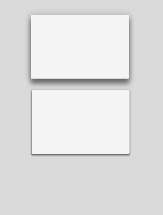
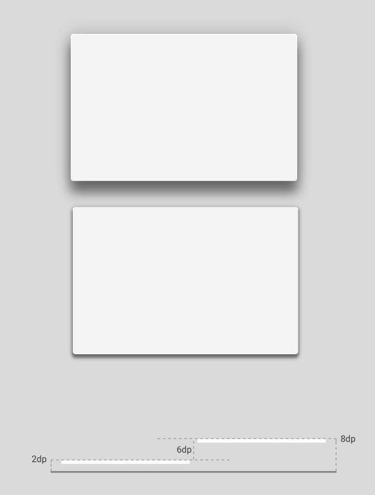
Light and Shadow
Material at higher Z values will cast a shadow upon those materials visible at lower Z positions.
Both directional lighting and ambient lighting is observed.
The Material Design Specification
https://design.google.com/spec/
Material Design Lite
http://www.getmdl.io/
- Google sponsored development effort
- Very active community, 17K+ stars on Github
- Good browser support
Material-UI
http://www.material-ui.com/
- React Framework
- Very active community, 12K+ stars on Github
Polymer
https://www.polymer-project.org/
- Web Components (html templates, shadow dom, html import, custom elements) [Chrome and Opera are ready]
- Polyfills/Shims (until browsers are ready)
- Canonical implementation of Material Design
Materialize
http://materializecss.com/
- 4 guys from Carnegie Mellon University
- Awesome support of the specification
- Commit activity may be slowing
- 15K+ stars on GitHub
Angular Material
https://material.angularjs.org/
- Angular JS 1.x Library
- 12K Stars on GitHub
- Strong community support
Angular Material
https://material.angularjs.org/
- Developed and deployed under Angular JS team
- Version 1.0 released December 8, 2015
- Version 1.0.1 released December 17, 2015
- 1.0 works with Angular 1.3.19+ and 1.4.6+
- Recommend material-start seed project
https://github.com/angular/material-start - Angular Material compatibility with Angular 2.0 is a work in progress
Angular Material Basic Demo
Material
Material Rules
- Varying x & y dimensions
- Uniform thickness (1dp)
- Material cast shadows
- Material is solid
- Multiple material cannot occupy the same point in space
- Material cannot pass through other material
Material Transformations
- Material can change shape
- Material grows and shrinks only along its plane
- Material never bends or folds
- Material sheets can split and join
- Material sheets can "heal"
Content
- Content is applied to the surface of material
- Content is bounded by the material's bounds
- Content does not have thickness
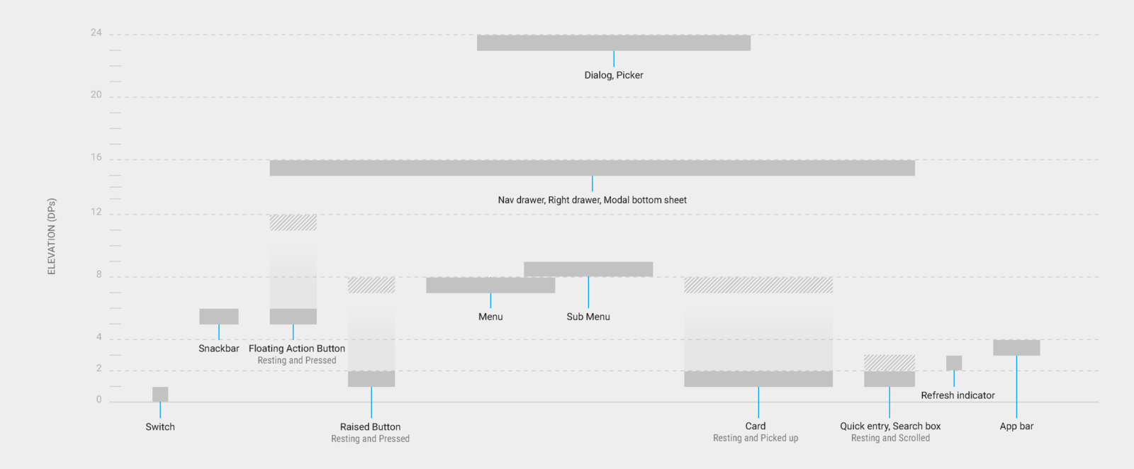
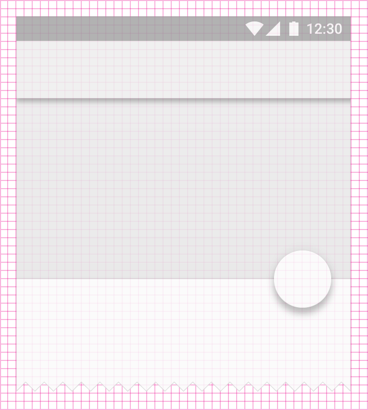
Elevation
All material objects have a resting elevation that is dependent upon the device
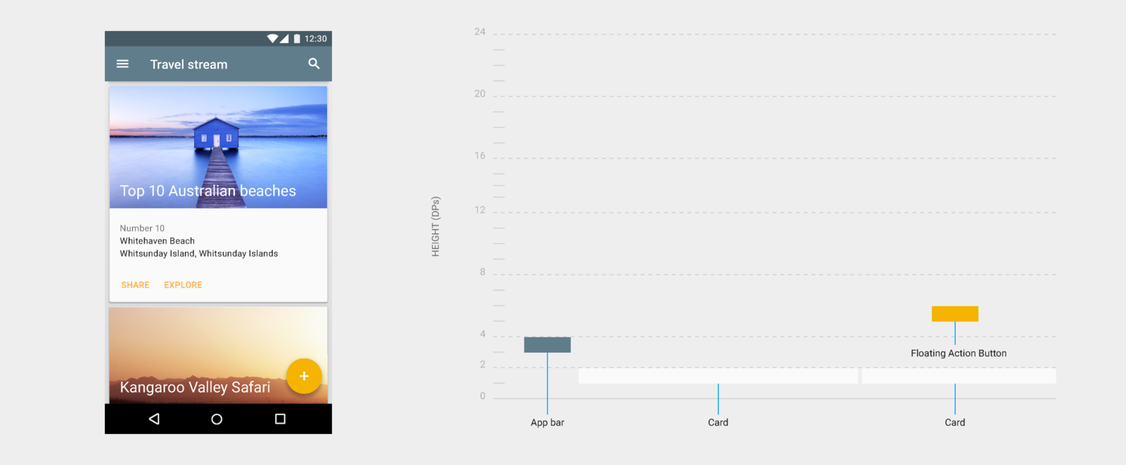
Elevation
All material objects have a resting elevation that is dependent upon the device
Layout
Layout Concepts
- Are numerous, way too many to cover
- Material design has given great thought to templates, relative ratios, and device-independent dimensions
- Mobile-first design philosophy
Material design layout can be used
grid-based and structurally.
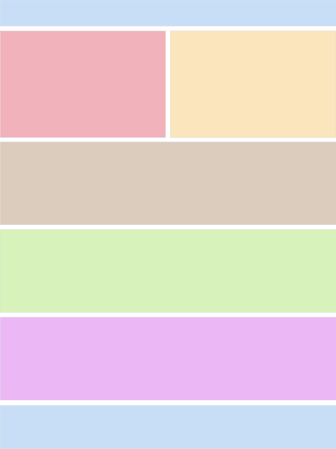
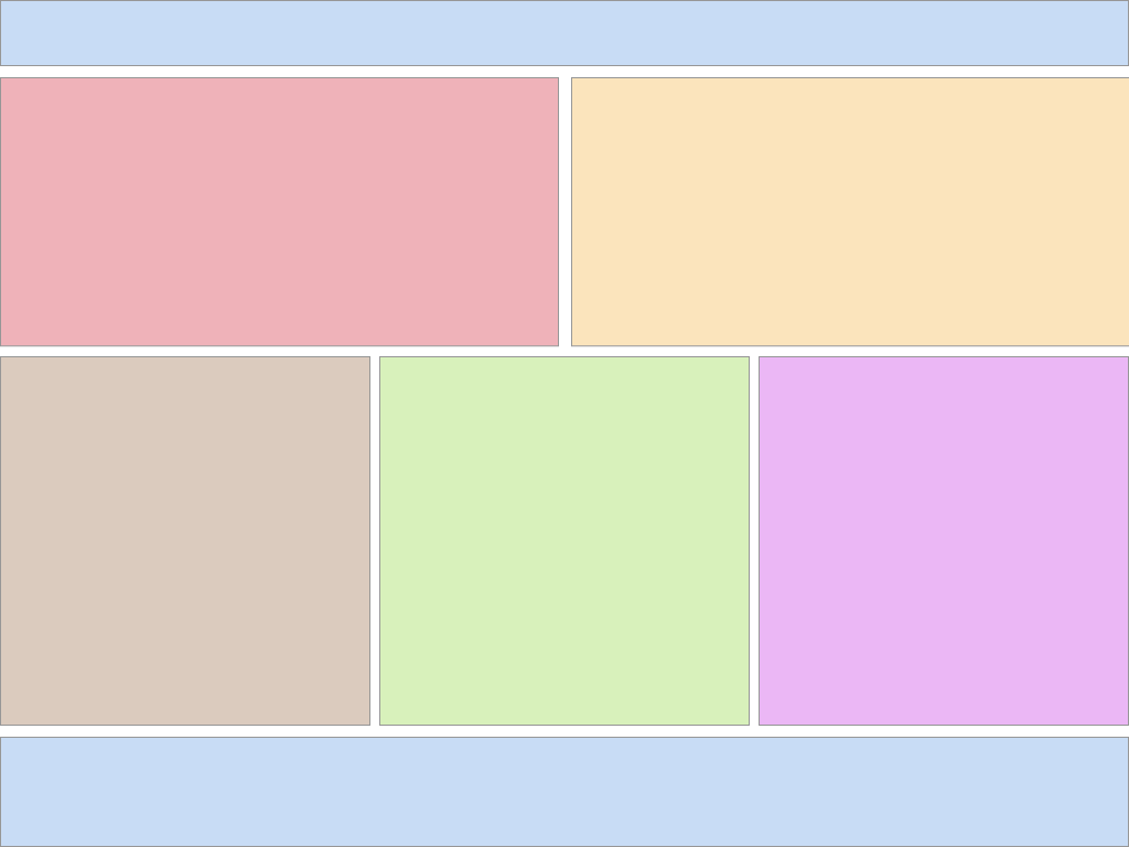
Flexbox
Angular Material leverages the CSS3 flexbox specification.
Angular directives provide attributes to declaratively define a layout environment that goes beyond grids.
Directives are replaced with class styles that are further defined in angular-material.css.
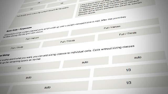
Responsive Grid
Material Design specifies a grid based on a 12 column layout and uses fixed margin/gutter sizes based on window size.
Conditional Visibility
Example
Responsive Layout
SideNav
Structural
- All components align to an 8dp square baseline grids
- Layout is comprised of structured components – not (necessarily) a grid
<md-toolbar>
<md-list>
<md-input-container>
<md-fab-trigger>
Style
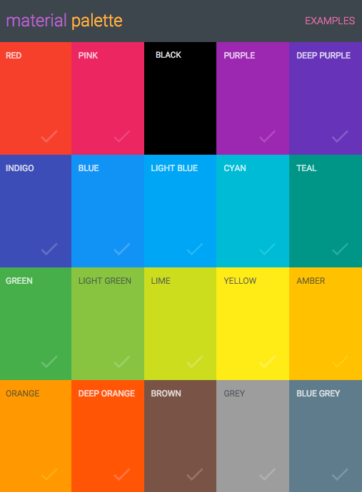
Color
- Bold and vibrant
- Preset palettes
- Custom colors are allowed
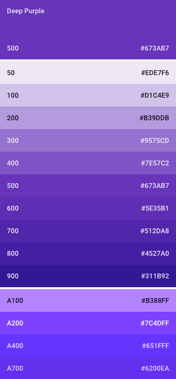
Shades of Color
- Varying degrees of intensity
- Primary and secondary palettes
- 500 colors for primary
- Other colors for accent
- Toolbars and large color blocks use 500
- Status bar should be 700
- Accent color indicates primary action, links, switches and sliders
Color Palette Demo
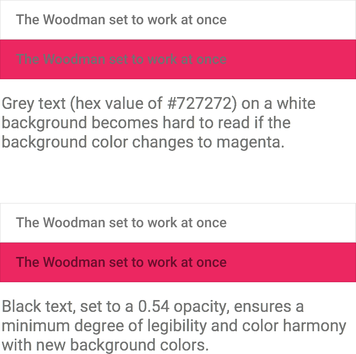
Opacity
Do not use opacity on materials
Opacity should be reserved to differentiate typography
- Important text is 84%
- Secondary text is 54%
- Hints are 38%
- Disabled text
- 38% for dark on light
- 30% for light on dark
- Inactive icon is 26%
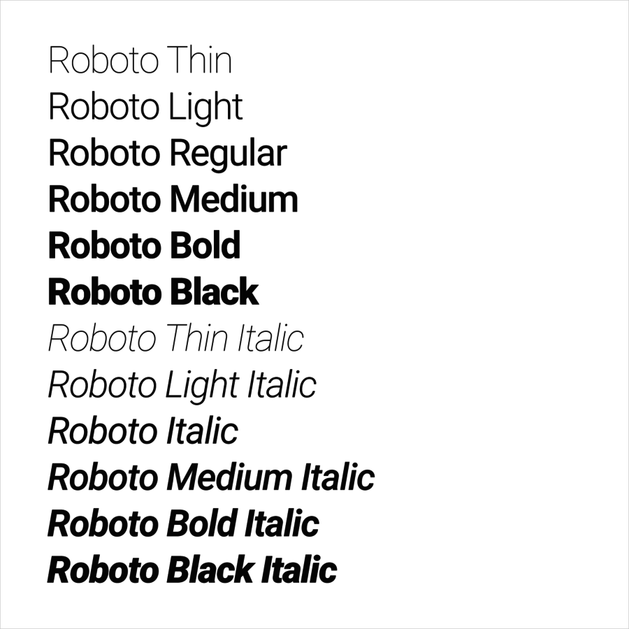
Typography
The Roboto typeface was developed by Google as the system font for Android
Licensed under Apache
Originally announced in 2012, and redesigned with the launch of Material Design
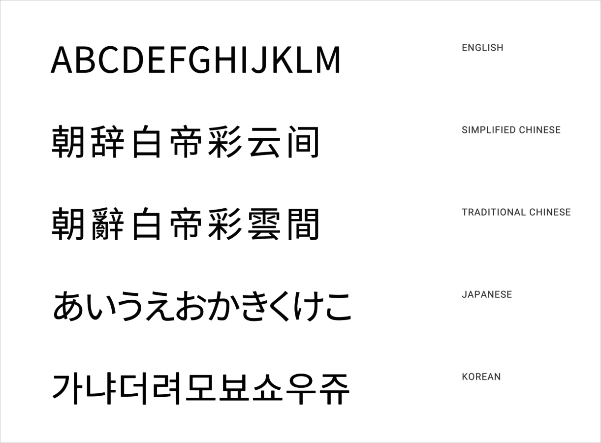
Typography
The Noto typeface was commissioned by Google and derived from Droid fonts
Licensed under SIL Open Font
Still under development with plans to support all of Unicode 6.2
98 fonts as of March 2015
Type Styles
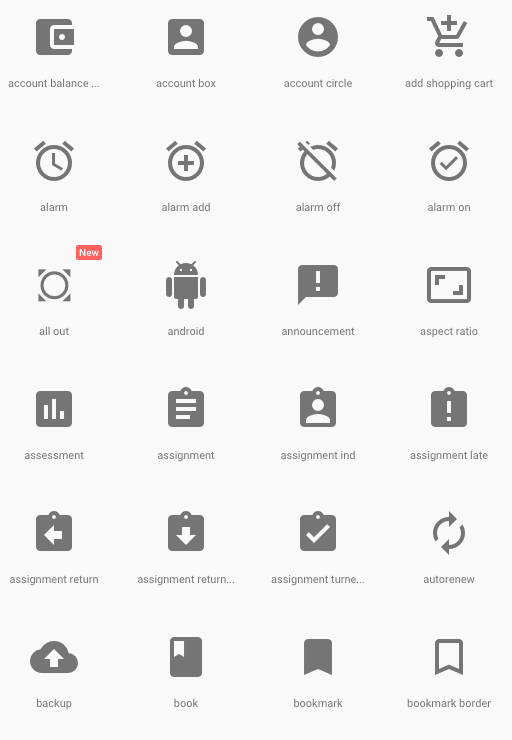
Icons
- Bold shapes
- Geometric principles
- <md-icon> directive
- Support for bitmap and SVG
- Actual icons come from Google's Material Design icon page
- Ability to load bundle svg icons into a single file
Animation
Animation Fundamentals
- Material has mass and weight
- Acceleration is smooth and eases
- Movement has purpose and promotes visual continuity
- Directs the user's attention
- Movement is not direct
- Direction is more like birds, and less like atoms
- Angular Material provides intra-component animation
- On your own for cooler transitions
Animation Fundamentals
Components
Questions?
Intro to Material Design
By James Cook