Album digipak
forms and Conventions
Digipak function
The function of a digipak is to appeal to the target audience (TA) and encourage them to buy the album. Together, the panels must work synergistically to promote the album and the artist's image. The outside panels work to entice the TA and perk their interest. Whereas, the inside panels' role is to offer something alternative that the TA would enjoy and will hook them into becoming a fan of the artist so that they will spend money on merchandise and concert tickets.


Eponymous albums

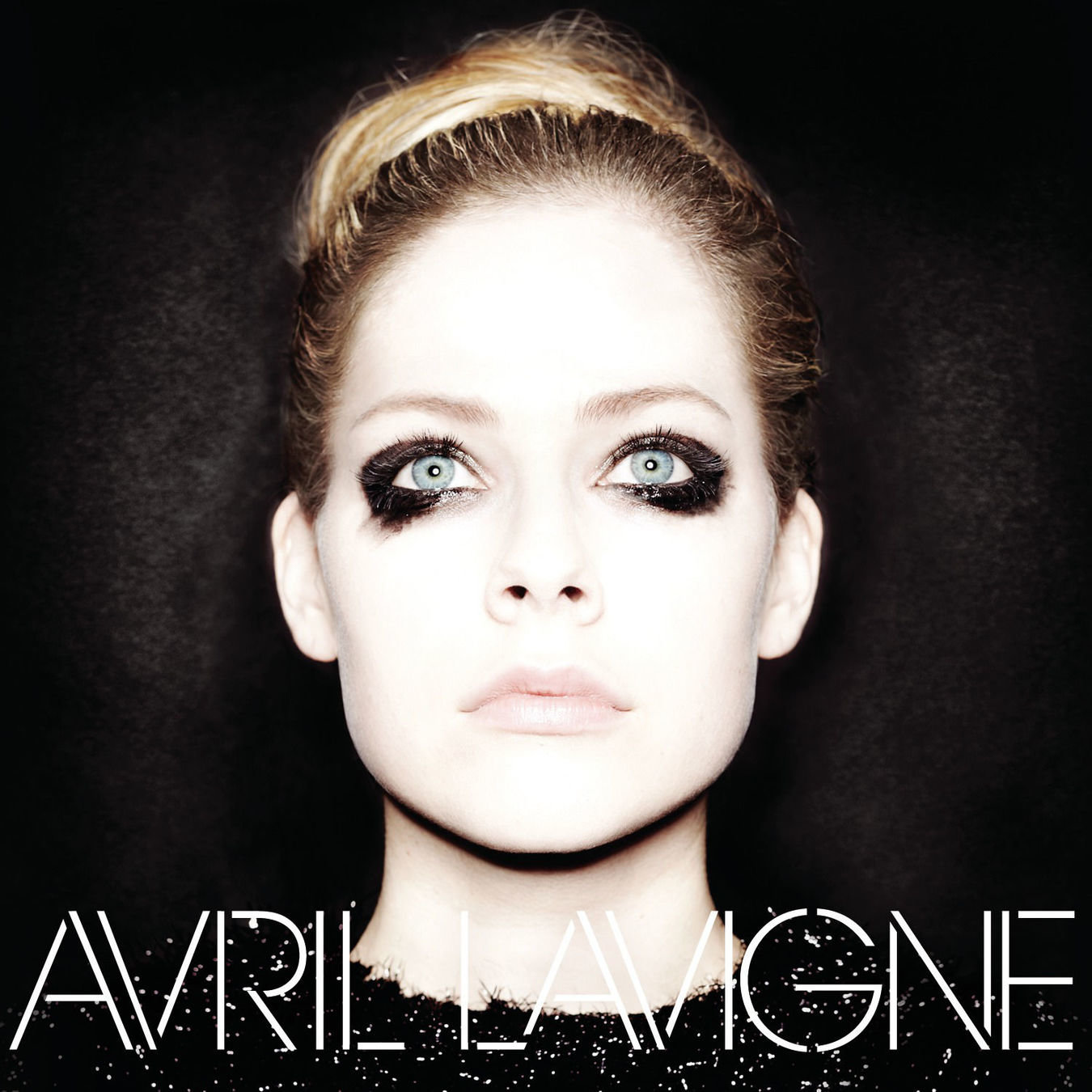


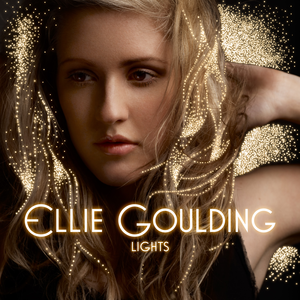
I learned, from my research into female pop artist albums, that it is conventional for artists to have an eponymous (self-titled) album. Although debut albums are less likely to be eponymous, I found that it was still a convention amongst pop artists such as Birdy, Dua Lipa, Jennifer Lopez and Taylor Swift.


We decided to conform to this convention as we wanted GiGi's debut album to reflect her as an artist. We characterised GiGi so that she writes her own songs and she would want the album to revolve around her, her ideals and her distinct image.
Debut albums
As you can see, it is conventional for debut albums to feature an image of the artist. This is because they need to establish themselves as a brand from the very beginning and express their unique selling point to their target audience.


Although not necessary for all debut albums, the focal image tends to be a close up (CU) or medium close up (MCU) and the artists directly addressing the camera and, therefore, the target audience to form a personal relationship with them, appeal to their preferences, gratify their needs and convince them to buy the album. We chose to use conform to this convention and have a MCU of GiGi looking straight into the camera like Rita Ora, Ke$ha, Charli XCX and Zara Larsson.


Rihanna - Good Girl Gone Bad


Focal image of Rihanna
Direct address
Name of artist
Album title
Barcode
Tracklist
Institutional information
Record label logo
Spine: record label, Artist name, Album title, serial number
Rihanna - Good Girl Gone Bad
Rihanna's album cover features visual images of the artist on both the front and back covers. While it is definitely a convention to have a focal image of the artist on the front cover, she also has an image of herself on the back cover, which is less conventional.
The barcode, tracklist and institutional information are on the back cover, a convention which most albums conform to. However, Rihanna breaks the convention of having all the institutions run along the bottom. Instead, the institutions are along the right had side, where her face is partially obscured.
The different shot types used on the front and back covers are used to accentuate the different sides to Rihanna. On the back cover, Rihanna directly addresses the audience with a bold stare but her lips are slightly parted to give an innocent look. Whereas on the front cover, Rihanna's body language makes her appear timid or shy but she has a mysterious air around her from the dark shadows. This could be to convey the meaning of the album's title - Good Girl Gone Bad. She has aspects of both naivety and confidence in both images, but overall, she exudes an alluring aura to captivate her target audience.
The number on the barcode matches the serial number along the spine.
Selena Gomez - Stars Dance
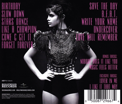

Artist as the focal image
Album title
Artist's name
Tracklisting
Institutions
Record label logo
Barcode
Selena Gomez - Stars Dance
Selena Gomez's album has a focal image of herself on the front and back cover. On the front cover of the digipak, there is an MCU of Selena Gomez directly addressing the audience. This is a trend that I spotted in a few debut artist's album covers and Selena's pose reaffirms my ideas about this as a conventional shot type.
The front and back covers are synergistic. This has been achieved through using the same tall font and pink colour that stands out from the back and white background. Selena is wearing the same headgear and gladiator style outfit in both panels.
Similar to Rihanna's digipak for "Good Girl Gone Bad", the institutional information doesn't run across the bottom of the page, but instead it takes up the bottom left corner.
On the front cover, Selena is directly addressing the audience by looking directly into the camera, portraying herself as confident. Her lips are slightly parted to soften her face and open up her features to also give her an amiable look. On the back cover, however, Selena directs her harsh gaze off screen. She tenses her jawline and places her hands on her hips to give herself a strong and warlike defiant aura.
Album conventions
By phoebexhung


