


Alexander Vassbotn Røyne-Helgesen PRO
Lover of life, technologist at heart
Manager, Front-end Developer @ Bekk
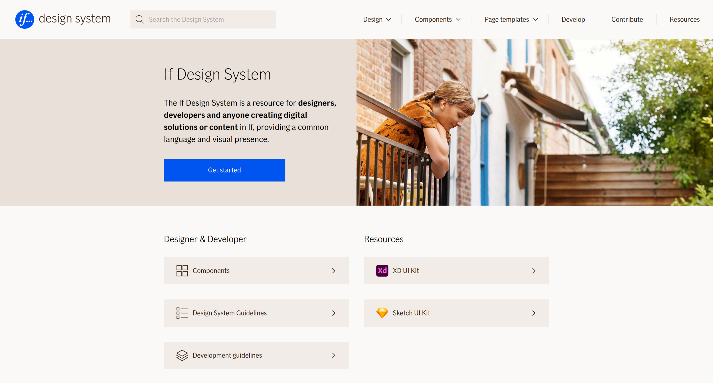
@if-design-system
if-design-system
packages
├── …
├── alert-banner
├── autocomplete
├── autocomplete-js
├── …
├── datepicker
├── datepicker-webcomponent
├── …
├── faq
├── faq-js
├── faq-webcomponent
├── …
├── help-tooltip
├── help-tooltip-webcomponent
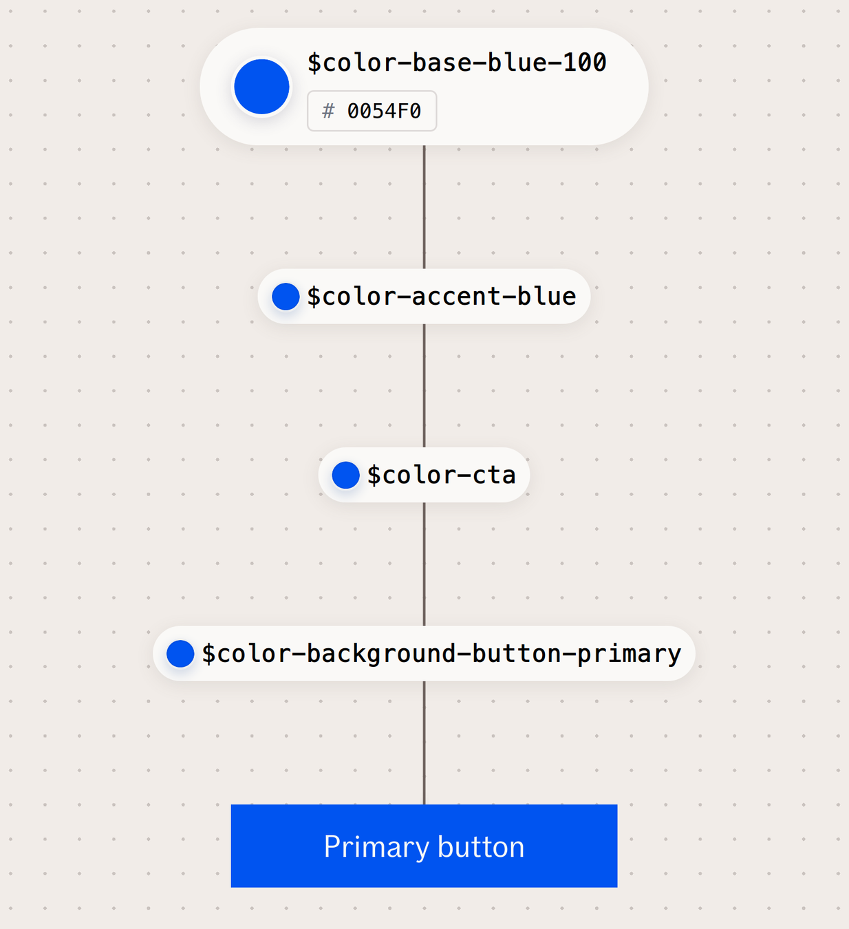
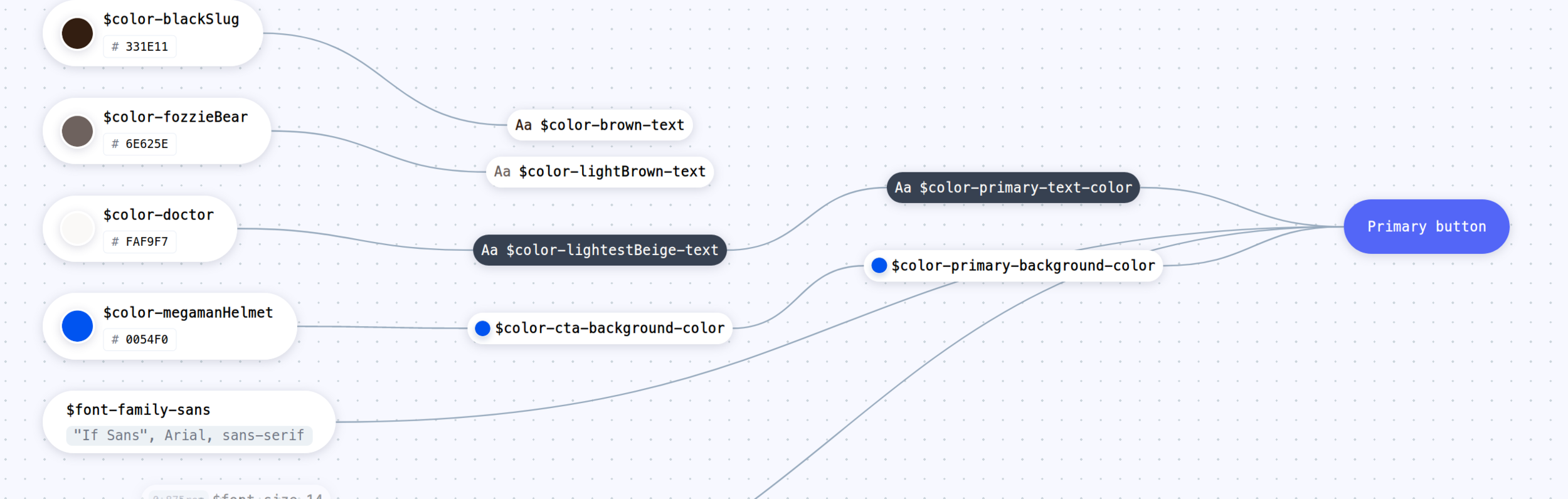
├── …... is a central location to store design related information such as colors, fonts, animations and so on. These raw values can then be transformed and be formatted to fit the needs of any platform.”
With design tokens, you can capture low-level values and then use them to create the styles for your product or app. You can maintain a scalable and consistent visual system for UI development.”
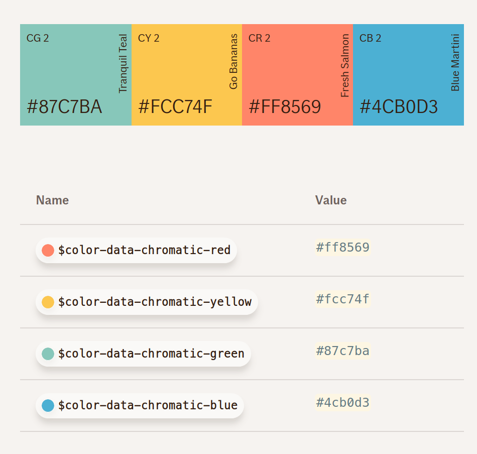
props:
  - blue:
    value: 'rgb(0,84,240)'
    hex: '#0054f0'
    realName: 'megamanHelmet'
    name: 'color-blue-accent'
    stylus: '$color-blue-accent'
    scss: '$color-blue-accent'
    less: '$color-blue-accent'
    versionName: 'blue'
    boldName: BL 1
    rgb: 'rgb(0,84,240)'
global:
  type: color
  category: accent
@import '@if-design-system/color/accent.less';

a {
  color: @color-blue-accent; /* #0054f0 */
}
import React from 'react';
import accentColor from '@if-design-system/color/src/accent.js'
const Button = ({...props}) => (
<button
type="button"
onClick={...}
onKeyPress={...}
style={{
backgroundColor: accentColor.blue.rgb
}}
>
{title}
</button>
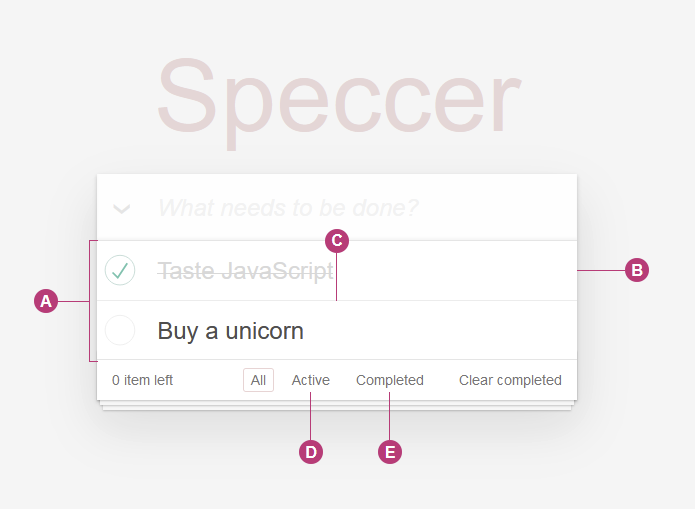
)https://github.com/phun-ky/speccer
npm i --save @phun-ky/speccer$ratio = 7
getCorrectContrastColor($bgcolor)
if(contrast($bgcolor, $white).ratio > $ratio){
color $white
} else if(contrast($bgcolor, $darkerGrey).ratio > $ratio){
color $darkerGrey
} else {
color $darkerSlate
}
By Alexander Vassbotn Røyne-Helgesen
Today, more and more development is done in tight relation with designers and UX-designer, triggering the need for a design system that is tightly coupled with both design and code. Up until recent years, the design communication has gone one way, from the designers to the developers. This talk covers the process I came up with on securing design/develop communication both ways when building a design system. We will cover generation of preprocessor styles with design tokens and how we generate our design systems continuously. I will also cover the importance of a design system and on how we make sure the documentation is clear, understandable and how we emphasize the end user AND the user of the design system. With weight on accessibility for the end user, how we create documentation examples and the technical aspects tied into the design system.


