


Schalk Venter
🔧 Front-end Development / 🎨 UI Design / 🌍 Social Good / ❤️ Destigmatising mental illness
🕵 What is Interaction design?
🚦 Interaction Design as design of internal state changes.
3️⃣ Three types of user feedback.
☠️ Why validation is the hardest of these.
🛸 Comparing post-submission vs. real-time validation.
🍬 General tips.
"Perhaps even more than "design" and "systems," debates over the term "interactivity" have run rampant. Interactivity is one of those words that can mean everything and nothing at once. If everything can indeed be considered interactive, then the concept loses its ability to help us solve design problems. In corralling this
runaway word, our aim is to try and understand it in its most general sense, but also to identify those very particular aspects of interactivity that are relevant to games.
Katie Salen
Rules of Play (2003)
"Interaction comes in many forms. But for the purposes of designing interactivity, it is important to be able to recognize what forms of interactivity designers create. As an example, compare the following two actions: someone dropping an apple on the ground and someone rolling dice on a craps table. Although both are examples of interaction proper, only the second act, the rolling of the dice, is a form of designed interaction.
Katie Salen
Rules of Play (2003)
"These are the five stages of a choice, the five events that transpire every time an action and outcome occur in a game. Each stage is an event that occurs internal or external to the game. Internal events are related to the systemic processing of the choice; external events are related to the representation of the choice to the player. These two categories make a distinction between the moment of action as handled by the internal game state and the manifestation of that action to the player"
Katie Salen
Rules of Play (2003)
"Within each action [to] outcome event is a series of five stages that help construct a choice in a game. These stages are expressed through the following questions:
1. What happened before the player was given the choice?
2. How is the possibility of choice conveyed to the player?
3. How did the player make the choice?
4. What is the result of the choice? How will it affect future choices?
5. How is the result of the choice conveyed to the player?"
Katie Salen
Rules of Play (2003)
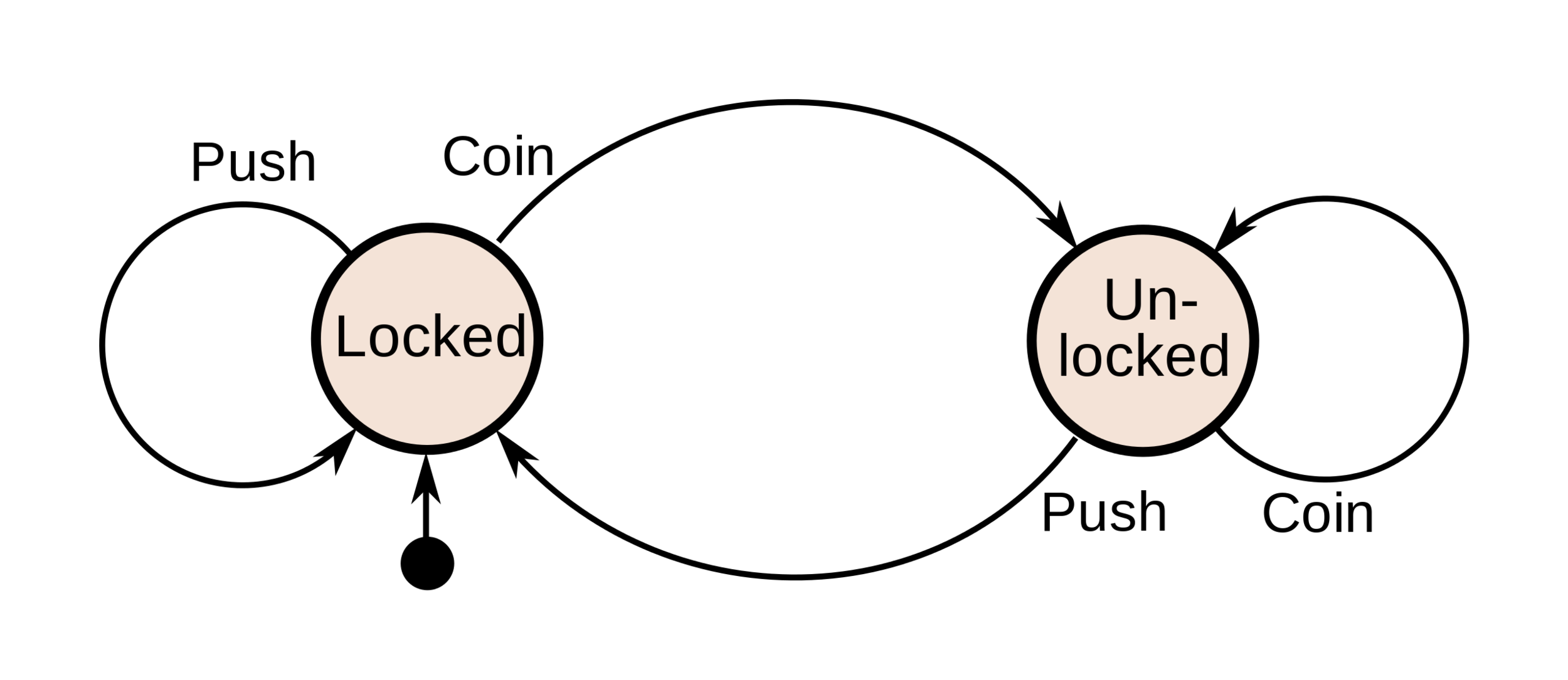
"A game is actually what computer science describes as a state machine. It is a system that can be in different states. It contains input and output functions, as well as definitions of what state and what input will lead to what following state. When you play a game, you are interacting with the state machine that is the game. In a board game, this state is stored in the position of the pieces on the board, in computer games the state is stored as variables, and then represented on the screen."
Jesper Juul
An Examination of Game Temporality (2004)
"It is an abstract machine that can be in exactly one of a finite number of states at any given time. The FSM can change from one state to another in response to some inputs; the change from one state to another is called a transition. An FSM is defined by a list of its states, its initial state, and the inputs that trigger each transition."
Wikipedia
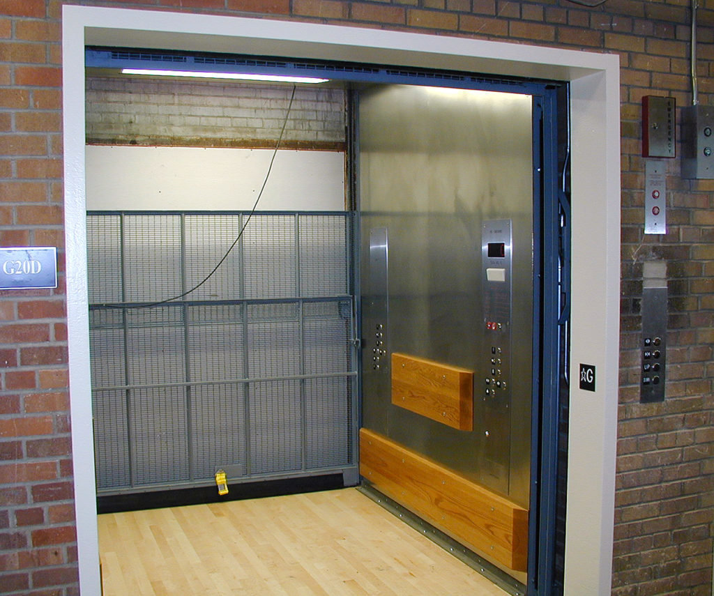
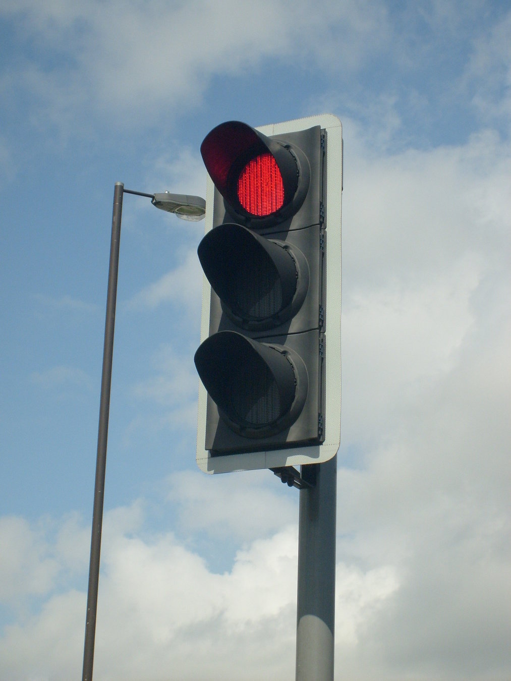
"Simple examples are vending machines, which dispense products when the proper combination of coins is deposited, elevators, whose sequence of stops is determined by the floors requested by riders, traffic lights, which change sequence when cars are waiting, and combination locks, which require the input of a sequence of numbers in the proper order."
Wikipedia
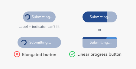
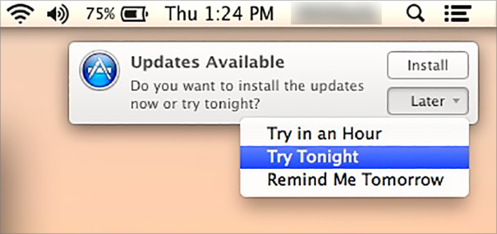
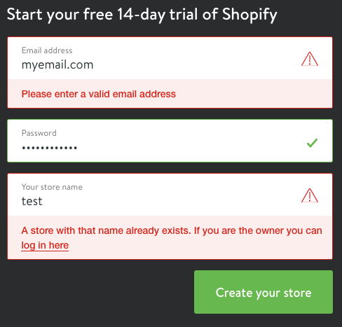
"Let's assume that you've answered all the questions on a form correctly and selected the primary action to signify you're done. Then what? If nothing changes, perhaps the site didn't register your click. Is your information being processed? When in doubt, most people will try again. Depending on how a form is developed, this may lead to a duplicate submission. Now you've done what you were trying to accomplish twice!"
Luke Wroblewski
Web Form Design (2008)
"In interaction design, a system, whether an application, website, or piece of hardware (anything from a smartwatch to a thermostat), should always keep users informed, by providing appropriate feedback. Ensuring that the state of the system is always visible is one of the 10 usability heuristics for interface design. Information about system status, such as error messages and notifications of system activity, allows users to fully understand the current context."
Kim Salazar
Nielsen Norman Group (2015)
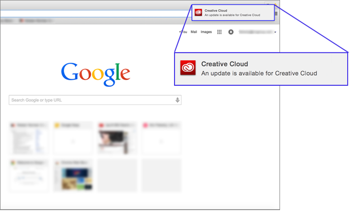
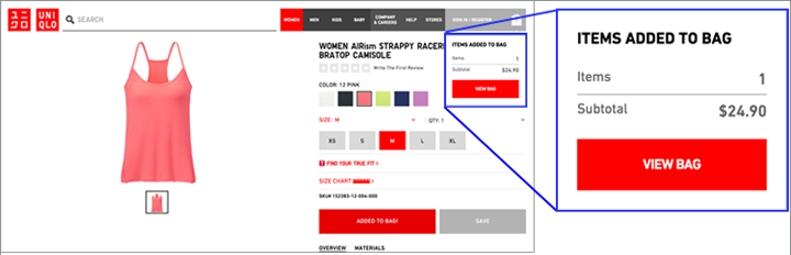
"Three common approaches for status communication include validation, notifications, and status indicators. These terms are used sometimes interchangeably in product design, but they stand for different communication methods that should be used in different circumstances. Understanding the differences between them will help you sharpen your feedback to users by choosing the best option for each need."
Kim Salazar
Nielsen Norman Group (2015)
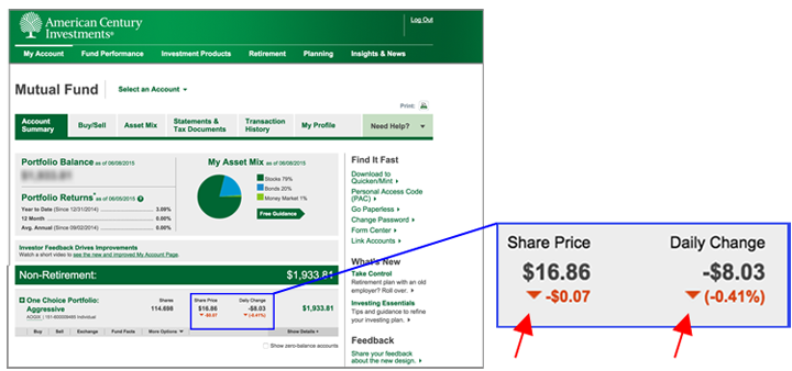
"An indicator is a way of making a page element (be it content or part of the user interface) stand out to inform the user that there is something special about it that warrants the user’s attention. Often, the indicator will denote that there has been some change to the item represented by that element."
Kim Salazar
Nielsen Norman Group (2015)
"Notifications are informational messages that alert the user of general occurrences within a system. Unlike validation, notifications may not be directly tied to user input or even to the user’s current activity in the system, but they usually inform the user of a change in the system state or of an event that may be of interest. In the case of email, social networks, and mobile-phone applications, notifications can even be delivered while a user is away from the application."
Kim Salazar
Nielsen Norman Group (2015)
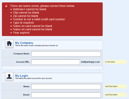
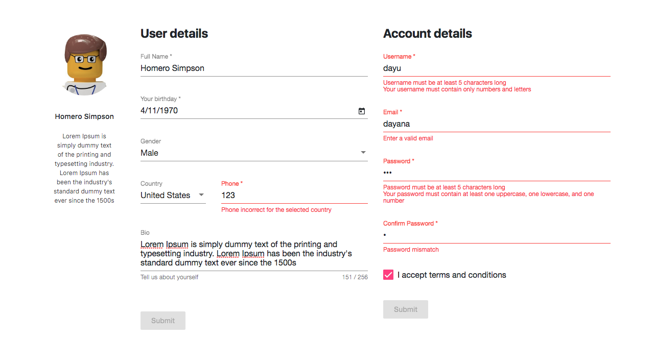
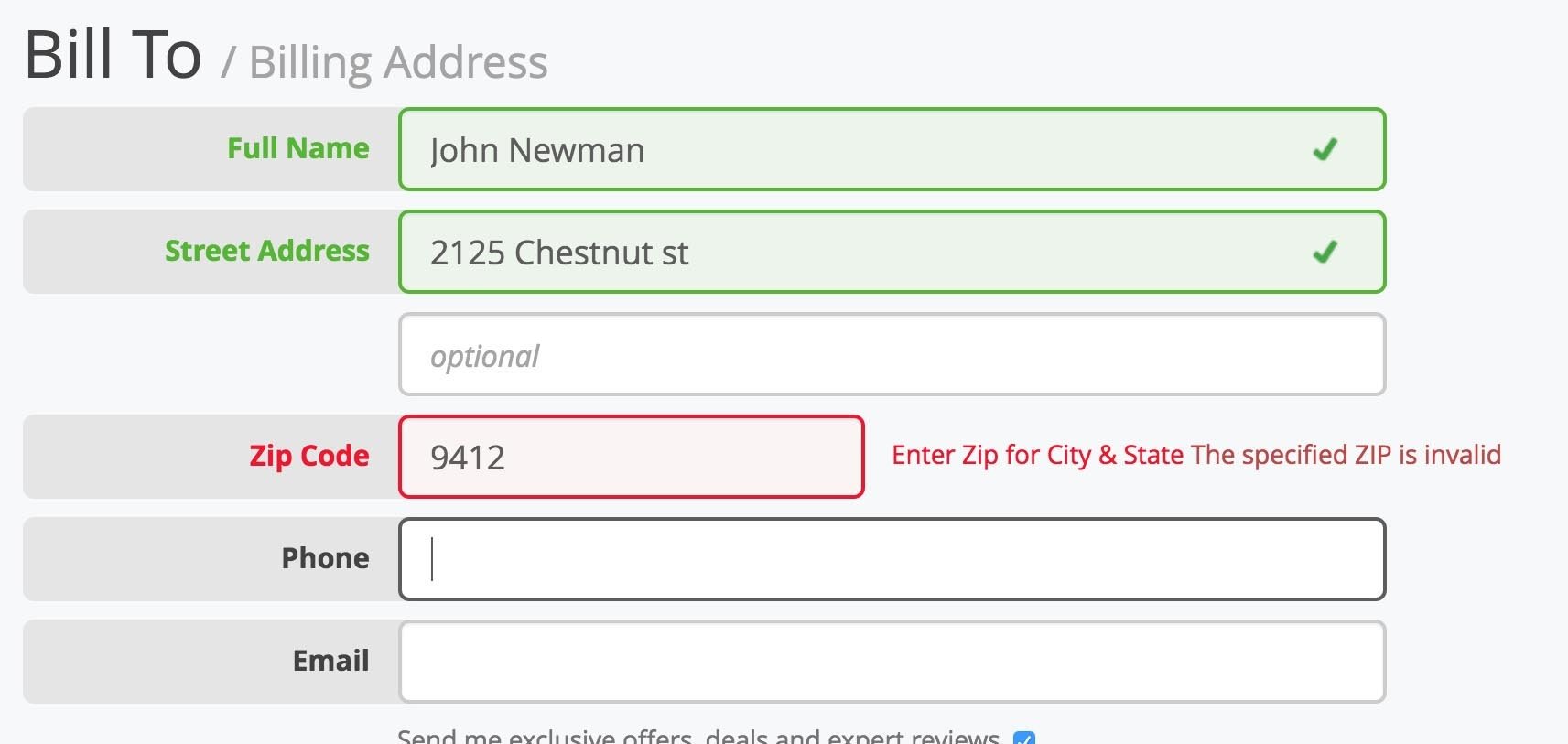
"Validation messages are error messages related to users’ inputs: they communicate whether the data just entered was incomplete or incorrect. For example, in e-commerce systems, validation messages often involve information such as name, billing address, and credit-card information."
Kim Salazar
Nielsen Norman Group (2015)
| Validation | Notifications | Indicators |
|---|---|---|
| 🏠 Contextual | 🌍 Global | 🌍🏠 Global or Contextual |
| ☎️ Request | ☎️📺 Request or Passive | 📺 Passive |
| 🧑 User | 🌈 System | 🧑🌈 User or System |
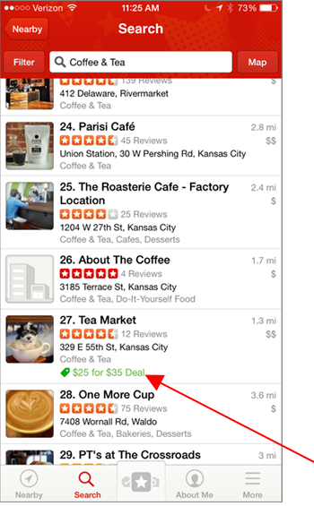
"This information is contextual and important to users who have specifically searched for a place to have tea. You may think that an alternative way of alerting users of potential [special] deals would be to send them a notification when such a deal has become available. Wrong! A notification sent irrespective of the current user goal would likely be ignored, and may even annoy users because it will disrupt their current task and be irrelevant to their current needs."
Kim Salazar
Nielsen Norman Group (2015)
"There are no other reasons to show an error message. If you show something that looks like an error message in order to market something to the customer, you are a bad person."
Luke Wroblewski
Web Form Design (2008)
"Step one for dealing with errors is letting people know they happened. Though this may seem like a trivial point, all too often error messages don’t get the attention they deserve. When present, an error message is arguably the most important element on the page. It prevents people from achieving their primary goal of completing a form. As a result, the visual presentation of an error needs to match its importance."
Luke Wroblewski
Web Form Design (2008)
" Error messages aren’t big-time fun for designers or customers. But dealing with them—and other forms of messaging within a form—is a critical part of the user experience, and handling them well or badly may make a huge difference in the overall success of a form"
Luke Wroblewski
Web Form Design (2008)
" Error messages are the most common, the most overused, and the most likely to annoy your customers. Avoid them where possible by using input types with no error states (such as drop-down menus), inputs that have undo options, and inputs with good default values. Where you can’t avoid error messages, use them sparingly. [...] If people enter a valid phone number in a different format, we can simply change their answer to the correct one."
Adam Silver
Form Design Patterns (2018)
"As the user types the first line of their address, suggestions will appear from which they can select. This reduces the number of keystrokes and therefore the chance of typos. [...] If no address is found, users can change the interface back to the original address form."
Adam Silver
Form Design Patterns (2018)
"In computer programming, an input mask refers to a string expression, defined by a developer, that constrains user input . It can be said to be a template, or set format that entered data must conform to, ensuring data integrity by preventing transcription errors. The syntax of this string expression differs between implementations, but the fundamental input types are all supported. Some frequent uses of input masks include entry of telephone numbers, ZIP or postal codes, times and dates."
Wikipedia
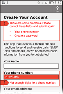
"The message tells us to “Please verify the number and try again.” But where is the number? How do I try again? Surfacing the error message next to the responsible elements would have made a solution much more understandable and actionable. The inclusion of instructions next to the input field responsible for the error provides people with a remedy where they need it most: where the error can be fixed."
Luke Wroblewski
Web Form Design (2008)
"Now, what happens when there is more than one error on a form? Or when no particular input fields are responsible for the problem, such as when a server goes down or a payment cannot be authorized? In most cases, the same structure still works well."
Luke Wroblewski
Web Form Design (2008)
"Instead, the more common case is when one or two input fields are preventing someone from completing a form. In these instances, it is quite useful to be able to locate the responsible input field(s) quickly and easily—especially on long forms [...] Top-level error messages should indicate an error has occurred and how it can be resolved. If multiple errors exist, they should be listed in the top-level message."
Luke Wroblewski
Web Form Design (2008)
"Inline validation can provide several types of feedback: confirmation that an appropriate answer was given, suggestions for valid answers, and real-time updates designed to help people stay within necessary limits. These bits of feedback usually happen when people begin, continue, or stop entering answers within input fields. [...] Confirming appropriate answers is most useful when there is a high likelihood that people won't get the answer "right."
Luke Wroblewski
Web Form Design (2008)
"Help text is basically just a set of messages that help people complete forms successfully. This means that help messages are structurally similar to the error and success messages we'll look at in Chapter 8 and, as a result, share many best practices."
Luke Wroblewski
Web Form Design (2008)
Inline confirmation works best for questions with potentially high error rates or specific formatting requirements. [...] Inline quality indicators can guide people to better answers to complex questions.
Luke Wroblewski
Web Form Design (2008)
"A common example is the selection of a unique username. Chances are good that the first username to pop into people's heads is one that someone else already claimed. [...] Of course, it's impossible for people to know what usernames are available to them when they are filling in a registration form so they continue to guess and guess again until they stumble upon something obscure enough not to be taken."
Luke Wroblewski
Web Form Design (2008)
" Another question commonly fraught with errors is the password. I won't dwell on the fact that asking people to generate complex combinations of uppercase and lowercase letters, numerals, and symbols is another example of how our "inside out" systems create confusion for people. Instead, I'll provide a way we can help people overcome those obstacles through the use of inline validation."
Luke Wroblewski
Web Form Design (2008)
"Instead, we should let users type freely, and tell users how many characters they have left. This way, users can see the feedback when they finally look up at the screen and can edit their entry in response. If they don’t notice the feedback, an error will be shown when they submit the form, thanks to the validation routine."
Adam Silver
Form Design Patterns (2018)
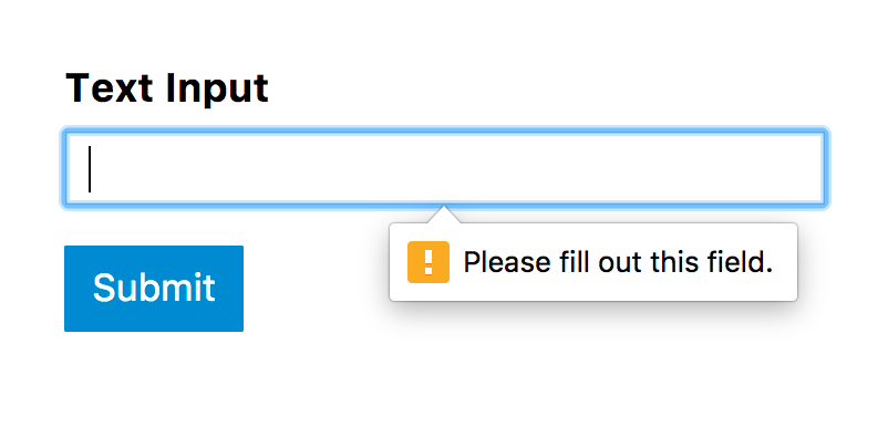
"Given the benefits of confirming appropriate answers in real time, you might be tempted to consider using inline validation for all the questions you pose in your forms. [...] If you do choose to provide inline validation for many of the questions you ask, timing is everything. [...] I've only managed to enter the first letter of my email address, and I'm already faced with an error. A much better approach is to only provide feedback when it's clear someone is done providing an answer.
Luke Wroblewski
Web Form Design (2008)
"Does validating an email address mean that it is, in fact, an email address (based on its formatting), or that it is my email address (and this site knows that somehow), or that this email address is already known to the site (especially important if I am registering or updating a customer record)? Though not everyone will think this way, why make people think at all? Use inline validation to help people with answers they aren't guaranteed to know. I know my name, so there's no need to validate it for me! [...]"
Luke Wroblewski
Web Form Design (2008)
"Moreover, some users switch windows or use a password manager when using a form. Doing so will trigger the blur event, causing an error to show before the user is finished. All very frustrating. [...] Remember, there’s no problem with giving users feedback without a page refresh. Nor is there a problem with putting the error messages inline (next to fields) — we’ve done this already. The problem with live feedback is that it interrupts users either too early or too late, which often results in a jarring experience."
Adam Silver
Form Design Patterns (2018)
" Yahoo!'s registration form only validates an answer once someone has indicated he or she is done by moving to the next input field. [...] When validating people's answers inline, do so after they have finished providing an answer, not during the process."
Luke Wroblewski
Web Form Design (2008)
"For entries that require a certain number of characters, the first keystroke will always constitute an invalid entry. This means users will be interrupted early, which can cause them to switch mental contexts, from entering information to fixing it. [...] Alternatively, we could wait until the user enters enough characters before showing an error. [...] We could wait until the user leaves the field (onblur), but this is too late as the user has mentally prepared for (and often started to type in) the next field."
Adam Silver
Form Design Patterns (2018)
"Your tone also changes depending on the emotional state of the person you’re addressing. You wouldn’t want to use the same tone of voice with someone who’s scared or upset as you would with someone who’s laughing. [...] When you’re writing, consider the reader’s state of mind. Are they relieved to be finished with a campaign? Are they confused and seeking our help on Twitter? Once you have an idea of their emotional state, you can adjust your tone accordingly. [...] If you’re unsure, keep a straight face."
Mailchimp
"Use plain language. Error messages are not an opportunity to promote your brand’s humorous tone of voice."
Adam Silver
Form Design Patterns (2018)
"Something very, very bad has happened to the system, so the customer can’t continue (e.g., an essential server just got smote by lightning). This kind of message should be very apologetic and should give the customer some alternate way of contacting you."
Luke Wroblewski
Web Form Design (2008)
"Conventionally, errors are colored red. However, relying on color alone could exclude colorblind users. To draw attention to the summary, consider also using position, size, text, and iconography."
Adam Silver
Form Design Patterns (2018)
"However, if users are likely to stay on the page for a long time after, research might show that dismissing a message is valuable after all. Offer that functionality with a button. When clicked, it hides the message."
Adam Silver
Form Design Patterns (2018)
"A variation of live validation involves ticking off rules (marking them as complete) as the user types. This is less invasive than live validation but isn’t suited to every type of field. Here’s an example of MailChimp’s sign-up form, which employs this technique for the password field. [...] MailChimp’s password field with instructions that get marked as the user meets the requirements."
Adam Silver
Form Design Patterns (2018)
By Schalk Venter
How do we design interaction?


