


Schalk Venter
🔧 Front-end Development / 🎨 UI Design / 🌍 Social Good / ❤️ Destigmatising mental illness
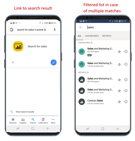
"So Search, Sort and Filter: how different are they from each other? Conventionally, they’re very different. [...] However, all three functions eventually lead to the same outcome: surfacing relevant content. "
Rozann Peter
Search, Sort and Filter Sorted (2018)
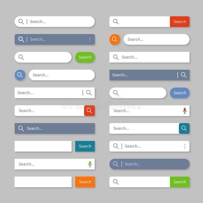
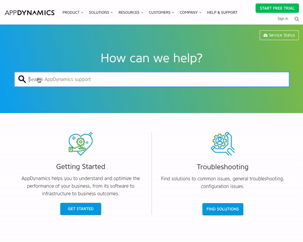
"Typically, search is placed within the header. Like navigation, this makes it easily discoverable and quick to access. Putting such an integral feature elsewhere on the page would be counterintuitive and unconventional. [...] The challenge, of course, is that it’s hard to fit the search form inside the header along with everything else. The header is premium screen real estate. That is, there isn’t much room available and it’s highly sought after. The more we put into the header, the more the main content is pushed down the page."
Adam Silver
Form Design Patterns (2018)
"When conducting eye-tracking research, we regularly see users are drawn to the top and top left area of the page expecting to find the filter and sort options. And on desktop, where there is (usually) enough screen space to display both options, users tend to find and use them relatively easy."
Rozann Peter
Search, Sort and Filter Sorted (2018)
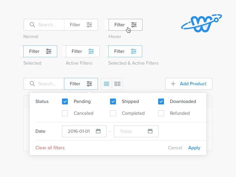
"Don’t rely on just an icon. In our research, we see users look directly at icons, on mobile and desktop but because they are not sure what the icon is, simply carry on with their task journey. Remove any ambiguity by adding a label to the icon, or removing the icon altogether and just have text. It doesn’t take up too much extra room, but it will increase the chances of users knowing what it means and that it’s what they are looking for."
Rozann Peter
Search, Sort and Filter Sorted (2018)
"Display result count. Tell users how many results have been returned. A simple approach would be to update the page’s [...] text to read “Search results for [search term]” or similar. Users can then decide what their next action is. For example, if there are many results, they may decide to filter them (more on this in the next chapter)."
Adam Silver
Form Design Patterns (2018)
"This leaves “Show more” or standard pagination. “Show more” is more appropriate for sites with a lot of user-generated content, where the location of the result is not important. Pagination is more appropriate for ecommerce sites, where users are looking for a specific item, not just browsing for entertainment."
Adam Silver
Form Design Patterns (2018)
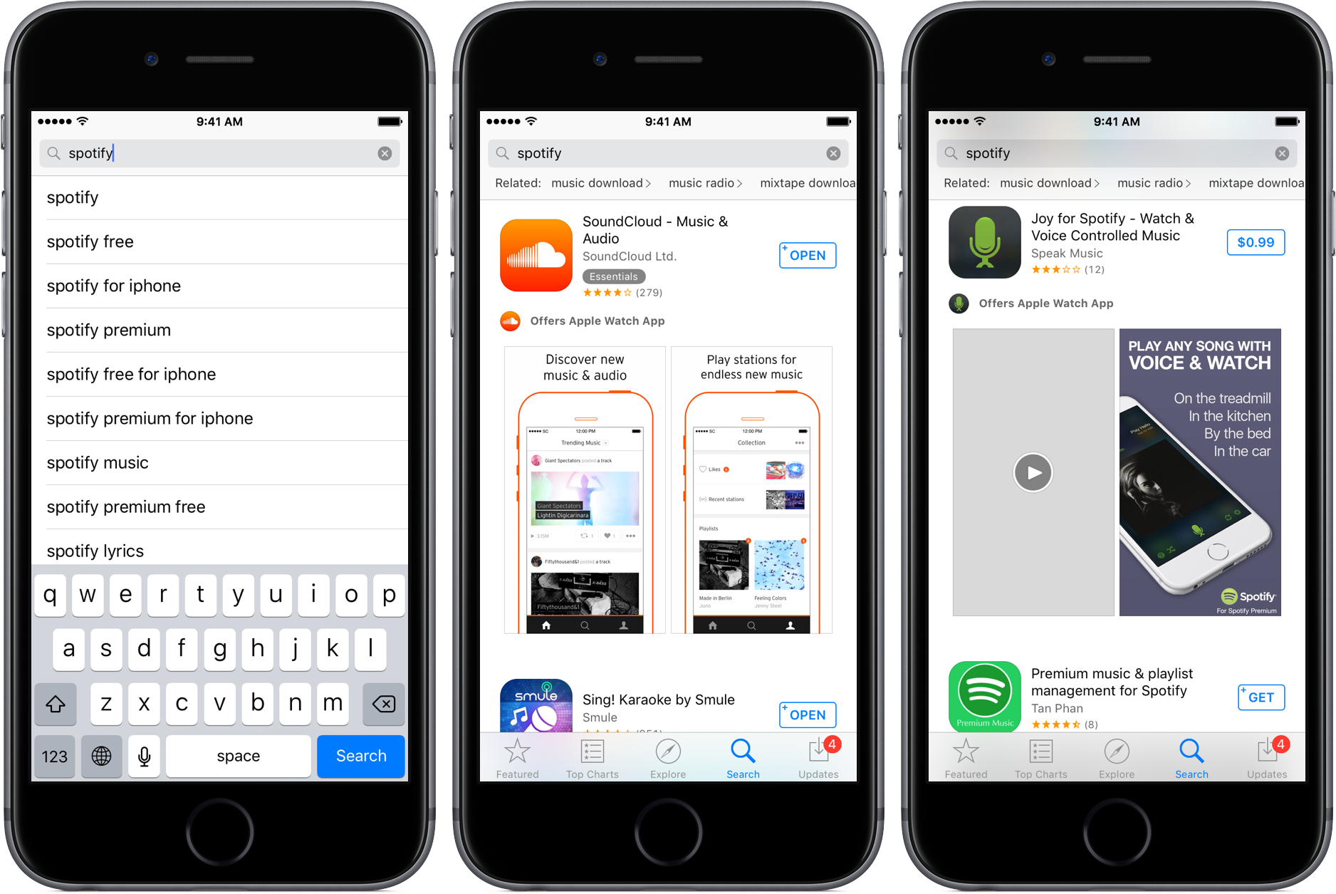
"Users 'Search' to find something specific from large amounts of information. They usually use keywords or type in phrases to find what they’re looking for. It is the most common way of finding things on a website or an app."
Rozann Peter
Search, Sort and Filter Sorted (2018)
"Instead of messing around with pixels to this extent, we can toggle the entire form’s visibility by letting users click a button. Finding room in the header for a button is relatively straightforward. And including a visible label, a hint (if needed), and a submit button is an easy task."
Adam Silver
Form Design Patterns (2018)
"Maintain search text. When the user arrives at the search page, what they typed should persist. This way users can make tweaks without having to retype the entire query."
Adam Silver
Form Design Patterns (2018)
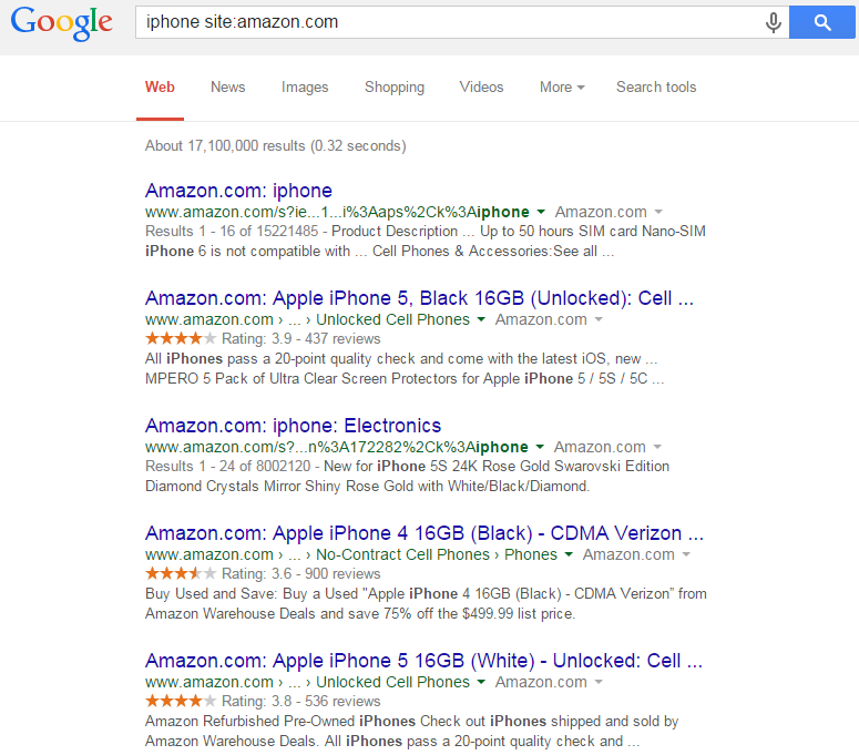
"He recounts a story from user research where someone was trying to buy a purse. The woman was happy enough to buy the purse on the proviso she could return it. But the returns policy wasn’t on the product page, or in the FAQ. In the end, she tried typing “Refund policy” into the search box — but it didn’t return any results. [...] Wherever possible, search should search everything. And if it doesn’t, the label should be explicit. If the search function only returns products, make that clear within the interface. "
Adam Silver
Form Design Patterns (2018)
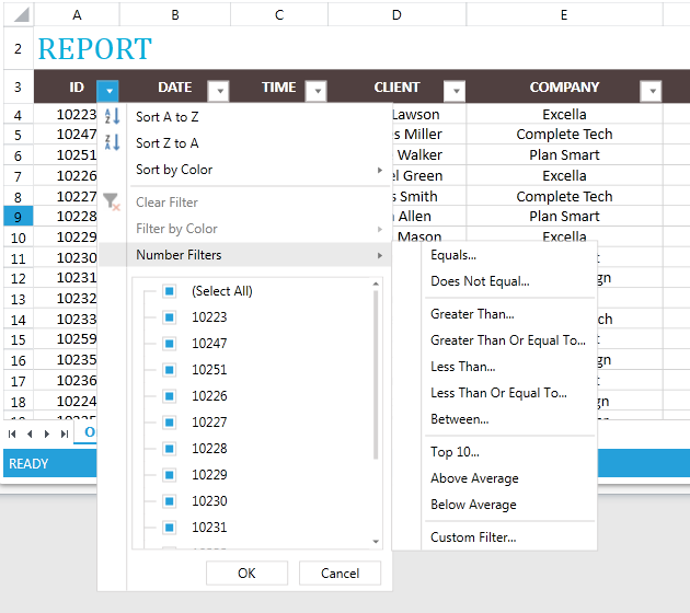
"They 'Sort' when they don’t want to narrow their search but rather, arrange it in a certain order, for example, newest first or alphabetically."
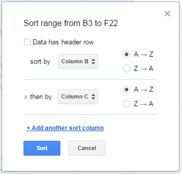
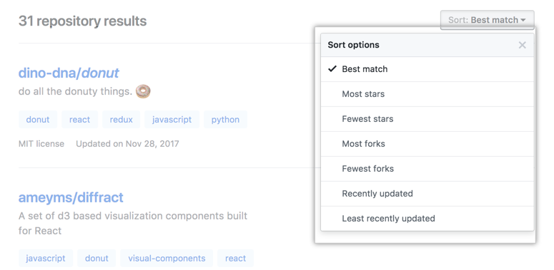
Rozann Peter
Search, Sort and Filter Sorted (2018)
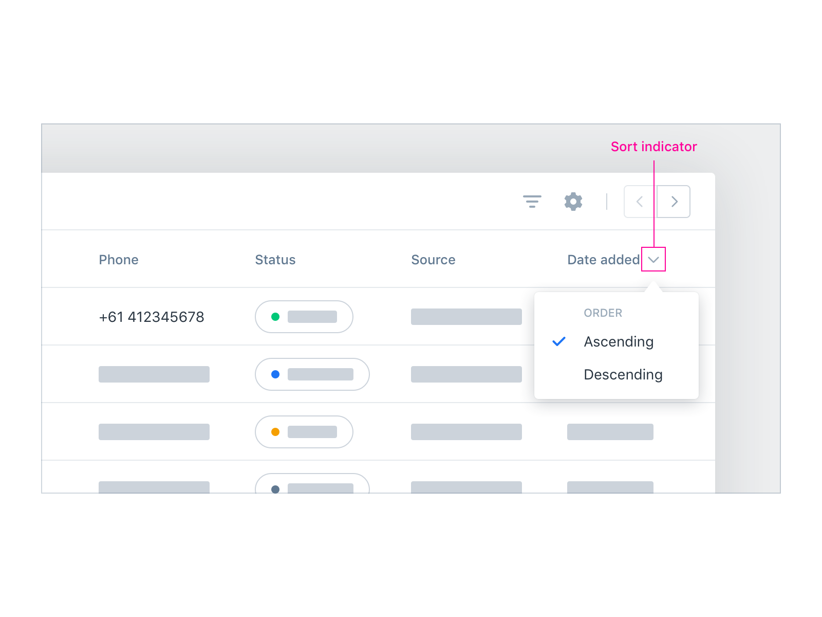
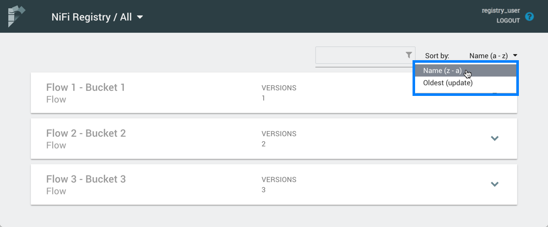
"Let users sort. Depending on the dataset being searched, it’s often useful to let users sort by relevance, popularity, or recency, for example."
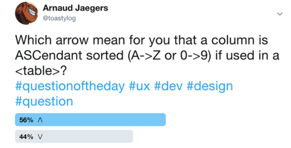
Adam Silver
Form Design Patterns (2018)
| Ascending | Descending | |
|---|---|---|
| Number | Smallest first | Largest first |
| Alphabetical | "A" first | "Z" first |
| Dates | Oldest first | Earliest first |
Shape
Direction
VS
"They 'Filter' when they want to narrow the list of available items based on specific criteria such as brand, price range or colour. This mechanism is useful in situations where the user may not know exactly what terms to search for or where choosing from a list of search criteria is faster than typing in all the search terms."
Rozann Peter
Search, Sort and Filter Sorted (2018)
"Filters (also referred to as facet navigation or guided navigation) let users refine a large set of search results. This helps users home in on what they’re looking for. [...] Letting users filter out irrelevant results is important. The ability to filter not only offers an additional dimension of control, but it does so in a way that matches each user’s own mental model."
Adam Silver
Form Design Patterns (2018)
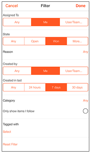
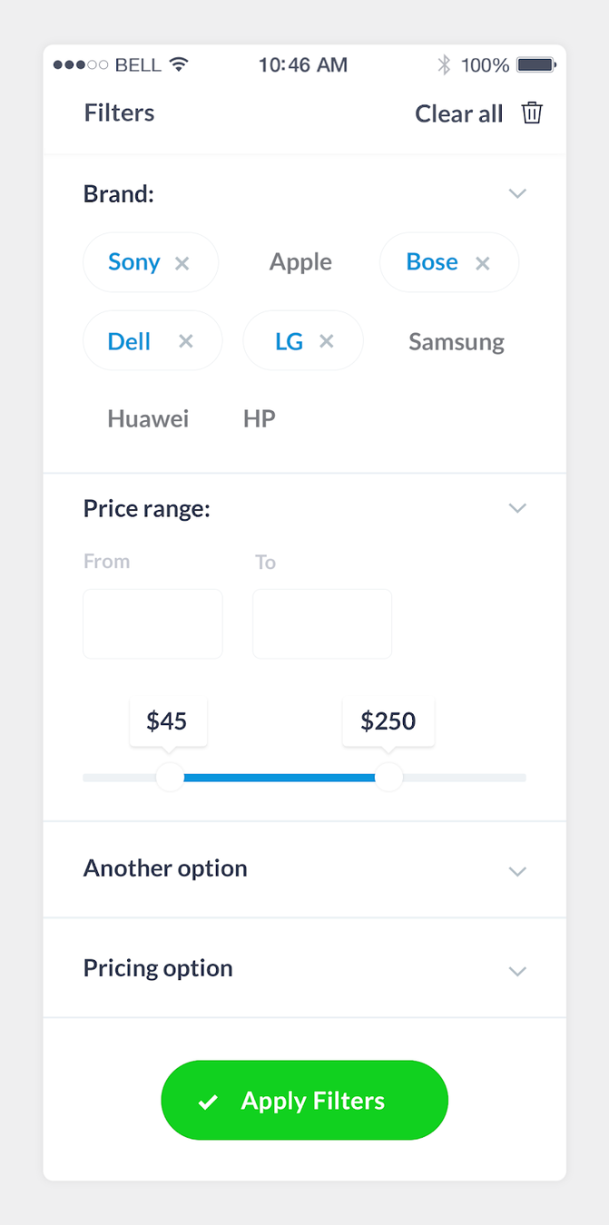
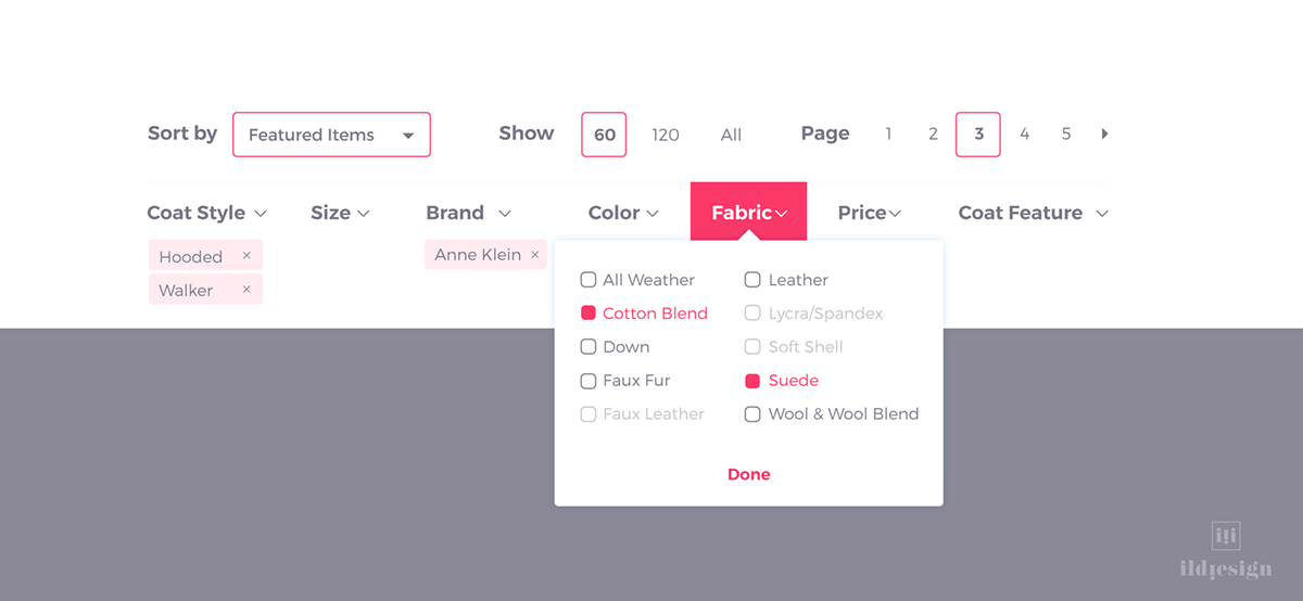
"Not being allowed to apply multiple filter values is worse on mobile sites, where going back and forth is even more tedious and complex than it is on desktop sites. [...] The end result observed in our testing of wrongly implementing filter values as mutually exclusive is that users are far less likely to use filters, or to use them effectively, and therefore less likely to find a suitable product to purchase."
"At first glance, filters might look similar across different sites, but their behavior varies quite widely. When and how filters should be applied, how to denote selected filters, what elements should be used, how to give users feedback, how they’ll work on mobile and desktop: all of these things need to be taken into account. "
Adam Silver
Form Design Patterns (2018)
"Despite the ubiquity of filters in e-commerce — all of the top 50 US e-commerce sites allow users to filter product lists — our benchmarking reveals that the underlying filtering logic found at 32% of e-commerce sites downright misaligns with users’ expectations of how filters work, and how users even look for and evaluate products online."
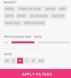
"A filter category is a property of the items, such as color or price. A filter category often contains several filter values. A filter value is either a specific value of a property (say, “red”), or a range of values (say, “less than $100” or “red or blue”)."
Kate Morgan
Nielsen Norman Group (2018)
"However, using just those common filter categories across your site won’t be enough to help people make choices. You’ll obviously need different filter categories for appliances than you’ll need for adoptable pets or rental cars. But even then, you’ll want different filters for washing machines versus dishwashers. (Also, remember to provide appropriate currencies and international measurement units if you’re serving an international audience.)"
Kate Morgan
Nielsen Norman Group (2018)
"As much as possible, avoid filter categories with vague labels like Item Type. Words like Category, Format, Content Type, or Genre are better, because they feel a bit more specific and tailored to the current item. For example, products can be divided into Product Categories, while movie rentals fall into Genres. Labels for filter categories and values must be as concrete and precise as possible, to bridge the gulf of execution and help users figure out what they should do."
Kate Morgan
Nielsen Norman Group (2018)
"Not everyone shopping for a laptop will know what processors are or how they work, but some shoppers will care very much about the type of processor in a computer they buy. To serve both inexperienced and experienced laptop shoppers, Best Buy provides a tooltip next to the filter category labeled, Processor Model. When clicked, the tooltip launches a modal with more information."
Kate Morgan
Nielsen Norman Group (2018)
"While categories are pertinent on sites with a large amount of content, that isn’t the case when the content isn’t vast. In fact, this can lead to the problem of over-categorisation. This occurs when a website lists its products as rigid, individual categories. Instead of this, listing products as combinable, fluid filters allows the user to customise the result list to exactly what they’re looking for."
Rozann Peter
Search, Sort and Filter Sorted (2018)
"As a good rule of thumb, consider placing the most general, high-level filter categories at the top of the list, and the more specific ones towards the bottom. [...] There will be instances where you’ll want to break this rule and will want to move a more specific filter category higher up the list. [...] For example, users shopping for washing machines may care much more about the Interior Capacity than the Color while narrowing their options. "
Kate Morgan
Nielsen Norman Group (2018)
"Furthermore, our usability test sessions revealed that this is a common user behavior, with 45% of users trying to apply multiple filter values of the same filter type at some point during testing. Yet our benchmark data reveal that 32% of sites fail to allow users to combine multiple filter values for at least some of the available filter types."
"The logic is therefore that filter types should follow an “AND” logic when multiple types are selected, whereas the selected filtering values within any of those types should follow an “OR” logic. [...] This “AND”-logic for filtering types and “OR”-logic for filtering values is also a strong web convention within e-commerce, which our benchmark reveals is the logic used by 98% of the 50 top US e-commerce sites (among those that allow multiple values to be selected within the same filter type)."
"A typical Web form usually enables several final actions. Actions such as Submit, Save, or Continue are intended to enable completion, which is the primary goal of just about anyone who has started filling in a form. Because they enable the most important action on the form (completion), they can be referred to as primary actions."
Luke Wroblewski
Web Form Design (2008)
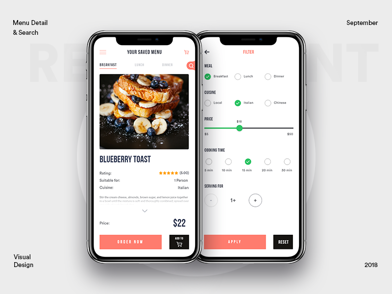
"Interactive filters update as soon as the user clicks a filter. The advantage is that users will see the results update as they go. [...] Batch filters work by letting users set a number of options before submitting and reloading the page (see above). One advantage of this approach is that it’s faster, as users just make one request for several filters. [...] One disadvantage of this approach is that a combination of filters could lead to zero results."
Adam Silver
Form Design Patterns (2018)
"And this may work for radio buttons and checkboxes, but what if there were text boxes that could be used to enter a price range? When would users expect the form to submit? Submitting while typing is out of the question. This leaves submitting the form on blur (tabbing or clicking out of the field), which is odd and unintuitive. We’d need a submit button just for that box."
Adam Silver
Form Design Patterns (2018)
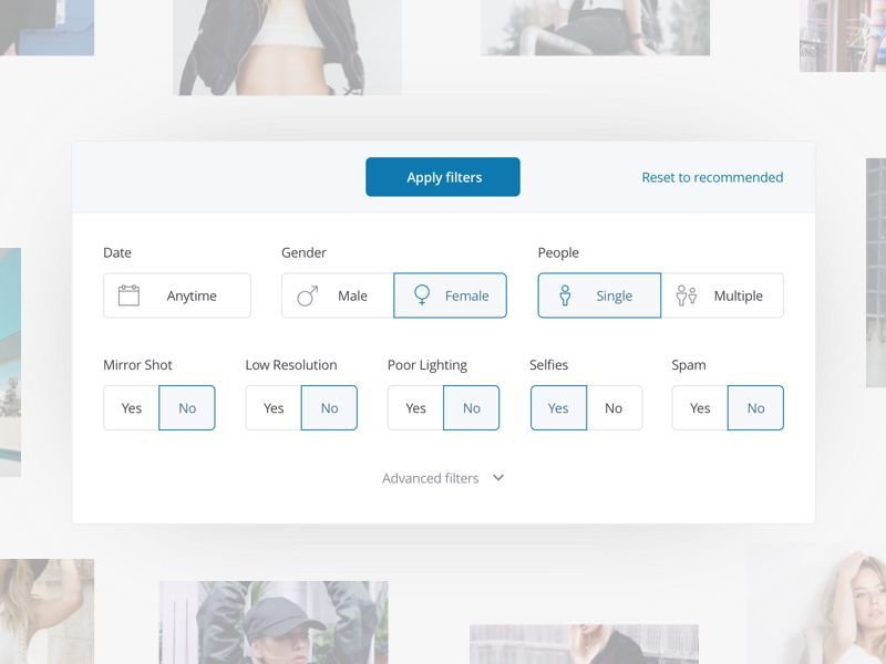
"As UX Practioners, we know feedback is an important heuristic for the usability of a website. So, once users have found filter and sort, understood the options they have, and made their selections – it’s important to let them know their choices have been applied to the list of products."
Rozann Peter
Search, Sort and Filter Sorted (2018)
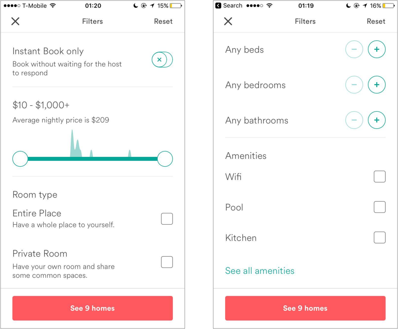
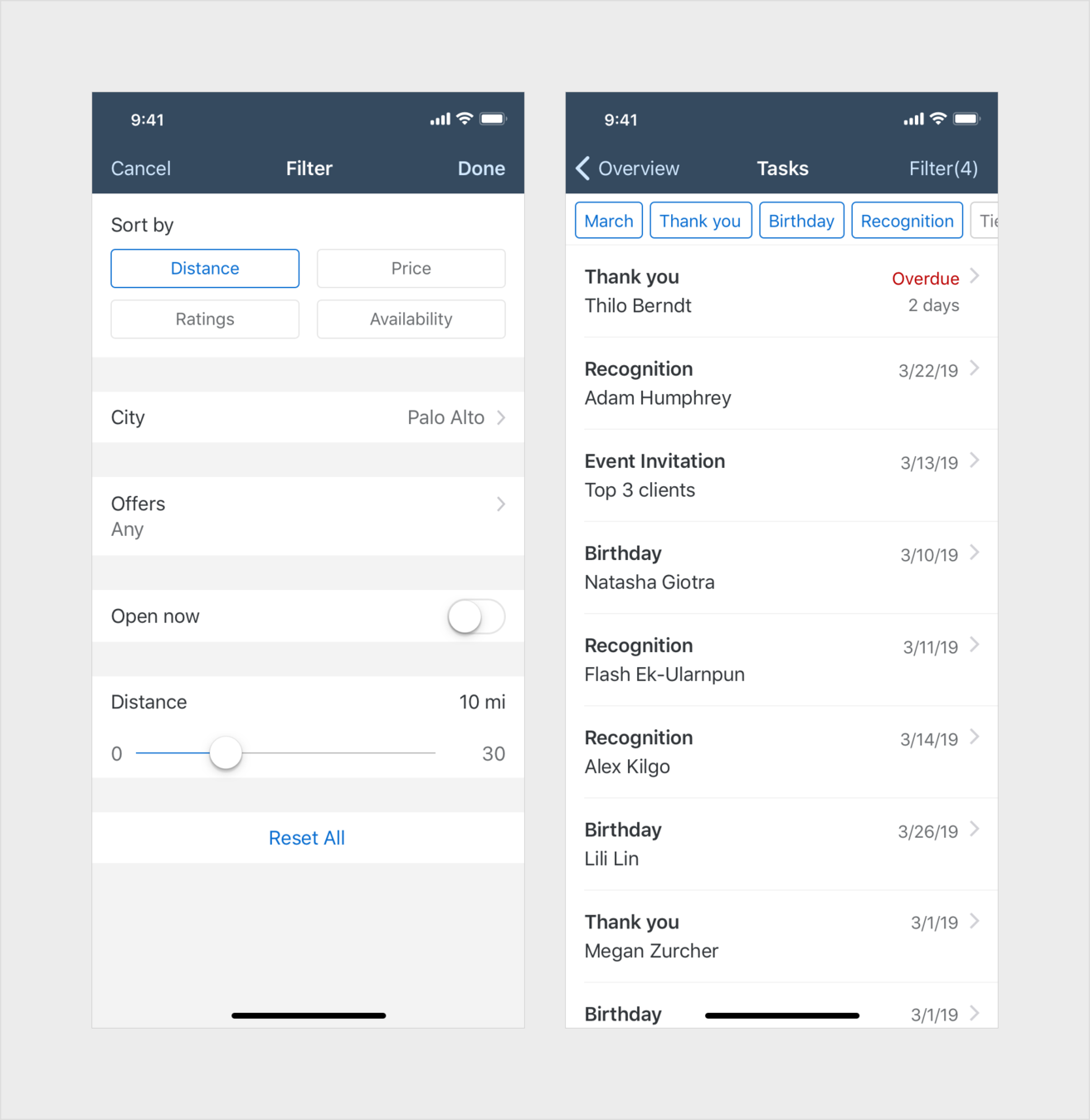
"Up to now, we’ve only considered the interface in the context of desktop-sized screens, where there’s enough space to fit the filter next to the results. But what about the small-screen experience? [...] We can’t just put the filters first, as this will push the results down the page. And we can’t just put them after the results, as users would have to move beyond them — most users wouldn’t know they exist. [...] We’re left with having to collapse the filters behind a toggle button."
Adam Silver
Form Design Patterns (2018)
"We need to make sure that users can see the results update as they filter. We can achieve this by having the filters appear on top of the results without completely covering them. It works because users can see the results on the left, while filters are selected on the right."
Adam Silver
Form Design Patterns (2018)
"Check search logs to see what people search for and understand which characteristics are most popular and the exact language your users are familiar with. If you already have a filtering tool implemented, analytics metrics can help you figure out which filter categories are most popular. Experiment with A/B or multivariate testing to refine the language used in your filter labels"
Kate Morgan
Nielsen Norman Group (2018)
By Schalk Venter
Providing users with controls to find content


