Analysis and Visualization of Large Complex Data with Tessera

Spring Research Conference
Barret Schloerke
Purdue University
May 25th, 2016
Background
-
Purdue University
- PhD Candidate in Statistics (4th Year)
- Dr. William Cleveland and Dr. Ryan Hafen
- Research in large data visualization using R
- www.tessera.io
-
Metamarkets.com - 1.5 years
- San Francisco startup
- Front end engineer - coffee script / node.js
-
Iowa State University
- B.S. in Computer Engineering
-
Research in statistical data visualization with R
- Dr. Di Cook, Dr. Hadley Wickham, and Dr. Heike Hofmann
Big Data Deserves a Big Screen

"Big Data"
- Great buzzword!
- But imprecise when put to action
- Needs a floating definition
- Small Data
- In memory
- Medium Data
- Single machine
- Large Data
- Multiple machines
- Small Data
Large and Complex Data
- Large number of records
- Large number of variables
- Complex data structures not readily put into tabular form
- Intricate patterns and dependencies
- Require complex models and methods of analysis
- Not i.i.d.!
Often, complex data is more of a challenge than large data, but most large data sets are also complex
(Any / all of the following)
Large Data Computation
-
Computational analysis performance also depends on
- Computational complexity of methods used
- Issue for all sizes of data
- Hardware computing power
- More machines ≈ more power
- Computational complexity of methods used

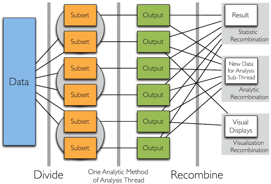
Divide and Recombine (D&R)
- Statistical Approach for High Performance Computing for Data Analysis
- Specify meaningful, persistent divisions of the data
- Analytic or visual methods are applied independently to each subset of the divided data in embarrassingly parallel fashion
- No communication between subsets
- Results are recombined to yield a statistically valid D&R result for the analytic method
-
plyr "split apply combine" idea, but using multiple machines
- Dr. Wickham: http://vita.had.co.nz/papers/plyr.pdf
Divide and Recombine
What is Tessera?
- tessera.io
- A set high level R interfaces for analyzing complex data
for small, medium, and large data - Powered by statistical methodology of Divide & Recombine
- Code is simple and consistent regardless of size
- Provides access to 1000s of statistical, machine learning, and visualization methods
- Detailed, flexible, scalable visualization with Trelliscope

Tessera Environment
- User Interface: two R packages, datadr & trelliscope
- Data Interface: Rhipe
- Can use many different data back ends: R, Hadoop, Spark, etc.
- R <-> backend bridges: Rhipe, SparkR, etc.
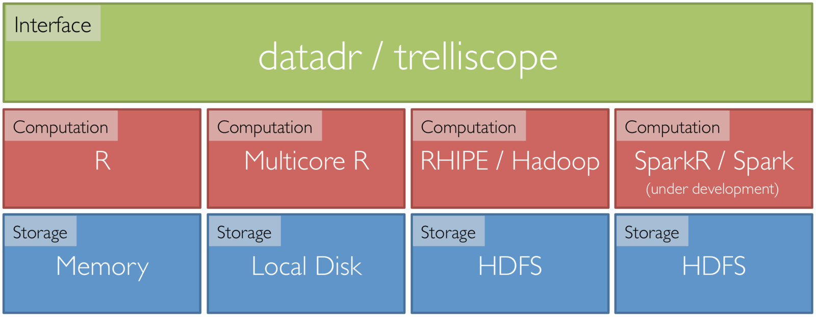
Tessera
Computing
Location
{
{
{
Data Back End: Rhipe
- R Hadoop Interface Programming Environment
- R package that communicates with Hadoop
- Hadoop
- Built to handle Large Data
- Already does distributed Divide & Recombine
- Saves data as R objects

Front End: datadr
- R package
- Interface to small, medium, and large data
- Analyst provides
- divisions
- analytics methods
- recombination method
- Protects users from the ugly
details of distributed data- less time thinking
about systems - more time thinking
about data
- less time thinking

datadr vs. dplyr
- dplyr
- "A fast, consistent tool for working with data frame like objects, both in memory and out of memory"
- Provides a simple interface for quickly performing a wide variety of operations on data frames
- Built for data.frames
- Similarities
- Both are extensible interfaces for data anlaysis / manipulation
- Both have a flavor of split-apply-combine
- Often datadr is confused as a dplyr alternative or competitor
- Not true!
dplyr is great for subsetting, aggregating up to medium tabular data
datadr is great for scalable deep analysis of large, complex data
Visual Recombination: Trelliscope
- www.tessera.io
-
Most tools and approaches for big data either
- Summarize lot of data and make a single plot
- Are very specialized for a particular domain
- Summaries are critical...
- But we must be able to visualize complex data in detail even when they are large!
- Trelliscope does this by building on Trellis Display
Trellis Display
- Tufte, Edward (1983). Visual Display of Quantitative Information
- Data are split into meaningful subsets, usually conditioning on variables of the dataset
- A visualization method is applied to each subset
- The image for each subset is called a "panel"
- Panels are arranged in an array of rows, columns, and pages, resembling a garden trellis
Scaling Trellis
-
Big data lends itself nicely to the idea of small multiples
- small multiple: series of similar graphs or charts using the same scale + axes, allowing them to be easily compared
- Typically "big data" is big because it is made up of collections of smaller data from many subjects, sensors, locations, time periods, etc.
- Potentially thousands or millions of panels
- We can create millions of plots, but we will never be able to (or want to) view all of them!
Scaling Trellis
-
To scale, we can apply the same steps as in Trellis display, with one extra step:
- Data are split into meaningful subsets, usually conditioning on variables of the dataset
- A visualization method is applied to each subset
- A set of cognostic metrics is computed for each subset
- Panels are arranged in an array of rows, columns, and pages, resembling a garden trellis, with the arrangement being specified through interactions with the cognostics
Trelliscope
-
Extension of multi-panel display systems, e.g. Trellis Display or faceting in ggplot
-
Number of panels can be very large (in the millions)
-
Panels can be interactively navigated through the use of cognostics (each subset's metrics)
-
Provides flexible, scalable, detailed visualization of large, complex data

Trelliscope is Scalable
- 6 months of high frequency trading data
- Hundreds of gigabytes of data
- Split by stock symbol and day
- Nearly 1 million subsets
For more information (docs, code, papers, user group, blog, etc.): http://tessera.io
More Information
- website: http://tessera.io
- code: http://github.com/tesseradata
- @TesseraIO
- Google user group
-
Try it out
- If you have some applications in mind, give it a try!
- You don’t need big data or a cluster to use Tessera
- Ask us for help, give us feedback
Example Code
library(magrittr); library(dplyr); library(tidyr); library(ggplot2)

library(trelliscope)
library(datadr)
library(housingData)

# divide housing data by county and state
divide(housing, by = c("county", "state")) %>%
  drFilter(function(x){nrow(x) > 10}) ->
  # drFilter(function(x){nrow(x) > 120}) ->
  byCounty

# calculate the min and max y range
byCounty %>%
  drLapply(function(x){
    range(x[,c("medListPriceSqft", "medSoldPriceSqft")], na.rm = TRUE)
  }) %>%
  as.list() %>%
  lapply("[[", 2) %>%
  unlist() %>%
  range() ->
  yRanges


# for every subset 'x', calculate this information
priceCog <- function(x) {
   zillowString <- gsub(" ", "-", do.call(paste, getSplitVars(x)))
   list(
      slopeList = cog(
        coef(lm(medListPriceSqft ~ time, data = x))[2],
        desc = "list price slope"
      ),
      meanList = cogMean(x$medListPriceSqft),
      meanSold = cogMean(x$medSoldPriceSqft),
      nObsList = cog(
        length(which(!is.na(x$medListPriceSqft))),
        desc = "number of non-NA list prices"
      ),
      zillowHref = cogHref(
        sprintf("http://www.zillow.com/homes/%s_rb/", zillowString),
        desc = "zillow link"
      )
   )
}


# for every subset 'x', generate this plot
latticePanel <- function(x) {
  x %>%
    select(time, medListPriceSqft, medSoldPriceSqft) %>%
    gather(key = "variable", value = "value", medListPriceSqft, medSoldPriceSqft, -time) %>%
    ggplot(aes(x = time, y = value, color = variable)) +
      geom_smooth() +
      geom_point() +
      ylim(yRanges) +
      labs(y = "Price / Sq. Ft.") +
      theme(legend.position = "bottom")
}

# make this display
makeDisplay(
  byCounty,
  group   = "fields",
  panelFn = latticePanel,
  cogFn   = priceCog,
  name    = "list_vs_time_ggplot",
  desc    = "List and sold priceover time w/ggplot2",
  conn    = vdbConn("vdb", autoYes = TRUE)
)

# make a second display
latticePanelLM <- function(x) {
  x %>%
    select(time, medListPriceSqft, medSoldPriceSqft) %>%
    gather(key = "variable", value = "value", medListPriceSqft, medSoldPriceSqft, -time) %>%
    ggplot(aes(x = time, y = value, color = variable)) +
      geom_smooth(method = "lm") +
      geom_point() +
      ylim(yRanges) +
      labs(y = "Price / Sq. Ft.") +
      theme(legend.position = "bottom")
}
makeDisplay(
  byCounty,
  group   = "fields",
  panelFn = latticePanelLM,
  cogFn   = priceCog,
  name    = "list_vs_time_ggplot_lm",
  desc    = "List and sold priceover time w/ggplot2 with lm line",
  conn    = vdbConn("vdb")
)


view()
Tessera - Spring Research Conference
By Barret Schloerke


