FRONTEND MASTERS
Advanced SVG Animation 2
4
Performance
- People expect mobile to be faster than web
- JankFree.org
- Advanced Performance Audits with DevTools by Paul Irish
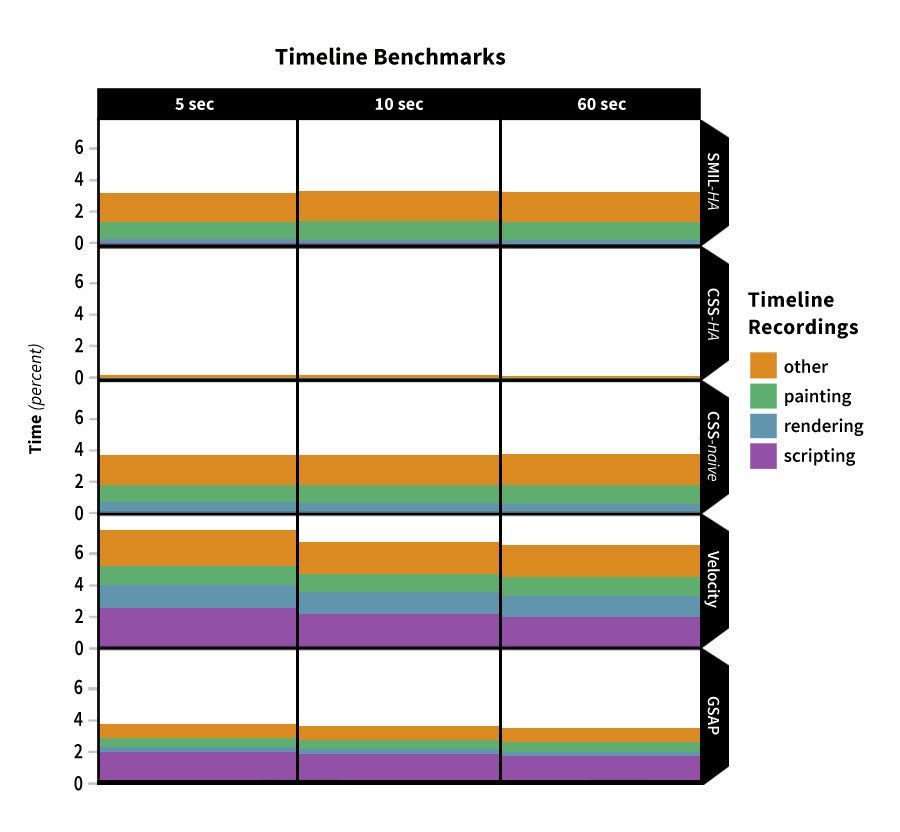
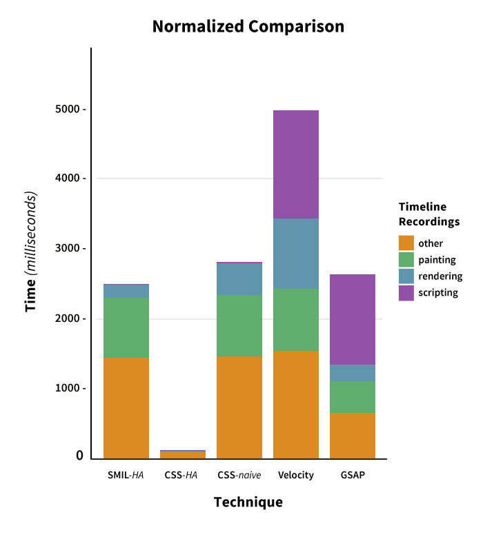
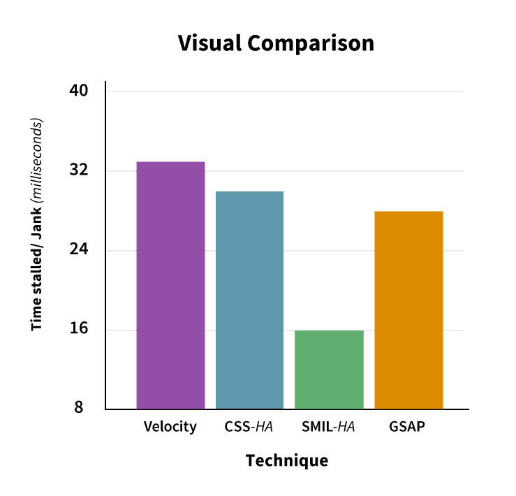
- CSS-Tricks Article: Weighing SVG Animation Techniques with Benchmarks
- Above all else: test things yourself!

Timeline Benchmarks
Timeline Benchmarks- Normalized
Visual Benchmarks
More tests soon!
Stay tuned...
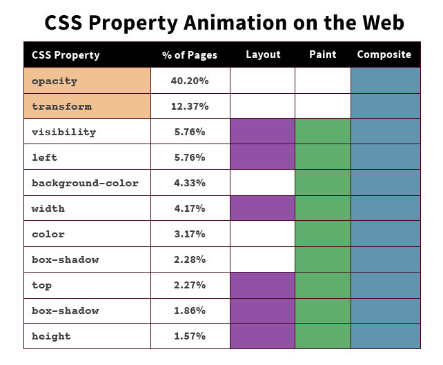
+ Workflow:
GreenSock!

The issue with longer CSS animations:
More information in this CSS-Tricks article
Killer workflow features
- Simple syntax
- Timelines
- Nested Timelines
- Draggable
- DrawSVG
- Stagger
- MorphSVG
Solves cross-browser inconsistencies


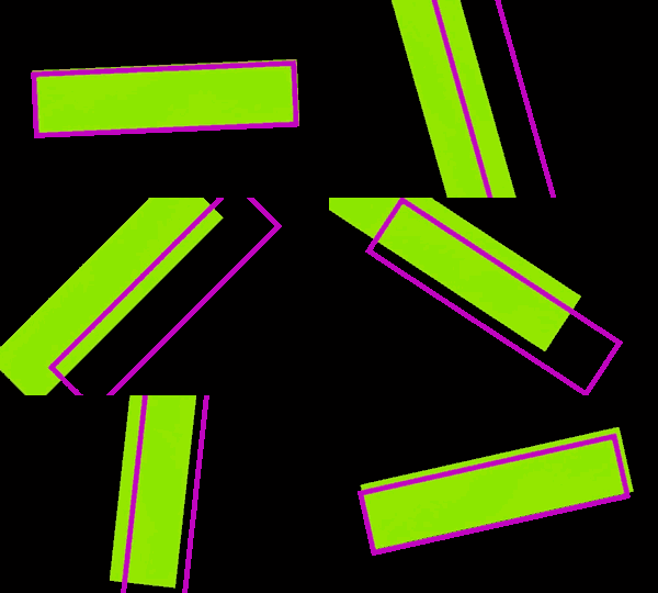
Historically bad transform origin bug on rotation in CSS,
now about to be resolved in Firefox.
More in this CSS-Tricks article.
Chrome
IE
Firefox
Safari (zoomed)
More!
Other neat GSAP goodies to come...
But First: GSAP Overview
5
GreenSock Overview
Syntax
TweenLite/TweenMax .to/.from/.fromTo ( variable, seconds { property:amount, ease });
TweenLite.to("div", 2, {
    scaleY:0.75, scaleX:1.25, y:100, opacity:0.75, ease:Elastic.easeOut
});
For help with easing: GSAP's Ease Visualizer
Stagger
.css
  %h2 CSS
  - @x = 5
  - @x.times do
    .bar

.sass
  %h2 SASS
  - @x = 5
  - @x.times do
    .bar

.gsap
  %h2 GSAP
  - @x = 5
  - @x.times do
    .bar
HAML
@keyframes staggerFoo {
  to {
    background: orange;
    transform: rotate(90deg);
 }
}

.css .bar:nth-child(1) { animation: staggerFoo 1s 0.1s ease-out both; }
.css .bar:nth-child(2) { animation: staggerFoo 1s 0.2s ease-out both; }
.css .bar:nth-child(3) { animation: staggerFoo 1s 0.3s ease-out both; }
.css .bar:nth-child(4) { animation: staggerFoo 1s 0.4s ease-out both; }
.css .bar:nth-child(5) { animation: staggerFoo 1s 0.5s ease-out both; }
.css .bar:nth-child(6) { animation: staggerFoo 1s 0.5s ease-out both; }
CSS
@keyframes staggerFoo {
  to {
    background: orange;
    transform: rotate(90deg);
 }
}

@for $i from 1 through 6 {
  .sass .bar:nth-child(#{$i} ) {
      animation: staggerFoo 1s ($i * 0.1s) ease-out both;
   }
 }
SASS
TweenMax.staggerTo(".gsap .bar", 1, {
  backgroundColor: "orange",
  rotation: 90,
  ease: Sine.easeOut
}, 0.1);
GSAP
Stagger
Things like stagger are really complicated to do in CSS animation, and in GSAP are one line of code.
TweenMax.staggerTo(".squares", 2, {
    y:100, backgroundColor:"#4f9d88", ease:Elastic.easeOut
}, 0.05);
TweenMax.staggerTo(".squares", 2, {
    rotation:200, delay:1, scale:0.5, backgroundColor:"#72b165", ease:Elastic.easeOut
}, 0.025);
Cycle Stagger
David Walsh Blog GSAP + SVG Article
Cycle Stagger
tl.staggerFrom(bP, 3, {
  cycle:{
    fill:["white", "yellow", "#e23e0c"],
    opacity:[0.8, 0.2, 0.5, 0.3],
  },
  ease:Elastic.easeOut
}, 0.001);
CSS Properties in GSAP
TweenMax.set($(".squares"), {
    css:{transformPerspective:200, perspective:200, transformStyle:"preserve-3d"}
});
TweenMax.to($(".squares"), 2.5, {
    css:{rotationX:230, z:-150}, y:180, opacity:0.2, ease:Power2.easeOut
}, "+=0.2");
Timeline
- stack tweens
- set them a little before and after one another
- change their placement in time
- group them into scenes
- add relative labels
- animate the scenes!
- make the whole thing faster, move the placement of the whole scene, nesting
This pen.
Simple Timeline
var tl = new TimelineLite();

//you can add a relative label (optional)
tl.add("start");
//or just add to the timeline without the label
tl.staggerFrom(bP, 3, {
  cycle:{
    fill:["white", "yellow", "#e23e0c"],
    opacity:[0.8, 0.2, 0.5, 0.3],
  },
  ease:Elastic.easeOut
}, 0.001);
Nesting Timelines
//set properties needed for animation
TweenMax.set($t1, {
  perspective: 400
});

// the first scene
function sceneOne() {
  var tl = new TimelineMax();

  tl.add("label");
  tl.to(elem, 1, {vars}, "label");

  tl.timeScale(1.2);

  return tl;
}

// Create a master timeline
var master = new TimelineMax({options});
// Add the scene function to the master
master.add(sceneOne(), "labelOnMaster");

//use this while you're working to get to a place in time
//master.seek("labelOnMaster+=2");
No momentary display
//set back in js
TweenMax.set(".foo", {
  visibility: "visible"
});
//set to hide in CSS
.foo { visibility: hidden; }Position Parameter
var tl = new TimelineLite();
tl.to(".orange", 1, {x:750})
  //this just follows the first
  .to(".green", 1, {x:750})
  //there is a one second gap between these two tweens
  .to(".blue", 1, {x:750}, "+=1")
  //this goes to two seconds in
  .to(".red", 1, {x:750}, "2")
  // add a relative label at this part of the timeline
  .add("newLabel")
  // tween at 3 seconds past the relative label
  .to(".purple", 1, {x:750}, "newlabel+=3");
Percentage based transforms on SVG!
get excited.
This pen courtesy of GreenSock.
var playBtn = document.getElementById("play"),
    tl = new TimelineMax({repeat:1, yoyo:true, paused:true});

tl.staggerTo(".box", 0.5, {x:"100%"}, 0.4);

play.onclick = function() {
  tl.restart();
}
We can do stuff like this, all fully responsive in every direction
Exercise 3:
Take an SVG, animate it with GSAP, and make it responsive. Use a timeline and the position parameter or labels.
There are starter pens for reference in the repo:
6
UI/UX Animation
vs.
Standalone
+ Interaction
UI/UX animation
Pieces of the UI move to aid in an informative UX choreography. This can typically be done with well placed CSS, some JS to trigger interactions. Responsive can be achieved with good CSS media queries.
UI/UX Animation:
Context-shifting

From this CSS Animation Rocks
Another good navigation example at Concrete Matter
Standalone
Used to illustrate concepts in the body of the page, either alongside or on it's own. Most of the basis of this talk is complex standalone animation. JavaScript is recommended for much longer implementations (explained later).
This pen.
This pen.
If animation just feels like the sugar on top, that's because you treated it that way.

Motion on the web:
Not one size fits all

Not one size fits all
Adhering to branding means solving the problem for your users.
Motion Design Language for projects
- Consider your tooling- loss leader- it was a lot of work at first that paid off along the way
- Reuse resources like easing functions, animation keyframes in mixins, extends, variables, you name it!
- If mobile is decoupled- easier to keep it consistent across both
- Good animation branding guidelines means less reinventing the wheel and communication down the line.
Seems like a lot of work?

Motion Design Language for Projects
- time
- experience
- performance budget
- color
- composition
- user’s time

Standalone SVG as an illustration of text
Very easy to implement. SVG stays a consistent size.
UI/UX Animation with Interaction
Helps with context-shifting.
UI/UX Animation: Context-Shifting
jQuery or Vanilla JS for Interaction
Since jQuery 3.0, we can now do class operations on SVG. You can also do so with vanilla JS.
 $("#close").on("click", function() {

    if ($(this).hasClass("contactOpen")) {
      contactOut.restart();
    } else {
      master.reverse();
      master.timeScale(1.8);
    }

 });
JS Detection for CSS Animation
Hook into
-
animationstart
-
animationiteration
-
animationend
var lil = $(".lilguy"),
  logIt = $(".logIt"),
  log = $(".term-content");

logIt.on('click', function() {
  lil.addClass('restart');
});

lil.on('animationstart webkitAnimationStart oanimationstart MSAnimationStart',
function() {
  log.empty();
  log.append("<p>Animation has started.</p>");
});

lil.on('animationiteration webkitAnimationIteration oanimationiteration MSAnimationIteration',
function() {
  log.append("<p>An iteration fired.");
});

lil.on('animationend webkitAnimationEnd oanimationend MSAnimationEnd',
function() {
  log.append("<p>Animation has completed.</p>");
  lil.removeClass("restart");
});
Useful functions for Interaction + GSAP Timeline
tl.pause(); // Pause timeline
tl.resume(); // Continue playback
tl.restart(); // Restart the timeline
tl.play(X); // Play from Xs
tl.play(-X); // Play Xs from end
tl.seek(X); // Go to Xs or 'label'
tl.reverse(); // Reverse playback anytime
tl.timeScale(x); // Speed up/slow down timeline
tl.progress(0.5); // Skip to halfway
Also in the repo.


Interaction with Responsive:
build like legos
//variable declaration for the global repeated animations
var gear = $("#gear1, #gear2, #gear3");
...

//animation that's repeated for all of the sections
function revolve() {
  var tl = new TimelineMax();

  tl.add("begin");
  tl.to(gear, 4, {
      transformOrigin: "50% 50%",
      rotation: 360,
      ease: Linear.easeNone
    }, "begin");
    ...

  return tl;
}

var repeat = new TimelineMax({repeat:-1});
repeat.add(revolve());
function paintPanda() {
var tl = new TimelineMax();
tl.to(lh, 1, {
scaleY: 1.2,
rotation: -5,
transformOrigin: "50% 0",
ease: Circ.easeOut
}, "paintIt+=1");
...
return tl;
}
//create a timeline but initially pause it so that we can control it via click
var triggerPaint = new TimelineMax({
paused: true
});
triggerPaint.add(paintPanda());
//this button kicks off the panda painting timeline
$("#button").on("click", function(e) {
e.preventDefault();
triggerPaint.restart();
});
...with jQuery UI
with jQuery UI
var master = new TimelineMax();
master.add(sceneOne(), "scene1")
      .add(sceneTwo(), "scene2")
      .add(scThree, "scene3");

//jQueryUI Slider
function updateSlider(){
  $slider.slider("value", scThree.progress() * 100);
}

$slider.slider({
    range: false,
    min: 0,
    max: 100,
    step:.1,
    slide: function ( event, ui ) {
    scThree.pause();
    scThree.progress( ui.value/100 );
  }
});
Draggable
Draggable.create(".box", {type:"x,y", edgeResistance:0.65,
bounds:"#container", throwProps:true});- Device-enabled for touchscreen
- Impose bounds- containing units or pixel parameters bounds:{top:100, left:0, width:1000, height:800}
- Momentum: If you have ThrowPropsPlugin you can set throwProps:true
- Draggable.hitTest() to sense if elements touch eachother (more on this in a moment)
- Honors transform-origin
- Still works on transformed elements
- Lock movement to an axis lockAxis:true
- GPU-accelerated and requestAnimationFrame-driven
- more
Draggable.create(circ, {
  type: "x,y",
  edgeResistance: 0.5,
  bounds: "#container",
  throwProps: true
});

TweenMax.staggerTo(circ, 3, {
  rotation: 360,
  scale: 0.85,
  repeat: -1,
  yoyo: true,
  transformOrigin: "50% 50%",
  ease: Elastic.easeInOut
}, 0.35);- onPress
- onDragStart
- onDrag
- onDragEnd
- onRelease
- onLockAxis
- onClick
Rich Callback System and Event Dispatching
Callbacks:
"this" refers to the Draggable instance itself, so you can easily access its "target" or bounds.
If you prefer event listeners, Draggable dispatches events:
yourDraggable.addEventListener("dragend", yourFunc);var droppables = $(".box");
var overlapThreshold = "50%";
//we'll call onDrop() when a Draggable is dropped on top of one of the "droppables"
function onDrop(dragged, dropped) {
TweenMax.fromTo(dropped, 0.1, {opacity:1}, {opacity:0, repeat:3, yoyo:true});
}
Draggable.create(droppables, {
bounds:window,
onDrag: function(e) {
var i = droppables.length;
while (--i > -1) {
if (this.hitTest(droppables[i], overlapThreshold)) {
$(droppables[i]).addClass("highlight");
} else {
$(droppables[i]).removeClass("highlight");
}
}
},
onDragEnd:function(e) {
var i = droppables.length;
while (--i > -1) {
if (this.hitTest(droppables[i], overlapThreshold)) {
onDrop(this.target, droppables[i]);
}
}
}
});jQuery 3.0
Draggable to Control a Timeline Interaction
Draggable to Control a Timeline Interaction
TweenMax.set($("#flowers1, #radio, #burst, #magnolia, #flowers2, #starfish, #berries1, #berries2, #berries3, #skulls, #tv, #glitch, #shadow, #lights"), {
  visibility: "visible"
});

// the first scene
function sceneOne() {
  var tl = new TimelineMax();

  tl.add("start");
  tl.staggerFromTo($f1, 0.3, {
    scale: 0
  }, {
    scale: 1,
    ease: Back.easeOut
  }, 0.05, "start");
  ...

  return tl;
}

var master = new TimelineMax({paused:true});
master.add(sceneOne(), "scene1");
Draggable to Control a Timeline Interaction
Draggable.create($gear, {
  type: "rotation",
  bounds: {
    minRotation: 0,
    maxRotation: 360
  },
  onDrag: function() {
    master.progress((this.rotation)/360 );
  }
});
Draggable and SVGOrigin for Responsive
TweenMax.set(cow, {
  svgOrigin:"321.05, 323.3",
  rotation:50
});
what's happening?
Problem with hitTest() for SVG
Extra: clipPath
<defs>
  <ellipse id="SVGID_3_" class="st2" cx="276" cy="147" rx="272" ry="147"/>
</defs>

<clipPath id="SVGID_4_">
  <use xlink:href="#SVGID_3_" />
</clipPath>
.st4 {
clip-path: url(#SVGID_4_);
}SVG
CSS
Example of output from Illustrator
<defs>
  <clipPath id="clippy">
    <ellipse cx="276" cy="147" rx="272" ry="147"/>
  </clipPath>
</defs>
.img {
clip-path: url(#clippy);
}SVG
CSS
Better
-webkit-clip-path: ellipse(25% 35% at 50% 36%);
clip-path: ellipse(25% 35% at 50% 36%);
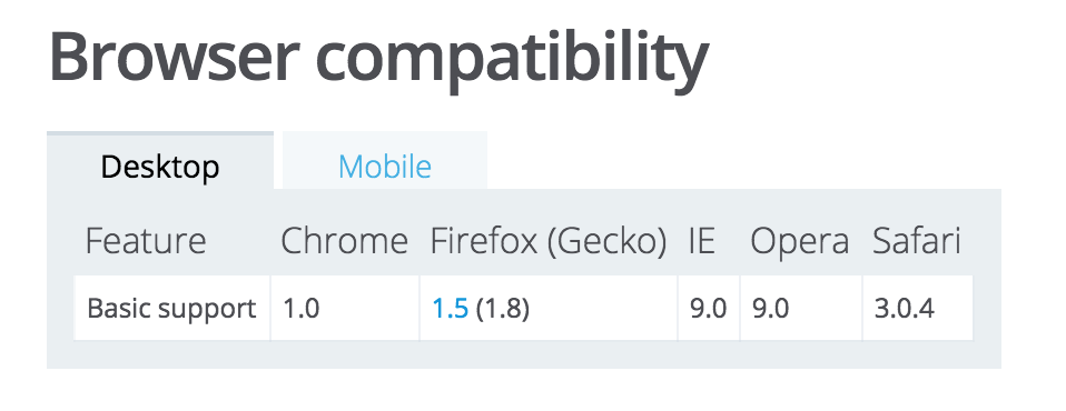
Support in SVG
Support in CSS
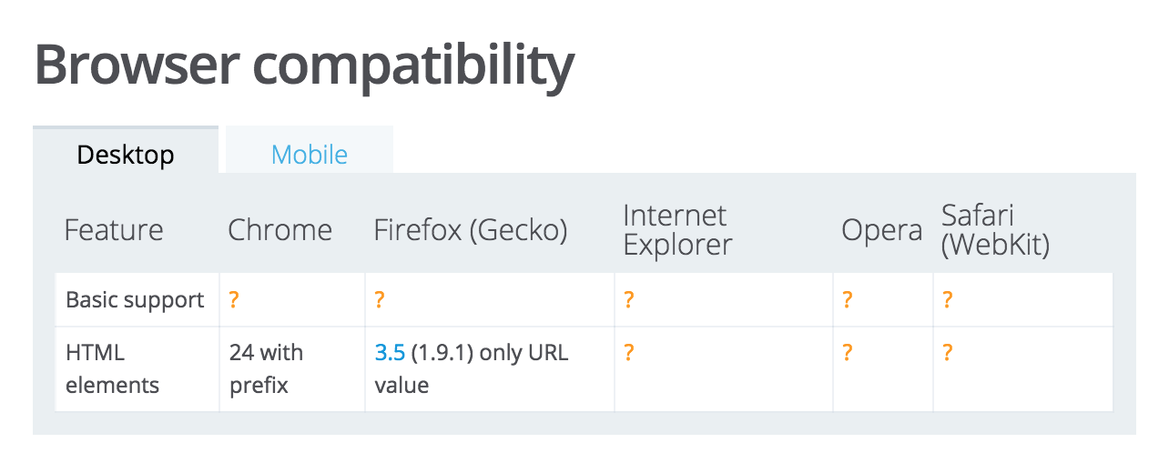
Source: MDN
You can animate it
Exercise 4:
Take the your last animation and make it interactive with any of the techniques we just covered.
Frontend Masters 2: Advanced SVG Animaton
By sdrasner
Frontend Masters 2: Advanced SVG Animaton
SVG Animation Performance, GreenSock Overview, Adding Interaction
- 11,222


