Animating SVG with CSS and SMIL
Fronteers, Amsterdam, October 10th, 2014
Hello!


Animating SVGs
-
Using CSS
-
Using SVG Animations (SMIL)
-
Using Javascript*
*We won't be covering JS in this talk
CSS'ing SVGs
<svg xmlns="http://www.w3.org/2000/svg" version="1.1" width="300px" height="300px" viewBox="0 0 300 300">
<polygon
fill = "#FF931E"
stroke = "#ED1C24"
stroke-width = "5"
points = "279.1,160.8 195.2,193.3 174.4,280.8 117.6,211.1 27.9,218.3 76.7,142.7 42.1,59.6 129.1,82.7 197.4,24.1 202.3,114 "/>
</svg>
Before CSS: SVG Presentation Attributes
star.svg
Shared with CSS |
SVG-Only |
|---|---|
|
|
clip-rule, flood-color, flood-opacity, stop-opacity, kerning, tech-anchor, color-profile, color-rendering, fill, fill-opacity, fill-rule, marker, marker-end, marker-mid, marker-start, stroke, stroke-width, stop-color, lighting-color, enable-background, dominant-baseline, color-interpolation-filters, color-interpolation, glyph-orientation-horizontal, glyph-orientation-vertical, shape-rendering, baseline-shift, alignment-baseline, stroke-miterlimit, stroke-linejoin, stroke-linecap, stroke-dashoffset, stroke-dasharray, stroke-opacity |
In SVG2, more presentation attributes will be added.
<svg xmlns="http://www.w3.org/2000/svg" version="1.1" style="width: 300px; height: 300px;" viewBox="0 0 300 300">
<polygon
style="fill: #FF931E; stroke: #ED1C24; stroke-width: 5;"
points = "279.1,160.8 195.2,193.3 174.4,280.8 117.6,211.1 27.9,218.3 76.7,142.7 42.1,59.6 129.1,82.7 197.4,24.1 202.3,114 "/>
</svg>
Inline Styles (style="...")
star.svg
<svg xmlns="http://www.w3.org/2000/svg" version="1.1" width="300px" height="300px" viewBox="0 0 300 300">
<style type="text/css">
polygon { fill: ... ;}
</style>
<polygon points = "279.1,160.8 195.2,193.3 174.4,280.8 117.6,211.1 27.9,218.3 76.7,142.7 42.1,59.6 129.1,82.7 197.4,24.1 202.3,114 "/>
</svg>
Embedded Styles (<style>) Inside SVG
star.svg
<!DOCTYPE html> <html><head>...</head>
<body>
<style type="text/css">
svg { width: ...; }
polygon { fill: ... ; }
</style>
<svg version="1.1" viewBox="0 0 300 300">
<!--SVG content-->
</svg>
</body>
</html>
Embedded Styles (<style>) Outside SVG
star.svg
External Style Sheets
<?xml version="1.0" standalone="no"?>
<?xml-stylesheet type="text/css" href="styles.css"?>
<svg xmlns="http://www.w3.org/2000/svg" version="1.1" width="300px" height="300px" viewBox="0 0 300 300">
<!-- SVG Content -->
</svg>
star.svg
Animating SVGs with CSS
Using CSS Transitions
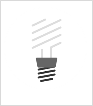
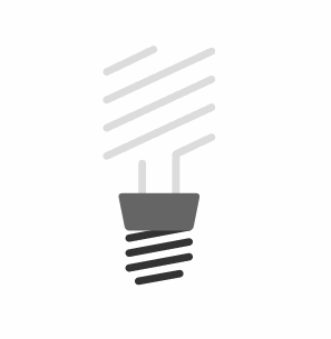
Example: Iconic
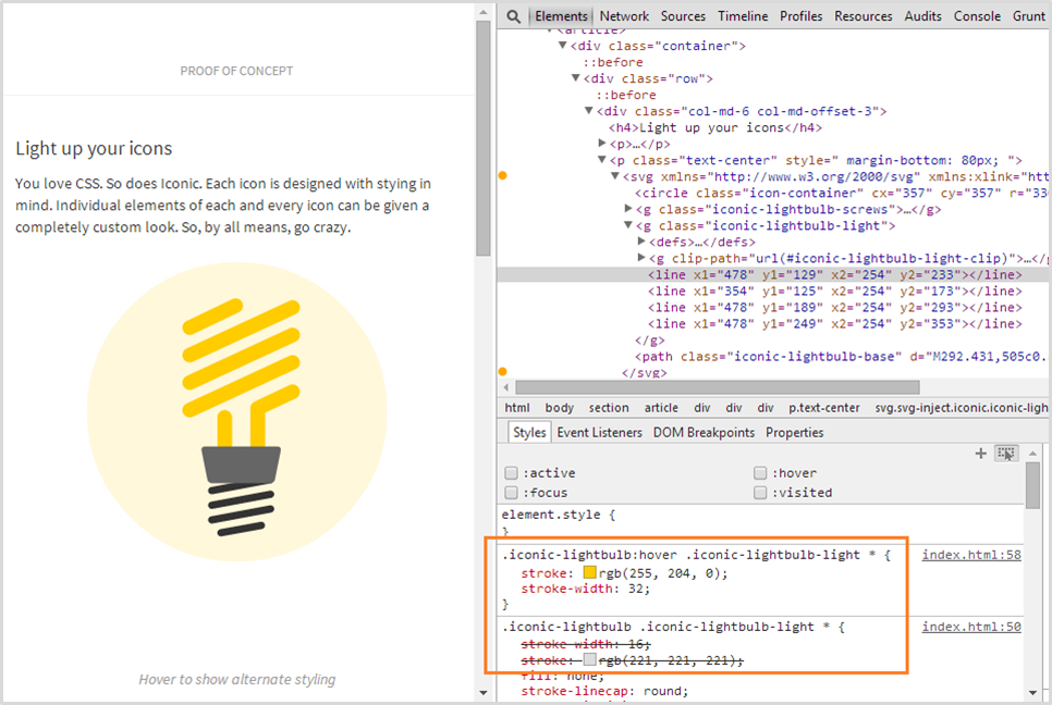
Using CSS Animations & Transforms
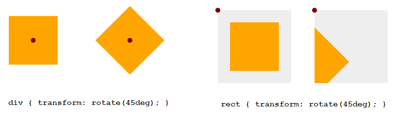
transform-origin: SVG vs HTML
transform-origin (default value)
HTML Elements (div, ::before, etc.)
SVG Elements (circle, rect, etc.)
50% 50%
(the center of the element itself, calculated relative to its box model)
0 0
(top left corner of the SVG canvas, not of the element itself)
transform-origin: SVG vs HTML
Example: 45deg Rotation
<!DOCTYPE html>
<div style="width: 100px; height: 100px; background-color: orange"> </div>
<svg style="width: 150px; height: 150px; background-color: #eee">
<rect width="100" height="100" x="25" y="25" fill="orange" />
</svg>
Setting transform-origin in SVG using CSS
- Using percentage values: The value is set relative to the element's bounding box, which includes the stroke used to draw its border.
- Using absolute values: The origin is set relative to the SVG canvas.
Setting transform-origin in SVG using CSS
Example
<!DOCTYPE html><style>
div, rect { transform-origin: 50% 50%; }
</style>
Setting transform-origin in SVG using CSS
FIREFOX BUG
Setting transform-origin in percentages does not work as expected. Use absolute values instead.
Example Animations Demo
.wheel {

        -webkit-transform-origin: 50% 50%;

        transform-origin: 193px 164px;

        animation:  spin 4s cubic-bezier(.49,.05,.32,1.04) infinite alternate;

}

@keyframes spin {

   50% {

      transform: rotate(360deg);

   }

}
3D Transforms
They work!
But...
Bugs!
- perspective doesn't currently work in Chrome
- 3D transforms on SVG elements are (currently) not hardware-accelerated in Chrome. They have the same performance profile as SVG transform attributes.
Animating SVG with CSS: Current Limitations
Example: Motion Along a Path
Motion Along a Path in CSS

Example: Morphing Shapes
And animating other attributes that simply cannot be set/styled/changed via CSS..
Animating SVG with SMIL
Synchronized Multimedia Integration Language
- Define an XML-based language that allows authors to write interactive multimedia presentations.
- Allow reusing of SMIL syntax and semantics in other XML-based languages, in particular those who need to represent timing and synchronization. For example, SMIL components are used for integrating timing into XHTML and into SVG.
What
Why
- Declarative (Info)
- Can animate attributes that CSS can't
- Animations work when SVG is embedded as <img> or as background image in CSS
- Event handling & animation synchronization capabilities
Current Browser Support
SMIL animations work in all browsers except IE and Opera Mini
Applying Animations:
SVG/SMIL Animation Elements
<animate>
Used to animate scalar attributes and properties over a period of time.
<animateTransform>
Used to animate one of SVG's transformation attributes over time, such as the transform attribute.
<animateMotion>
Used to animate/move an element along a motion path.
<set>
Used to assign animation values to non-numeric attributes and properties (e.g visibility).
Animation Attributes:
Naming Animations
<animate id="myAnim"
         attributeName=" "
         from=" "
         to=" "
         ...
/>
id
*You don't need to specify an animation name for the animation to work.
Animation Attributes: Specifying the target of the animation
<animate xlink:href="#myElement"
         id="myAnim"
         attributeName=" "
         from=" "
         to=" "
         ...
/>
xlink:href
*The target element must be part of the current SVG document fragment.
Nesting the animation element inside the target
<circle cx="50" cy="50" r="20">
    <animate
         attributeName=" "
         from=" "
         to=" "
         ... />
</circle>
Animation Attributes:
Specifying the target attribute of the animation
<animate xlink:href="#myCircle"
         id="myAnim"
         attributeName="cx"
         from=" "
         to=" "
         ...
/>
attributeName
*Only one attribute name can be specified per animation element.
<animate xlink:href="#myCircle"
         ID="myAnim"
         attributeName="cx"
         attributeType="XML"
         from=" "
         to=" "
         ...
/>
attributeType
*The attributeType can be either "XML", "CSS", or "auto".
Animation Attributes:
Simple animation from one value to another, over a duration of time
<animate id="move" link:href="#myCircle"
         attributeName="cx" attributeType="XML"
         from="50"
         to="450"
         dur="5s"
/>
CSS Equivalent
animation-name: move;
animation-duration: 5s;
@keyframes move {
    from {/* ... */}
    to { /* ... */ }
}
Animation Attributes:
Specifying the end state of the animation
<animate id="move" xlink:href="#myCircle"
         attributeName="cx" attributeType="XML"
         from="50" to="450"
         dur="5s"
         fill="freeze"
/>
CSS Equivalent
animation-name: move;
animation-duration: 5s;
animation-fill-mode: forwards;
@keyframes move {
    from {/* ... */}
    to { /* ... */ }
}
Animation Attributes:
Repeating Animations
<animate id="move" xlink:href="#myCircle"
         attributeName="cx" attributeType="XML"
         from="50" to="450"
         dur="3s" fill="freeze"
         repeatCount="indefinite"
         repeatDur="00:30"
/>
CSS Equivalent
animation-name: move;
animation-duration: 5s;
animation-fill-mode: forwards;
animation-iteration-count: infinite;
@keyframes move {
    from {/* ... */}
    to { /* ... */ }
}
Animation Attributes:
Controlling animation begin time
<animate xlink:href="#myCircle"
         attributeName="cx" attributeType="XML"
         from="50" to="450"
         dur="1s"
         fill="freeze"
         begin="click"
/>
CSS Equivalent
There is none.
Animation Attributes:
Synchronizing Animations
Examples of values
begin
click
focus
click + 2s
click + 01:30
click + 01:05:33
1s
15min
indefinite (relies on JS)
otherAnim.begin
otherAnim.begin + 1s
otherAnim.end - 1min
otherAnim.repeat(1)
otherAnim.repeat(1) + 5s
<circle id="orange-circle" r="30" cx="50" cy="50" fill="orange" />
<rect id="blue-rectangle" width="50" height="50" x="25" y="200" fill="#0099cc"></rect>
<animate xlink:href="#orange-circle" attributeName="cx" from="50"

to="450" dur="5s" fill="freeze" begin="click" id="circ-anim"/>
<animate xlink:href="#orange-circle" attributeName="fill" from="orange"

to="#0099aa" dur="2s" fill="freeze" begin="circ-anim.begin + 5s"

id="circ-color-anim"/>
<animate xlink:href="#blue-rectangle" attributeName="x" from="50"

to="425" dur="5s" fill="freeze" begin="circ-anim.begin + 1s" id="rect-anim"/>
Example
Animation Attributes:
Restarting Animations
<animate id="move"
         link:href="#myCircle"
         attributeName="cx"
         attributeType="XML"
         from="50"
         to="450"
         dur="1s"
         fill="freeze"
         begin="click"
         restart="whenNotActive"
/>
CSS Equivalent
There is none.
Animation Attributes:
Controlling animation keyframe values and pacing
The CSS Animations Way
@keyframes bounce {
    0% {
        top: 0;
        animation-timing-function: ease-in;
    }
    15% {
        top: 200px;
        animation-timing-function: ease-out;
    }
    30% {
        top: 70px;
        animation-timing-function: ease-in;
    }

    /*...other keyframes...*/

    90% {
        top: 170px;
        animation-timing-function: ease-in;
    }
    100% {
        top: 200px;
        animation-timing-function: ease-out;
    }
}
<animate
    id="bounce"
    xlink:href="#orange-circle"
    attributeName="cy"
    from="50"
    to="250"
    dur="3s"
    begin="click"
    fill="freeze"
    values="50; 250; 120;250; 170; 250; 210; 250"

    keyTimes="0; 0.15; 0.3; 0.45; 0.6;
              0.75; 0.9; 1"

    keySplines=".42 0 1 1;
                 0 0 .59 1;
                 .42 0 1 1;
                 0 0 .59 1;
                 .42 0 1 1;
                 0 0 .59 1;
                 .42 0 1 1;
                 0 0 .59 1;"
    calcMode="spline"
/>
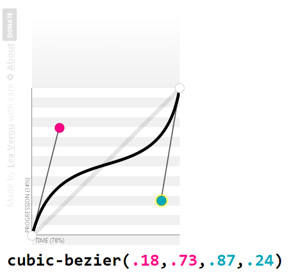
The SMIL Animations Way
- calcMode = linear | discrete | paced | spline
- keyTimes are fractions, not percentages
- nb. of keyTimes == nb. of values == nb. of keySplines + 1
- keySplines use control points coordinates, not the bezier function syntax
Notes
keySplines control points: visual representation
Animation Attributes:
Additive and Accumulative Animations
- Useful for repeating animations
- Animation starts relative to current value.
- Animation proceeds building up on the result of the previous iteration.
additive & accumulate
<animate
    xlink:href="#orange-circle"
    attributeName="cx"
    from="0"
    to="100"
    additive="sum"
    accumulate="sum"
    repeatCount="3"
    calcMode="spline"
    keyTimes="0;1"
    keySplines=".42 0 1 1"
    dur="1s"
    begin="click"
    fill="freeze"
/>
<circle id="orange-circle" r="30" cx="50" cy="50" fill="orange" />
additive & accumulate
additive
accumulate
Animation Attributes:
Explicitly specifying an animation's end time
<animate
    xlink:href="#orange-circle"
    attributeName="cx"
    from="50"
    to="450"
    dur="1s"
    begin="click"
    fill="freeze"
    id="move"
/>
<animate
    xlink:href="#orange-circle"
    attributeName="fill"
    from="#0099CC"
    to="deepPink"
    dur="5s"
    repeatCount="indefinite"
    begin="0s"
    end="move.begin"
    fill="freeze"
/>
Animation Attributes:
Specifying animation intervals
<animateTransform
    xlink:href="#deepPink-rectangle"
    attributeName="transform"
    attributeType="XML"
    type="rotate"
    from="0 75 75"
    to="360 75 75"
    dur="2s"
    fill="freeze"
    begin="click; 5s; 9s; 17s;"
    end="2s; 8s; 15s; 25s;"
/>
Animation Attributes:
Restricting the entire active duration of an animation with `min` and `max`
<animate> animation example
Shape Tweening
<path fill="#1EB287">

    <animate

             attributeName="d"

             dur="1440ms"

             repeatCount="indefinite"

             keyTimes="0; .0625; .208333333; .3125; .395833333; .645833333; .833333333; 1;"

             calcMode="spline"

             keySplines="0,0,1,1; .42,0,.58,1; .42,0,1,1; 0,0,.58,1; .42,0,.58,1; .42,0,.58,1; .42,0,.58,1"

             values="M 0,0

                     C 50,0 50,0 100,0

                     100,50 100,50 100,100

                     50,100 50,100 0,100

                     0,50 0,50 0,0

                     Z;


                     M 0,0

                     C 50,0 50,0 100,0

                     100,50 100,50 100,100

                     50,100 50,100 0,100

                     0,50 0,50 0,0

                     Z;


                     M 50,0

                     C 75,25 75,25 100,50

                     75,75 75,75 50,100

                     25,75 25,75 0,50

                     25,25 25,25 50,0

                     Z;
                     ... "


    />


  </path>
<animateTransform> animation example
<animateTransform
           xlink:href="#deepPink-rectangle"
           attributeName="transform"
           attributeType="XML"
           type="rotate"
           from="0 75 75"
           to="360 75 75"
           dur="2s"
           begin="0s"
           repeatCount="indefinite"
           fill="freeze"
/>
All about SVG transforms:
http://sarasoueidan.com/blog/svg-transformations/
<set> animation example
<set
   xlink:href="#deepPink-rectangle"
   attributeName="fill"
   to="#0099AA"
   begin="click"
   dur="3s"
/>
Animations along arbitrary paths:
<animateMotion>
Specifying a motion path
<animateMotion
           xlink:href="#circle"
           dur="1s"
           begin="click"
           fill="freeze"
           path="M0,0c3.2-3.4,18.4-0.6,23.4-0.6c5.7,0.1,10.8,0.9,16.3,2.3    c13.5,3.5,26.1,9.6,38.5,16.2c12.3,6.5,21.3,16.8,31.9,25.4c10.8,8.7,21,18.3,31.7,26.9c9.3,7.4,20.9,11.5,31.4,16.7
    c13.7,6.8,26.8,9.7,41.8,9c21.4-1,40.8-3.7,61.3-10.4c10.9-3.5,18.9-11.3,28.5-17.8c5.4-3.7,10.4-6.7,14.8-11.5
    c1.9-2.1,3.7-5.5,6.5-6.5"
/>
OR
<animateMotion xlink:href="#circle" dur="1s" begin="click" fill="freeze">
    <mpath xlink:href="#motionPath" />
</animateMotion>
1
2
<path id="motionPath" d="..." />
1
2
Setting the orientation
without changing orientation
<animateMotion
    xlink:href="#car"
    dur="3s"
    begin="0s"
    fill="freeze"
    repeatCount="indefinite"
    rotate="auto">
   <mpath xlink:href="#motionPath" />
</animateMotion>
<animateMotion
    xlink:href="#car"
    dur="3s"
    begin="0s"
    fill="freeze"
    repeatCount="indefinite"
    rotate="auto-reverse">
   <mpath xlink:href="#motionPath" />
</animateMotion>
Setting the orientation
flipping the car with transforms
Controlling the animation distance along the motion path
Animationing <text> along arbitrary paths
Laying text along a path
<path id="myPath" fill="none" stroke="#000000" stroke-miterlimit="10" d="M91.4,104.2c3.2-3.4,18.4-0.6,23.4-0.6c5.7,0.1,10.8,0.9,16.3,..."/>
<text>
    <textpath xlink:href="#myPath">
      Text laid out along a path.
    </textpath>
</text>
Animating the text offset
<text>
    <textpath xlink:href="#myPath">
      Text laid out along a path.

      <animate attributeName="startOffset" from="0%" to ="100%" begin="0s" dur="5s" repeatCount="indefinite" keyTimes="0;1" calcMode="spline" keySplines="0.1 0.2 .22 1"/>
    </textpath>
</text>
Animatable elements & attributes:
Embedding SVGs
Embedding Technique
CSS Animations
<img src="mySVG.svg" alt=".." />
CSS Interactions
Yes, only if inside <svg>
No
.el {background: url(mySVG.svg);}
No
Yes, only if inside <svg>
<object type="image/svg+xml" data="mySVG.svg"><!--fallback--></object>
Yes, only if inside <svg>
Yes, only if inside <svg>
<embed type="image/svg+xml" src="mySVG.svg" />
Yes, only if inside <svg>
Yes, only if inside <svg>
<iframe src="mySVG.svg"><!--fallback--></iframe>
Yes, only if inside <svg>
Yes, only if inside <svg>
<svg><!--SVG content--></svg>
Yes
Yes
Embedding Technique
SMIL Animations
<img src="mySVG.svg" alt=".." />
SMIL Interactions
Yes
No
.el {background: url(mySVG.svg);}
No
Yes
<object type="image/svg+xml" data="mySVG.svg"><!--fallback--></object>
Yes
Yes
<embed type="image/svg+xml" src="mySVG.svg" />
Yes
Yes
<iframe src="mySVG.svg"><!--fallback--></iframe>
Yes
Yes
<svg><!--SVG content--></svg>
Yes
Yes
Thank You!
Copy of Copy of Animating SVG with CSS and SMIL (FULL VERSION)
By shirlin1028
Copy of Copy of Animating SVG with CSS and SMIL (FULL VERSION)
Fronteers, October 2014, Amsterdam.


