Front-end programming


CSS
CSS
Cascading style sheets
CSS is a stylesheet language used to describe the presentation of a document written in HTML.
Whilst HTML is responsible for structuring the content of our page, CSS gives it style.

CSS RULESets
CSS is made up of rules.
A CSS rule is a block of code, containing one or more selectors and one or more declarations.
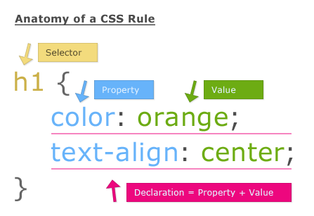
Selector - the HTML element(s) to which the rule will apply.
Property - the attributes we can use to style the HTML element.
Value - the property value; it is specific to the property we're configuring.
CSS RULESets
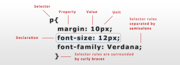
- Each ruleset must be wrapped in curly braces.
- Properties are separated from values by a colon.
- Each rule declaration must be separated by a semicolon.
Types of selectors
| NAME | SELECTION | EXAMPLE |
|---|---|---|
| Element selector | All elements of the specified type | h1 (selects elements of type h1) |
| Id selector | The element with the specified id. | #my-id |
| Class selector | The element(s) with the specified class. | .my-class |
| Attribute selector | The element(s) on the page that have the specified attribute. | div[lang="pt"] |
| Pseudo-class selector | The specified element(s) when they are in a specific state. | a:hover |
Box model
Everything displayed by CSS is a box.
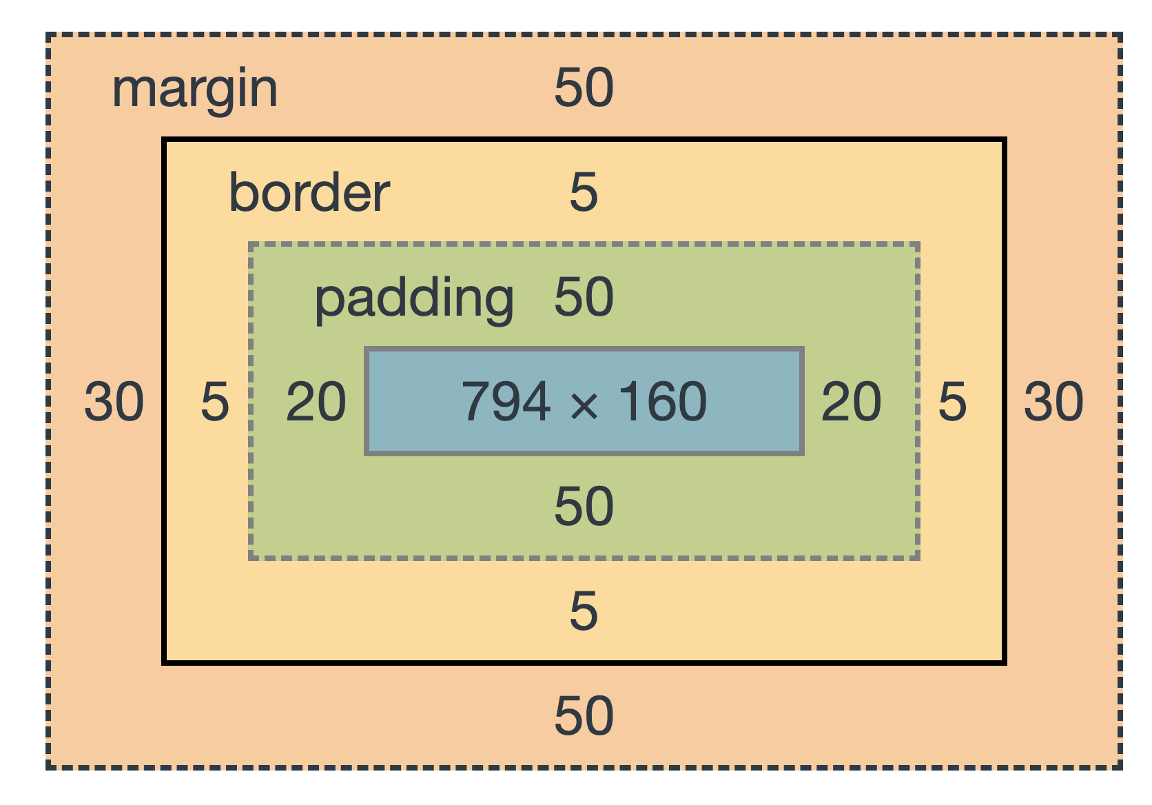
Boxes are made up of distinct box model areas that do a specific job.
- Content box - the area where the content lives in; it's usually the most variably sized area.
- Padding box - surrounds the content box. Because it is inside the box, the background of the box will be visible in the space that it creates.
- Border box - surrounds the padding box; it's the space occupied by the border.
- Margin box - the space around the box
Box model - an example

margin box
border box
padding box
content box
CSS Insertion
Inline CSS - May be used to apply a unique style for a single element.
Internal CSS - Defined inside the <style> element, in the head section.
External CSS - CSS written inside a separate file. The HTML file must include a reference to the external style sheet, inside a <link> element.
<h1 style="color:blue;text-align:center;">This is a heading</h1><head>
<style>
body {
background-color: hotpink;
}
</style>
</head><link rel="stylesheet" href="styles.css">
Live coding
First CSS steps
Cascading
Cascading is the algorithm for solving conflicts where multiple CSS rules apply to an HTML element. The algorithm is split into 4 stages:
- Position and order of appearance
- Specificity
- Origin
- Importance
Position and order of appearence
Refers to the order of appearance of our CSS rules.
button {
    color: blue;
}

button {
    color: hotpink;
}

/*What will be the color of the button?*/
specificity
An algorithm which determines which CSS selector has the strongest match.
p {
    color: blue;
}

.details {
    color: hotpink;
}

/*What will be the color of the paragraph?*/
<p class="details">Mary Lucky</p>origin
A single HTML page may inherit different style configurations. Different style origins have different priorities.
Priority is defined as follows, from most to least important:
- Inline CSS
- Embedded CSS
- External CSS
importance
CSS rules marked as !important have priority over other rules, except animations and transitions. This is because when an element is animated or a transition becomes active, it's expected to change its visual state.
Live coding
Test CSS insertion priority
layout
CSS Layouts
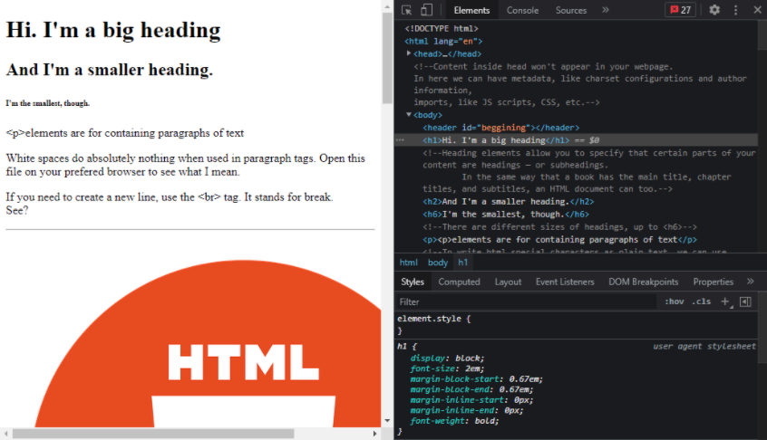
CSS provides several properties and techniques that allow for the control of the positioning of the page's elements.
The HTML pages have a normal layout when there are no CSS rules controlling it. With this layout, elements are displayed from left to right, from top to bottom (according to the document's writing mode).
CSS Layouts
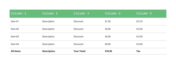
HTML tables' appearance and layout is defined by a set of CSS properties, which can be used for non-table HTML elements.
The table layout can be used when we want to display elements in a more rigid table layout, without needing to use the table markup. It's still very rigid and a bit complex, so nowadays the alternative layouts are usually preferred.
flexbox Layout
The flexbox layout distributes the elements in one dimension, either in rows or columns.
For a 'flex' container element, it is possible to control the elements' relative size, how they wrap in rows/columns, how they are aligned and spaced.
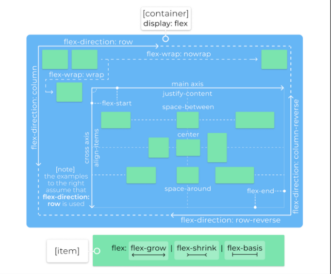
flexbox Layout
The flexbox layout has many CSS properties that can be used by the flex container or the flex items.

Some of these properties can be defined using shorthand, such as flex and flex-flow.
Here's a helpful visual cheatsheet of some of these flexbox properties: https://flexboxsheet.com/
flexbox Layout
Other flexbox-related properties can be used to align and distributes the content and the items between themselves.
Some examples:

Grid Layout
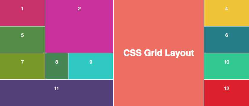
A grid layout uses a two-dimensional system to position and resize the HTML elements.
Although it also uses the concepts of rows and columns, it allows for greater ease of use and flexibility compared to the table layout.
Grid Layout
In order to define the grid in the container, we can use some of the following properties. The provided values can be absolute values, percentages, specific flex-related units (i.e., fr), and even some functions (e.g., max-content())
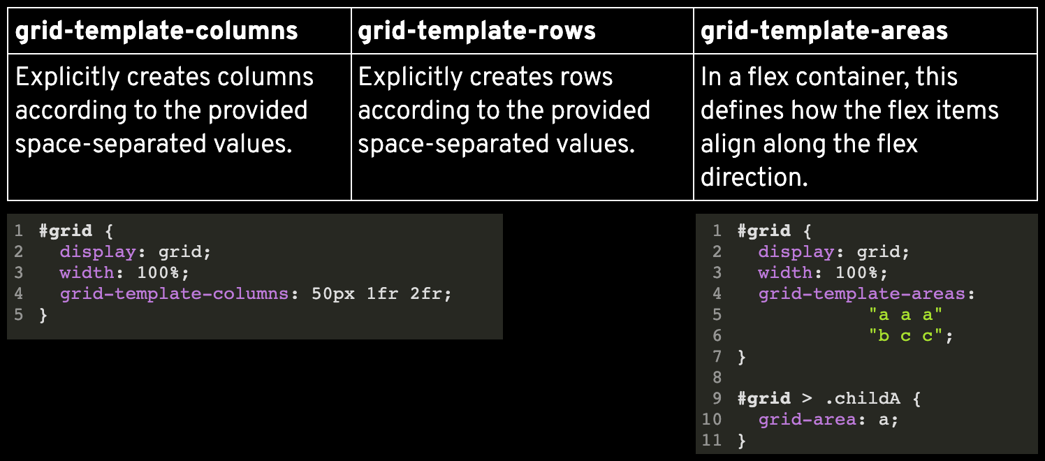
#grid {
  display: grid;
  width: 100%;
  grid-template-columns: 50px 1fr 2fr;
}
#grid {
display: grid;
width: 100%;
grid-template-areas:
"a a a"
"b c c";
}
#grid > .childA {
grid-area: a;
}Grid Layout
Once we have defined the grid for our container, we can now place the items in the grid. For each item we can define in which rows and columns it should be placed and expanded in, using these properties:
#grid > childA {
  grid-area: a;
}

#grid > childB{
 grid-row: 1 / 3;
}
The values used in these properties can be 'auto', 'span' + number, a name of a specific template area name, or an integer (referring to the line number).
Grid Layout
Regarding aligning and distributing the content and items, we have the properties presented previously for the flexbox layout, with slightly different outcomes:
Here's a helpful visual cheatsheet of some of these grid layout properties: https://grid.malven.co/

Grid Layout
Regarding aligning and distributing the content and items, we have the properties presented previously for the flexbox layout, with slightly different outcomes:
Here's a helpful visual cheatsheet of some of these grid layout properties: https://grid.malven.co/

Display property
This property defines how an element is displayed in the page, or how its contents are displayed. The display options are many, so we will focus on some more common ones.
Outside display types - display of element in the flow layout they are inserted in.

Display property
Inside display types - defines the display of the contents of the current element.
Some of these display types have internal display types associated to them, for their child elements. E.g., for table: table-row, table-cell,...

Display property
Other relevant common display types:

Display property
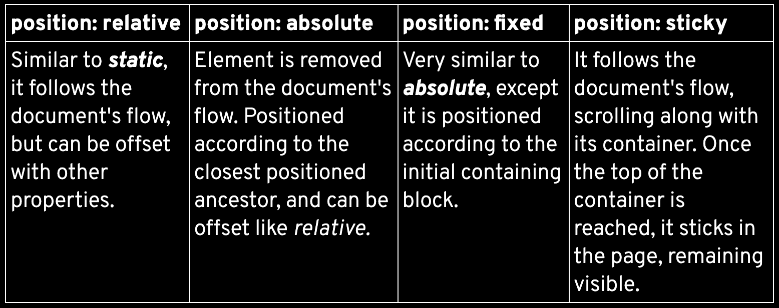
This property helps define how the element should be positioned considering the flow of the document.
The default value is static, where the element is placed exactly according to its place in the document.
Other properties can be used together with position in order to specify the element's position. e.g., top, left, right, bottom, z-index.
position property
Besides these values, the global values can be used: initial, inherit, revert, unset.
float property
Elements may float to the left/right of their container, until it reaches the edge of its container, or another floating element.
Other elements may wrap around it (if possible) or may be forced below using the clear property. This property can also be used to solve floating elements' overflow issues.
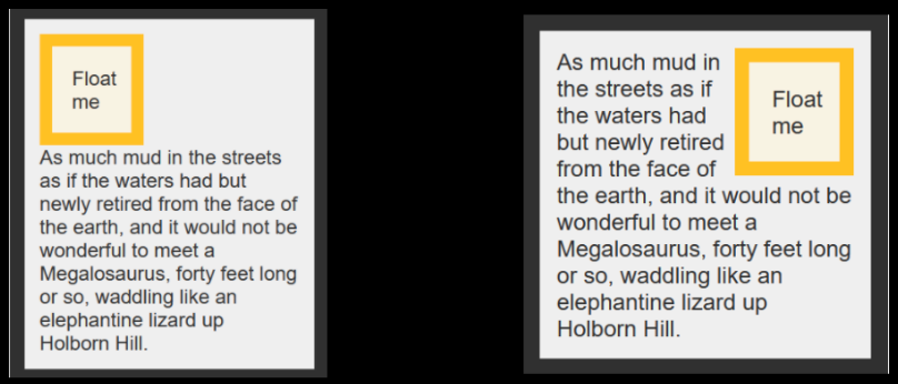
Non-floating compared to floating image, to the right.
z-index property
HTML positioned elements can be positioned in the z-axis as well, in different stacks/layers.
By default, elements are at the 0 index, larger numbers are closer and smaller numbers are further.
In the same stack/layer, the elements are positioned as follows, from furthest to closest:
- Background and borders of root
- Child static elements, ordered as they appear in the document
- Child positioned elements, ordered as they appear in the document
Live coding
CSS Layouts
animations
CSS animations
CSS animations control the values of animatable properties over time.
The animation is represented by keyframes, which define the value of the properties.
The animation has properties as well.
Let's take a look at them.
Animation properties

/*DEFINING ANIMATION USING SHORTHAND*/
.welcome{
    animation: fadein 2s forwards 1s;
}

/*OR USING THE SEPARATE PROPERTIES*/
.welcome{
    animation-name: fadein;
    animation-duration: 2s;
    animation-fillmode: forwards;
    animation-delay: 1s;
}
keyframes
@keyframes fadein {
  0% {
    opacity: 0;
    color: black;
  }

  100% {
    opacity: 1;
    color: white;
  }
}
The name property identifies the keyframes to be used for the animation, which are defined separately using the at-rule @keyframes.
Keyframes correspond to a set of property values at a specific animation time.
live coding
CSS Animations
exercisE
Holy Grail Layout
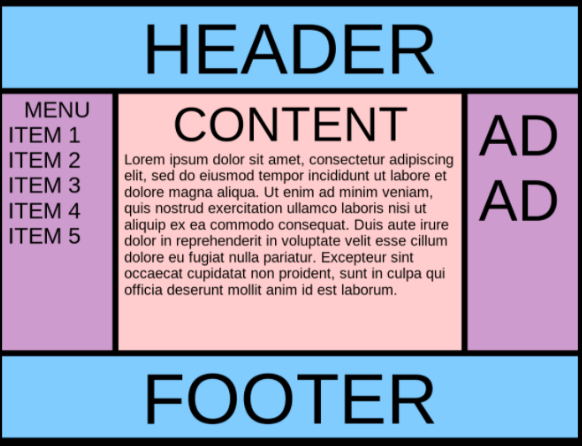
For many years, this type of layout was difficult to achieve, before the flexbox and grid layouts emerged.
Let's try to recreate this layout, with and without these layouts :)
Use the header, nav, and footer for the corresponding areas.
CSS
By Soraia Veríssimo
CSS
- 2,730


