Animation SVG avec CSS et SMIL
Hello!


Animating SVGs
-
Avec CSS
-
Avec Animations SVG (SMIL)
-
Avec JavaScript*
*Nous ne parlerons pas de JavaScript dans cette présentation
CSS et SVG
<svg xmlns="http://www.w3.org/2000/svg" version="1.1" width="300px" height="300px" viewBox="0 0 300 300">
<polygon
fill = "#FF931E"
stroke = "#ED1C24"
stroke-width = "5"
points = "279.1,160.8 195.2,193.3 174.4,280.8 117.6,211.1 27.9,218.3 76.7,142.7 42.1,59.6 129.1,82.7 197.4,24.1 202.3,114 "/>
</svg>
Avant le CSS: Attributs de Presentation SVG
star.svg
Partagé avec le CSS |
SVG Seulement |
|---|---|
|
|
clip-rule, flood-color, flood-opacity, stop-opacity, kerning, tech-anchor, color-profile, color-rendering, fill, fill-opacity, fill-rule, marker, marker-end, marker-mid, marker-start, stroke, stroke-width, stop-color, lighting-color, enable-background, dominant-baseline, color-interpolation-filters, color-interpolation, glyph-orientation-horizontal, glyph-orientation-vertical, shape-rendering, baseline-shift, alignment-baseline, stroke-miterlimit, stroke-linejoin, stroke-linecap, stroke-dashoffset, stroke-dasharray, stroke-opacity |
En SVG2, plus d'attributs de presentation seront ajoutés.
<svg xmlns="http://www.w3.org/2000/svg" version="1.1" style="width: 300px; height: 300px;" viewBox="0 0 300 300">
<polygon
style="fill: #FF931E; stroke: #ED1C24; stroke-width: 5;"
points = "279.1,160.8 195.2,193.3 174.4,280.8 117.6,211.1 27.9,218.3 76.7,142.7 42.1,59.6 129.1,82.7 197.4,24.1 202.3,114 "/>
</svg>
Styles (style="...") dans la ligne
star.svg
<svg xmlns="http://www.w3.org/2000/svg" version="1.1" width="300px" height="300px" viewBox="0 0 300 300">
<style type="text/css">
polygon { fill: ... ;}
</style>
<polygon points = "279.1,160.8 195.2,193.3 174.4,280.8 117.6,211.1 27.9,218.3 76.7,142.7 42.1,59.6 129.1,82.7 197.4,24.1 202.3,114 "/>
</svg>
Styles (<style>) incorporé dans le SVG
star.svg
<!DOCTYPE html> <html><head>...</head>
<body>
<style type="text/css">
svg { width: ...; }
polygon { fill: ... ; }
</style>
<svg version="1.1" viewBox="0 0 300 300">
<!--SVG content-->
</svg>
</body>
</html>
Styles (<style>) incorporé dans le HTML en dehors du SVG
star.svg
Style Sheets externe
<?xml version="1.0" standalone="no"?>
<?xml-stylesheet type="text/css" href="styles.css"?>
<svg xmlns="http://www.w3.org/2000/svg" version="1.1" width="300px" height="300px" viewBox="0 0 300 300">
<!-- SVG Content -->
</svg>
star.svg
Animer le SVG avec le CSS
Transitions CSS
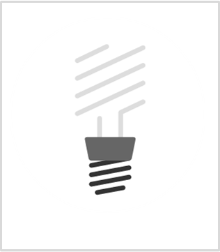
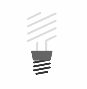
Exemple: Iconic
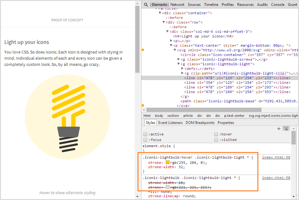
Animations & transformations CSS
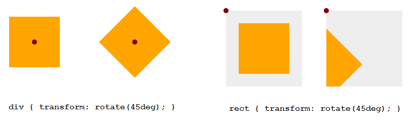
transform-origin: SVG vs HTML
transform-origin (default value)
HTML Elements (div, ::before, etc.)
SVG Elements (circle, rect, etc.)
50% 50%
(le centre de l'élément par rapport à lui même, calculé relativement a sa boite)
0 0
(coin haut à gauche du SVG, no de l'élément lui même)
transform-origin: SVG vs HTML
Exemple: 45deg Rotation
<!DOCTYPE html>
<div style="width: 100px; height: 100px; background-color: orange"> </div>
<svg style="width: 150px; height: 150px; background-color: #eee">
<rect width="100" height="100" x="25" y="25" fill="orange" />
</svg>
Paramétrer transform-origin en SVG avec CSS
- Avec les valeurs en pourcentages: La valeur est mise en relatif par rapport a la boîte de l'élément qui inclu le contour utilisé pour dessiner ses bords
- Avec des valeurs absolues:
L'origine est mise en relatif par rapport au SVG
Paramétrer transform-origin en SVG avec CSS
Exemple
<!DOCTYPE html><style>
div, rect { transform-origin: 50% 50%; }
</style>
Utiliser transform-origin en SVG avec CSS
BUG FIREFOX
Utiliser transform-origin
en pourcentage ne fonctionne pas comme prévu. Il vaut mieux utiliser des valeurs absolues à la place.
Exemple d'animation
.wheel {
-webkit-transform-origin: 50% 50%;
transform-origin: 193px 164px;
animation: spin 4s cubic-bezier(.49,.05,.32,1.04) infinite alternate;
}
@keyframes spin {
50% {
transform: rotate(360deg);
}
}
Transformations 3D
Ils marchent !
Mais...
Bugs!
- perspective ne fonctionne pas sur Google Chrome
- Les transformations 3D ne bénéficient pas de l'accélération matérielle dans Chrome. Ils ont les mêmes performances avec la transformation des attributs.
Animation SVG avec CSS: les chemins
Exemple: Suivre un chemin
Animer en suivant un chemin en CSS

Exemple: Interpoler des formes
On ne peut animer toutes les propriétés via le CSS
Animation SVG avec SMIL
Synchronized Multimedia Integration Language
- Défini un language basé sur le XML qui permet d'écrire des interactions.
- Permet de réutiliser la syntaxe de SMIL et sa sémantique dans d'autres languages basé sur le XML, en particulier celles qui demandent un timing et un synchronisation. Par exemple, les composants de SMIL sont utilisé pour intégrer un timing dans l'XHTML et dans le SVG.
Quoi ?
Pourquoi ?
- Declaratif (Info)
- Peux animer des attributs que le CSS ne peux pas
- Les animations fonctionnent quand le SVG est inclu avec <img> ou en tant que background-image en CSS
- Gestion événements et capabilité de synchronisation d'animations
Support des navigateurs
Les animations SMIL fonctionent dans tous les navigateurs
sauf IE et Opera Mini
Appliquer des animations:
SVG/ Elements d'animation SMIL
<animate>
Utilisé pour animer des attributs et des propriétés dans une période de temps
<animateTransform>
Utilisé pour animer un des attributs de transformation SVG
<animateMotion>
Utilisé pour animer et bouger un élément sur un chemin
<set>
Utilisé pour assigner des animation a des valeurs non-numérique tel que visibility
Animation des attributs:
Nomer l'animations
<animate id="myAnim"
         attributeName=" "
         from=" "
         to=" "
         ...
/>
id
*On n'a pas besoin de spécifier le nom de l'animation pour qu'elle fonctionne
Animation d'attributs: Specifier la cible de l'animation
<animate xlink:href="#myElement"
         id="myAnim"
         attributeName=" "
         from=" "
         to=" "
         ...
/>
xlink:href
*L'élément sélectionné doit faire partie du SVG dans le quel l'animation se trouve
Imbrication de l'animation dans sa cible
<circle cx="50" cy="50" r="20">
    <animate
         attributeName=" "
         from=" "
         to=" "
         ... />
</circle>
Animation d'attributs:
Specifier l'attribut de la cible de l'animation
<animate xlink:href="#myCircle"
         id="myAnim"
         attributeName="cx"
         from=" "
         to=" "
         ...
/>
attributeName
*Seulement un seul nom d'attribut peut-être spécifié par animation, mais on peut mettre plusieurs animations
<animate xlink:href="#myCircle"
         ID="myAnim"
         attributeName="cx"
         attributeType="XML"
         from=" "
         to=" "
         ...
/>
attributeType
*Les types d'attribut peut être "XML", "CSS", ou "auto".
Animation d'attributs:
Simple animation d'une valeur à une autre, pendant une durée
<animate id="move" link:href="#myCircle"
         attributeName="cx" attributeType="XML"
         from="50"
         to="450"
         dur="5s"
/>
Equivalent CSS
animation-name: move;
animation-duration: 5s;
@keyframes move {
    from {/* ... */}
    to { /* ... */ }
}
Animation d'attributs:
Specifier l'état final de l'animation
<animate id="move" xlink:href="#myCircle"
         attributeName="cx" attributeType="XML"
         from="50" to="450"
         dur="5s"
         fill="freeze"
/>
Equivalent CSS
animation-name: move;
animation-duration: 5s;
animation-fill-mode: forwards;
@keyframes move {
    from {/* ... */}
    to { /* ... */ }
}
Animation d'attributs:
Répeter les animations
<animate id="move" xlink:href="#myCircle"
         attributeName="cx" attributeType="XML"
         from="50" to="450"
         dur="3s" fill="freeze"
         repeatCount="indefinite"
         repeatDur="00:30"
/>
Equivalent CSS
animation-name: move;
animation-duration: 5s;
animation-fill-mode: forwards;
animation-iteration-count: infinite;
@keyframes move {
    from {/* ... */}
    to { /* ... */ }
}
Animation d'attributs:
Contrôler le début de l'animation
<animate xlink:href="#myCircle"
         attributeName="cx" attributeType="XML"
         from="50" to="450"
         dur="1s"
         fill="freeze"
         begin="click"
/>
Equivalent CSS
Il n'y en a pas.
Animation d'attributs:
Synchroniser les animations
Exemples de valeurs
begin
click
focus
click + 2s
click + 01:30
click + 01:05:33
1s
15min
indefinite (relies on JS)
otherAnim.begin
otherAnim.begin + 1s
otherAnim.end - 1min
otherAnim.repeat(1)
otherAnim.repeat(1) + 5s
<circle id="orange-circle" r="30" cx="50" cy="50" fill="orange" />
<rect id="blue-rectangle" width="50" height="50" x="25" y="200" fill="#0099cc"></rect>
<animate xlink:href="#orange-circle" attributeName="cx" from="50"

to="450" dur="5s" fill="freeze" begin="click" id="circ-anim"/>
<animate xlink:href="#orange-circle" attributeName="fill" from="orange"

to="#0099aa" dur="2s" fill="freeze" begin="circ-anim.begin + 5s"

id="circ-color-anim"/>
<animate xlink:href="#blue-rectangle" attributeName="x" from="50"

to="425" dur="5s" fill="freeze" begin="circ-anim.begin + 1s" id="rect-anim"/>
Exemple
Animation d'attributs:
Recommencer une animation
<animate id="move"
         link:href="#myCircle"
         attributeName="cx"
         attributeType="XML"
         from="50"
         to="450"
         dur="1s"
         fill="freeze"
         begin="click"
         restart="whenNotActive"
/>
CSS Equivalent
Il n'y en a pas.
Animation d'attributs:
Controller une animation avec des valeurs d'images clé
Animation CSS
@keyframes bounce {
    0% {
        top: 0;
        animation-timing-function: ease-in;
    }
    15% {
        top: 200px;
        animation-timing-function: ease-out;
    }
    30% {
        top: 70px;
        animation-timing-function: ease-in;
    }

    /*...other keyframes...*/

    90% {
        top: 170px;
        animation-timing-function: ease-in;
    }
    100% {
        top: 200px;
        animation-timing-function: ease-out;
    }
}
<animate
    id="bounce"
    xlink:href="#orange-circle"
    attributeName="cy"
    from="50"
    to="250"
    dur="3s"
    begin="click"
    fill="freeze"
    values="50; 250; 120;250; 170; 250; 210; 250"

    keyTimes="0; 0.15; 0.3; 0.45; 0.6;
              0.75; 0.9; 1"

    keySplines=".42 0 1 1;
                 0 0 .59 1;
                 .42 0 1 1;
                 0 0 .59 1;
                 .42 0 1 1;
                 0 0 .59 1;
                 .42 0 1 1;
                 0 0 .59 1;"
    calcMode="spline"
/>
Animation SMIL
- calcMode = linear | discrete | paced | spline
- keyTimes are fractions, not percentages
- nb. of keyTimes == nb. of values == nb. of keySplines + 1
- keySplines use control points coordinates, not the bezier function syntax
Notes
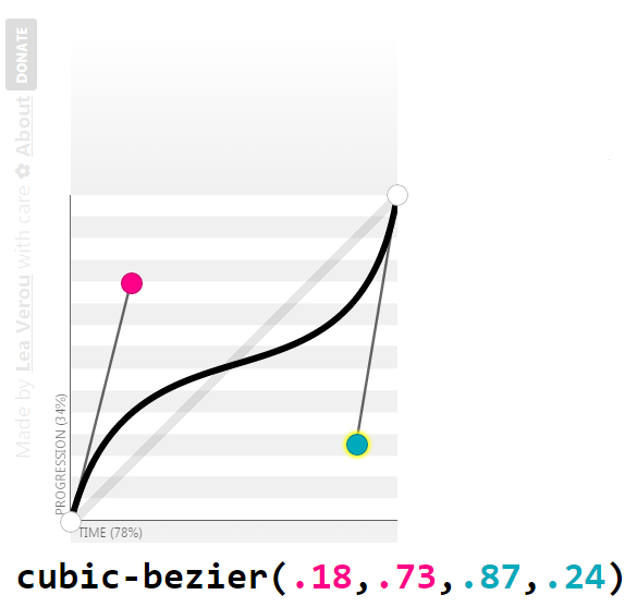
keySplines control points: visual representation
Animation d'attributs:
Animations additive et accumulative
- Utile pour répéter des animations
- L'animation commence relativement a sa position.
- L'animation se construit selon le résultat de la précédente itération.
additive & accumulate
<animate
    xlink:href="#orange-circle"
    attributeName="cx"
    from="0"
    to="100"
    additive="sum"
    accumulate="sum"
    repeatCount="3"
    calcMode="spline"
    keyTimes="0;1"
    keySplines=".42 0 1 1"
    dur="1s"
    begin="click"
    fill="freeze"
/>
<circle id="orange-circle" r="30" cx="50" cy="50" fill="orange" />
additive & accumulate
additive
accumulate
Animation d'attributs:
Specifier la fin d'une animation
<animate
    xlink:href="#orange-circle"
    attributeName="cx"
    from="50"
    to="450"
    dur="1s"
    begin="click"
    fill="freeze"
    id="move"
/>
<animate
    xlink:href="#orange-circle"
    attributeName="fill"
    from="#0099CC"
    to="deepPink"
    dur="5s"
    repeatCount="indefinite"
    begin="0s"
    end="move.begin"
    fill="freeze"
/>
Animation d'attributs:
Specifier des intervals d'animation
<animateTransform
    xlink:href="#deepPink-rectangle"
    attributeName="transform"
    attributeType="XML"
    type="rotate"
    from="0 75 75"
    to="360 75 75"
    dur="2s"
    fill="freeze"
    begin="click; 5s; 9s; 17s;"
    end="2s; 8s; 15s; 25s;"
/>
Animation d'attributs:
Restreindre l'entièreté de la durée l'animation active avec `min` and `max`
<animate> exemple d'animation
Interpolation de forme
<path fill="#1EB287">

    <animate

             attributeName="d"

             dur="1440ms"

             repeatCount="indefinite"

             keyTimes="0; .0625; .208333333; .3125; .395833333; .645833333; .833333333; 1;"

             calcMode="spline"

             keySplines="0,0,1,1; .42,0,.58,1; .42,0,1,1; 0,0,.58,1; .42,0,.58,1; .42,0,.58,1; .42,0,.58,1"

             values="M 0,0

                     C 50,0 50,0 100,0

                     100,50 100,50 100,100

                     50,100 50,100 0,100

                     0,50 0,50 0,0

                     Z;


                     M 0,0

                     C 50,0 50,0 100,0

                     100,50 100,50 100,100

                     50,100 50,100 0,100

                     0,50 0,50 0,0

                     Z;


                     M 50,0

                     C 75,25 75,25 100,50

                     75,75 75,75 50,100

                     25,75 25,75 0,50

                     25,25 25,25 50,0

                     Z;
                     ... "


    />


  </path>
<animateTransform> exemple d'animation
<animateTransform
           xlink:href="#deepPink-rectangle"
           attributeName="transform"
           attributeType="XML"
           type="rotate"
           from="0 75 75"
           to="360 75 75"
           dur="2s"
           begin="0s"
           repeatCount="indefinite"
           fill="freeze"
/>
Tout à propos des transformations SVG:
http://sarasoueidan.com/blog/svg-transformations/
<set> exemple d'animation
<set
   xlink:href="#deepPink-rectangle"
   attributeName="fill"
   to="#0099AA"
   begin="click"
   dur="3s"
/>
Animations suivant un chemin:
<animateMotion>
Specifier un chemin
<animateMotion
           xlink:href="#circle"
           dur="1s"
           begin="click"
           fill="freeze"
           path="M0,0c3.2-3.4,18.4-0.6,23.4-0.6c5.7,0.1,10.8,0.9,16.3,2.3    c13.5,3.5,26.1,9.6,38.5,16.2c12.3,6.5,21.3,16.8,31.9,25.4c10.8,8.7,21,18.3,31.7,26.9c9.3,7.4,20.9,11.5,31.4,16.7
    c13.7,6.8,26.8,9.7,41.8,9c21.4-1,40.8-3.7,61.3-10.4c10.9-3.5,18.9-11.3,28.5-17.8c5.4-3.7,10.4-6.7,14.8-11.5
    c1.9-2.1,3.7-5.5,6.5-6.5"
/>
Ou
<animateMotion xlink:href="#circle" dur="1s" begin="click" fill="freeze">
    <mpath xlink:href="#motionPath" />
</animateMotion>
1
2
<path id="motionPath" d="..." />
1
2
Paramétrer l'orientation
sans changer l'orientation
<animateMotion
    xlink:href="#car"
    dur="3s"
    begin="0s"
    fill="freeze"
    repeatCount="indefinite"
    rotate="auto">
   <mpath xlink:href="#motionPath" />
</animateMotion>
<animateMotion
    xlink:href="#car"
    dur="3s"
    begin="0s"
    fill="freeze"
    repeatCount="indefinite"
    rotate="auto-reverse">
   <mpath xlink:href="#motionPath" />
</animateMotion>
Paramétrer l'orientation
tourner la voiture avec les transformations
Contrôler la distance d'animation le long d'un chemin
Animation de <text> selon un chemin
Faire que le texte suive le chemin
<path id="myPath" fill="none" stroke="#000000" stroke-miterlimit="10" d="M91.4,104.2c3.2-3.4,18.4-0.6,23.4-0.6c5.7,0.1,10.8,0.9,16.3,..."/>
<text>
    <textpath xlink:href="#myPath">
      Text laid out along a path.
    </textpath>
</text>
Animer le décalage de texte
<text>
    <textpath xlink:href="#myPath">
      Text laid out along a path.

      <animate attributeName="startOffset" from="0%" to ="100%" begin="0s" dur="5s" repeatCount="indefinite" keyTimes="0;1" calcMode="spline" keySplines="0.1 0.2 .22 1"/>
    </textpath>
</text>
Élements animamble et leurs attributs:
Importation du SVG
Technique d'importation
Animations CSS
<img src="mySVG.svg" alt=".." />
Interactions CSS
Oui, dans <svg>
NON
.el {
background:url(mySVG.svg);}
NON
Oui, dans <svg>
<object type="image/svg+xml" data="mySVG.svg"><!--fallback--></object>
Oui, dans <svg>
Oui, dans <svg>
<embed type="image/svg+xml" src="mySVG.svg" />
Oui, dans <svg>
Oui, dans <svg>
<iframe src="mySVG.svg"><!--fallback--></iframe>
Oui, dans <svg>
Oui, dans <svg>
<svg><!--SVG content--></svg>
OUI
OUI
Technique d'importation
Animations SMIL
<img src="mySVG.svg" alt=".." />
Interactions SMIL
Oui
NON
.el {background: url(mySVG.svg);}
NON
Oui
<object type="image/svg+xml" data="mySVG.svg"><!--fallback--></object>
Oui
Oui
<embed type="image/svg+xml" src="mySVG.svg" />
Oui
Oui
<iframe src="mySVG.svg"><!--fallback--></iframe>
Oui
Oui
<svg><!--SVG content--></svg>
Oui
Oui
Merci !
allez voir et suivez
sarasoueidan.com / @SaraSoueidan
French translation of "Animating SVG with CSS and SMIL"
By Teddy K
French translation of "Animating SVG with CSS and SMIL"
Made by Sara Soueidan atFronteers, October 2014, Amsterdam. Translated by Teddy Kishi


