POP ALBUM COVER RESEARCH
KATY PERRY
'One of the boys'
This is an example of a pop album cover. This is a very bright eye catching image which displays the artist. As a result of this it creates a quite relaxing image which someone can associate with for example, going or holiday or having time to relax. The artist name appears very bright and bold in quite a feminine font which could be to attract the female audience however it is also quite pop arty, perhaps cartoon which could attract a younger audience. The variety of objects in the image reinforces the theme of holiday with the sunbed and towel for example. I feel this could perhaps be suggesting the music is something fun and exciting which would be interesting to listen to on holiday or perhaps take you to a place that feels similar to being on holiday.
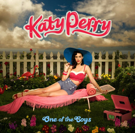
The title of this album is 'One of the Boys' which could perhaps be trying to create quite a controversial image. The reason for this is because the name is not relating to the image we are seeing on screen. Therefore perhaps this is trying to create quite a humorous image that people will find fun and enjoyable which could also be relating to her American culture and background.
ONE DIRECTION
'Take me home'
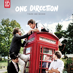
This is another pop album for the well known band One Direction. The album displayed is called 'Take Me Home' and highlights an image of the band joking around on the telephone box. The title 'Take Me Home' along with the telephone box could perhaps be suggesting the idea that London is the boys home and thats where they like to stay. The telephone box is a stereotypical image that people associate with London therefore catching the attention of the audience. As well as this the boys overall image displayed makes them appear very fun, happy, friendly people which is what they want to be portrayed as to their audience. In addition to this the artist are wearing smart clothing perhaps suggesting they are changing from boys to men.
I feel this album cover presents that the music will be quite fun and exciting and nice to listen to. In addition to this it could be trying to target a female audience because typical young girls would be attractive to them.
The colours are also very realistic and eye catching which would therefore stand out in shops for example.
ED SHEERAN
'+'
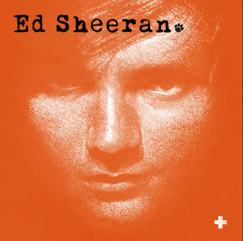
This is Ed Sheeran's pop album called '+'. This highlights an close up image of Ed with the name of the album in the bottom right corner and then Ed's name in the top left corner. This is a very simplistic cover but is also very eye catching. It follows the conventions of using an image of the artist as well as displaying the titles however the name of the cover is not very bold meaning it is therefore very difficult for the audience to see. I feel the colours have been chosen in order to people to identify it as an Ed Sheeran, the reason for this is because Ed is ginger something that is quite bold and a lot of people know about it therefore the dark orange colour expressing part of him.
The use of font and the paw print is not very formal linking to his individual image of being quite edgy. In addition to this it could perhaps be suggesting he is quite reserved and not one of these celebrities that are pretending to be someone who they're not. To add to this the name of the album cover could be expressing that this is a positive album, however it could also convey that there is more music to come.
TAYLOR SWIFT
'Red'
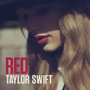
This is a pop album of Taylor Swift called 'Red'. This displays an image of Taylor Swift with the name of the album and the artist all of which are very conventional. The artist is displayed in a shadow which therefore makes her identity slightly hidden, perhaps giving an effect that by listening to her music she will be revealed and you will begin to get to know the artist. The artist is seen as looking down which could therefore indicate she is looking down at her name to clearly portray that this is her own album and she has ownership of it. In addition to this the font creates quite a sharp and bold image on the cover which could be linked in with the music.
The album is called 'Red' which clearly links to the image we are seeing. The artist is seen wearing bright, bold red lipstick which linked in with the title could be expressing hidden meanings of love or danger. This therefore could be displaying that the songs in this album are based on previous love experiences or times she has found hard.
ELLA HENDERSON
'Chapter One'
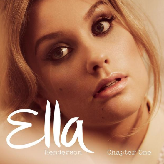
This is the album cover of Ella Henderson who is a fairly new artist but has a large audience. This is another pop album cover which is very conventional with the main image being of the artist, a bold title of the artist and also the album cover. I feel the image highlights her as someone who cares about her appearance with the use of lots of make up therefore she is perhaps creating an image that a younger audience would look up to and want to be like her. In addition I feel her name is written in quite a friendly font which therefore creates a warm, welcoming album for all audiences. To add to this the fact that only her first name is bold could be perhaps indicating she wants to come across as a normal person and be addressed as if she was a friend. Furthermore the colours used on this album are very warm and soft creating a relaxed atmosphere which could be describing the music.
The name of this album is 'Chapter One'. This could be demonstrating how this is the first step in her journey and she has many more to come. I suppose this is quite a literal title but its has the opportunity to engage the audience because they will want to listen and discover what her new music will be like.
POP ALBUM RESEARCH
By ThirteenAMS Twothousandfourteen