Mock ups
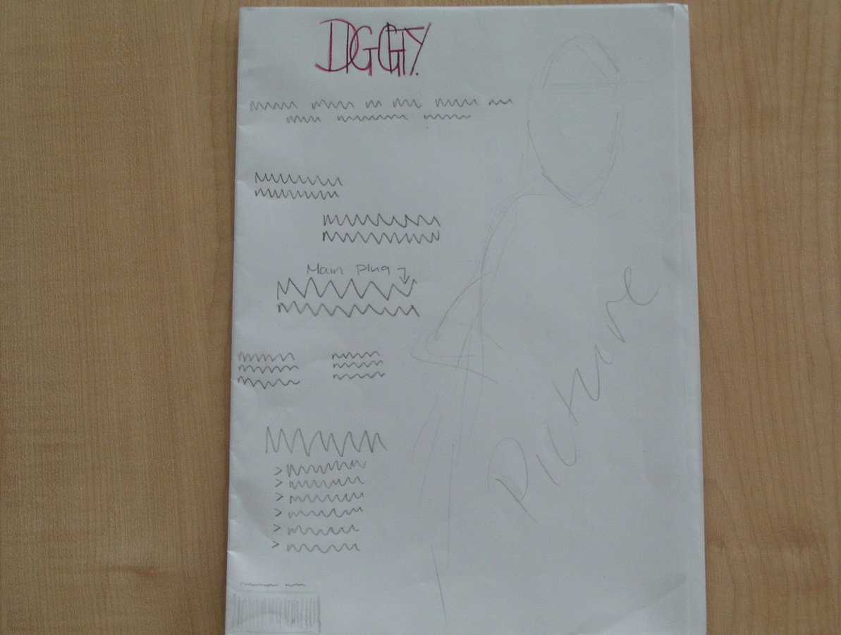
Front Cover 1
This draft suits the r&b genre very well as I incorporated a nice central image which it a close up of a female which will attract my target audience.
My masthead font also stands out very well combined with the bright orange colour i've used which will attract my target audience as they are intrigued by unique things/ things that stand out.
I could've however be a slogan or buzz words used to draw my audience in.
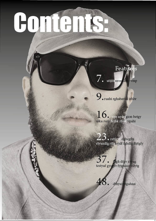
Front Cover 2
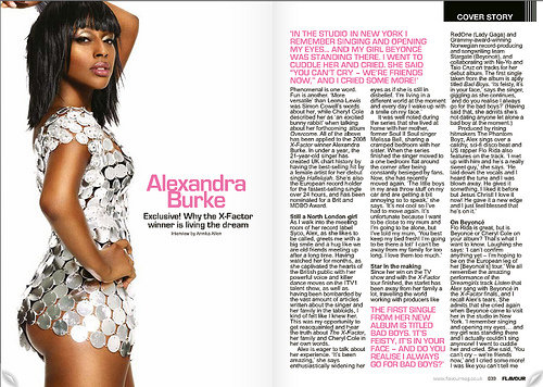
This mock up of my FC was slightly inspired from this contents page. I mimicked the basic style of this magazines contents page but used it as a template for my Front Cover as I liked how much the central image stood out in contrast to the other features on the page.
However, I felt that the font would be too small and didn't stand out enough for a FC and it also wouldn't capture my audiences eye.
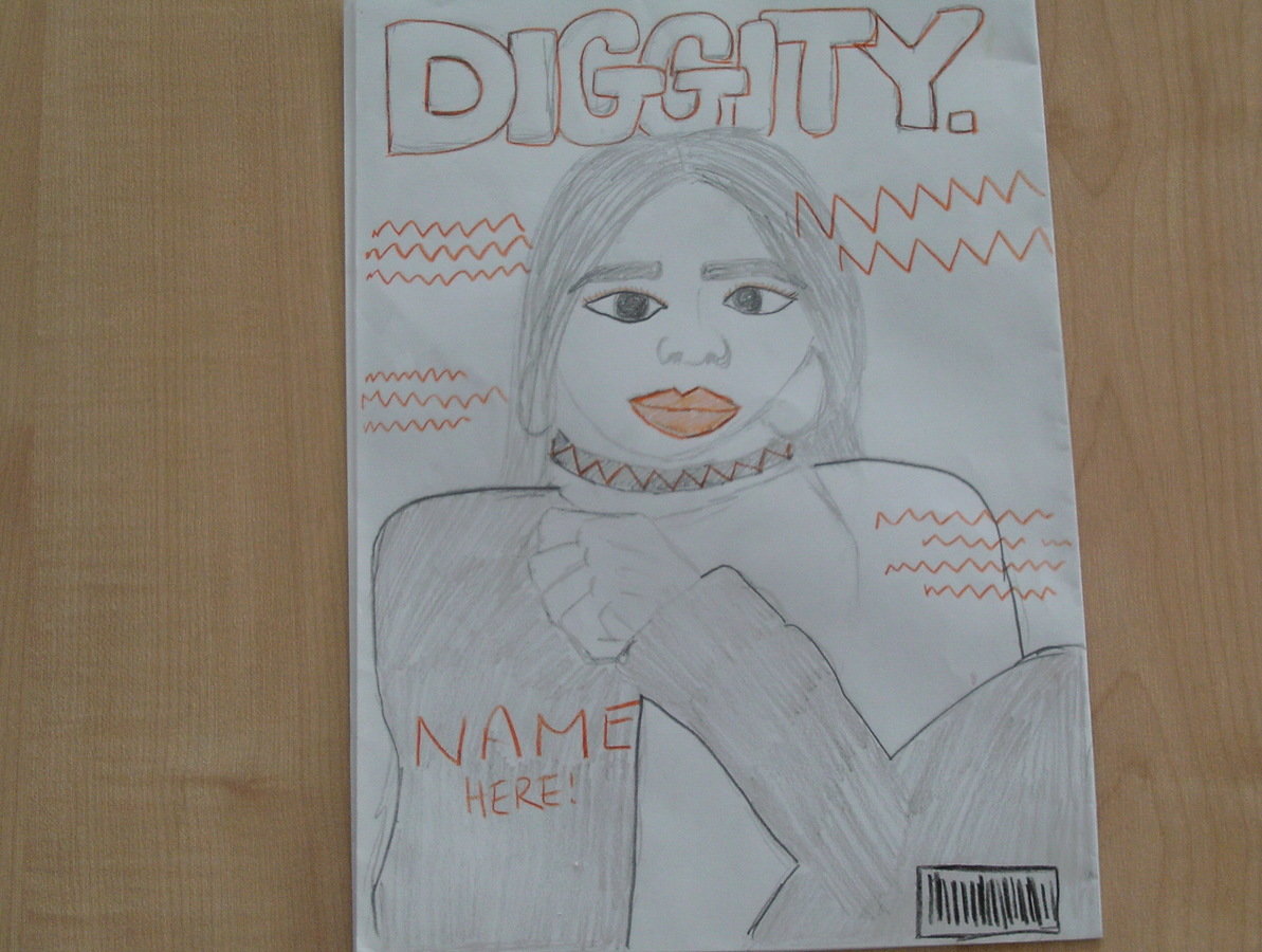
Front Cover 3
This is the draft I will use for my music magazine. I chose it based on feedback from my peers who are also very similar to my target audience therefore I felt comfortable complying with their decision.
I like the fact that the central image covers some of the magazines name/ header as it looks edgy. It's commonly done in music magazines of the r&b genre.
I felt that this layout is also what my target audience would expect of my music genre.
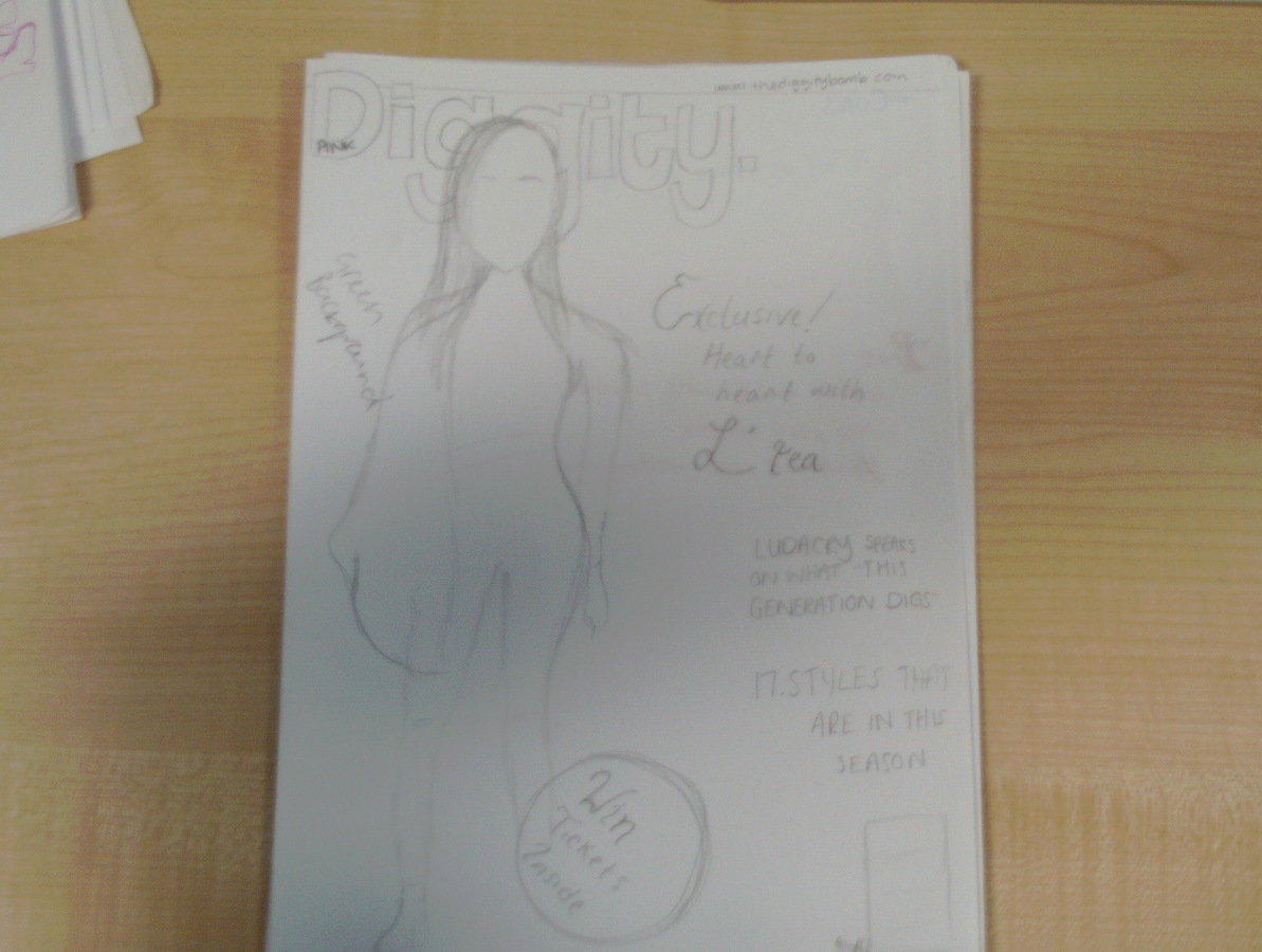
Contents Page 1
For my first contents page I wanted everything to be spread out and for the cover stories to be the main focus of the page -but still having an image of my main model from my FC as anchorage to the DPS- therfore I felt that having the title and magazine name in a small font at the top would suit this style.
I chose not to use this design as I felt that it didn't suit my chosen genre [rnb] and would therefore not be clear to my audience when reading it.
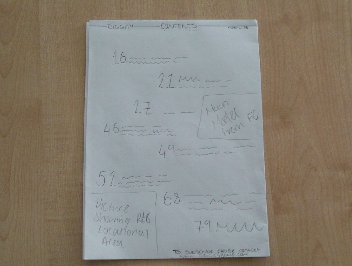
Contents Page 2
This is a good structure for my contents page as it's clearly layed out making it easy for my audience to read and therefore locate the articles they're interested in. As my central image is down the side of the page it leaves plenty of room for my body copy.
This design could however be seen as too simple for my Rnb genre as the audience look for something unique/ that stands out and this draft doesn't really have that.
It's also uncommon for the contents page to not be labeled as so which doesnt follow magazine conventions.
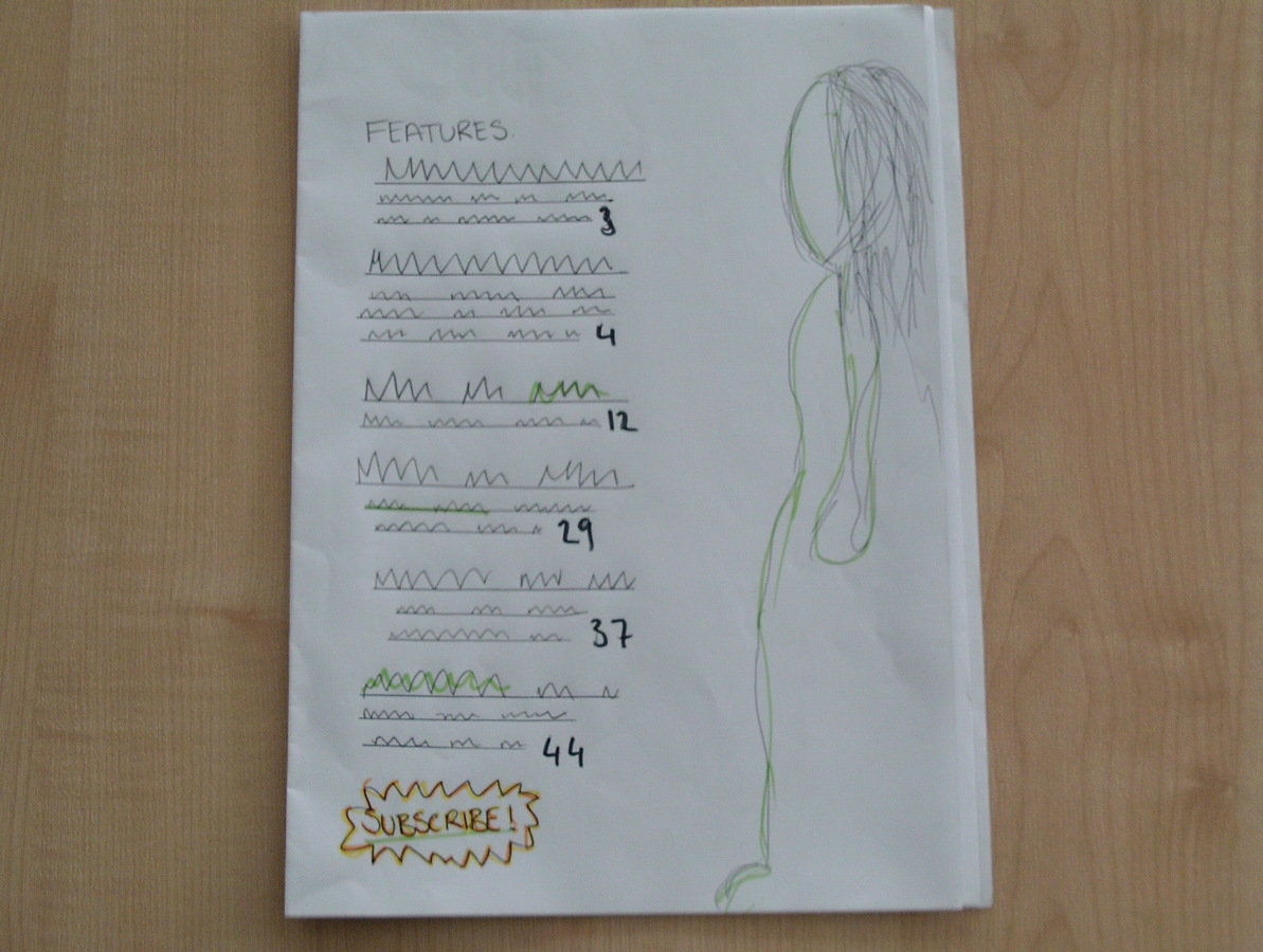
Contents Page 3
For this mock up I decided to use the software that I'd be using to create my final piece as a better practice.
I created a simple contents page and played around with the images saturation and hue.
I didn't really like having a close up image behind the features descriptions as I felt that it would be too distracting for my audience while reading them. This did however give me the inspiration to play around with text wrapping which I ended up using on my final design of my DPS.
Double Page Spread 1
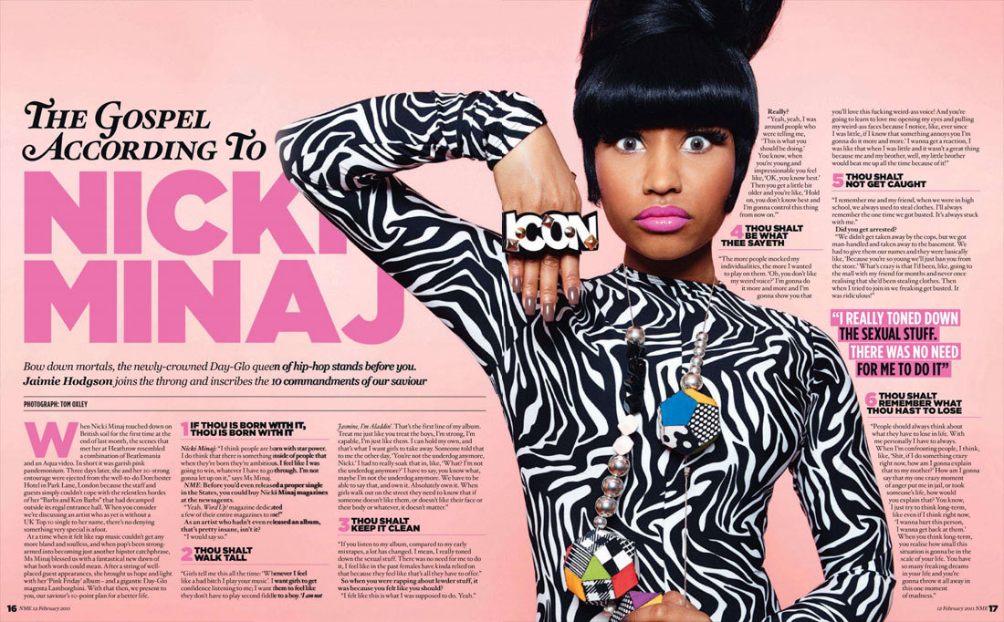
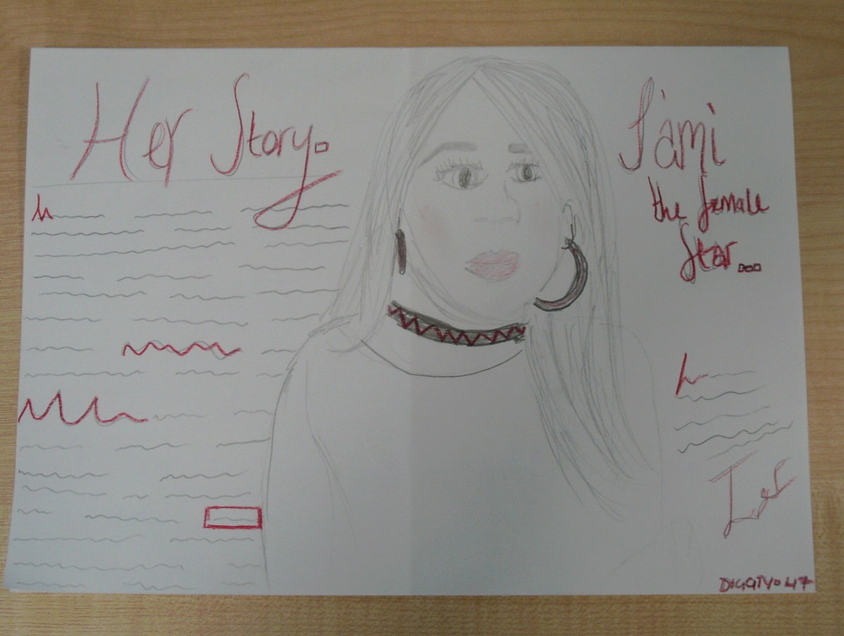
I really loved the layout of this DPS as despite the fact that its so spread out with the writing everywhere, it still looks neat and elegant which is what I was looking for for my Rnb magazine final piece.
I placed my central image in the same place for this draft and changed the layout of the text. I ended up using this design for my final DPS however I felt that the way the text was layed out didn't suit my Rnb genre so I altered it to two columns which is more common in music magazines and therefore will make my audience more comfortable and draw them in more due to familiarity.
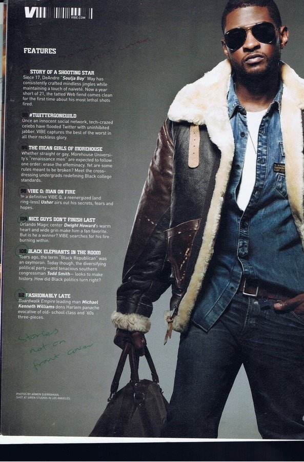
Double Page Spread 2
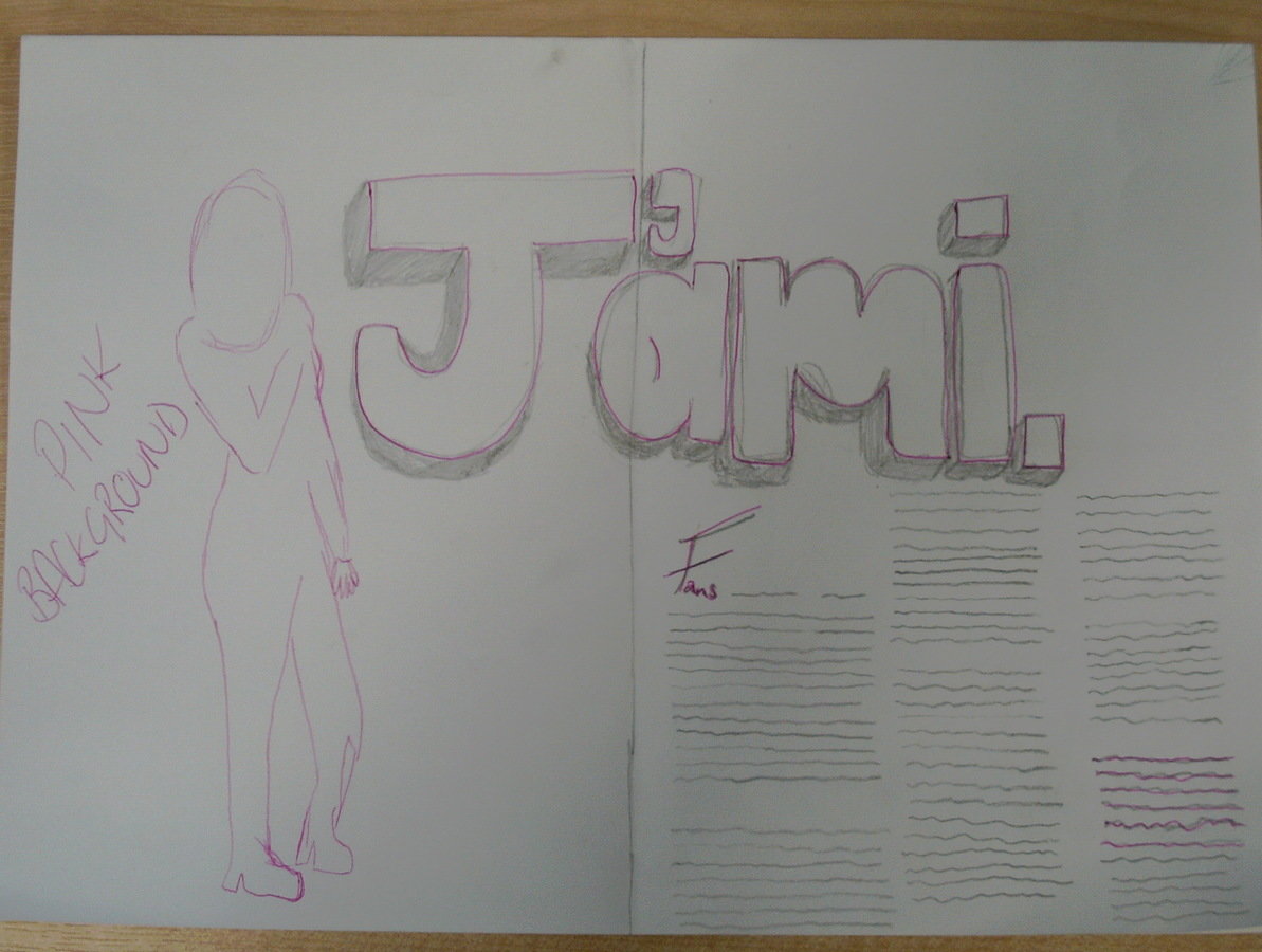
I really liked this mock up as I felt it was the most suitable for my genre out of the three I designed. I think the artists name in such a large font would draw my type of audience in to read the article and having such a simple layout would please them.
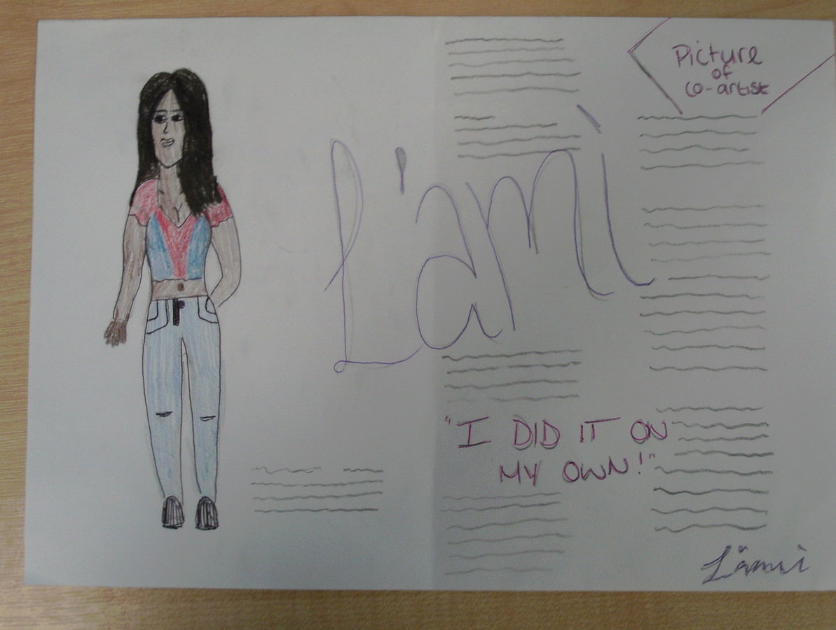
I used this DPS above for inspiration as it is the same genre as my magazine which meant that the way they have chosen to represent women is the common way to do so for the Rnb genre
and will therefore be what my target audience would expect. Due to this I looked through my models images and found one which would similarly represent women and then sketched the image on to my mock up.
I chose not to use this as my final piece as from my target audience feedback upon viewing my three mock ups I found out that they prefer close ups of the artist on DPS.
Double Page Spread 3
I think this draft gives a clear indication of what genre my music magazine is and it uses a conventional layout style that my target audience will be familar with.
Also incorporating a graphic image as well as my central image makes the DPS more interesting for my audience to look at.
I debated whether this draft didn't focus enough on the body copy as the other features on the page take up a lot of room :The artists name and the central image of the artist takes up near to a whole page.
Mock ups
By tisha