Animations
CSS Animations

Reflow: compute the layout of each visible element (position and size).
Repaint: renders the pixels to screen.
How the browser renders the document
CSS3 Transform
CSS3 2D Support
transform: method(properties)
CSS3 Transform
CSS3 2D transformations
The translate() Method


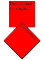
The rotate() Method

The scale() Method
translate(x, y);
rotate(angle);
transform: scale(width, height);
CSS3 Transform
CSS3 2D transformations
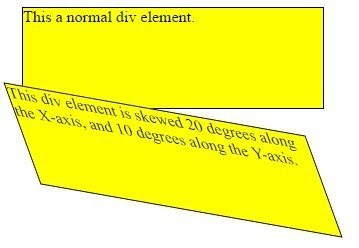
The skew() Method

matrix(scaleX(),skewY(),skewX(),scaleY(),translateX(),translateY()):
skew(xAngle, yAngle);
CSS3 Transform
CSS3 2D transformations
CSS3 Transform
CSS3 3D transformations
transform: method(property);
CSS3 Transform
CSS3 3D transformations
The rotateX() Method

The rotateY() Method

The rotateZ() Method

rotateX(Angle);
rotateY(Angle);
rotateZ(Angle);
CSS3 Transform
CSS3 Transitions
CSS3 transitions allows us to apply animations or different css changes smoothly or with a delay
CSS3 Transitions
To use transitions you need to:
- CSS property that you want to apply transition to
- length of the effect
div {
    width: 100px;
    height: 100px;
    background: red;
    transition: width 2s;
}
div:hover {
    width: 300px;
}
CSS3 Transitions
transition-timing-function
- ease
- linear
- ease-in
- ease-out
- ease-in-out
- cubic-bezier(n,n,n,n)
…more
CSS3 Transitions
transition-delay: time;
CSS3 Transitions
Transition + Transformation
transition: width 2s, height 2s, transform 2s;
CSS3 Transitions
div {
    transition-property: width;
    transition-duration: 2s;
    transition-timing-function: linear;
    transition-delay: 1s;
}
div {
transition: width 2s linear 1s;
}CSS3 Animations
CSS3 animations allow us to animate big number of elements without using JS
CSS3 Animations
@keyframes rule
@keyframes example {
    from {
        background-color: red;
    }
    to {
        background-color: yellow;
    }
}

div {
    width: 100px;
    height: 100px;
    background-color: red;
    animation-name: example;
    animation-duration: 4s;
}
Without animation-duration property - animation won’t start
CSS3 Animations
@keyframes example {
    0% {
        background-color: red;
    }
    50% {
        background-color: green;
    }
    100% {
        background-color: yellow;
    }
}

div {
    width: 100px;
    height: 100px;
    background-color: red;
    animation-name: example;
    animation-duration: 4s;
}
@keyframes rule
CSS3 Animations
animation-delay
CSS3 Animations
Animation-iteration-count
"infinite" = animation will last forever
CSS3 Animations
Animation-direction
- reverse
- alternate
CSS3 Animations
Animation-timing-function
- ease
- linear
- ease-in
- ease-out
- ease-in-out
- cubic-bezier(n,n,n,n)
CSS3 Animations
Animation-timing-function
CSS3 Animations
div {
    animation-name: example;
    animation-duration: 5s;
    animation-timing-function: linear;
    animation-delay: 2s;
    animation-iteration-count: infinite;
    animation-direction: alternate;
}
shorter way
div {
    animation: example 5s linear 2s infinite alternate;
}
Cool EXAMPLES
JS animations
For animations that CSS can’t handle well, or those that need tight control, JavaScript can help
JavaScript animations are done by programming gradual changes in an element's style.
var id = setInterval(frame, 5);

function frame() {
  if (/* test for finished */) {
    clearInterval(id);
  } else {
    /* code to change the element style */
  }
}
Request animation frame
Let’s imagine we have several animations running simultaneously.
If we run them separately, then even though each one has setInterval(..., 20), then the browser would have to repaint much more often than every 20ms, because they have different starting time.
These several independent redraws should be grouped together, to make the redraw easier for the browser and hence load less CPU load and look smoother.
There’s one more thing to keep in mind. Sometimes CPU is overloaded, or there are other reasons to redraw less often (like when the browser tab is hidden), so we really shouldn’t run it every 20ms.
Request animation frame
That schedules the callback function to run in the closest time when the browser wants to do animation.
If we do changes in elements in callback then they will be grouped together with other requestAnimationFrame callbacks and with CSS animations. So there will be one geometry recalculation and repaint instead of many.
When a page is in the background, there are no repaints at all, so the callback won’t run: the animation will be suspended and won’t consume resources.
The returned value requestId can be used to cancel the call
let requestId = requestAnimationFrame(callback);

cancelAnimationFrame(requestId);WEB animations API
Suport: Firefox 48+, Chrome 36+ and Safari 13.1+
The Web Animations API allows for synchronizing and timing changes to the presentation of a Web page, i.e. animation of DOM elements. It does so by combining two models: the Timing Model and the Animation Model.
It is one of the most performant ways to animate on the Web, letting the browser make its own internal optimizations without hacks, coercion, or Window.requestAnimationFrame().
element.animate(keyframes, options);animation.pause();animation.play();const animation = document
.querySelector(".block")
.animate(
tumbling,
timing
)Pausing and playing animations
Thank you
Copy of Position.Floats.Semantics.CSS3
By Victoria Budyonnaya
Copy of Position.Floats.Semantics.CSS3
Box model. Display. Float & Clear. Position
- 359


