Welcome to VueJS workshop
Excercise 6
Create VueX store with user and module and posts module
Load posts into a store on initial app load
Change posts access to be getters from the store
Integrate login flow with VueX user module
Add login button to redirect to the Login page or present user name when the user is logged in
create add comments functionality to an app (if not logged in, it should be a guest, if logged in, should write user name near the comment)
When filling the login form, log in to dummy API, store user in store and redirect to UserProfile page.
Exercises

Animations and transitions
Vue provides a transition wrapper component, allowing you to add entering/leave transitions for any element or component in the following contexts:
- Conditional rendering (using v-if)
- Conditional display (using v-show)
- Dynamic components
- Component root nodes
Animations and transitions
 <transition name="fade">
    <p v-if="show">hello</p>
  </transition>
.fade-enter-active, .fade-leave-active {
transition: opacity .5s;
}
.fade-enter, .fade-leave-to /* .fade-leave-active below version 2.1.8 */ {
opacity: 0;
}What happens?
- Vue will automatically sniff whether the target element has CSS transitions or animations applied. If it does, CSS transition classes will be added/removed at appropriate timings.
- If the transition component provided JavaScript hooks, these hooks will be called at appropriate timings.
- If no CSS transitions/animations are detected and no JavaScript hooks are provided, the DOM operations for insertion and/or removal will be executed immediately on next frame (Note: this is a browser animation frame, different from Vue’s concept of nextTick).
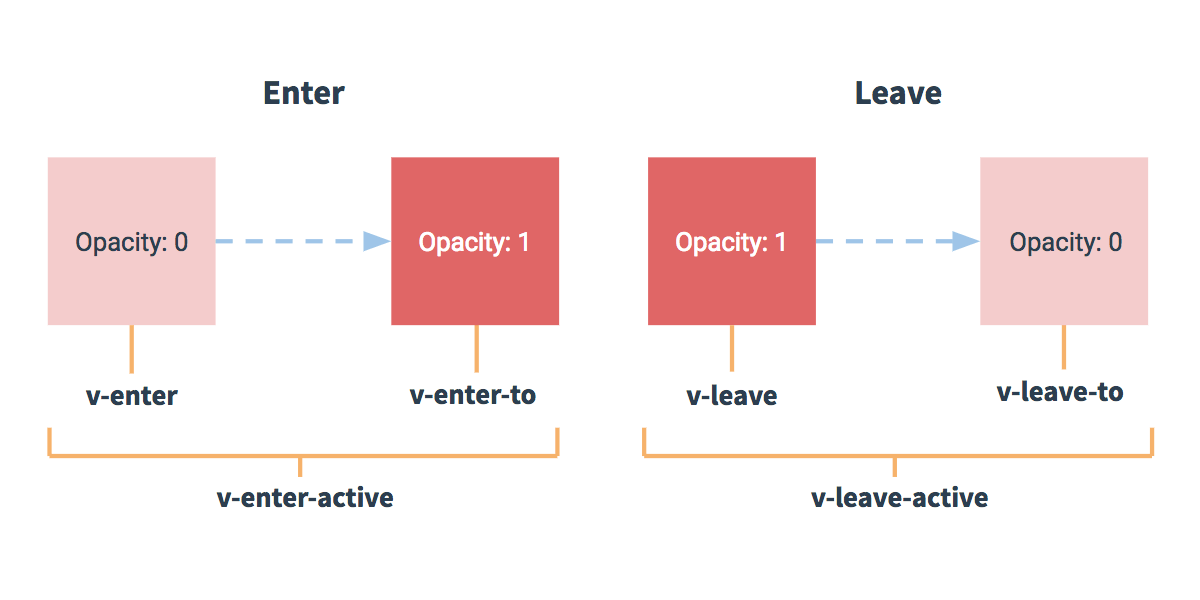
Enter - leave
- v-enter: before element is inserted, removed one frame after element is inserted.
- v-enter-active: Applied during the entire entering phase. Added before an element is inserted, removed when transition/animation finishes. used to define the duration, delay and easing
- v-enter-to: End state for enter. Added one frame after an element is inserted (at the same time v-enter is removed), removed when transition/animation finishes.
- v-leave: Added immediately when a leaving transition is triggered, removed after one frame.
- v-leave-active: Applied during the entire leaving phase. Added immediately when leave transition is triggered, removed when the transition/animation finishes. used to define the duration, delay and easing
- v-leave-to: Added one frame after a leaving transition is triggered (at the same time v-leave is removed), removed when the transition/animation finishes.
Enter - leave
CSS Transitions
<div id="example-1">
  <button @click="show = !show">
    Toggle render
  </button>
  <transition name="slide-fade">
    <p v-if="show">hello</p>
  </transition>
</div>
/* Enter and leave animations can use different */
/* durations and timing functions. */
.slide-fade-enter-active {
transition: all .3s ease;
}
.slide-fade-leave-active {
transition: all .8s cubic-bezier(1.0, 0.5, 0.8, 1.0);
}
.slide-fade-enter, .slide-fade-leave-to
/* .slide-fade-leave-active below version 2.1.8 */ {
transform: translateX(10px);
opacity: 0;
}CSS Animations
<div id="example-2">
  <button @click="show = !show">Toggle show</button>
  <transition name="bounce">
    <p v-if="show">Lorem ipsum dolor sit amet, consectetur adipiscing elit. Mauris facilisis enim libero, at lacinia diam fermentum id. Pellentesque habitant morbi tristique senectus et netus.</p>
  </transition>
</div>
.bounce-enter-active {
animation: bounce-in .5s;
}
.bounce-leave-active {
animation: bounce-in .5s reverse;
}
@keyframes bounce-in {
0% {
transform: scale(0);
}
50% {
transform: scale(1.5);
}
100% {
transform: scale(1);
}
}The difference being that v-enter is not removed immediately after the element is inserted, but on an animationend event.
Custom classes
<link href="https://cdn.jsdelivr.net/npm/animate.css@3.5.1" rel="stylesheet" type="text/css">

<div id="example-3">
  <button @click="show = !show">
    Toggle render
  </button>
  <transition
    name="custom-classes-transition"
    enter-active-class="animated tada"
    leave-active-class="animated bounceOutRight"
  >
    <p v-if="show">hello</p>
  </transition>
</div>- enter-class
- enter-active-class
- enter-to-class (2.1.8+)
- leave-class
- leave-active-class
- leave-to-class (2.1.8+)
Custom duration
You can specify duration
<transition :duration="1000">...</transition><transition :duration="{ enter: 500, leave: 800 }">...</transition>Transition hooks
<transition
  v-on:before-enter="beforeEnter"
  v-on:enter="enter"
  v-on:after-enter="afterEnter"
  v-on:enter-cancelled="enterCancelled"

  v-on:before-leave="beforeLeave"
  v-on:leave="leave"
  v-on:after-leave="afterLeave"
  v-on:leave-cancelled="leaveCancelled"
>
  <!-- ... -->
</transition>
Transition hooks
// ...
methods: {
  // --------
  // ENTERING
  // --------

  beforeEnter: function (el) {
    // ...
  },
  // the done callback is optional when
  // used in combination with CSS
  enter: function (el, done) {
    // ...
    done()
  },
  afterEnter: function (el) {
    // ...
  },
  enterCancelled: function (el) {
    // ...
  },

  // --------
  // LEAVING
  // --------

  beforeLeave: function (el) {
    // ...
  },
  // the done callback is optional when
  // used in combination with CSS
  leave: function (el, done) {
    // ...
    done()
  },
  afterLeave: function (el) {
    // ...
  },
  // leaveCancelled only available with v-show
  leaveCancelled: function (el) {
    // ...
  }
}
There is a lot more about transitions. check out the docs
Vue Plugins
- Plugins that add global methods or properties
- Plugins that add one or more global assets: directives/filters/transitions etc. e.g. vue-touch
- Plugins that add some component options by the global mixin. e.g. vue-router
- Plugins that add some Vue instance methods by attaching them to Vue.prototype.
- A library that provides an API of its own, while at the same time injecting some combination of the above. e.g. vue-router
VueX Plugins
// calls `MyPlugin.install(Vue)`
Vue.use(MyPlugin)

new Vue({
  //... options
})
Plugin should expose an install method. The method will be called with the Vue constructor as the first argument, along with possible options:
Vue Plugins
MyPlugin.install = function (Vue, options) {
  // 1. add global method or property
  Vue.myGlobalMethod = function () {
    // some logic ...
  }

  // 2. add a global asset
  Vue.directive('my-directive', {
    bind (el, binding, vnode, oldVnode) {
      // some logic ...
    }
    ...
  })

  // 3. inject some component options
  Vue.mixin({
    created: function () {
      // some logic ...
    }
    ...
  })

  // 4. add an instance method
  Vue.prototype.$myMethod = function (methodOptions) {
    // some logic ...
  }
}
Mixins
// define a mixin object
var myMixin = {
  created: function () {
    this.hello()
  },
  methods: {
    hello: function () {
      console.log('hello from mixin!')
    }
  }
}

// define a component that uses this mixin
var Component = Vue.extend({
  mixins: [myMixin]
})

var component = new Component() // => "hello from mixin!"
Mixins
When a mixin and the component itself contain overlapping options, they will be “merged” using appropriate strategies.
For example, data objects undergo a recursive merge, with the component’s data taking priority in cases of conflicts.
Custom directives
// Register a global custom directive called `v-focus`
Vue.directive('focus', {
  // When the bound element is inserted into the DOM...
  inserted: function (el) {
    // Focus the element
    el.focus()
  }
})
Hook Functions
A directive definition object can provide several hook functions (all optional):
-
bind: called only once, when the directive is first bound to the element
-
inserted: called when the bound element has been inserted into its parent node
-
update: called after the containing component’s VNode has updated, but possibly before its children have updated.
-
componentUpdated: called after the containing component’s VNode and the VNodes of its children have updated.
-
unbind: called only once, when the directive is unbound from the element.
Directive Hook Arguments
- el: The element the directive is bound to
-
binding: An object containing the following properties.
- name: The name of the directive, without the v- prefix.
- value: The value passed to the directive. For example in v-my-directive="1 + 1", the value would be 2.
- oldValue: The previous value, only available in update and componentUpdated. It is available whether or not the value has changed.
- expression: The expression of the binding as a string. For example in v-my-directive="1 + 1", the expression would be "1 + 1".
- arg: The argument passed to the directive, if any.
- modifiers: An object containing modifiers, if any.
- vnode: The virtual node produced by Vue’s compiler
- oldVnode: The previous virtual node, only available in the update and componentUpdated hooks.
Dynamic args
Directive arguments can be dynamic.
v-mydirective:[argument]="value"
Shorthand
In many cases, you may want the same behavior on bind and update, but don’t care about other
Vue.directive('color', function (el, binding) {
  el.style.color = binding.value
})
Render Functions
- Used when you need JS power over the template
- Render functions are closer to compiler
Render Functions
<script type="text/x-template" id="anchored-heading-template">
  <h1 v-if="level === 1">
    <slot></slot>
  </h1>
  <h2 v-else-if="level === 2">
    <slot></slot>
  </h2>
  <h3 v-else-if="level === 3">
    <slot></slot>
  </h3>
  <h4 v-else-if="level === 4">
    <slot></slot>
  </h4>
  <h5 v-else-if="level === 5">
    <slot></slot>
  </h5>
  <h6 v-else-if="level === 6">
    <slot></slot>
  </h6>
</script>
Vue.component('anchored-heading', {
render: function (createElement) {
return createElement(
'h' + this.level, // tag name
this.$slots.default // array of children
)
},
props: {
level: {
type: Number,
required: true
}
}
})Create element
// @returns {VNode}
createElement(
  // {String | Object | Function}
  // An HTML tag name, component options, or async
  // function resolving to one of these. Required.
  'div',

  // {Object}
  // A data object corresponding to the attributes
  // you would use in a template. Optional.
  {
    // (see details in the next section below)
  },

  // {String | Array}
  // Children VNodes, built using `createElement()`,
  // or using strings to get 'text VNodes'. Optional.
  [
    'Some text comes first.',
    createElement('h1', 'A headline'),
    createElement(MyComponent, {
      props: {
        someProp: 'foobar'
      }
    })
  ]
)You might want to switch to JSX
import AnchoredHeading from './AnchoredHeading.vue'

new Vue({
  el: '#demo',
  render: function (h) {
    return (
      <AnchoredHeading level={1}>
        <span>Hello</span> world!
      </AnchoredHeading>
    )
  }
})Functional components
Vue.component('my-component', {
  functional: true,
  // Props are optional
  props: {
    // ...
  },
  // To compensate for the lack of an instance,
  // we are now provided a 2nd context argument.
  render: function (createElement, context) {
    // ...
  }
})
<template functional>
</template>Different edge cases
Vue Reactivity system in depth
Security
Folder structure in big projects
Sort by Feature vs Sort by Type
Form Validations
import Vue from 'vue'
import Vuelidate from 'vuelidate'
Vue.use(Vuelidate)
import { validationMixin } from 'vuelidate'
var Component = Vue.extend({
mixins: [validationMixin],
validations: { ... }
})Or use as a mixin inside component
import { required, minLength, between } from 'vuelidate/lib/validators'

export default {
  data() {
    return {
      name: '',
      age: 0
    }
  },
  validations: {
    name: {
      required,
      minLength: minLength(4)
    },
    age: {
      between: between(20, 30)
    }
  }
}
<div>
<div class="form-group" :class="{ 'form-group--error': $v.form.userName.$error }">
<label class="form__label">Username</label>
<input class="form__input" v-model.trim="$v.form.userName.$model"/>
</div>
<div class="error" v-if="!$v.form.userName.required">Field is required.</div>
<div class="error" v-if="!$v.form.userName.minLength">Field must have at least {{ $v.form.userName.$params.minLength.min }} characters.</div>
<div class="form-group" :class="{ 'form-group--error': $v.form.password.$error }">
<label class="form__label">Password</label>
<input class="form__input" v-model.trim="$v.form.password.$model" type="password"/>
</div>
<div class="error" v-if="!$v.form.password.required">Field is required.</div>
<div class="error" v-if="!$v.form.password.minLength">Field must have at least {{ $v.form.password.$params.minLength.min }} characters.</div>
<div class="form-group" :class="{ 'form-group--error': $v.form.$error }">
<div class="error" v-if="$v.form.$error">Form is invalid.</div>
</div>
<tree-view :data="$v" :options="{rootObjectKey: '$v', maxDepth: 2}"></tree-view>
</div>Dependency injection with provide and inject
The provide option should be an object or a function that returns an object. This object contains the properties that are available for injection (with inject) into its descendants.
export default {
  name: 'TodoList',
  inject: { fetchTodos: 'fetch' },
  created() {
    this.fetch();
  },
Dependency injection with provide and inject
The provide option should be an object or a function that returns an object. This object contains the properties that are available for injection (with inject) into its descendants.
export default {
  name: 'TodoList',
  inject: { fetchTodos: 'fetch' },
  created() {
    this.fetch();
  },
export default {
name: 'ProductListingProvider',
provide: { fetch },
};Dependency injection with provide and inject
Properties injected that way are not reactive!
Testing
Excercise - write tests
Architecture patterns and best practices
Provider components
<template>
  <DataProvider url="https://jsonplaceholder.typicode.com/users">
    <div v-slot="{ data, loading }">
      <div v-if="loading">Loading...</div>
      <div v-else>
        <h2>Result: {{ data.length }} users</h2>
        <p v-for="user in data" :key="user.id">{{ user.name }}</p>
      </div>
    </div>
  </DataProvider>
</template>
import axios from "axios";
export default {
props: ["url"],
data: () => ({
data: null,
loaded: false
}),
created() {
axios.get(this.url).then(({ data }) => {
this.data = data;
this.loaded = true;
});
},
render() {
const slot = this.$scopedSlots.default({
loading: !this.loaded,
data: this.data
});
return Array.isArray(slot) ? slot[0] : slot;
}
};Functional wrapper components
// src/components/factories/container.js
export default (Component, props) => ({
  functional: true,
  render(h) {
    return h(Component, { props });
  }
});
import containerFactory from './factories/container';
import apiService from '../services/apiService';
import TodoListContainer from './TodoListContainer';
export default containerFactory(TodoListContainer, {
api: apiService
});Repository pattern
Repository.js -> postsRepository.js -> RepositoryFactory
Vue 3 composition API syntax
GraphQL
Thanks
https://youtube.com/c/VladimirNovickDev
https://twitch.tv/vnovick
https://vnovick.com
@VladimirNovick
Vue Workshop Day 3
By Vladimir Novick
Vue Workshop Day 3
Custom directives, Testing, Provide and Inject, Architecture patterns