Intermediate
HTML & CSS
http://slides.com/amandacheung/intermediate-html-css
Instructor: Amanda Cheung
|
Teaching Assistants: Colleen, Jenn, Maura, Sara |

Introduction
Who am I?

A bit about me
- Amanda Cheung (@acacheung)
- Senior Designer at Upstatement
- Former adjunct professor at MassArt
- Former lead user experience developer at DockYard
- Bachelor of Fine Arts in painting and graphic design from the University of Wisconsin - Madison
- Conference speaker (designer-developer relationship, bettering user experience through accessibility, etc.)
- Organizes the Boston CSS Meetup group
Your TA: Colleen
- Freelance designer
- Former UI designer / developer
- Built a component-based design system using templated HTML and Sass
- Has been a designer / developer hybrid for 5 years!
- Has two cute guinea pigs
Your TA: Jenn
- Software engineering manager
- Just quit job and will be going to Audible/Amazon
- Has been working in the web world for ~20 years!
- Has been Microsoft tech (.net, sql, vb, c#, etc), but is now switching to Java/Mac
- Disney addict
Your TA: Maura
- IT manager for Boston non-profit working to advance women in legal professions
- Boston University graduate
- Experience comes from designing email templates and managing her organization’s website
Your TA: Sara
- TBD
What we’re going to build
Dobot shop
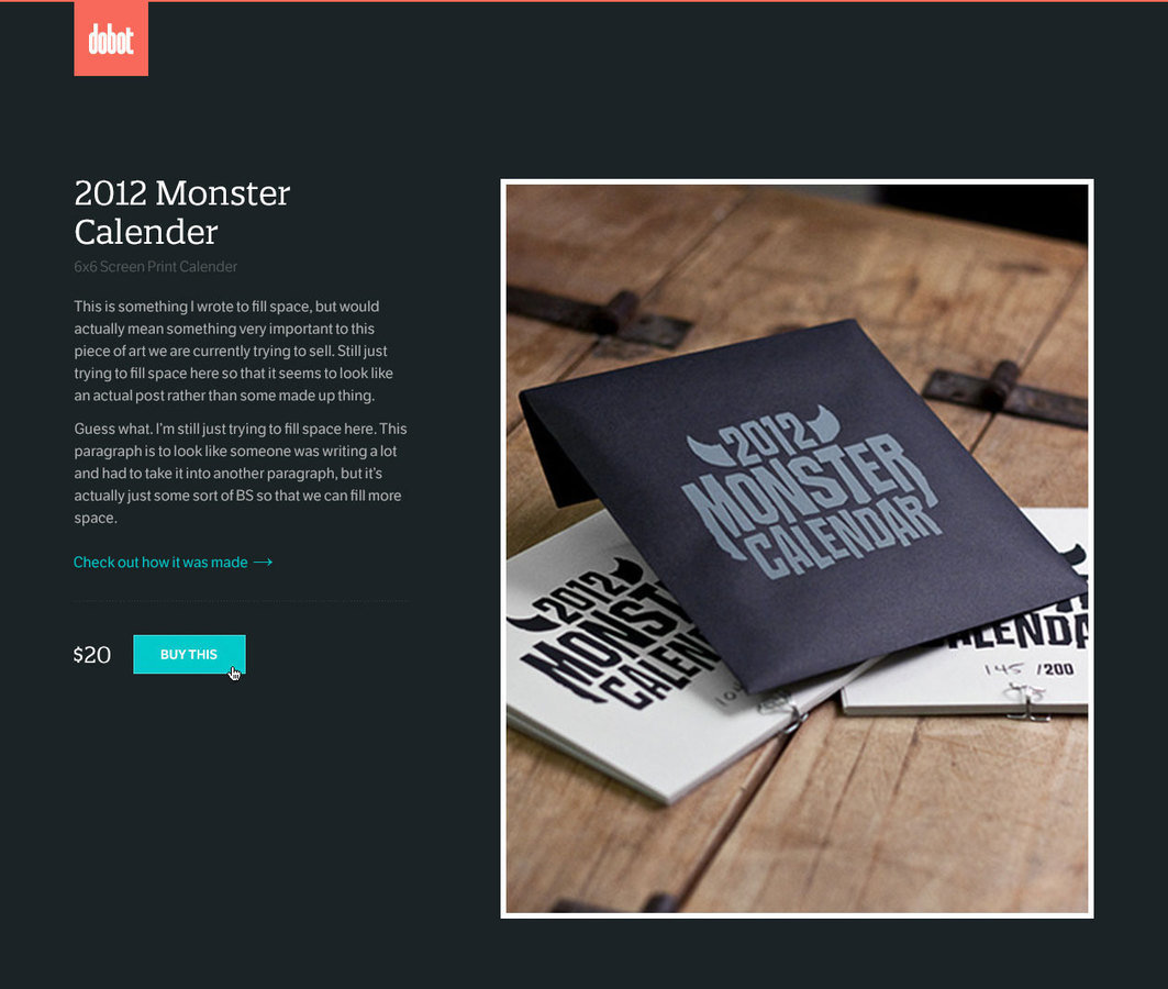
You’ll be provided with
- Semantic HTML
- All fonts and images linked
- “Mobile” styles
So you can focus on
- Accessibility: HTML outliner, order of elements, testing with screen readers, visually hiding elements
- Responsive web design: testing on devices, maintainability, building better systems
- Naming conventions: SMACSS (scalable and modular architecture for CSS), BEM (block__element--modifier)
Expectations
- Your HTML should always pass validation
- Know to separate styles from content (NO INLINE STYLES)
- Understand @mdo’s HTML code guide and comfortable with implementing layouts with CSS
Accessibility
Visual
Motor
Auditory
Cognitive


The basics
- Be semantic
- Have empathy
- Test, test, test!
Be semantic
- Am I using this tag properly?
- Is there something I could use that is better?
- Great resources:
Have empathy
- Think about what screen readers read aloud
- Does the order of elements makes sense?
- Are we ordering things in a certain way to make it easier to style? (Not good)
- HTML outliners help with this
Test, test, test!
- VoiceOver on Mac (⌘ + F5)
- NVDA with Firefox on Windows
Let’s test Dobot!
What are some things I built in for accessibility here?
.visually-hidden {
  border: 0;
  clip: rect(0 0 0 0);
  height: 1px;
  margin: -1px;
  overflow: hidden;
  padding: 0;
  position: absolute;
  width: 1px;
}
Visually hidden content
Work on Dobot
-
Visually hide “Shop”
Maintainability
Building a system
- No inline styles
- Order your declarations
- Maintain syntax rules
- Stay DRY
- Pay attention to code smells
- Be intentional about selectors
- SMACSS (scalable and modular architecture for CSS)
- BEM (block__element--modifier)
.logo {
  height: 50px;
  width: 50px;
  transition-duration: .25s;
  transition-property: opacity;
  &:hover {
    opacity: .75;
  }
}
SMACSS overview
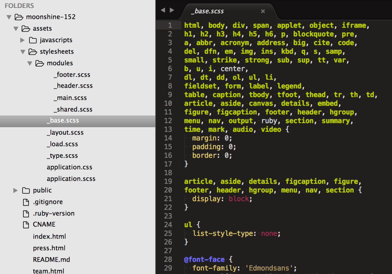
Naming conventions
- SMACSS’ is-#{state} classes
-
BEM!
- I usually don’t go more than two blocks deep. This prevents being too tightly tied to HTML structure.
Class all elements
using BEM
Maintainability resources
Responsive web design
What is responsive design?
Wikipedia says: Design and build sites to provide optimal viewing experience—easy reading and navigation with a minimum of resizing, panning, and scrolling—across a wide range of devices (from mobile phones to desktop computer monitors)
Example: The Great Discontent

What are other options?
- Fixed: set width, styles do not change depending on resize, no media queries
- Fluid: built using percentages, no media queries
- Adaptive: media queries to target specific devices (mobile, tablet, desktop)
- Native app: can work without an internet connection, higher quailty UX
- Separate mobile site: created only for small screens, lighter and faster
Why do responsive
web design?
Write the code once and have it functional
and legible across many devices.
People use a wide range of devices to complete their tasks.
Reading on mobile phones, shopping on tablets, etc.
More responsive sites
Boston Globe
"The first major, high-traffic, content-heavy website to adopt a responsive design" - Beaconfire Wire
"Raise[d] public awareness of this flexible, standards-based, multi-platform and user-focused web design approach"
- Jeffrey Zeldman
Built by Buffalo
RWD Exercise #1
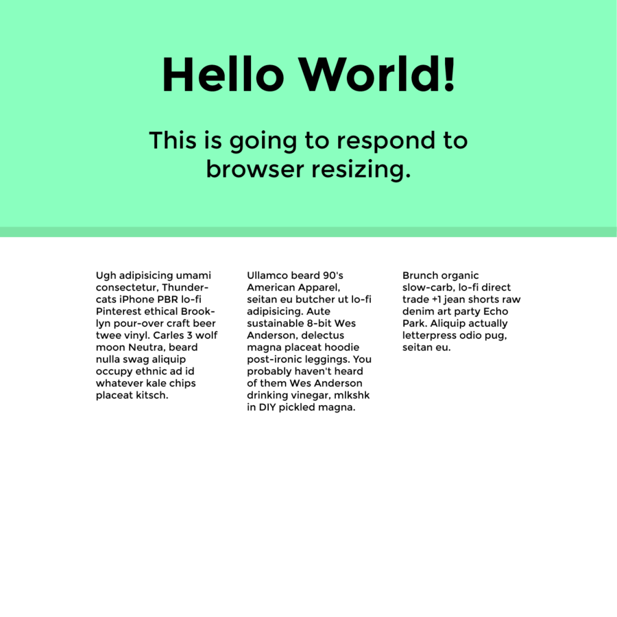
The font is Montserrat and the teal is #8affbf. Write CSS that changes the font sizes at different media queries.
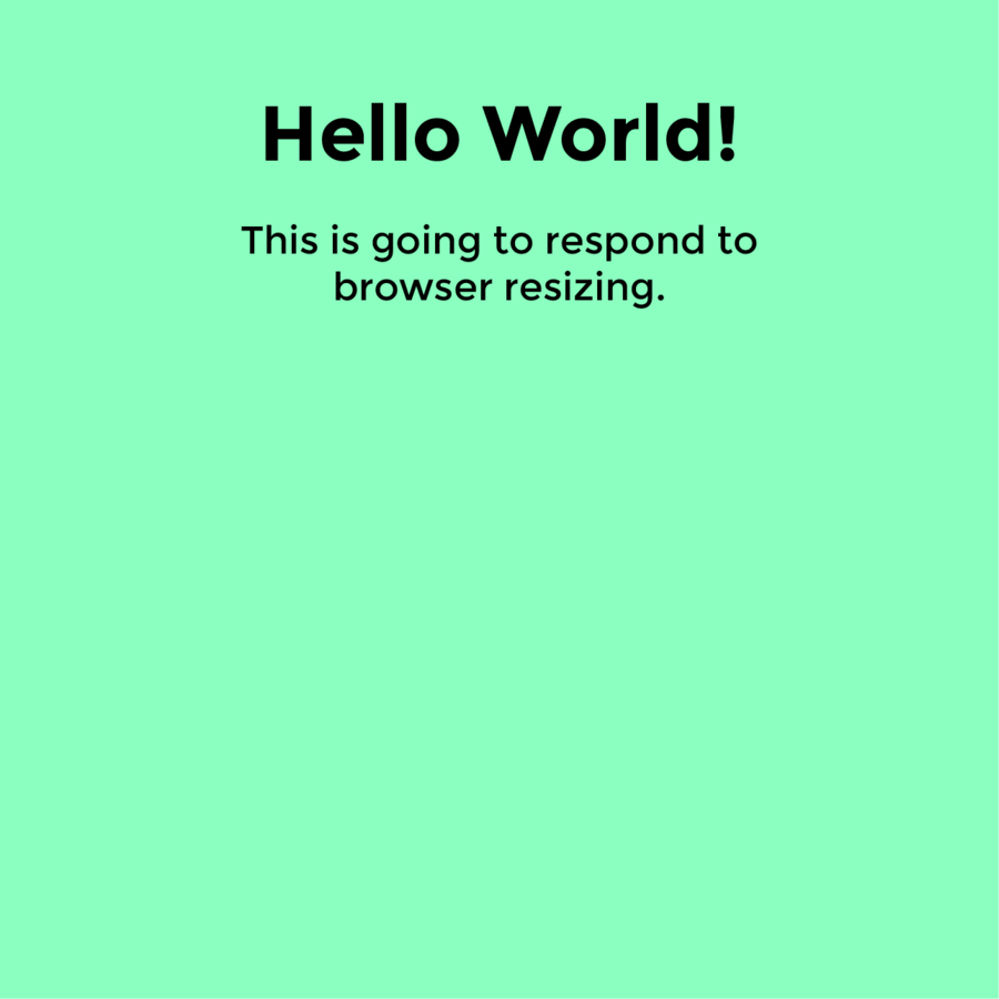
How I would do it
- Start mobile first
- Move on to bigger widths slowly
Why mobile first?
Work on making
Dobot responsive
-
Don’t forget this meta tag
<meta name="viewport" content="width=device-width"> -
Test on a device or with a simulator (Easy way: GitHub pages)
What now?
Challenges
- Design a focus state
- Keyframe animation like this on “Check out how it was made” when hovered
- Linear gradient stripes on button
- The solutions!
Looking for another portfolio project?
Stay in touch!
-
Twitter: @acacheung
-
-
6/7: CSS Modules
-
Girl Develop It: Intermediate HTML & CSS
By Amanda Cheung
Girl Develop It: Intermediate HTML & CSS
Sign up here: https://www.meetup.com/Girl-Develop-It-Boston/events/239727950/
- 4,972
