High-Throughput Count Data
Group 4
Bhoomika Agarwal
Srinath Jayaraman
CS4260
Chapter 8
Part 1
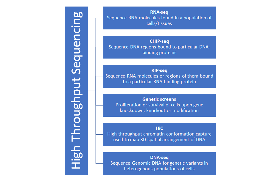
High-throughput data sequencing
Why?
Ideal scenario:
Sequence and count all molecules of interest in a sample
IRL:
We lose some molecules or intermediates in the process
What now?
Sequence and count a statistical sample
Where do we go now?
- The essentials
- Count Data
- Modelling count data
- IRL
- Under the critic's lens
The Essentials
- Sequencing library = collection of DNA molecules used as input for the sequencing machine
- Fragments = molecules being sequenced
- Read = sequence obtained from a fragment
Count Data
#Load the count data and examine it
fn = system.file("extdata", "pasilla_gene_counts.tsv",
                  package = "pasilla", mustWork = TRUE)
counts = as.matrix(read.csv(fn, sep = "\t", row.names = "gene_id"))
dim(counts)
counts[ 2000+(0:3), ]
- The matrix tallies the number of reads seen for each gene in each sample. We call it the count table
- 14599 rows, corresponding to the genes, and 7 columns, corresponding to the samples
- raw counts of sequencing reads
Challenges
- Heteroskedasticity
- The data does not fit a normal distribution - non-negative and asymmetric
- Normalization required
- Stochasticity of the data
Modeling Count Data
Step 1: Dispersion
Step 2: Normalization
Step 1: Dispersion
- Sequencing library that contains n1 fragments corresponding to gene 1, n2 fragments for gene 2, and so on, with a total library size of n=n1+n2+⋯
- Determine the identity of r randomly sampled fragments
- Model number of reads for gene i using Poisson distribution
λi=rpi
pi=ni/n
Step 1: Dispersion
- IRL, we are interested in comparing the counts between libraries
- pi and therefore also λi vary even between biological replicates
- gamma-Poisson (a.k.a. negative binomial) distribution suits our modeling needs
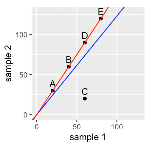
Step 2: Normalization
- Identify the nature and magnitude of systematic biases, and take them into account in our model-based analysis of the data
- The most important systematic bias stems from variations in the total number of reads in each sample
- Use DESeq2 package for robust regression to obtain the red line
IRL
Pasilla data
Example dataset
-
These data are from an experiment on Drosophila melanogaster cell cultures that investigated the effect of RNAi knock-down of the splicing factor pasilla (Brooks et al. 2011) on the cells’ transcriptome
-
2 experimental conditions:
-
untreated - negative control
-
treated - siRNA against pasilla
#Load metadata of 7 sample files
annotationFile = system.file("extdata",
  "pasilla_sample_annotation.csv",
  package = "pasilla", mustWork = TRUE)
pasillaSampleAnno = readr::read_csv(annotationFile)
pasillaSampleAnno
Example dataset
Data Wrangling:
- Replace the hyphens in the type column by underscores
- Convert the type and condition columns into factors, explicitly specifying our preferred order of the levels (the default is alphabetical).
#Data wrangling
library("dplyr")
pasillaSampleAnno = mutate(pasillaSampleAnno,
condition = factor(condition, levels = c("untreated", "treated")),
type = factor(sub("-.*", "", type), levels = c("single", "paired")))
Example dataset
DESeqDataSet
- DESeq2 uses a specialized data container, called DESeqDataSet to store the datasets it works with
- DESeqDataSet is an extension of the class SummarizedExperiment in Bioconductor
# DESeqDataSet
mt = match(colnames(counts), sub("fb$", "", pasillaSampleAnno$file))
stopifnot(!any(is.na(mt)))

library("DESeq2")
pasilla = DESeqDataSetFromMatrix(
  countData = counts,
  colData   = pasillaSampleAnno[mt, ],
  design    = ~ condition)
class(pasilla)

is(pasilla, "SummarizedExperiment")
Example dataset
The DESeq2 method
- Our aim is to identify genes that are differentially abundant between the treated and the untreated cells
- We will apply a test that is conceptually similar to the t-test
#The DESeq2 method
pasilla = DESeq(pasilla)

res = results(pasilla)
res[order(res$padj), ] %>% head
Example dataset
Exploring the results
- The first step after a differential expression analysis is the visualization of the following three or four basic plots:
-
the histogram of p-values
-
the MA plot
-
an ordination plot
-
a heatmap
-
Example dataset
p-value histogram
- uniform background with values between 0 and 1 = non-differentially expressed genes
- peak of small p-values at the left = differentially expressed genes
#p-value histogram
ggplot(as(res, "data.frame"), aes(x = pvalue)) +
  geom_histogram(binwidth = 0.01, fill = "Royalblue", boundary = 0)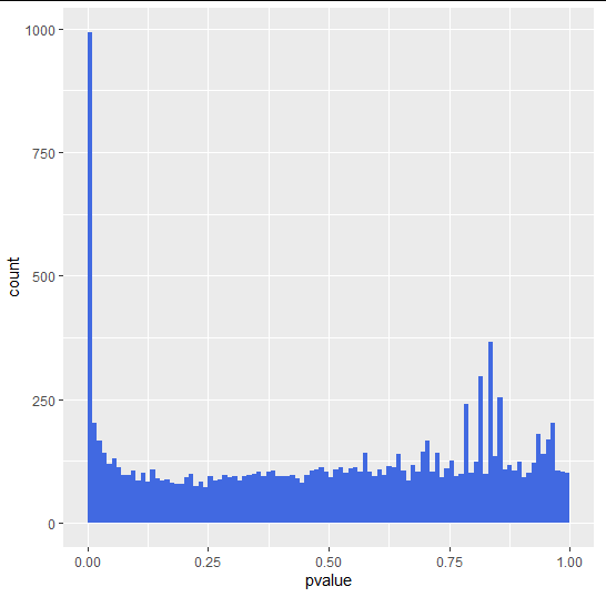
Example dataset
MA plot
- A scatter plot of log2 fold changes(on the y-axis) vs. mean of normalized counts(on the x-axis)
- red = adjusted p-value is less than 0.1.
- triangles = Points which fall out of the y-axis range
#MA plot
plotMA(pasilla, ylim = c( -2, 2))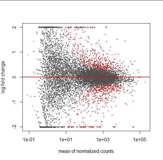
Example dataset
PCA plot
- useful for visualizing the overall effect of experimental covariates and/or to detect batch effects
- We used a data transformation, the regularized logarithm or rlog
#PCA plot
pas_rlog = rlogTransformation(pasilla)
plotPCA(pas_rlog, intgroup=c("condition", "type")) + coord_fixed()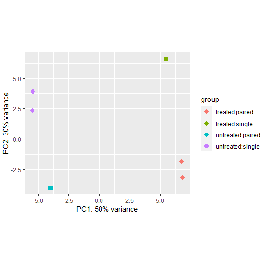
Example dataset
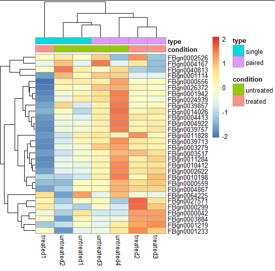
Heatmap
- Quickly getting an overview over a matrix-like dataset, count tables included
- We plot the subset of the 30 most variable genes
#Heatmap
library("pheatmap")
select = order(rowMeans(assay(pas_rlog)), decreasing = TRUE)[1:30]
pheatmap( assay(pas_rlog)[select, ],
          scale = "row",
          annotation_col = as.data.frame(
            colData(pas_rlog)[, c("condition", "type")] ))
Under the Critic's Lens
Critique of default choices and possible modifications
The Few Changes Assumption
- Underlying the default normalization and the dispersion estimation in DESeq2 (and many other differential expression methods) is that most genes are not differentially expressed.
- How reasonable is this assumption?
- In case the assumption does not hold good, we will then need to identify a subset of (“negative control”) genes for which we believe the assumption is tenable, either because of prior biological knowledge, or because we explicitly controlled their abundance as external “spiked in” features
The Point-like null hypothesis
- As a default, the DESeq function tests against the null hypothesis that each gene has the same abundance across conditions
- If the sample size is limited, what is statistically significant also tends to be strong enough to be biologically interesting
- But as sample size increases, statistical significance in these tests may be present without much biological relevance.
Thank you for your attention!

Slides available here

♡2020 by Bhoomika Agarwal. Copying is an act of love. Love is not subject to law. Please copy.
MLBI_Group4
By Bhoomika Agarwal
MLBI_Group4
Chapter presentation for course CS4260- Group 4 (Chapter 8)


