Music Magazine Evaluation
Front Cover

1. In what ways does your media product use, develop or challenge forms and conventions of real media products?
Lorem ipsum dolor sit amet, consectetur adipiscing elit. Morbi nec metus justo. Aliquam erat volutpat.

The layout of my magazine is quite minimal which reflects the style of Spin and Clash magazine. I chose not to use a lot of text or too many photos on my magazine cover for this reason but challenged most designs by using a combination of fonts together for different text features.
4. Who would be the audience for your media product?
The audience would be people who are interested in music, fashion and live music events. My target audience says that the average reader is 16-22 years old and mostly have creative jobs and interests.



7. Looking back at your preliminary task (the continuity editing task), what do you feel you have learnt in the progression from it to full product?
I have learned that it can be quite difficult to target a broad target audience as they have different tastes and preferences. Particularly what attracts them to the magazine in terms of sell lines. For example an older person probably would not like a free EP, whereas a younger person would.
Contents Page

2. How does your media product represent particular social groups?
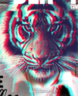
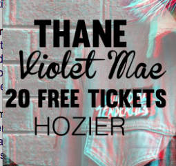
My music magazine targets people who already listen to indie rock music so there was not a lot of sell lines besides '20 free tickets'. As the indie style is quite minimalist and likes to be understated this helped to emphasise the indie aspect. The cover image would have appealed to a younger audience but as the colour scheme was quite dull it made it suitable for older members of my target audience.


5. How did you attract/address your audience?
Most of my audience would be familiar with music shops and other places where my magazine would be distributed so my audience would be attracted at places where they frequently go for example newsagents and shops. The internet would be the primary place for readers to be addressed as it targets a global audience.





Double Page Spread
3. What kind of media institution might distribute your media product and why?
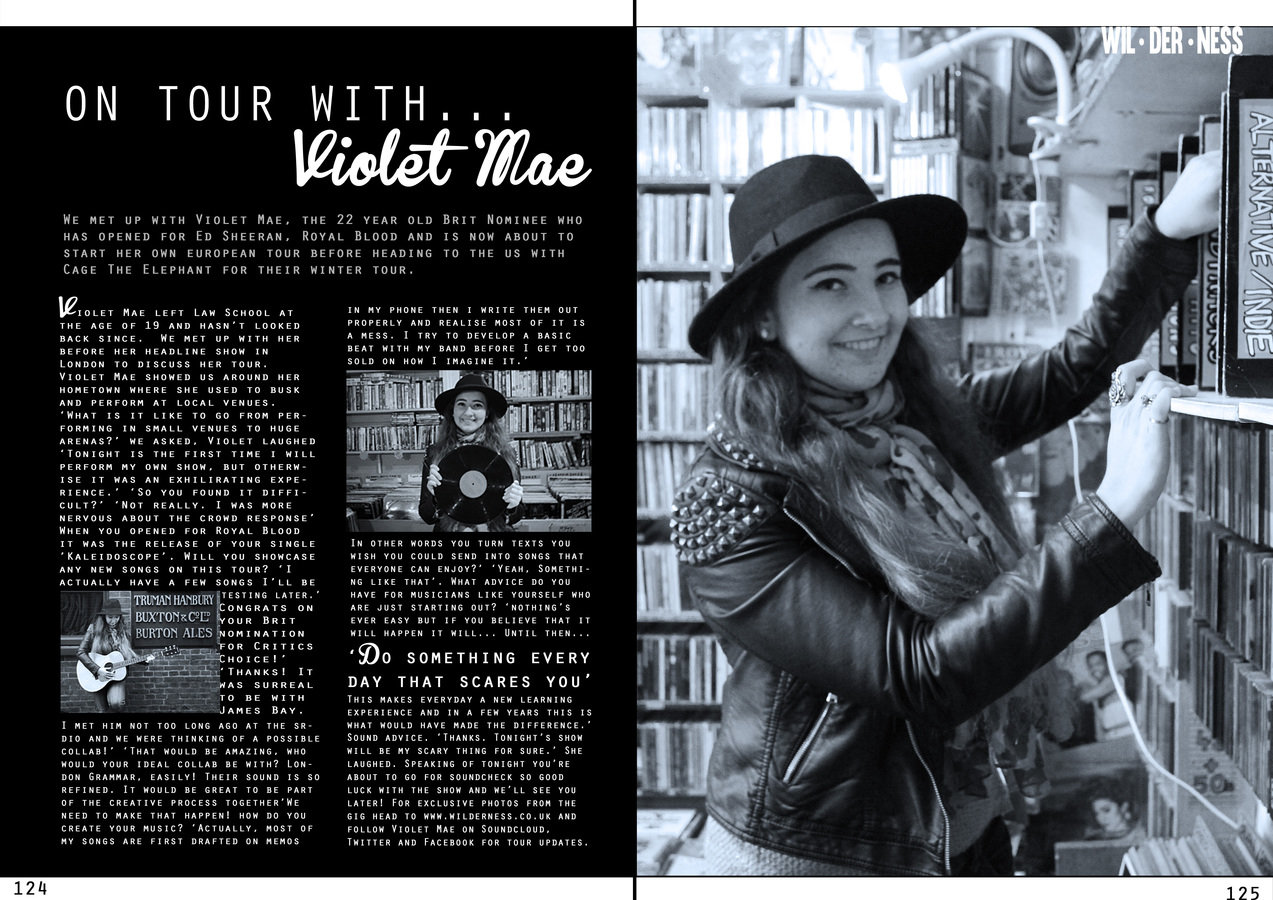
Clothing shops, music shops and newsagents would distribute my magazine, as well as the magazine website. As one of the aspects of Wilderness magazine was to combine lifestyle with music (like Dazed and Confused magazine) this allows clothing shops/boutique shops to display and distribute my magazine as well as small indie cafes and obviously music shops. As my magazine is online, this
allows a broader global audience to access my music magazine.


6. What have you learnt about technologies from the process of constructing this product?
Lorem ipsum dolor sit amet, consectetur adipiscing elit. Morbi nec metus justo. Aliquam erat volutpat.
deck
By devikamaharaj
deck
- 516


