7. LOOKING BACK AT YOUR PRELIMINARY TASK (THE CONTINUITY EDITING TASK), WHAT DO YOU FEEL YOU HAVE LEARNT IN THE PROGRESSION FROM IT TO FULL PRODUCT?
Audience
I have learned that it can be quite difficult to target a broad target audience as they have different tastes and preferences. Particularly what attracts them to the magazine in terms of cover lines. For example a young person would like behind the scenes interviews about the artist's life whereas an older person would be more interested in the creative process that the musician had to face.
In terms of attracting readers, an older person would not be like a free EP, whereas a younger person would, so in my magazine I had to decide what was best for meeting everyone's preference.
I found that taking inspiration from musicians and other indie magazines were best for examples of what works well in terms of text and decided to use '20 free tickets' and 'sound of 2015' to avoid overcrowding my cover page.
Design/Skill improvements
When I first began Media Studies, our task was to create a school magazine. Since then I have improved my skills and thanks to websites and research I am able to create more advanced magazines using Photoshop.
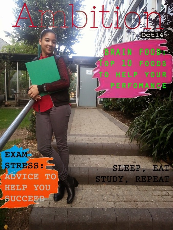

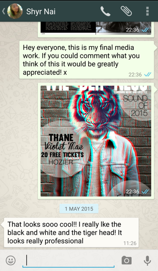
The image on the left is my first attempt at creating a magazine, and on the right is my final music magazine cover. I have discovered how to use Photoshop better, and edit images and text so that they look more professional. The colours on Ambition are too bright which cheapens the magazine and the design looks limited. Whereas Wilderness has a contemporary design which has been achieved by using feathering, opacity, brightness and other image changes as well as layering to give a professional look to the magazine layout.
Overall
Initially I was worried about creating my music magazine because I wasn't sure how realistic my ideas were. The ideas which did not make the final pieces were considered and discarded if they did not work well with my music magazine. For example, to incorporate my 'song club' feature, I would have needed another page so I had to compromise to use my space effectively. Fortunately, most of my ideas have been created the way I wanted them by using trial and error and practicing different editing techniques. Now I feel more confident about using Photoshop, Blogger and other programs to create better pieces of work in the future.
feedback
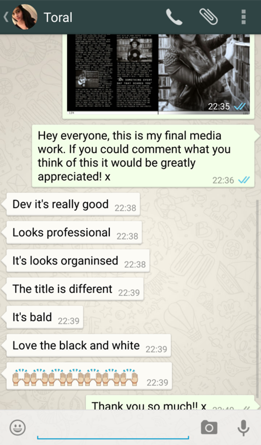
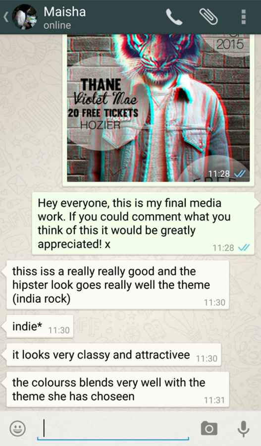
I asked some of my target audience members for their feedback and this was the response:
deck
By devikamaharaj
deck
- 726


