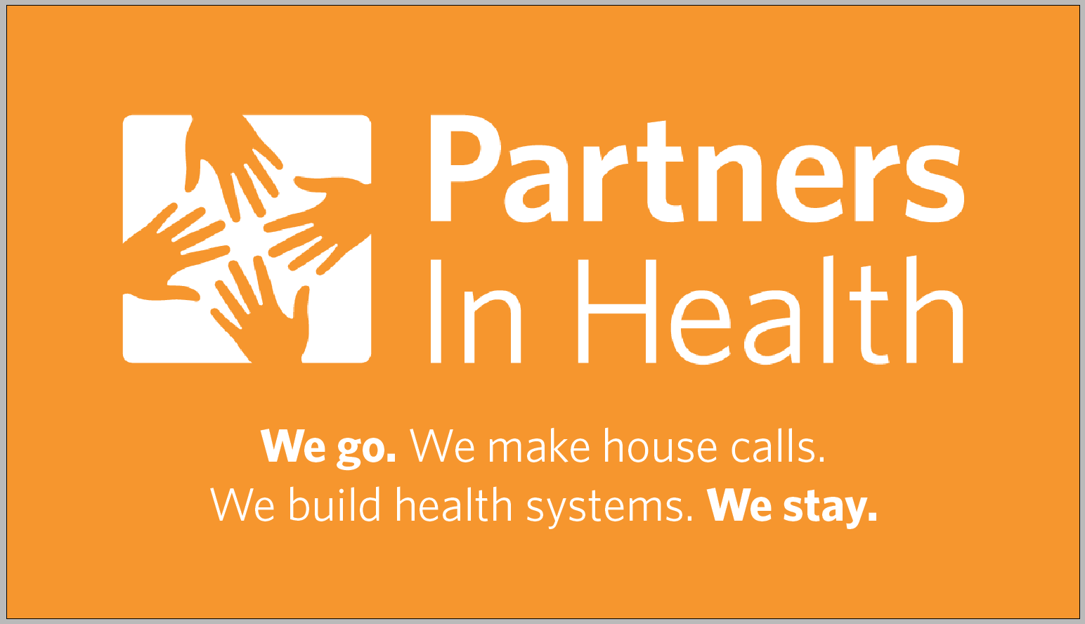
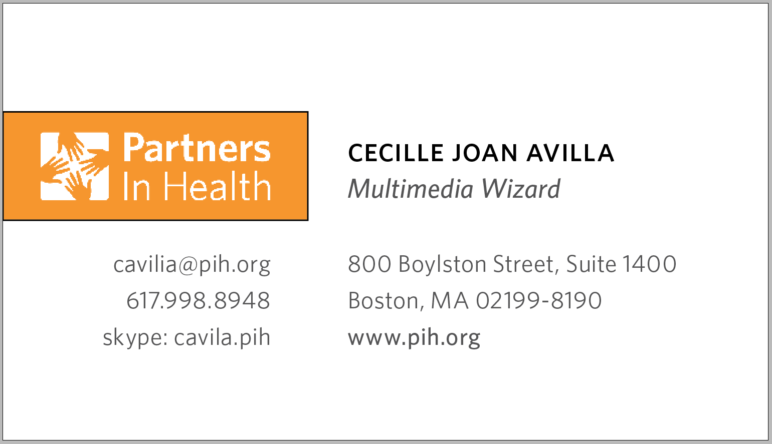
Partners In Health
Business Card Design Guide
Back Side
- Logo and mission centered
- This side only changes for executive level cards when they need both sides for personal info
Example of executive level back side
- duplicate the front side
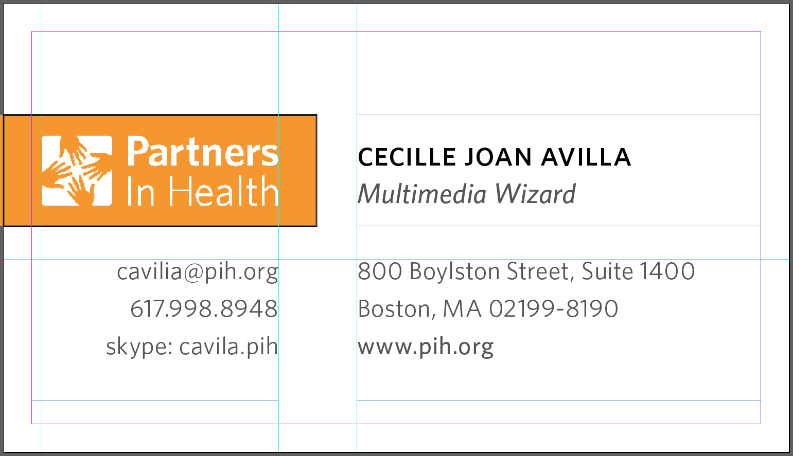
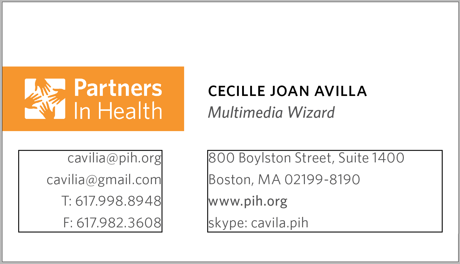
Front Side
1. Logo Box
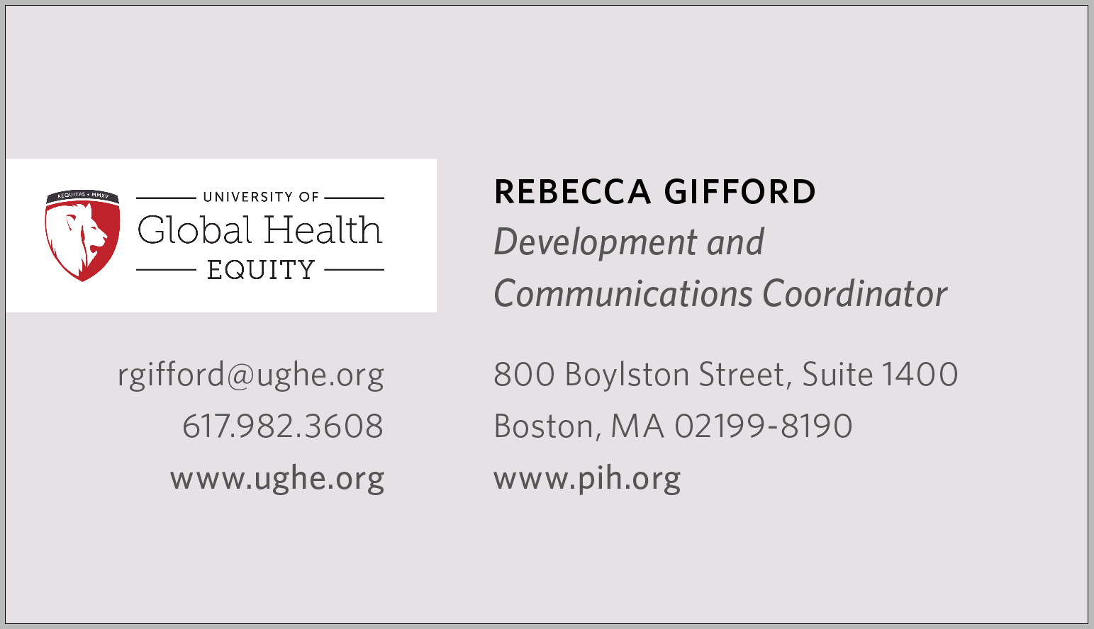
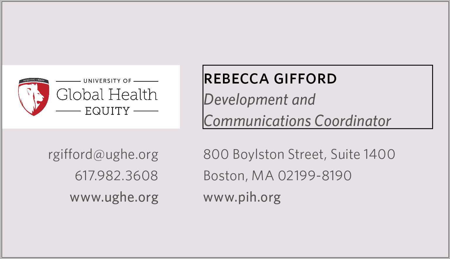
- Only changes for other branches within PIH
1
1. Logo Box
- When the logo box needs to be white, the card background can change to a color associated with its brand
1
1. Logo Box
- Follow the guidelines for positioning and spacing the logo
1
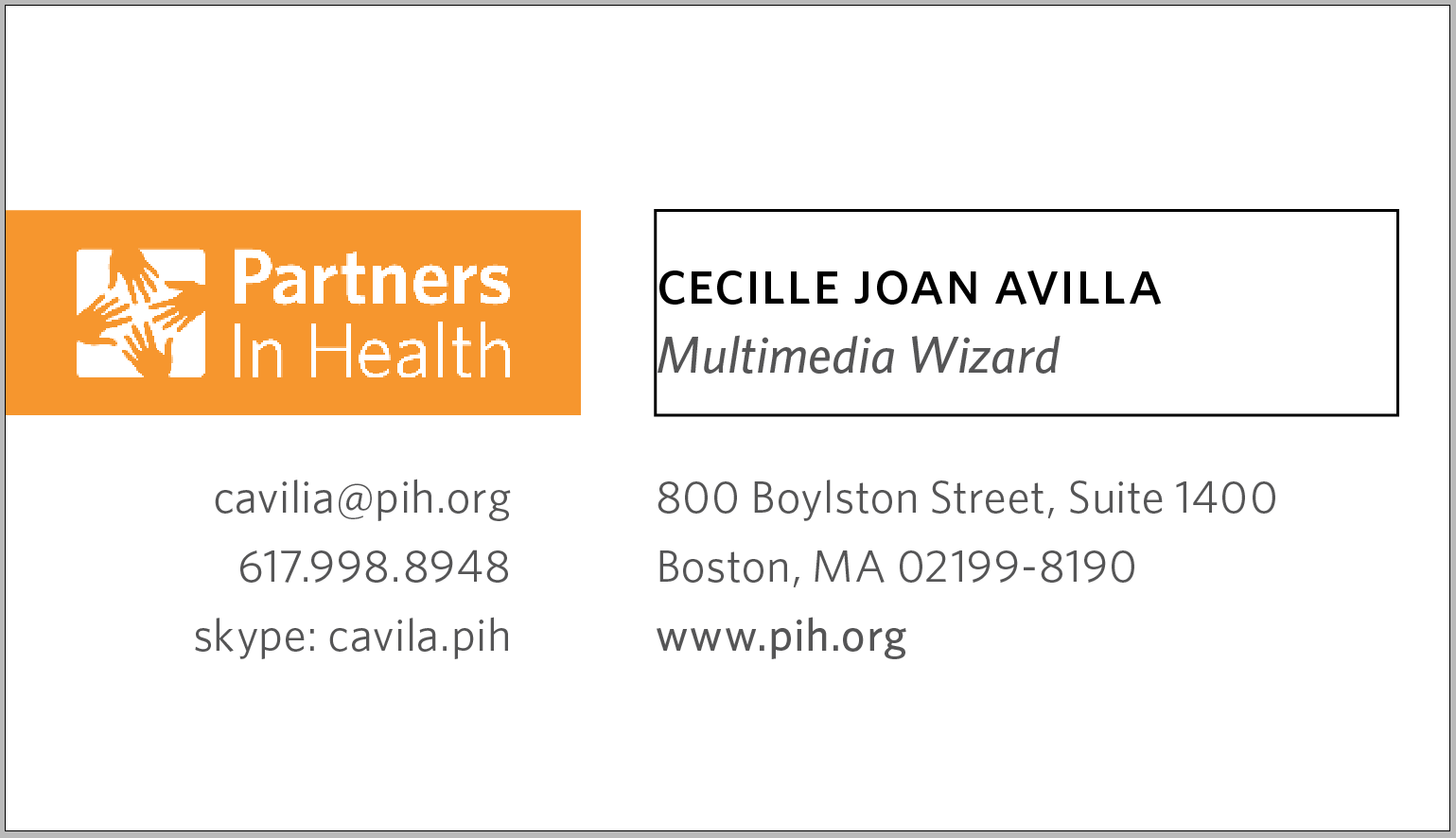
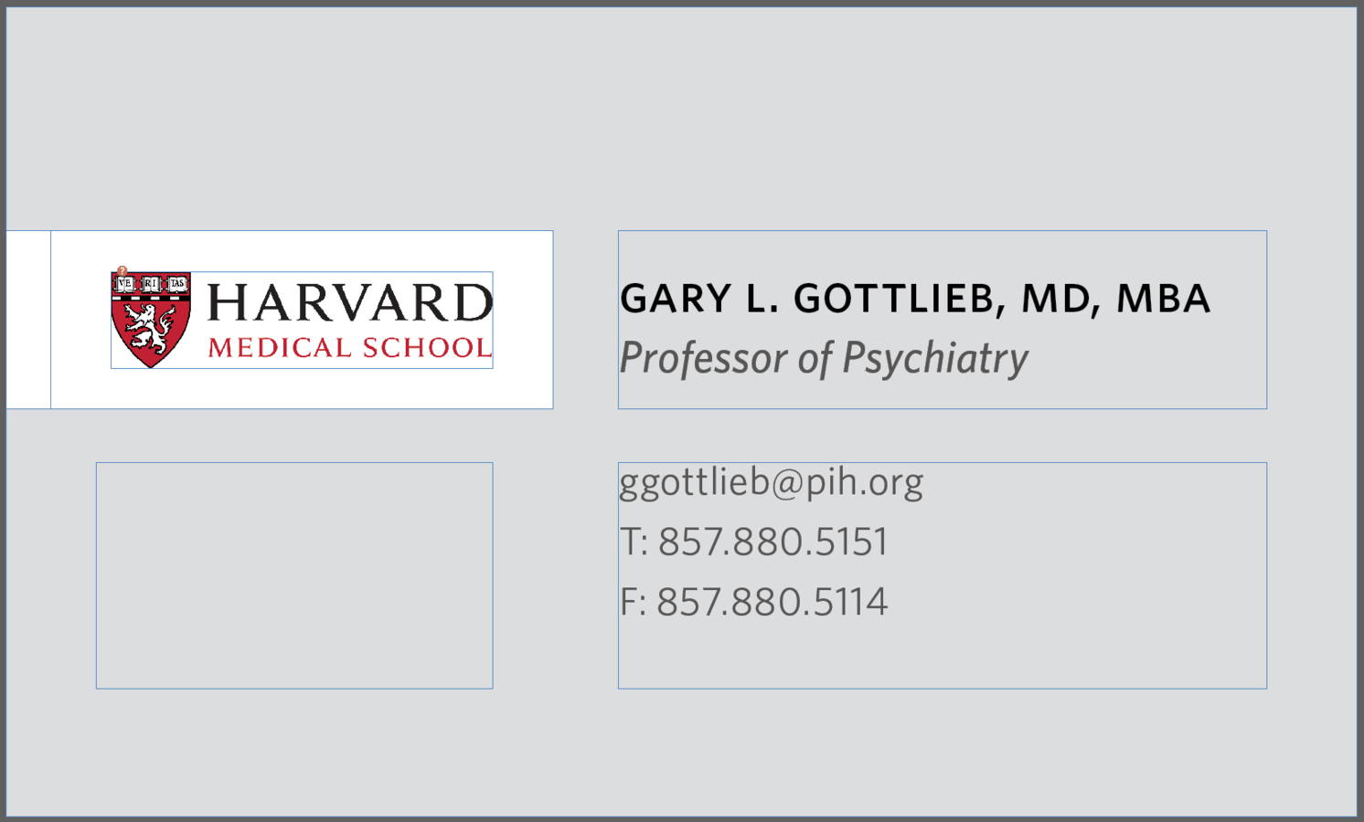
2. Name/Title Box
- Space only for name and title
- 1 line for name, possible 2 lines for title
- box is left justified, align center
2
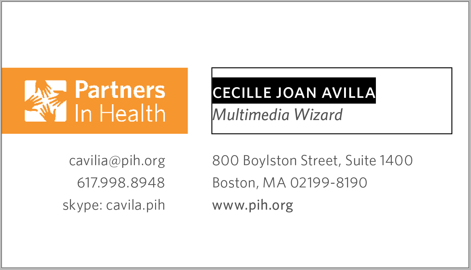
Name
- Font: Whitney Medium - Font size: 11 - Leading: 12
- Kerning: Optical (tighter for extreme cases, keep on 1-line)
- SMALL CAPS, written in lower case
2
Title
- Font: Whitney Medium Italic - Font size: 9 - Leading: 12
- Kerning: Optical (tighter for extreme cases, 2-line max)
- Not small caps, with every first letter capitalized
2
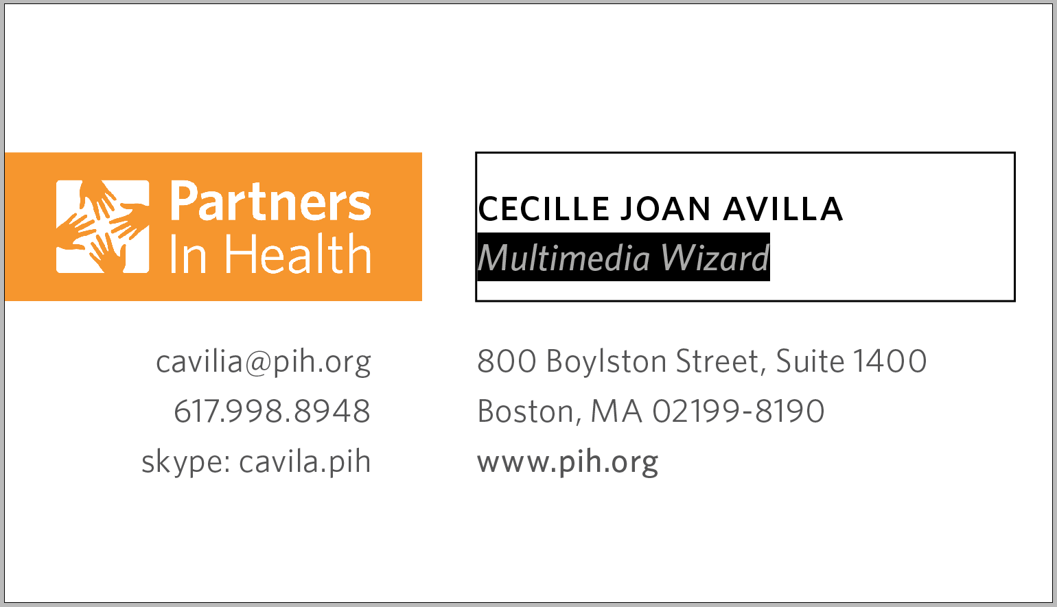
Example of a long title
- align center will automatically center the 3-lines as long as font sizes are correct and name is lower case small caps
2
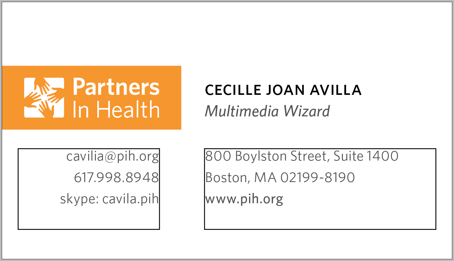
3 & 4. Contact information
- Most balanced format allows address and website on box #3
- And 3 (up to 4) personal contact info on box #4
3
4
3 & 4. Contact information
- Font: Whitney Book - Font size: 8 - Leading: 12
- Website link Font: Whitney Medium - Font size: 8 - Leading: 12
- Kerning: Optical
3
4
Example of 4 lines per box
- Make best judgement on balancing out information on both sides and arranging them by priority
- Keep in mind right side can accommodate longer information
- For extreme cases, take out address to accommodate more info
3
4
For any further question, please contact
John [Graphic Designer] at jra@pih.org
thank you
Partners In Health
By John Ra