


Sebastian Herrmann
A software-developing peep.
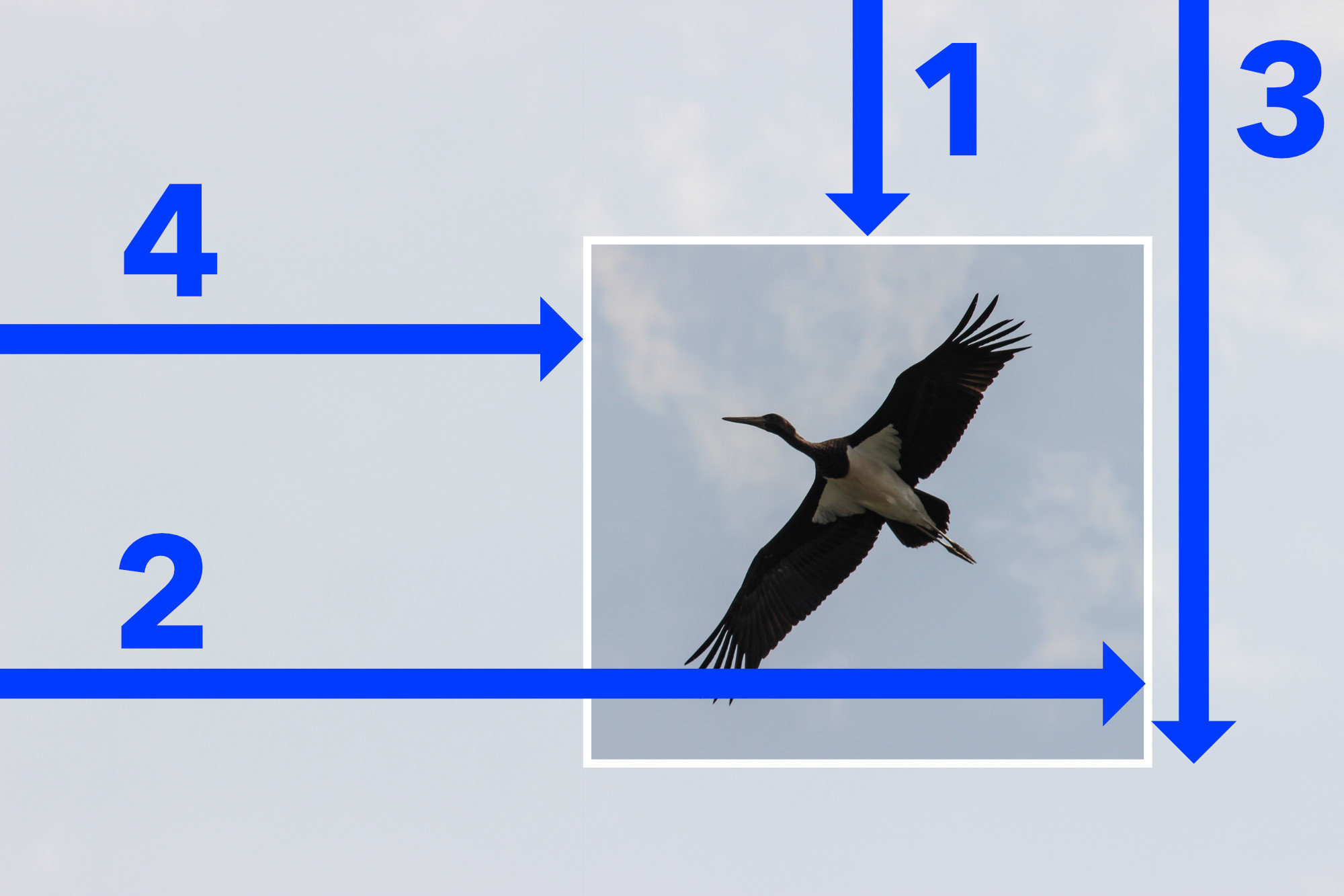
The clip CSS property defines what portion of an element is visible.
The clip property applies only to absolutely positioned elements, that is elements with position:absolute or position:fixed.
.bird {
  clip: rect(20px, 12px, 8px, 60px);
  /* top, right, bottom, left — but not like padding! */
}The clip-path CSS property creates a clipping region that sets what part of an element should be shown. Parts that are inside the region are shown, while those outside are hidden.
.bird {
  clip-path: inset(20px 12px 8px 60px);
  /* top, right, bottom, left — works just like padding! */
}🎉 doesn't require (absolute) positioning
🎉 more shapes!!
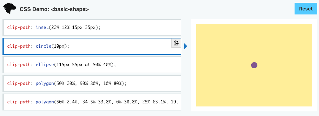
1. What is the result of this?
.circle {
  clip-path: circle(10px);
  /* How large is the circle? */
}1. Answer for circle: 20px!
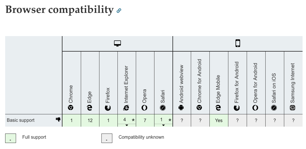
2. What is the result of this?
.hideElement {
  clip-path: inset(100%);
}2. Answer for hideElement: it depends (unfortunately)!
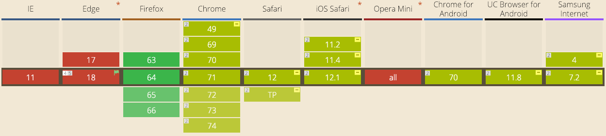
✅ Chrome works
🤔 Safari needs -webkit-clip-path
🤔 Firefox only works with clip-path: 50%
❌ IE does not work
❌ Edge only works with a feature flag
.hideElement {
clip-path: inset(100%);
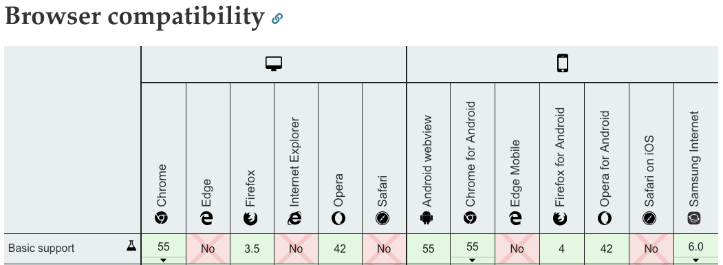
}.hideElement {
clip-path: inset(50%);
/* 50% inwards from each direction */
-webkit-clip-path: inset(50%);
/* prefix for Safari */
}✅
❌
More consistent hiding via inset(50%):
By Sebastian Herrmann
Let's take a look at the differences between CSS' clip and clip-path properties.


