Build-in Browser Support
for Responsive Images
<picture>
<picture> element
- No need CSS or JavaScript hacks to handle images in responsive design
- User benefit from natively-optimized image resource loading
*** especially for users on poor internet connection
Use for art direction
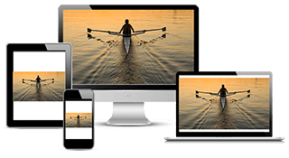
The result of using only one image that is scaled up or down based on the viewport width
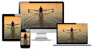
Use several different images to more appropriately fill the browser viewport
ควรจะออกแบบให้เป็นไปตามองค์ประกอบ แทนที่จะปรับตามความกว้างของ Viewport เพียงอย่างเดียว


http://googlechrome.github.io/samples/picture-element/
<picture> syntax
<style>
  img {display: block; margin: 0 auto;}
</style>

<picture>
  <source
    media="(min-width: 650px)"
    srcset="images/kitten-stretching.png">
  <source
    media="(min-width: 465px)"
    srcset="images/kitten-sitting.png">
  <img
    src="images/kitten-curled.png"
    alt="a cute kitten">
</picture>
CSS style - block is used only to style the image element and does not contain media queries
<picture> element - you can declare your responsive images using only HTML
Use with <source> element
- Used for loading media such as video and audio
- Updated for image loading and add with attributes (srcset, media, sizes, type)
srcset (requried)
-
Accepts a single image file path
- Or a comma-delimited list of images file paths with pixel density descriptors where a 1x descriptor is assumed when it is left off
<source srcset="images/kitten-stretching.png"><source srcset="images/kitten-stretching@2x.png 2x">media (optional)
-
Accepts any valid media query that you would normally find in CSS @media selector
<source media="(min-width: 650px)">sizes (optional)
-
Accepts a single with descriptor or a single media query with width descriptor
- Or a comma-delimited list of media queries with a width descriptor in which the last item in the list is used as the default
<source sizes="100vw">
<source sizes="(max-width: 30em) 100vw">
<source sizes="(max-width: 30em) 100vw, (max-width: 50em) 50vw, calc(33vw - 100px)">type (optional)
-
Accepts a supported MIME type
<source type="image/webp">
<source type="image/vnd.ms-photo">
Add a final <img> element
-
Used within a <picture> block
-
Place <img> as the last child of <picture> since the browser will ignore any <source> declaration
-
Image tag can attach alternative text by using alt attribute
<picture>
  <source
    media="(min-width: 650px)"
    srcset="images/kitten-stretching.png,
            images/kitten-stretching@1.5x.png 1.5x,
            images/kitten-stretching@2x.png 2x">
  <source
    media="(min-width: 465px)"
    srcset="images/kitten-sitting.png,
            images/kitten-sitting@1.5x.png 1.5x
            images/kitten-sitting@2x.png 2x">
  <img
    src="images/kitten-curled.png"
    srcset="images/kitten-curled@1.5x.png 1.5x,
            images/kitten-curled@2x.png 2x"
    alt="a cute kitten">
</picture>
Combine with pixel desity descriptor
-
Add support for high resolution display using pixel density description such as 1x, 1.5x, 2x and 3x
-
srcset attribute applies to both <img> and <source> element
<picture>
  <source
    media="(min-width: 650px)"
    srcset="images/kitten-stretching.png,
            images/kitten-stretching@1.5x.png 1.5x,
            images/kitten-stretching@2x.png 2x">
  <source
    media="(min-width: 465px)"
    srcset="images/kitten-sitting.png,
            images/kitten-sitting@1.5x.png 1.5x
            images/kitten-sitting@2x.png 2x">
  <img
    src="images/kitten-curled.png"
    srcset="images/kitten-curled@1.5x.png 1.5x,
            images/kitten-curled@2x.png 2x"
    alt="a cute kitten">
</picture>
Combine with width descriptor
-
Web fundamentals cover new the new sizes attribute for the <img> element
-
Automatically calculate the effective pixel density and choose the best image to download
The browser will use these hints to choose the most appropriate image resource to serve up based on the viewport width and hardware display resolution
<img src="lighthouse-160.jpg" alt="lighthouse"
     sizes="80vw"
     srcset="lighthouse-160.jpg 160w,
             lighthouse-320.jpg 320w,
             lighthouse-640.jpg 640w,
             lighthouse-1280.jpg 1280w">
กรณี viewport กว้าง 800px บราวเซอร์ก็จะโหลด 640px มา เว้นแต่ว่า device pixel ratio = 2x ในกรณีนี้ก็จะโหลด 1280 มาแทน
<picture>
  <source media="(min-width: 800px)"
          sizes="80vw"
          srcset="lighthouse-landscape-640.jpg 640w,
                  lighthouse-landscape-1280.jpg 1280w,
                  lighthouse-landscape-2560.jpg 2560w">
  <img src="lighthouse-160.jpg" alt="lighthouse"
       sizes="80vw"
       srcset="lighthouse-160.jpg 160w,
               lighthouse-320.jpg 320w,
               lighthouse-640.jpg 640w,
               lighthouse-1280.jpg 1280w">
</picture>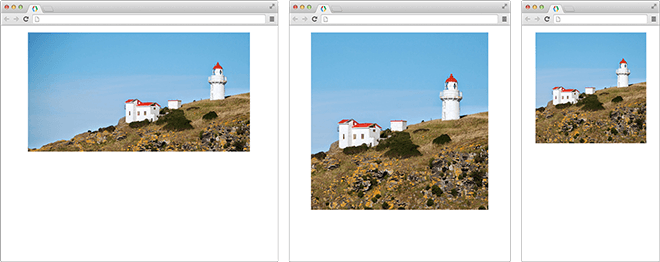
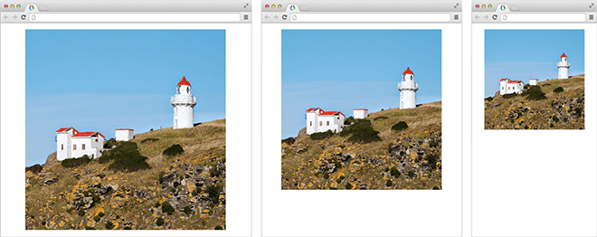
when the viewport is at 800px and above, the browser will serve up a landscape version of the lighthouse version instead
ด้านซ้ายมากกว่า 800 ดังนั้นก้จะปรับไปทางแนวนอน
Build-in Browser Support for Responsive Images
By Jiratha Laothong