Question 5
Text
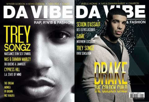
Existing Magazines
My Magazine

My magazine's target audience is the same as many of the other r&b magazines such as 'billboard'. I have adapted many different parts of their magazine to use in my own so that it would attract the target audience. Both my magazine and the professional one having the same target audience meant that it was easier to take out parts of the magazine and expand and adapt them to my own magazine.
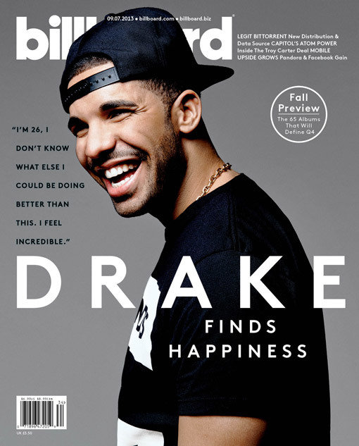
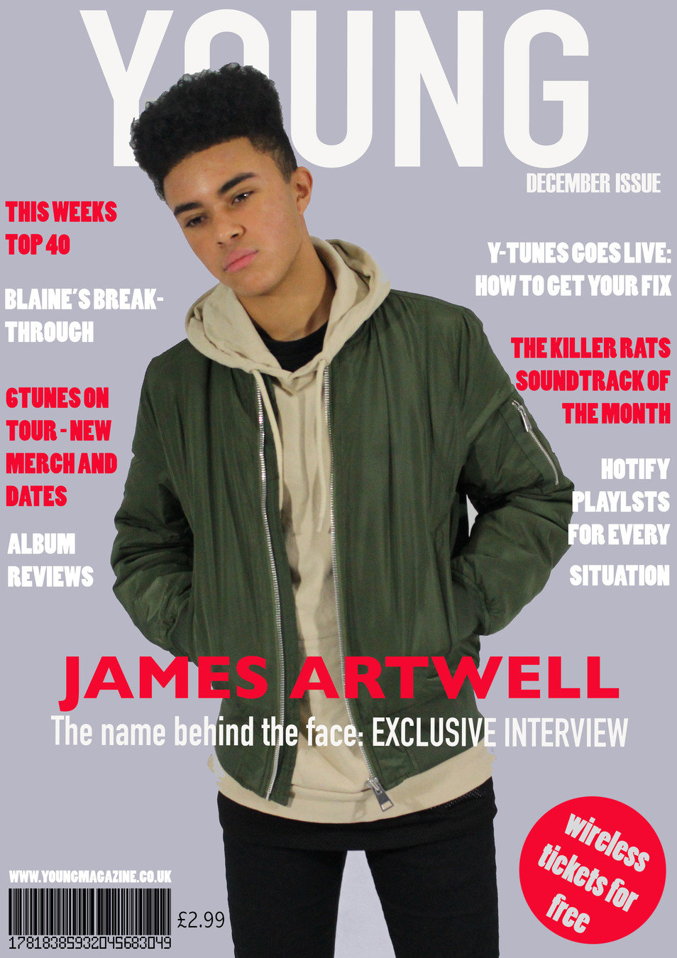
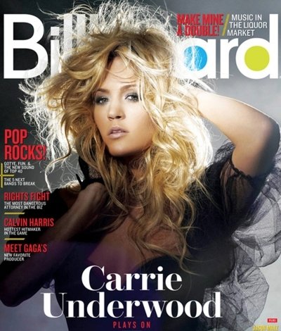
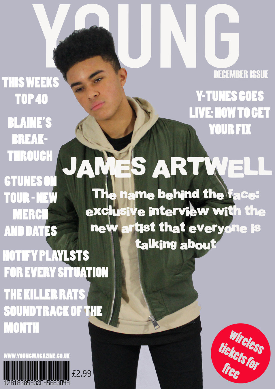
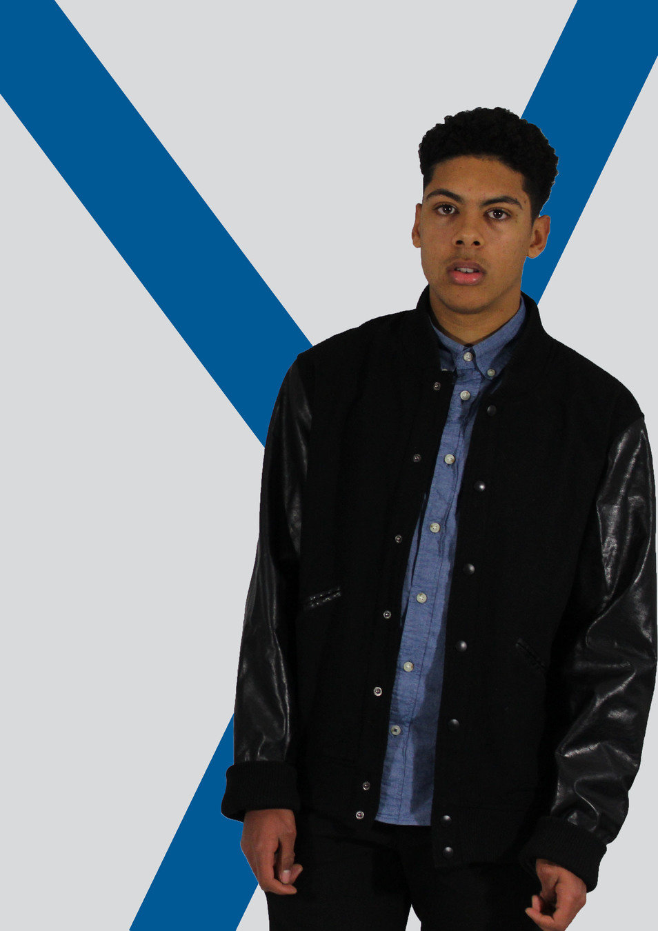
For my front cover I focused on the Billboard cover of Drake. This particular cover is very pain and most of the title is covered by the main image however, it is still noticeable as the magazine is a big company. I wanted to take this part of the magazine and use it in mine, however, as my magazine isn't as established, I decided to place the main image slightly in front of the masthead to h=keep with the conventions while still allowing the masthead to be shown. The barcode and the price have been kept in the same place as this
is the conventions of all the 'r&b' magazine's I analysed. This billboard cover is very plain and standard and I felt like my magazine should have a bit extra, instead of adding a quote I added cover lines which are included inside the magazine as this is another convention of magazines in general. I added the main cover line near the bottom over the main image like billboard usually does. This is another convention of magazines. The fact that the main cover line is on the bottom brings your eyes all the way down the magazine and makes you see everything not just the top half of the page.
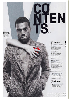
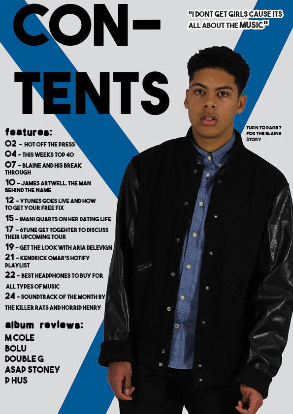
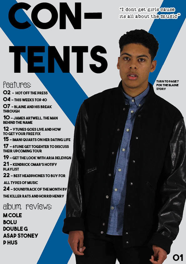
For my contents page I used the Kanye contents page as inspiration. I liked the layout of the page so I decided to use it. I made a 'Y' for the background of the page which stands for YOUNG. I used the 'features and fashion' from the contents page and adapted it to my magazine as my magazine is purely music. Instead of fashion I changed it to album reviews so that it would fit in with the themes in my magazine.
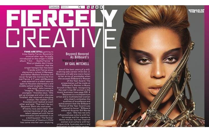
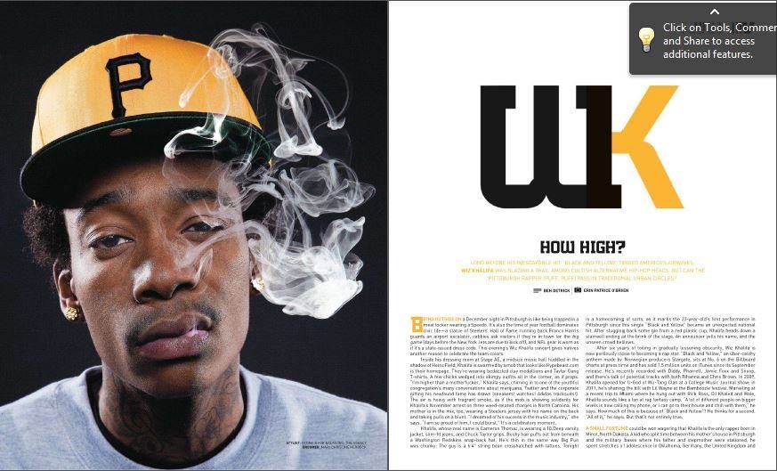
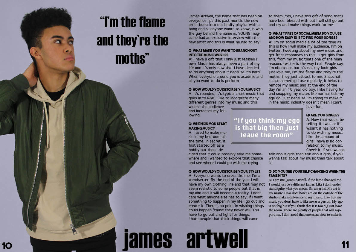
For my double page spread I took some inspiration from this double page spread. I liked the fact that it had the picture on one side and the article was on the other side. I adapted this with my magazine and the pictures that I took in my studio photoshoot.
Colours:
The colours that i used in my magazine are very similar to the ones that are used in existing R&B magazines. I used these similar colours to create audience appeal as they would already be associated with these magazines. For example, red is a big colour that runs all throughout R&B magazine covers. The colour red connotes danger and the songs that R&B rappers usually rap about includes some kind of danger. Red is also the brightest and boldest colour which attracts the audience. It brings your eyes to different parts of the magazine that need to be highlighted such as the main cover line.
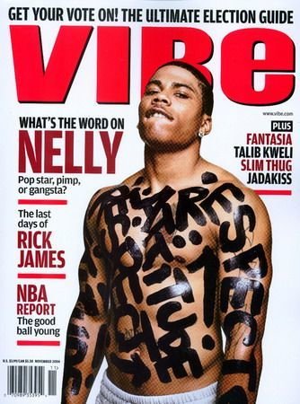
R&B magazines usually contain a few colours only. They usually have plain colours such as white or black then a bold colour such as red to make certain parts stand out on the page. Another colour that is used on the front cover is white. White symbolises light and it reflects the other words on the page. In the vibe front cover they have used a white background which makes the masthead and cover lines stand out. However, on my front cover I decided to use a plain cover as I wanted some cover lines and masthead to be in white and I feel like the light purple gives the magazine slight colour but it also makes the words stand out on the page.
Colours:
The colours on my contents page are very plain. As the front cover has the bold and bright colours of red included I decided to mellow down the contents page and use colours such as blue. The colour blue connotes peace and relaxation and as you go through the magazine there are different feelings that you should establish. The contents page is the first page of the magazine that people see and the laid back and plain vibe fit in well with the genre. I added a blue 'Y' in the background to bring the colour in and this also fits in with the models outfits.
The double page spread is in the same colour as my front cover. This gives some similarities between the magazine and it shows that the front cover artist is linked to this page. I used the same colours for the fonts, black and white as it stands out against the background. On typical double page spreads the writing is either in black or white so that is it readable and this is another reason why I chose to use these colours. Having my pull quote in the middle of the article in white makes that quote stand out on the page and is one of the first things the audience's eyes go to.
Fonts:
The fonts I used on my front cover is very similar to the fonts that are used on front covers such as 'vibe' and 'billboard'. The fonts that are used on those magazine are bold and stand out on the page. The font that I used for the masthead is different from the cover lines which is usually the case as it gives a break within the page and helps the audience to read the cover lines easier. I used a barcode font to create the barcode and used the same font that I used for my masthead to add the magazine website on the top of the barcode like the magazine 'vibe' does. As my magazine is chart music and R&B combined, it needs to represent both genres with the fonts and bold, crisp fonts are the way to go with those. From my research and planning I have expanded on my three choices of fonts. I used the bold font 'Hamburgerheaven' however, I changed font like belle rose for more bolder fonts the the bold room. I feel as though these fonts are a better feel for my genre and will appeal to the audience more. On the contents page I used basic bold fonts as I kept the page very plain and simple. There are only 2 different fonts on the contents pages as the actual articles are in the same font as the word contents. This is because I didn't want to overwhelm the audience with a lot of different fonts. On the double page spread, both of the pull quotes are in the same font along with the article title whereas the article itself is in a more basic font so that the audience would be able to read it and understand the text.
Poses:
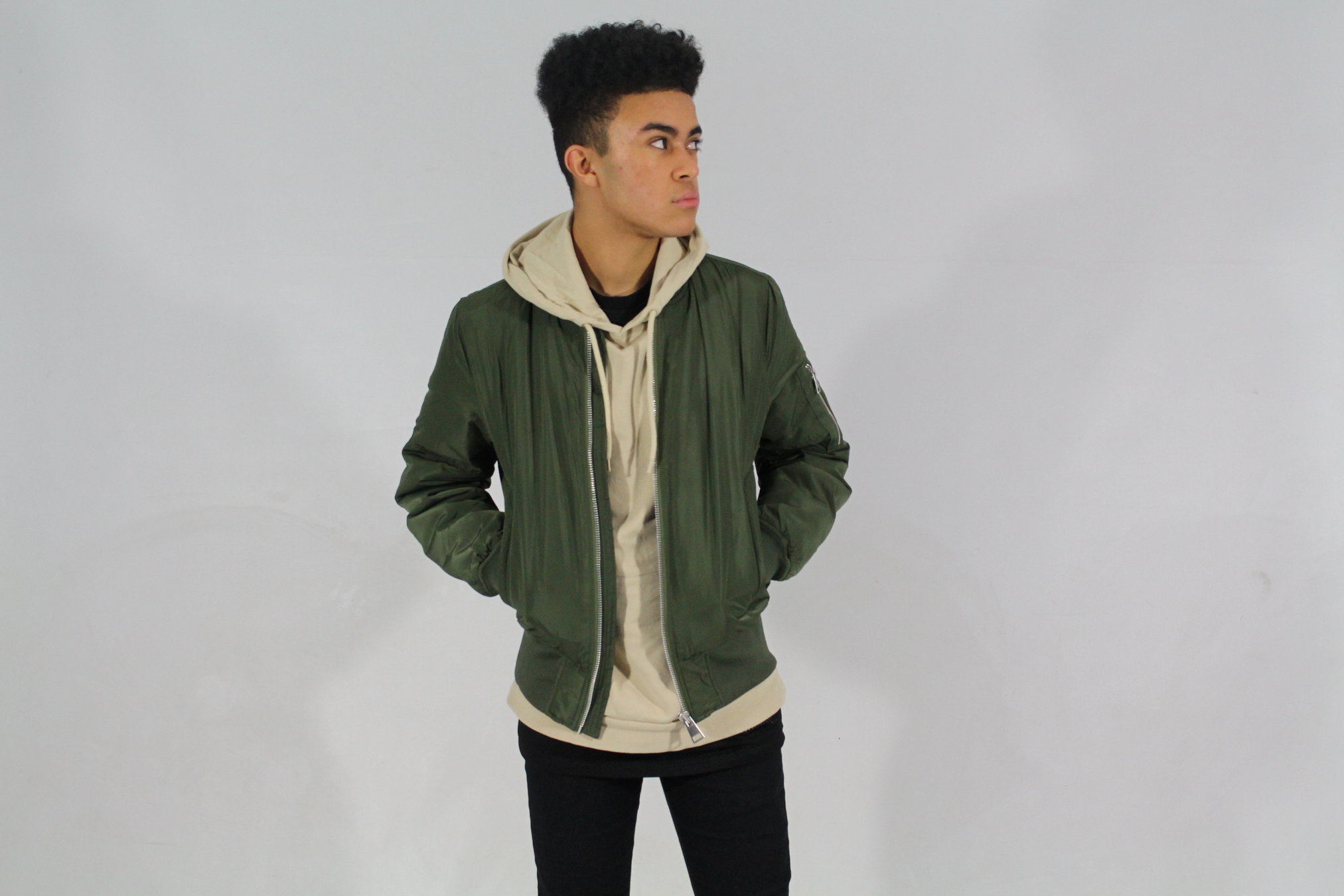
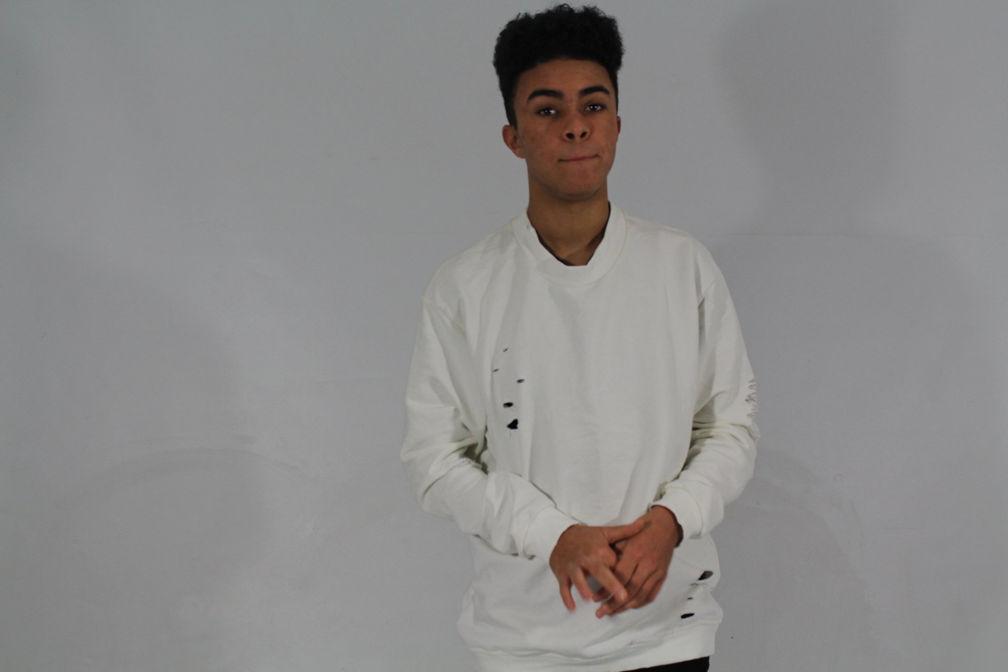
The poses that my models did in my studio photoshoot were inspired by the 'don't care' attitude that many other artists have towards their music and how they are portrayed in the media. James, who is on my front cover and on my double page spread captured this pose and mind-set completely. The pose that I chose for my front cover was a picture of James with his hands in his pockets. This shows slight attitude and from my research this is what many R&B magazines show. For my contents page the model I decided to use, Blaine, shows the same attitude with his pose as he is looking directly at the camera with his arms by his side looking very relaxed and now showing that anything is really bothering him. When researching contents pages there are usually just 1 or 2 people on the page and getting Blaine to pose like this, slightly to one side, allowed me to just have 1 person without it looking too empty.
On my double page spread James has one hand in his pocket again, showing the laid back attitude. I also feel like this pose interacts with the audience as James looks as though he is reading the article along with the readers.
Costume:
The clothes that the models are wearing have an element of edge to them. Bomber jackets have been a huge hit in the fashion industry and pairing it with a beige hoodie like James has done gives the outfit edge. I chose to have the same outfit on my front cover and my double page spread as it showed the link between them and kept the theme running through the whole of the magazine.
For the contents page the style is switched up slightly however, it is mainly kept the same. Black Is a key colour with the black jeans and the black jacket and I felt as though the shirt fits in with the background of the page and continues with the theme of slight colour appearing throughout the magazine.
I chose not to include any of my models that were wearing such things as full suits as this outfit wouldn't go with the theme of my magazine.
Stylistic Decisions in light of primary research
Use of language/Mode of address:
The mode of address is the way that I have addressed my audience throughout my magazine. How the text talks to my audience and how it influences my audience. I believe that my magazine gives off the 'I don't care' impression that many R&B artists have. However, this is to engage the audience and attract them to the magazine. Although, there is no direct address within the magazine I thin that it still engages with the audience and will attract the readers.
The use of language is the way the articles and the magazine is written. There are many different conventions to language. Usually in R&B magazines there are a lot of 'slang' words and it is not usually in full English. However, in my magazine I have adapted the colloquial slang with proper standard English to engage with my audience. My audience is a mix of R&B and chart music lovers and this is why I have chosen to do a mixture of the two. Most of my audience will be in their teens so I have adapted the language for a more mature audience.
Contents page: reference to bands/exclusives
There are many different things in my magazine that will attract the audience.
For example, I have first included the main features that will be in the magazine. In this section there are top 40 singles, the main cover line from the front cover and other articles that include well known 'celebrities' from the r&b and chart music world. There are a range of different articles from gossip to interviews to what's hot this week. The second part of the contents page is the album reviews. They have been put separately from the rest of the articles as it gives a break within the page. The artists included are all from this genre and this will attract the audience. I challenged a vibe contents page as it had outfit reviews, so I changed that to album reviews to suit my audience.
Images and masthead:
Many of the images I decided to take for my magazine are mid shots. These capture the upper body of the model and looking at current magazines, many of the shots they use are mid shots. With mid shots you are able to see the models facial expressions as well as their body language and this helps to engage with the audience.
The images also allow you to see the models outfits which is good for my readers as from my research I found that they are interested in fashion and showing the models outfit may attract other readers.
For the masthead I took inspiration from the existing magazine 'Vibe' . Vibe is very bold and stands out on the page and this is what I wanted my masthead to do. I wanted there to be no confusion with the masthead and for it to be recognisiable. This is also a convention of R&B magazines, to have a bold and bright font for the masthead.
Highlight how you made changes to your rough cut in light of audience feedback
Front Cover:
free
tickets
This was the first draft of my front cover. I had chosen the font for my masthead and I think that this is still a good fit as it is bold and stands out on the page. I wanted the main image to be covering the masthead slightly so I brought the main image forward. I started to add my cover lines and I wanted the cover lines to be around his body and not over it as I think these would stand out more. On the other side I added my main cover line with a brief description of what it was about.
On the bottom left I have the barcode with the price. After looking at other magazines that is where the barcode is usually placed. On top of the barcode i included the magazine website as the online presence with magazines is very large now, this would give more readers and more publicity.
For the second try at my front cover I used the audience feedback on my first cover which was to add colour to break the cover lines up and to not have as much writing. Taking this on board I split up the cover lines on either side of the main image and alternated in colour from red and white to break up the stories and add colour to the magazine. I kept on the theme of red and put the main coverline in red. The main cover line I moved down as there was a large empty space and I felt like it would fit nicely there. I also condensed down the description of the article as from my feedback there was too much going on. Moving the main cover line down increased the space for me to work on. In the corner I also have a red circle which keeps in with the theme. The red circle is to entice readers to my magazine and it is a chance to win festival tickets as from my research that is what they are interested in.
Contents page:
For my first draft at a contents page I didn't really know how I was going to place the articles and how the layout was going to be. I then decided to take inspiration from a Kanye contents page and started to make the layout from this. On photoshop i created the background which is the letter 'Y'. I then exported this into indesign and the way that my articles were going to be placed. Using the existing contents page as inspiration I added the articles down the left hand side wrapping it to the picture of Blaine. I also decided to include a bit about his article so that it wouldn't look out of place on the page.
Text
Going back from the feedback I was given I had change the fonts for the section headings. From the feedback I received it shows that the original fonts looked more like something in a pop magazine rather than a R&B magazine. I changed these fonts to a more bold font that will stand out as headings on the page. Other than the fonts, the feedback I received was that the rest of the page represented the genre so i kept it the same.
Double page spread:
This is the first draft of my double page spread and I decided to use this picture of James as he is looking up to the article and it adds another element of audience relationship. The title of the article is placed at the bottom which challenges general conventions. There are two pullquotes, one in the middle of the article, and one next to the article. This has been placed there to fill up the blank space around the model. The fonts for the pull quotes and for the title of the article have bee done in the same font which bring the magazine together and doesn't make anything look out of place in regard to fonts.
Text
After feedback it was clear to me that I needed to follow the conventions of a normal music magazine as move the title of the article to the top of the page and move the article down so that it was underneath it. Another thing I received in feedback was to make the double page spread more conventional to a normal magazine and to add borders where the page numbers are. After looking at magazines I have seen that this is a common feature so I added them on both sides.
Audience Feedback:
What would you improve
What attracts attentions
Strengths and weaknesses
What draws your attention?
Front cover:
After conducting extra feedback from my audience They said that the first thing that catches their eye is the main cover line as it is in a bright colour. From this bright colour it makes your eyes go up towards the main image and to the masthead. The bright red circle catches their eyes more as it is a large part in a solid colour rather than the text which is not as much of a block colour.
From the feedback I received that the main image also attracted attention and make your eyes draw to it as it is a contrast to the rest of the cover. It is in opposite colours which makes it stand out with the cover lines.
Contents page:
The feedback shows that the contents page, like the double page spread makes your eyes wonder down the page. When asked what stands out on the page the Y at the back of the page was the first thing to come up. Being a bright blue colour draws your eyes to that part of the page and the fact that the models top is the same colour then goes to that. The title of contents is seen as the last thing that people notice as your eyes wonder from the bottom to the top. At the top the pull quote stands out as it is put in bold and has a large border around it making it stand out even more.
Double page spread:
The first thing that you look at on the double page spread is the white pull quote in the middle of the article. The rest of the article is black and this one pull quote is white which makes it stand out on the page. The second pull quote is in quite a large font which stands out on the page also. The headers at the bottom on the page draw your eyes in as they are a contrast to the rest of the colours on the page. This is good as one of the footers shows the website where my magazine will also be available to read.
What genre is the magazine and how do you know?
From my conducted research the main genre that was said was R&B. When asking my peers how and why they thought the genre was R&B they said due to the colours and the layout of the magazine. The feedback I received was that the layout of my front cover shows them that the genre of my magazine is R&B. I used existing R&B magazines as inspirations for the layout of my magazine so this feedback helped me see that the inspiration I took from these magazines portrayed the genre in my own magazine. There are other things that I have done within my magazine, for example, another way of establishing the genre of my magazine was from the layout, structure and style of my contents page. There are album reviews on the bottom half of the contents page and this is usually found in R&B magazines.
What do you consider as the strengths?
From the feedback I received the strength of my product is the way the information i put on my pages. The double page spread for example shows the typical conventions of a magazine article y having the title at the top and the article in the middle. However, it also has the pull quotes in two different places. These pull quotes are the first things you see when you're looking at the article and this makes the article stand out when looking at it. Another strength that I received as feedback was that the actual pictures are strengths also. The pictures are showing a connection with the audience and this makes them want to read the magazine more.
Would you purchase the product and why?
Many of the people who I received feedback from said that they would purchase the magazine. They said that it appealed to their music tastes and they would want to read about new artists. Another thing that they said would attract them to purchase my product is the fact that there is a competition to win festival tickets. This is an intensive to buy the magazine and from the feedback I received this would persuade them to buy it.
They also said that the fact that I have new album reviews would make them want to buy my magazine. They said before they download the album and spend more money on an album it would be good to hear and read what someone else thought of the album and whether it is good enough for them to buy and them to spend their money on.
How would you improve the product?
From the feedback, the main thing that they wold change would be parts of the front cover. They said that they would make the cover lines flow into each other a bit more to make it all look connected and not to look like they were placed. Another thing that they said was that they would dull the colour red. Although they said that the red is a nice touch and it brings the whole look of the magazine together they said that it was a bit bright and this isn't usually a convention of R&B magazines. So, dulling the red would make the magazine come together and represent the genre more.
Consider how audience research impact on your decisions on how to target your audience? How did you modify your product in order to meet target audience needs more effectively?
My initial research showed me that I needed to reach my audience through the type of articles I include in my magazine and also competitions and free gifts. I decided to use the elements of competition and free gifts and combined them so that they can win festival tickets which will appeal to the audience. On the front cover I wrote free tickets to win which will show them straight away that there is an opportunity to win festival tickets and this many persuade them to buy the magazine.
Carrying on with my research I realised that the layout of my pages was important to attract my audience. This is why I took inspiration from existing magazine of the same genre. Using the same layout insured me that the layout would appeal to my target audience and that they would like the way that it is set up. I added album reviews as from my audience feedback they said that is something that they would like to see.
Moving on to the double page spread I made the article into an interview/gossip article as from my original audience feedback that is what was most popular and it is what was expected to be included in an R&B magazine. I decided to do a question and answer as these are the most popular.
deck
By leenaiii


