P16
Planning of digipak and advert
Digipack and advert Planning
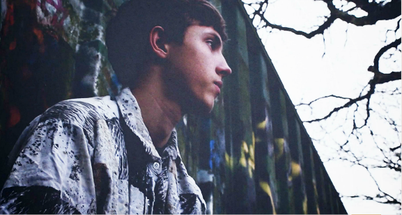
Digipack and Advert Photo Shots


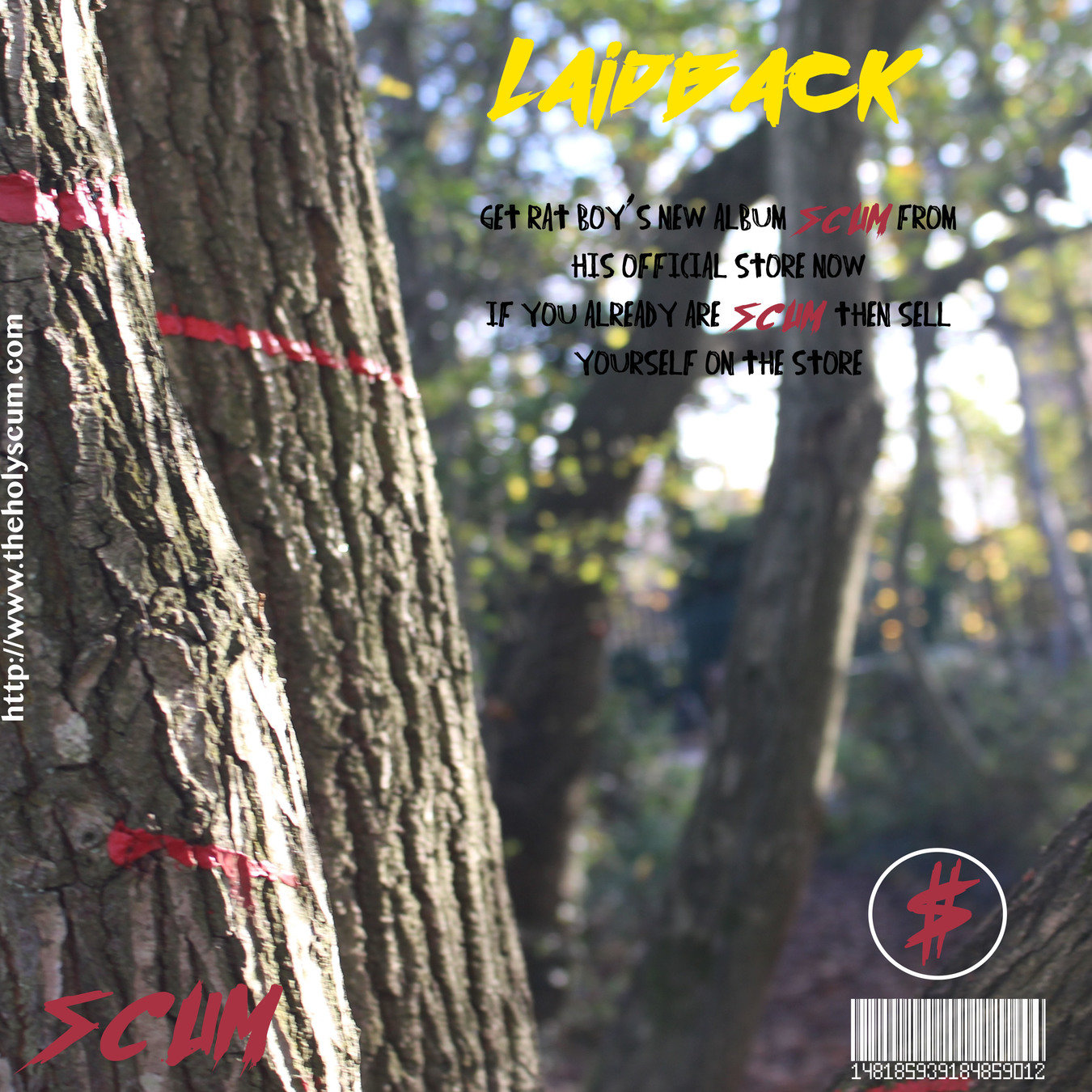
Final Digipack and Advert
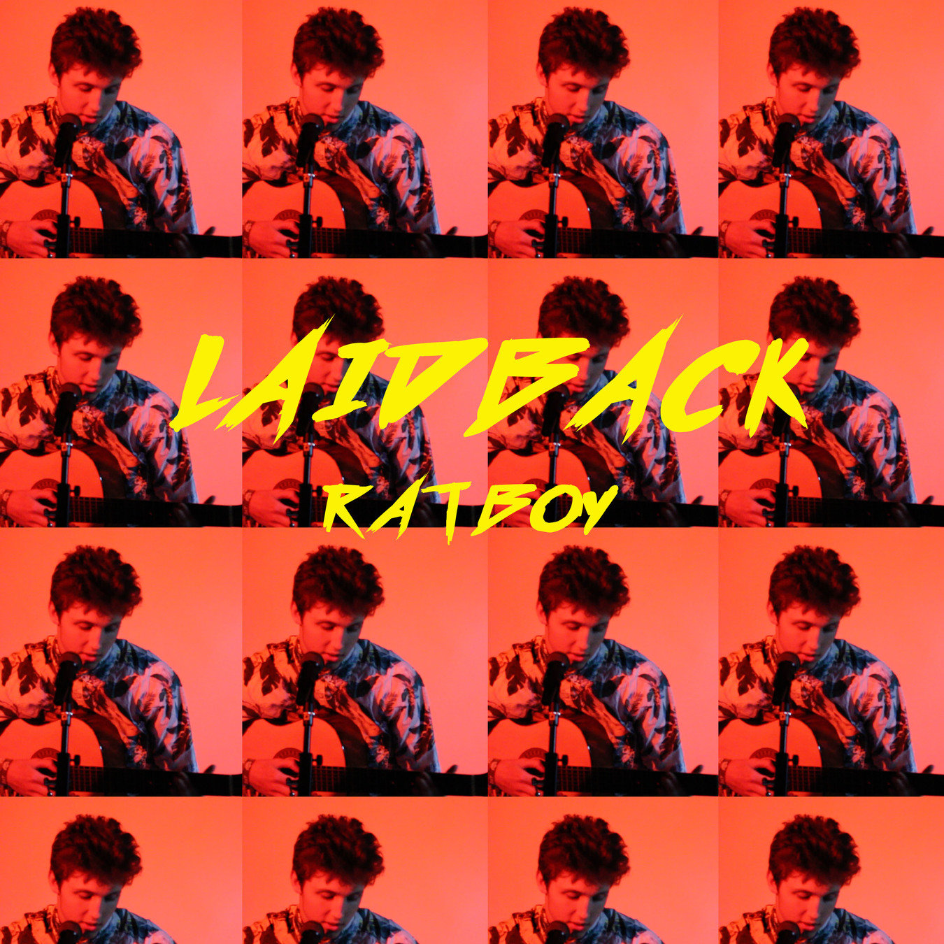
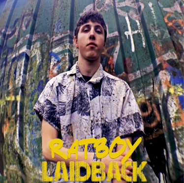
Fonts for the digipack and Advert
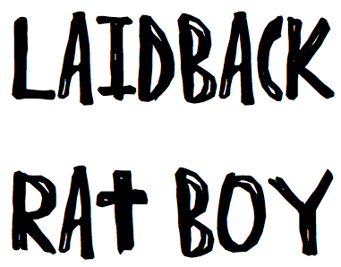
This font is called Indie Hype and looks more like it is drawn with a marker rather than written on a computer.
This does show our genre as it is not really harsh and 'metal' and it does not look pop either as it is not curly. It is just a plain bold font that will stand out against any back ground that we have. however, even though this font does in fact show the indie genre, it is bolder for what we would want it to be. It would stand out well on the page well however, it may be too harsh for the sub-genre of indie that Rat Boy comes under.
This font is called Indie Hand and this is another font that goes well when 'Rat Boy' is written. It is clear and bold and shows exactly what is written, which is important when choosing a font as if the audience can not properly read it they may not know exactly what it is. As well as needing to be readable to the audience it also needs to fit in with the genre. The genre of our music video is Indie and this 'handwritten' looking font fits in to the genre of indie as it is very relaxed and not that structured.
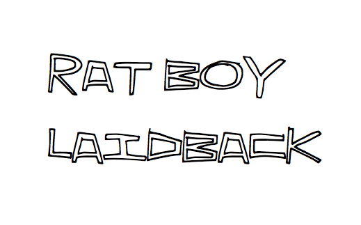
This font is called Indie Rock and it does not conform to standard indie looking fonts which mainly look handwritten. This font is more structured and crosses over more into the 'pop' and 'chart' music genre. It is a bold font where the text can be clearly seen. However, the fonts can not be put in capital letters and on our advert and our digipack we wanted to put some of the words in capital letters which is not possible in this font, therefor this ont does not seem acceptiable to use.


This font is called Indie press and this is another bold font. This font does not look like the other typical 'indie' fonts. It goes into the more alternative font which we decided would conform and challenge conventions of the indie genre at the same time. The font is bold and easily readable without being too plain and boring which we feel like this may be a good fit for our advert and digipack.
This font is called Amsterdam Graffiti and this is the furthest away from the typical indie vibe that the other fonts have however, it goes along with the graffiti vibe that we have chosen one of our locations to be. This shows the similarity throughout our video, advert and digipack. Choosing this font would go against general conventions of indie genre and make it more unique.
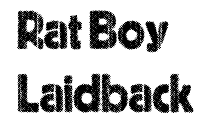
Final Fonts Chosen
These are the final fonts that we chose for our digipack and advert.
We chose these particular fonts as they conform and challenge the conventions of our indie genre. The indie fonts such as indie hype and indie hand conform to the genre conventions of looking handwritten and not too structured. Whereas using a font such as amsterdam graffiti breaks these conventions and shows a different side to the genre that we chose.
deck
By leenaiii


