CSS Christmath
@Mamboleoo


<div class="window">
  [...]
</div>
.window {
position: absolute;
top: 50%;
left: 50%;
transform: translate(-50%, -50%);
perspective: 800px;
}<div class="window">
<div class="container">
[...]
</div>
</div>.container {
width: 500px;
height: 500px;
animation: rotate 25s infinite linear;
transform-style: preserve-3d;
}
@keyframes rotate {
to { transform: rotateY(1turn); }
}<div class="window">
<div class="container">
<span class="particle"></span>
[2..398]
<span class="particle"></span>
</div>
</div>$radius: 6px;
.particle {
position: absolute;
top: calc(50% - #{$radius});
left: calc(50% - #{$radius});
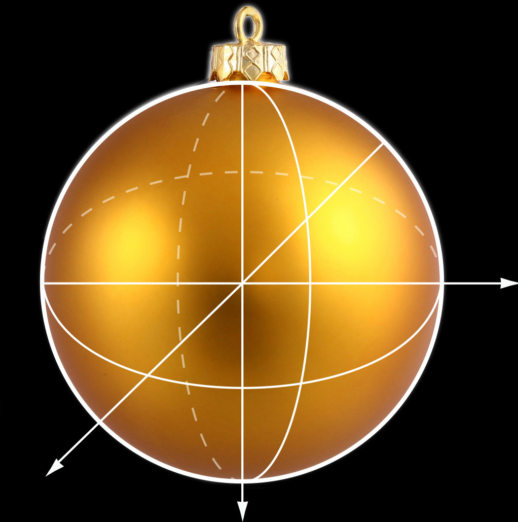
}Spherical Coordinates
Theta :
Phi :
Direction
Inclinaison
Radius :
Distance


$sphereRadius: 300px;
$colors: (#2E554A, #3A836C, #76AF87, #F5F1B9, #EA3458);
@for $i from 1 through 400 {
  $theta: random() * 360deg;
  $phi: (1 - sqrt(random())) * 90deg;
  @if random() > 0.5 { $phi: $phi * -1; }

  $x: $sphereRadius * cos($theta) * cos($phi);
  $y: $sphereRadius * sin($phi);
  $z: $sphereRadius * sin($theta) * cos($phi);

  .particle:nth-child(#{$i}) {
    transform: translate3d($x, $y, $z);
    $colorIndex: ceil(random() * 5);
    color: nth($colors, $colorIndex);
  }
}.particle {
[...]
transform-style: preserve-3d;
&::before {
content: "";
width: $radius * 2;
height: $radius * 2;
position: absolute;
background: currentColor;
border-radius: 50%;
animation: oppositeRotation 25s infinite linear;
}
}
@keyframes oppositeRotation {
to {transform: rotateY(-1turn);}
}.particle {
[...]
&:before {
[...]
animation: oppositeRotation 25s infinite linear,
blink 6s infinite linear;
box-shadow: 0 0 10px currentColor;
}
}
@keyframes blink {
5% {
box-shadow: 0 0 10px 6px currentColor;
}
10% {
box-shadow: 0 0 10px 0px currentColor;
}
}Thank you !
Louis Hoebregts
@Mamboleoo
CSS Christmath
By Louis Hoebregts


