


Trung Vo
Trung Vo, web expert with 10 years of experience, Google Developer Expert in Angular, fosters web dev communities and speaks globally, based in Singapore.
Staff Software Engineer @Ascenda
🎤 Angular Vietnam
📍 Ho Chi Minh City @ 27 Aug 2022
Hi, My name's Trung 😊
What are Directives, again?
Directives on your project
What "else" you can do?
1. The power of Angular selectorDirectives are classes that add additional behavior to elements in your Angular applications.
Looks familiar, isn't it?
<div [ngClass]="'first second'"></div>

<div [ngClass]="['first', 'second']"></div>

<div [ngClass]="{'first': true, 'second': true}"></div>

<div [ngClass]="stringExp|arrayExp|objExp"></div>

<div [ngClass]="{'class1 class2' : true}"></div>That's how it is implemented
@Directive({
  selector: '[ngClass]',
  standalone: true,
})
export class NgClass implements DoCheck {
  @Input('ngClass')
  set ngClass(
    value:
      string |
      string[] |
      Set<string> |
      { [klass: string]: any }
  ) {}
}
*correct answer will get a surprise 🎁
Attribute directives: Change the appearance or behavior of an element, component, or another directive.
Structural directives: Change the DOM layout by adding and removing DOM elements.
Components: Used with a template. This type of directive is the most common directive type.
export interface Directive {
  selector?: string;
  inputs?: string[];
  outputs?: string[];
  providers?: Provider[];
  exportAs?: string;
  queries?: {[key: string]: any};
  host?: {[key: string]: string};
  jit?: true;
  standalone?: boolean;
}// Usage
@Directive({
// blah blah
})export interface Component extends Directive {
changeDetection?: ChangeDetectionStrategy;
viewProviders?: Provider[];
moduleId?: string;
templateUrl?: string;
template?: string;
styleUrls?: string[];
styles?: string[];
animations?: any[];
encapsulation?: ViewEncapsulation;
interpolation?: [string, string];
preserveWhitespaces?: boolean;
standalone?: boolean;
imports?: (Type<any>|any[])[];
schemas?: SchemaMetadata[];
}<a href="https://trungk18.com/"
target="_blank"
rel="noopener"
>
Safe Link
</a>
<a href="https://trungk18.com/"
target="_blank"
>
Not Safe Link
</a>* All major browsers should have fixed this issue by now
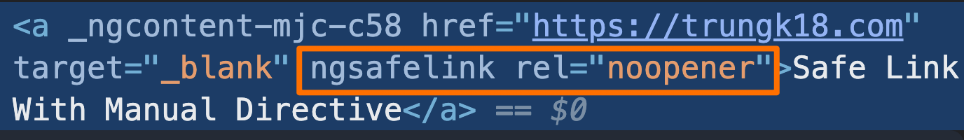
@Directive({
  selector: '[ngSafeLink]',
})
export class ManualSafeLinkDirective {
  @HostBinding('rel') rel = 'noopener';
}
<a
href="https://trungk18.com/"
target="_blank"
ngSafeLink
>
Safe Link With Manual Directive
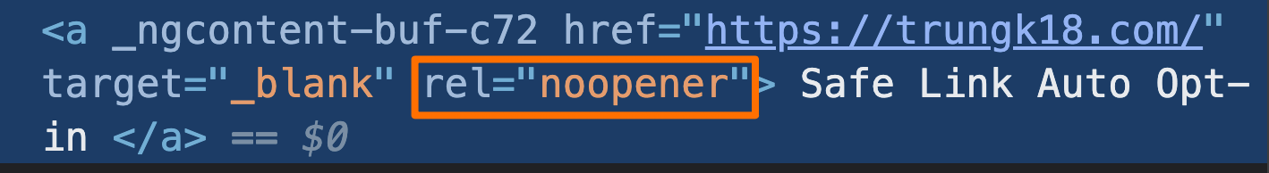
</a>@Directive({
selector: 'a[target="_blank"]:not([rel="noopener"])',
//selector: 'a:not([routerLink]):not([rel="noopener"])',
})
export class SafeLinkDirective {
@HostBinding('rel') rel = 'noopener';
}<a
href="https://trungk18.com/"
target="_blank"
>
Safe Link Auto Opt-in
</a>@Component({
selector: 'simple-form',
template: `
<form #f="ngForm" (ngSubmit)="onSubmit(f)" novalidate>
<input name="first" ngModel #first="ngModel" required>
<input name="last" ngModel>
<button>Submit</button>
</form>
<p>First name value: {{ first.value }}</p>
<p>Form value: {{ f.value | json }}</p>
<p>Form valid: {{ f.valid }}</p>
`,
})
export class SimpleFormComponent {@Directive({
selector: `
form:not([ngNoForm]):not([formGroup]),
ng-form,
[ngForm]
`,
providers: [formDirectiveProvider],
host: {'(submit)': 'onSubmit($event)', '(reset)': 'onReset()'},
outputs: ['ngSubmit'],
exportAs: 'ngForm'
})
export class NgForm extends ControlContainer {}I hope it makes sense ^_^
TL;DR: Think CSS selectors
@Directive({
selector: 'form:not([ngNoFocus])',
})
export class FormFocusDirective implements AfterViewInit {
focusables = ['input', 'select', 'textarea']
constructor(private element: ElementRef) {}
ngAfterViewInit() {
const input = this.element.nativeElement.querySelector(
this.focusables.join(','),
)
input?.focus()
}
@HostListener('submit')
submit() {
const input = this.element.nativeElement.querySelector(
this.focusables.map((x) => `${x}.ng-invalid`).join(','),
)
input?.focus()
}
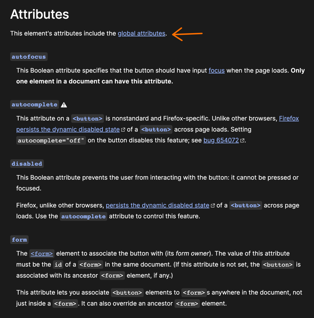
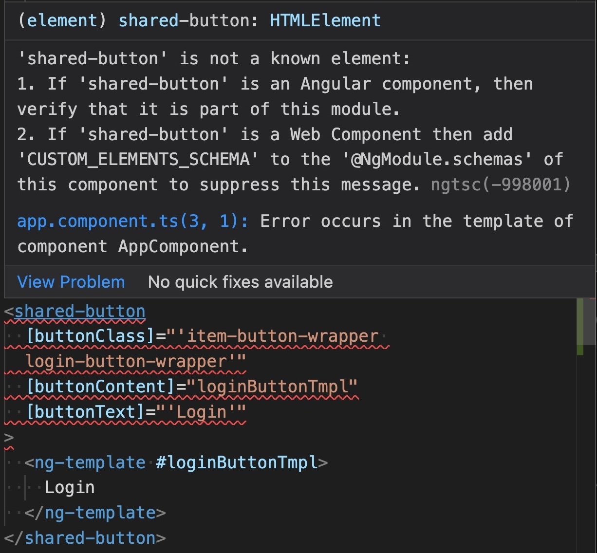
}Native HTML elements capture a number of standard interaction patterns that are important to accessibility. When authoring Angular components, you should re-use these native elements directly when possible, rather than re-implementing well-supported behaviors.
@Component({
selector: 'shared-button',
template: `
<button
class="button focus-link"
[attr.aria-label]="ariaLabel"
[attr.disabled]="isDisabled ? true : null"
[attr.type]="buttonType"
>
<img *ngIf="iconPath" alt="" class="btn-icon" [src]="iconPath" />
<span class="button-text">
<ng-container *ngIf="!!buttonText"> {{ buttonText }} </ng-container>
<ng-container *ngTemplateOutlet="buttonContent"> </ng-container>
</span>
</button>`
})
export class ButtonComponent implements OnInit {
@HostBinding('class.is-disabled') get isButtonDisabled(): boolean {
return this.isDisabled;
}
@Input() buttonClass: string;
@Input() buttonContent: TemplateRef<any>;
@Input() buttonText: string;
@Input() buttonType: 'button' | 'link' = 'button';
@Input() isDisabled: boolean;
@Input() iconPath: string;
@Input() ariaLabel: string;
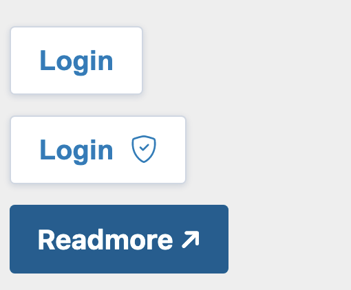
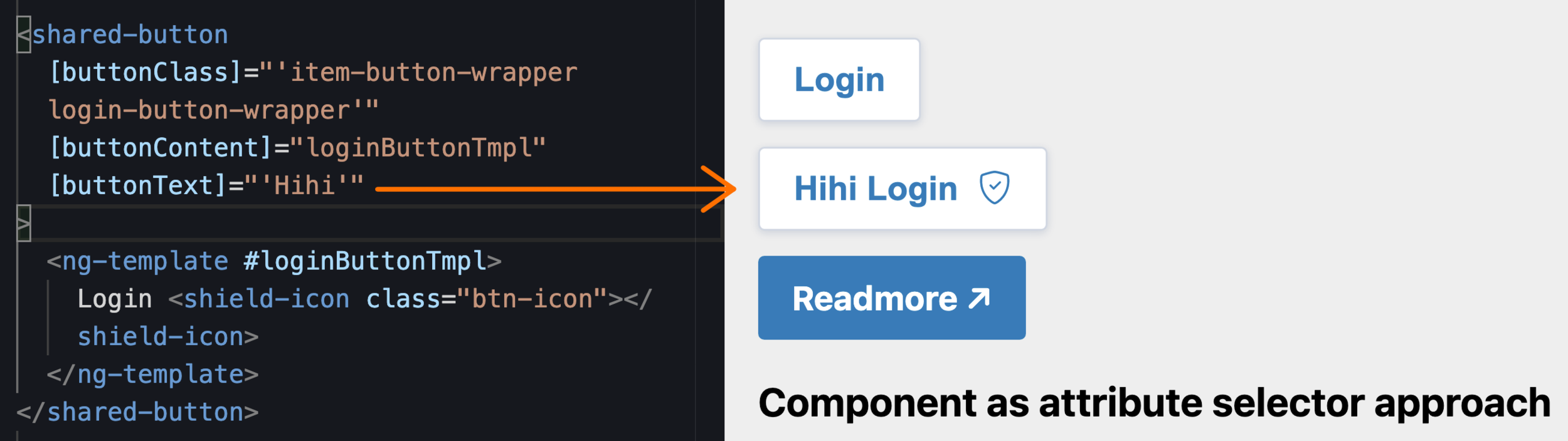
}<shared-button
[buttonClass]="'item-button-wrapper login-button-wrapper'"
[buttonText]="'Login'"
>
</shared-button>
<shared-button
[buttonClass]="'item-button-wrapper login-button-wrapper'"
[buttonContent]="loginButtonTmpl"
>
<ng-template #loginButtonTmpl>
Login <shield-icon class="btn-icon"></shield-icon>
</ng-template>
</shared-button><shared-button
[buttonContent]="readmoreTmpl"
[buttonTheme]="'primary'"
[isTargetBlank]="true"
redirectURL="https://trungk18.com/"
>
<ng-template #readmoreTmpl> Readmore ↗ </ng-template>
</shared-button> @Input() ariaHidden: boolean;
@Input() ariaPlaceholder: string;
@Input() ariaPressed: string;
@Input() ariaReadonly: string;
@Input() ariaRequired: string;
@Input() ariaSelected: string;
@Input() ariaSort: string;
@Input() ariaValueText: string;
@Input() ariaControls: string;
@Input() ariaDescribedBy: string;
@Input() ariaDescription: string;
@Input() ariaDetails: string;
@Input() ariaErrorMessage: string;
@Input() ariaFlowTo: string;
@Input() ariaLabelledBy: string;
// and another 20 more Inputs 😏@Component({
selector: 'button[shared-button], a[shared-button]',
template: ` <ng-content></ng-content> `,
changeDetection: ChangeDetectionStrategy.OnPush,
styleUrls: ['./button-v2.component.scss'],
encapsulation: ViewEncapsulation.None,
})
export class ButtonV2Component {
@HostBinding('class') get rdButtonClass(): string {
const classes = ['button', `btn-${this.buttonTheme}`];
return classes.filter(Boolean).join(' ');
}
@Input() buttonTheme: ButtonTheme = 'secondary';
}<button
shared-button
class="item-button-wrapper login-button-wrapper"
>
Login
</button>
<shared-button
  [buttonClass]="'item-button-wrapper login-button-wrapper'"
  [buttonText]="'Login'"
>
</shared-button>
🔁
<button
  shared-button
  class="item-button-wrapper login-button-wrapper"
>
  Login
  <shield-icon class="btn-icon"></shield-icon>
</button>
<shared-button
[buttonClass]="'item-button-wrapper login-button-wrapper'"
[buttonContent]="loginButtonTmpl"
>
<ng-template #loginButtonTmpl>
Login <shield-icon class="btn-icon"></shield-icon>
</ng-template>
</shared-button>🔁
<a
  shared-button
  [buttonTheme]="'primary'"
  target="_blank"
  href="https://trungk18.com/"
>
  Readmore ↗
</a>
<shared-button
[buttonContent]="readmoreTmpl"
[buttonTheme]="'primary'"
[isTargetBlank]="true"
redirectURL="https://trungk18.com/"
>
<ng-template #readmoreTmpl> Readmore ↗ </ng-template>
</shared-button>🔁
TL;DR: Components doesn't have to be <some-component> lah 😆
@Component({
  selector: `
    button[mat-button],
    button[mat-raised-button],
    button[mat-flat-button],
    button[mat-stroked-button]
  `,
  templateUrl: 'button.html',
  styleUrls: ['button.css', 'button-high-contrast.css'],
  inputs: MAT_BUTTON_INPUTS,
  host: MAT_BUTTON_HOST,
  exportAs: 'matButton',
  encapsulation: ViewEncapsulation.None,
  changeDetection: ChangeDetectionStrategy.OnPush,
})
export class MatButton extends MatButtonBase {@Component({
selector: 'button[nz-button], a[nz-button]',
exportAs: 'nzButton',
preserveWhitespaces: false,
encapsulation: ViewEncapsulation.None,
template: `
<span nz-icon nzType="loading" *ngIf="nzLoading"></span>
<ng-content></ng-content>
`,
host: {
class: 'ant-btn',
'[class.ant-btn-primary]': `nzType === 'primary'`,
'[class.ant-btn-dashed]': `nzType === 'dashed'`,
'[class.ant-btn-link]': `nzType === 'link'`,
}
})
export class NzButtonComponent implements OnDestroy, OnChanges, AfterViewInit, AfterContentInit, OnInit {@Component({
selector: 'mat-table, table[mat-table]',
exportAs: 'matTable',
template: CDK_TABLE_TEMPLATE,
styleUrls: ['table.css'],
host: {
'class': 'mat-table',
'[class.mat-table-fixed-layout]': 'fixedLayout',
},MatTabNav ↗️
@Component({
  selector: '[mat-tab-nav-bar]',
  exportAs: 'matTabNavBar, matTabNav',
  inputs: ['color'],
  templateUrl: 'tab-nav-bar.html',
  styleUrls: ['tab-nav-bar.css'],
  host: {
    'class': 'mat-tab-nav-bar mat-tab-header',
    '[class.mat-tab-header-pagination-controls-enabled]': '_showPaginationControls',
    '[class.mat-tab-header-rtl]': "_getLayoutDirection() == 'rtl'",
    '[class.mat-primary]': 'color !== "warn" && color !== "accent"',
    '[class.mat-accent]': 'color === "accent"',
    '[class.mat-warn]': 'color === "warn"',
  },
encapsulation: ViewEncapsulation.None,The key takeaway from this is that, whenever you’re creating a new component, you should ask yourself:
can I augment an existing one instead?
<button>
<span class="button-text">
<ng-container *ngIf="!!buttonText">
{{ buttonText }}
</ng-container>
<ng-container *ngTemplateOutlet="buttonContent">
</ng-container>
</span>
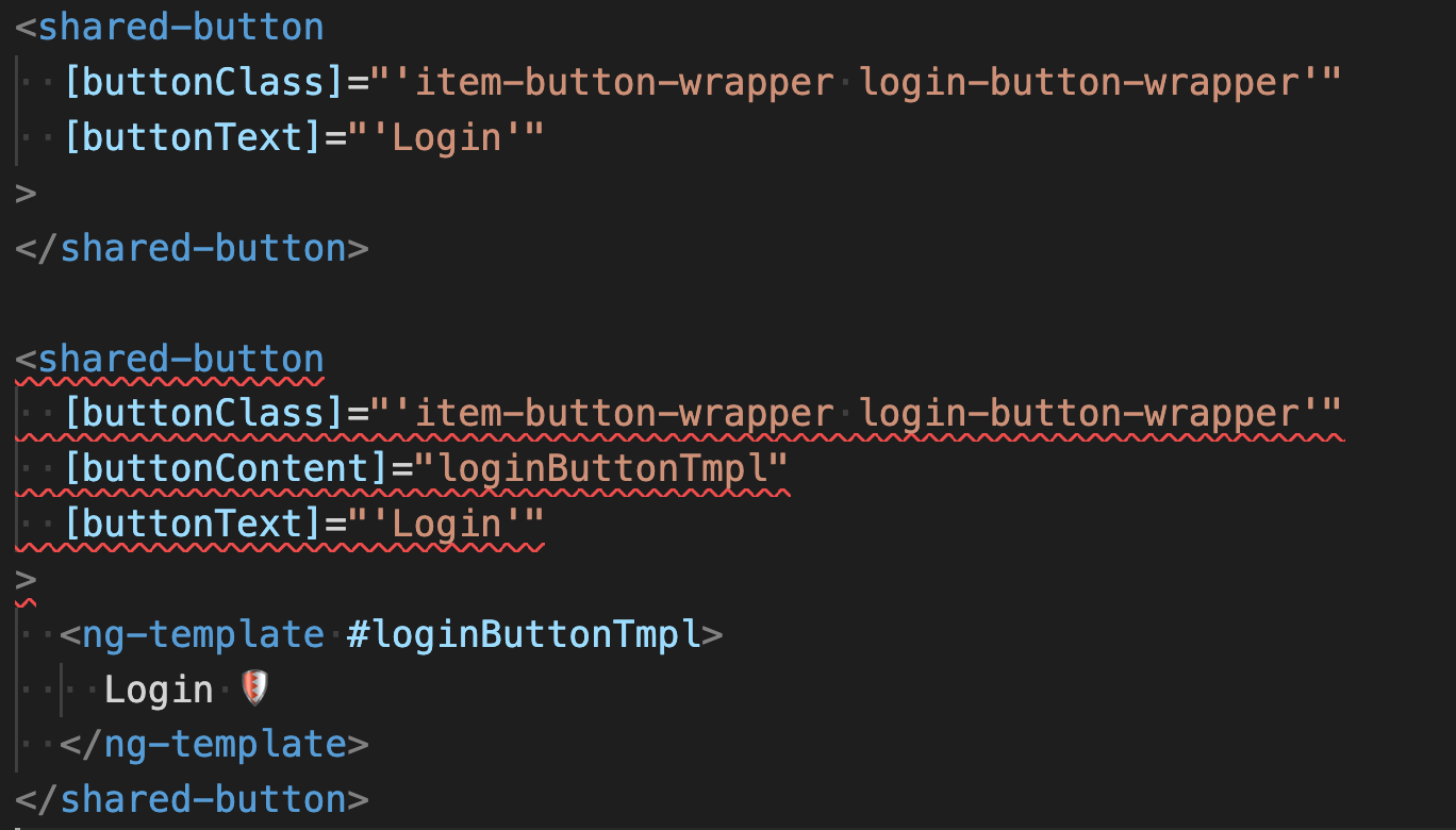
</button><shared-button
[buttonClass]="'item-button-wrapper login-button-wrapper'"
[buttonContent]="loginButtonTmpl"
[buttonText]="'Hihi'"
>
<ng-template #loginButtonTmpl>
Login <shield-icon class="btn-icon"></shield-icon>
</ng-template>
</shared-button><shared-button
[buttonText]="'Hihi'"
>
</shared-button>
<shared-button
[buttonContent]="loginButtonTmpl"
>
<ng-template #loginButtonTmpl>
Login <shield-icon class="btn-icon"></shield-icon>
</ng-template>
</shared-button>We only want either buttonText, or buttonContent.
NOT both of them
@Component({
  selector: `
    shared-button[buttonText]:not([buttonContent]),
    shared-button[buttonContent]:not([buttonText])`,
  templateUrl: './button.component.html',
  changeDetection: ChangeDetectionStrategy.OnPush,
})
export class ButtonComponent implements OnInit {
  @Input() buttonClass!: string;
@Input() buttonContent!: TemplateRef<any>;@Component({
selector: `
ngx-lil-gui:not([config]):not([object]),
ngx-lil-gui[config]:not([object]),
ngx-lil-gui[object]:not([config])
`,
template: ` <ng-content></ng-content> `,
changeDetection: ChangeDetectionStrategy.OnPush,
standalone: true,
})In Angular, you can attach Attribute Directives on any elements on the DOM, and if the Directive’s selector matches, Angular will instantiate the Directive with the appropriate context.
@Directive({
  selector: '[some]'
})
export class SomeDirective {
  // 👇 what is available here?
  constructor() { }
}
A context is an environment in that the Directive is created. In other words,
What is available to access via Angular’s Dependency Injection depends on where it is attached.
<div some></div>
<button some></button>
@Directive({/*...*/ })
export class SomeDirective {
constructor(elRef: ElementRef<HTMLButtonElement>) { }
}ElementRef<TElement> where TElement is the actual type of the element
<some-component some></some-component>@Directive({/*...*/ })
export class SomeDirective {
constructor(
// 👇 the <some-component> element
elRef: ElementRef<HTMLElement>,
// 👇 the SomeComponent instance
some: SomeComponent
) { }
}<ng-template some></ng-template>@Directive({/*...*/ })
export class SomeDirective {
constructor(
// 👇 the <!-- container --> comment
elRef: ElementRef<Comment>,
// 👇 the TemplateRef instance
// 👇. 👇 you can use any specific generic here if you know what the Context is
templateRef: TemplateRef<any>
) {
console.log(elRef.nativeElement.textContent): // logs: 'container'
}
}<input [ngModel]="name" some />@Directive({/*...*/ })
export class SomeDirective {
constructor(
ngModel: NgModel,
) { }
}SomeDirective has access to the NgModel instance and anything that NgModel might have inherited (the underlying NgControl), so you can have a Directive that might do some additional Form logic.
<some-component some></some-component>@Component({
/*...*/,
// 👇 this will also be made available to SomeDirective
providers: [SomeService]
})
export class SomeComponent { }
@Directive({/*...*/ })
export class SomeDirective {
constructor(
someService: SomeService
) { }
}SomeDirective has access to anything that is provided in SomeComponent’s providers
<some-parent>
  <some-component some></some-component>
</some-parent>
@Directive({/*...*/ })
export class SomeDirective {
constructor(
someParent: someParentComponent,
someComponent: someComponent,
) { }
}SomeDirective also has access to SomeComponent’s ancestors’ Injector
@Directive({/*...*/ })
export class SomeDirective {
  constructor(
    cdr: ChangeDetectionRef,
    @Inject(DOCUMENT) document: Document,
  ) { }
}Everything listed here might not be exhaustive, as these are the things that I am aware of.
<p-calendar
  [(ngModel)]="date"
  id="date"
  name="date"
  dateFormat="dd/mm/yy"
  [showIcon]="true"
  [showButtonBar]="true"
  [monthNavigator]="true"
  [yearNavigator]="true"
  [firstDayOfWeek]="1"
>
</p-calendar>
@Component({
  selector: 'shared-calendar',
  template: `
  <p-calendar
    [formControl]="formControl"
    [name]="name"
    dateFormat="dd/mm/yy"
    [showIcon]="true"
    [showButtonBar]="true"
    [monthNavigator]="true"
    [yearNavigator]="true"
    [firstDayOfWeek]="1"
  >
  </p-calendar>`,
})
export class ShareCalendar {
  @Input() name: string;
  @Input() formControl: FormControl;
}
<shared-calendar [formControl]="control">
</share-calendar>
We got the same issues as what we did for the custom button
import { Calendar } from 'primeng/calendar';

@Directive({
  selector: 'p-calendar',
})
export class CalenderDirective {
  constructor(private calendar: Calendar) {
    this.calendar.dateFormat = 'dd/mm/yy';
    this.calendar.showIcon = true;
    this.calendar.showButtonBar = true;
    this.calendar.monthNavigator = true;
    this.calendar.yearNavigator = true;
    this.calendar.firstDayOfWeek = 1;
  }
}<p-calendar
[(ngModel)]="date"
id="date"
name="date">
</p-calendar>
import { Calendar } from 'primeng/calendar';

@Directive({
  selector: 'p-calendar[resetCalendar]',
})
export class CalenderDirective {
  constructor(private calendar: Calendar) {
    this.calendar.dateFormat = 'dd/mm/yy';
    this.calendar.showIcon = true;
    this.calendar.showButtonBar = true;
    this.calendar.monthNavigator = true;
    this.calendar.yearNavigator = true;
    this.calendar.firstDayOfWeek = 1;
  }
}import { Calendar } from 'primeng/calendar';
@Directive({
selector: 'p-calendar:not([noResetCalendar])',
})
export class CalenderDirective {
constructor(private calendar: Calendar) {
this.calendar.dateFormat = 'dd/mm/yy';
this.calendar.showIcon = true;
this.calendar.showButtonBar = true;
this.calendar.monthNavigator = true;
this.calendar.yearNavigator = true;
this.calendar.firstDayOfWeek = 1;
}
}1️⃣ Attribute selector ([]) is not the only way that you can write your directive
2️⃣ Utilize attribute selector for component to extend the native element
3️⃣ Combine multiple selectors to have very flexible components
4️⃣ Directive context
By Trung Vo
Deck for Angular Vietnam 2nd in-person meetup. Ho Chi Minh City, Vietnam, 27 Aug 2022


