


Trung Vo
Trung Vo, web expert with 10 years of experience, Google Developer Expert in Angular, fosters web dev communities and speaks globally, based in Singapore.
Staff Software Engineer @Ascenda
🎤 Ascenda
📍 Singapore @ 06 Oct 2022
Hi, My name's Trung 😊
Angular component
Thoughtful component design
Q&A
Components are the most basic UI building block of an Angular app. An Angular app contains a tree of Angular components.
@Component({
  selector: 'fancy-button',
  template: `
    <button [ngClass]="classes">{{ text }}</button>
  `
})
export class FancyButtonComponent implements OnInit {
  @Input() text: string;
  @Input() theme: string;

  get classes() {
    return {
      'btn': true,
      'btn-primary': this.theme === 'primary',
      'btn-secondary': this.theme === 'secondary'
    };
  }
}
<fancy-button [text]="Read more" theme="primary">
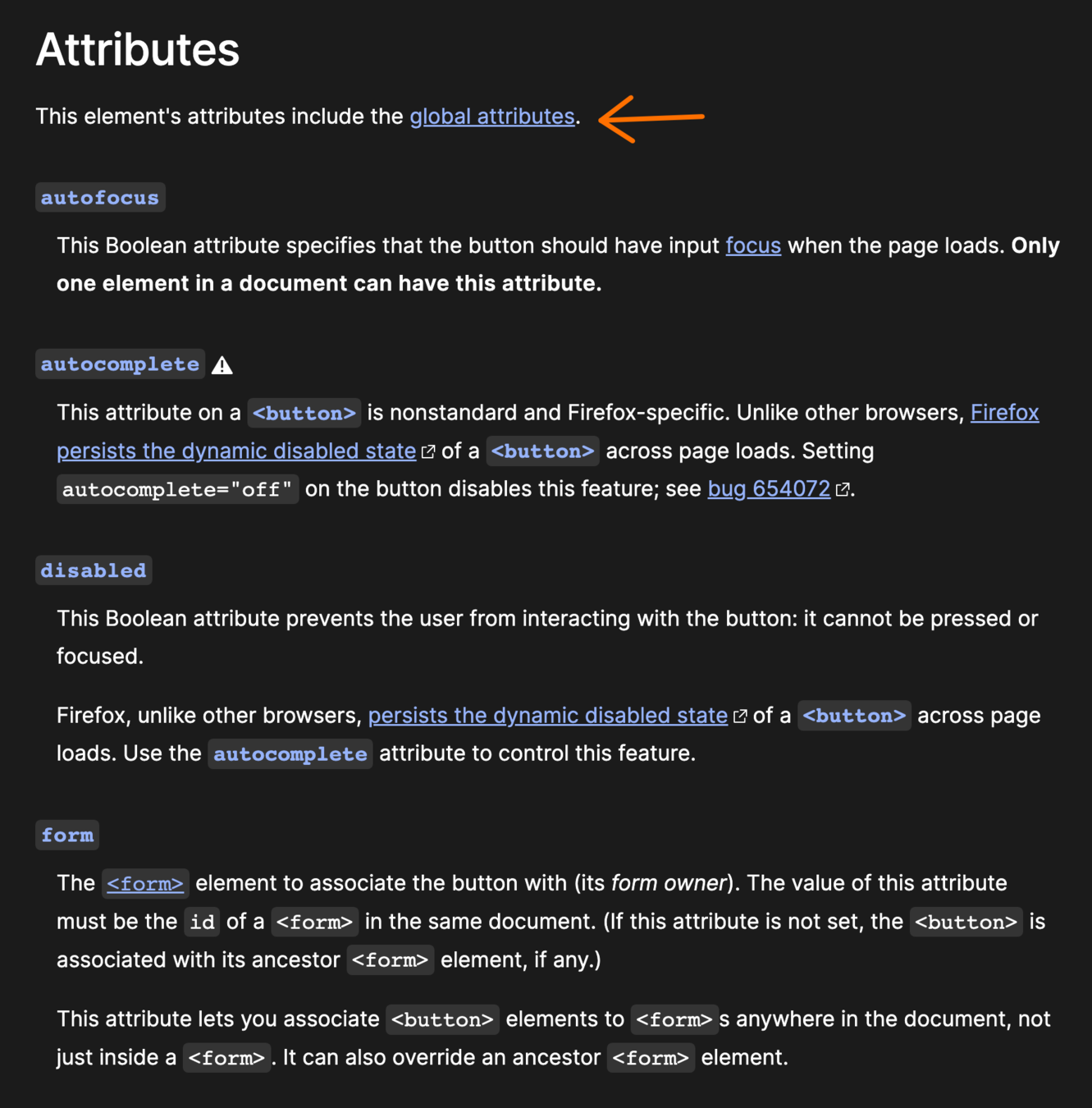
</fancy-button>Native HTML elements capture a number of standard interaction patterns that are important to accessibility. When authoring Angular components, you should re-use these native elements directly when possible, rather than re-implementing well-supported behaviors.
@Component({
selector: 'shared-button',
template: `
<button
class="button focus-link"
[attr.aria-label]="ariaLabel"
[attr.disabled]="isDisabled ? true : null"
[attr.type]="buttonType"
>
<img *ngIf="iconPath" alt="" class="btn-icon" [src]="iconPath" />
<span class="button-text">
<ng-container *ngIf="!!buttonText"> {{ buttonText }} </ng-container>
<ng-container *ngTemplateOutlet="buttonContent"> </ng-container>
</span>
</button>`
})
export class ButtonComponent implements OnInit {
@HostBinding('class.is-disabled') get isButtonDisabled(): boolean {
return this.isDisabled;
}
@Input() buttonClass: string;
@Input() buttonContent: TemplateRef<any>;
@Input() buttonText: string;
@Input() buttonType: 'button' | 'link' = 'button';
@Input() iconPath: string;
@Input() isDisabled: boolean;
@Input() ariaLabel: string;
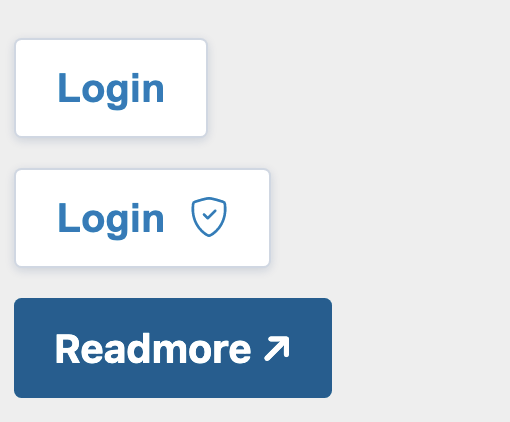
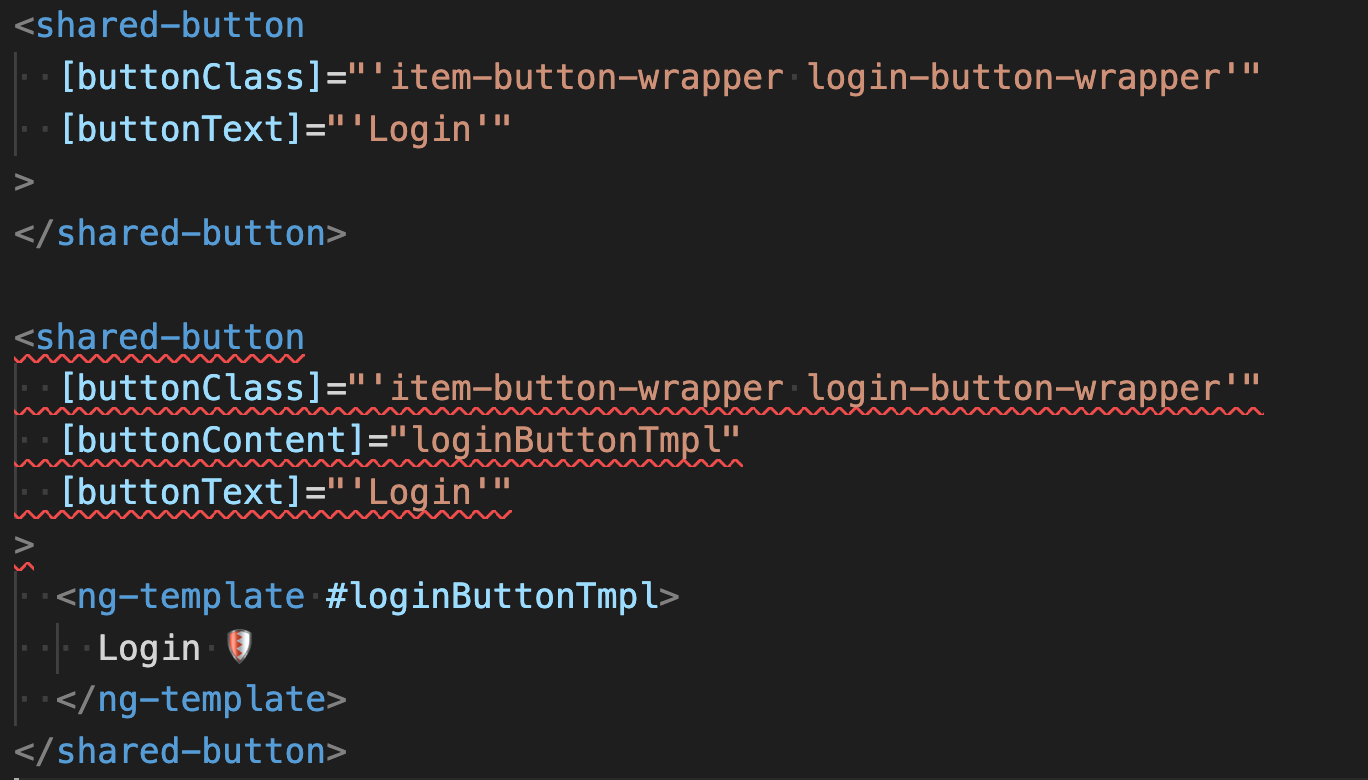
}<shared-button
[buttonClass]="'item-button-wrapper login-button-wrapper'"
[buttonText]="'Login'"
>
</shared-button>
<shared-button
[buttonClass]="'item-button-wrapper login-button-wrapper'"
[buttonContent]="loginButtonTmpl"
>
<ng-template #loginButtonTmpl>
Login <shield-icon class="btn-icon"></shield-icon>
</ng-template>
</shared-button><shared-button
[buttonContent]="readmoreTmpl"
[buttonTheme]="'primary'"
[isTargetBlank]="true"
redirectURL="https://trungk18.com/"
>
<ng-template #readmoreTmpl> Readmore ↗ </ng-template>
</shared-button> @Input() ariaHidden: boolean;
@Input() ariaPlaceholder: string;
@Input() ariaPressed: string;
@Input() ariaReadonly: string;
@Input() ariaRequired: string;
@Input() ariaSelected: string;
@Input() ariaSort: string;
@Input() ariaValueText: string;
@Input() ariaControls: string;
@Input() ariaDescribedBy: string;
@Input() ariaDescription: string;
@Input() ariaDetails: string;
@Input() ariaErrorMessage: string;
@Input() ariaFlowTo: string;
@Input() ariaLabelledBy: string;
// and another 20 more Inputs 😏@Component({
selector: 'button[shared-button], a[shared-button]',
template: ` <ng-content></ng-content> `,
changeDetection: ChangeDetectionStrategy.OnPush,
styleUrls: ['./button-v2.component.scss'],
encapsulation: ViewEncapsulation.None,
})
export class ButtonV2Component {
@HostBinding('class') get rdButtonClass(): string {
const classes = ['button', `btn-${this.buttonTheme}`];
return classes.filter(Boolean).join(' ');
}
@Input() buttonTheme: ButtonTheme = 'secondary';
}<button
shared-button
class="item-button-wrapper login-button-wrapper"
>
Login
</button>
<shared-button
  [buttonClass]="'item-button-wrapper login-button-wrapper'"
  [buttonText]="'Login'"
>
</shared-button>🔁
<button
  shared-button
  class="item-button-wrapper login-button-wrapper"
>
  Login
  <shield-icon class="btn-icon"></shield-icon>
</button>
<shared-button
[buttonClass]="'item-button-wrapper login-button-wrapper'"
[buttonContent]="loginButtonTmpl"
>
<ng-template #loginButtonTmpl>
Login <shield-icon class="btn-icon"></shield-icon>
</ng-template>
</shared-button>🔁
<a
  shared-button
  [buttonTheme]="'primary'"
  target="_blank"
  href="https://trungk18.com/"
>
  Readmore ↗
</a>
<shared-button
[buttonContent]="readmoreTmpl"
[buttonTheme]="'primary'"
[isTargetBlank]="true"
redirectURL="https://trungk18.com/"
>
<ng-template #readmoreTmpl> Readmore ↗ </ng-template>
</shared-button>🔁
TL;DR: Components doesn't have to be <some-component> lah 😆
1. Familiar APIs!
2. Accessibility win!
1. Familiar APIs!
2. Accessibility win!
1. Familiar APIs!
3. Simpler implementation!
@Component({
  selector: `
    button[mat-button],
    button[mat-raised-button],
    button[mat-flat-button],
    button[mat-stroked-button]
  `,
  templateUrl: 'button.html',
  styleUrls: ['button.css', 'button-high-contrast.css'],
  inputs: MAT_BUTTON_INPUTS,
  host: MAT_BUTTON_HOST,
  exportAs: 'matButton',
  encapsulation: ViewEncapsulation.None,
  changeDetection: ChangeDetectionStrategy.OnPush,
})
export class MatButton extends MatButtonBase {@Component({
selector: 'button[nz-button], a[nz-button]',
exportAs: 'nzButton',
preserveWhitespaces: false,
encapsulation: ViewEncapsulation.None,
template: `
<span nz-icon nzType="loading" *ngIf="nzLoading"></span>
<ng-content></ng-content>
`,
host: {
class: 'ant-btn',
'[class.ant-btn-primary]': `nzType === 'primary'`,
'[class.ant-btn-dashed]': `nzType === 'dashed'`,
'[class.ant-btn-link]': `nzType === 'link'`,
}
})
export class NzButtonComponent implements OnDestroy, OnChanges, AfterViewInit, AfterContentInit, OnInit {export type ButtonType =
| 'solid-primary'
| 'outline-secondary'
| 'outline-primary';
@Component({
selector: 'button[nexus-tc-button], a[nexus-tc-button]',
styleUrls: ['./button.component.scss'],
template: ` <ng-content></ng-content> `,
changeDetection: ChangeDetectionStrategy.OnPush,
encapsulation: ViewEncapsulation.None,
})
export class NexusTCButtonComponent {
@HostBinding('class') get rdButtonClass(): string {
const classes = ['btn', `${variantClasses[this.type]}`];
return classes.filter(Boolean).join(' ');
}
@Input() type: ButtonType = 'outline-secondary';
}@Component({
selector: 'mat-table, table[mat-table]',
exportAs: 'matTable',
template: CDK_TABLE_TEMPLATE,
styleUrls: ['table.css'],
host: {
'class': 'mat-table',
'[class.mat-table-fixed-layout]': 'fixedLayout',
},MatTabNav ↗️
@Component({
  selector: '[mat-tab-nav-bar]',
  exportAs: 'matTabNavBar, matTabNav',
  inputs: ['color'],
  templateUrl: 'tab-nav-bar.html',
  styleUrls: ['tab-nav-bar.css'],
  host: {
    'class': 'mat-tab-nav-bar mat-tab-header',
    '[class.mat-tab-header-pagination-controls-enabled]': '_showPaginationControls',
    '[class.mat-tab-header-rtl]': "_getLayoutDirection() == 'rtl'",
    '[class.mat-primary]': 'color !== "warn" && color !== "accent"',
    '[class.mat-accent]': 'color === "accent"',
    '[class.mat-warn]': 'color === "warn"',
  },
encapsulation: ViewEncapsulation.None,The key takeaway from this is that, whenever you’re creating a new component, you should ask yourself:
can I augment an existing one instead?
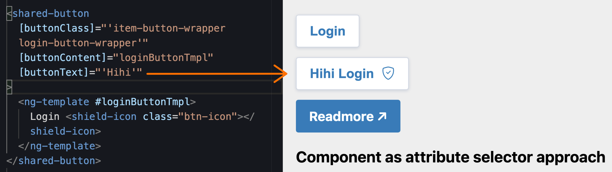
<button>
  <span class="button-text">
    <ng-container *ngIf="!!buttonText">
      {{ buttonText }}
    </ng-container>
    <ng-container *ngTemplateOutlet="buttonContent">
    </ng-container>
  </span>
</button>
<shared-button
[buttonClass]="'item-button-wrapper login-button-wrapper'"
[buttonContent]="loginButtonTmpl"
[buttonText]="'Hihi'"
>
<ng-template #loginButtonTmpl>
Login <shield-icon class="btn-icon"></shield-icon>
</ng-template>
</shared-button><shared-button
[buttonText]="'Hihi'"
>
</shared-button>
<shared-button
[buttonContent]="loginButtonTmpl"
>
<ng-template #loginButtonTmpl>
Login <shield-icon class="btn-icon"></shield-icon>
</ng-template>
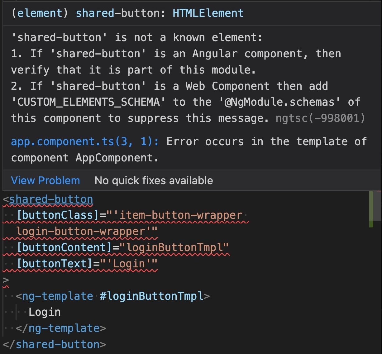
</shared-button>We only want either buttonText, or buttonContent.
NOT both of them
@Component({
  selector: `
    shared-button[buttonText]:not([buttonContent]),
    shared-button[buttonContent]:not([buttonText])`,
  templateUrl: './button.component.html',
  changeDetection: ChangeDetectionStrategy.OnPush,
})
export class ButtonComponent implements OnInit {
  @Input() buttonClass!: string;
@Input() buttonContent!: TemplateRef<any>;@Component({
selector: `
ngx-lil-gui:not([config]):not([object]),
ngx-lil-gui[config]:not([object]),
ngx-lil-gui[object]:not([config])
`,
template: ` <ng-content></ng-content> `,
changeDetection: ChangeDetectionStrategy.OnPush,
standalone: true,
})sometimes works better than
<button shared-button>
</button>
<shared-button>
</shared-button>By Trung Vo
Deck for Ascenda Tech All Hands, 06.10.2022


