Question 1
In what ways does your media product use, develop or challenge forms and conventions of real media products?
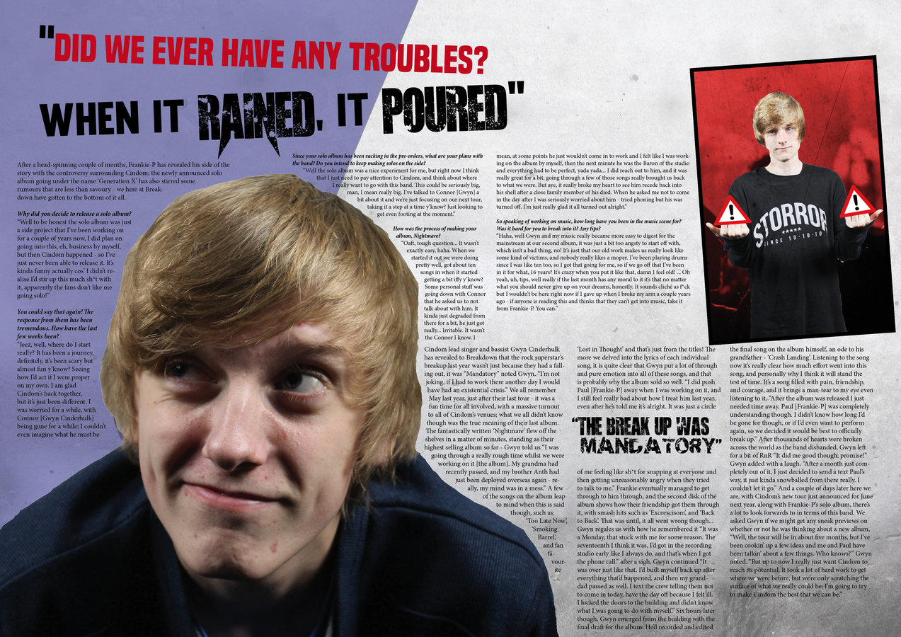
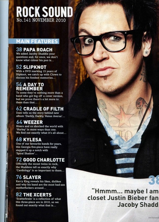
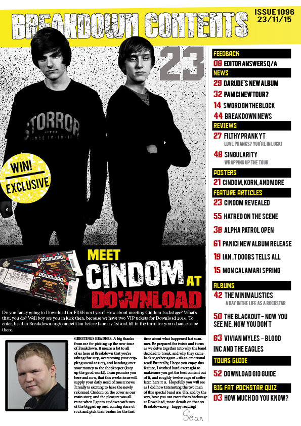
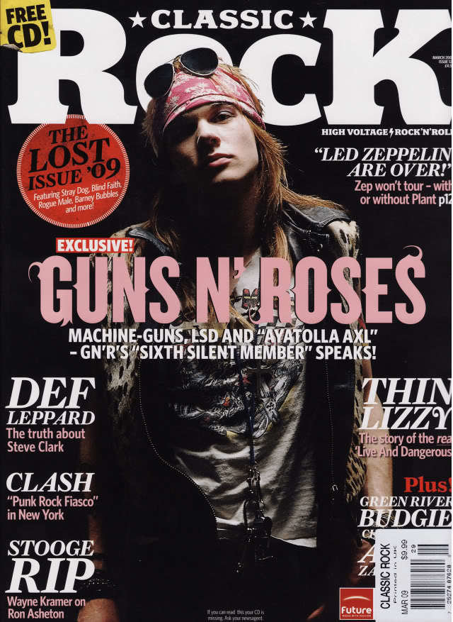
The magazine I created did use a lot of the very conventional items usually seen in magazines. A few of these conventional pieces would consist of: a masthead, taglines, and a main slugline - the magazine itself took inspiration from other rock magazines, Kerrang! in specific; I took information from their use of backgrounds, positioning of the models on the page, and also with the font, these things helped me to create a magazine that obviously belonged to a specific genre. In a specific instance I couldn’t get my magazine to look right, there was something about it which looked wrong, and after looking at some examples of real magazines it was clear that covers are usually not done in very dark colours - by making a magazine that had a black cover I was going outside of the norm and challenging expectations. In order to make it look presentable I found that I had to put the background on a gradient, making it appear lighter and darker in some areas to give it depth - a block colour would not work very well with dark colours. I originally went for the darker theme due to the connection that is has with the genre of music I would be writing about (rock/heavy rock is usually associated with darkness), and as magazines do not usually go for darker themes, I believe that I tried to develop this convention of this genre of magazine - going the extra step when it comes to identifying the magazine by colours.
The fonts I used (and the ways I decorated them) were also influenced by generic rock magazine conventions - fonts were usually largely distorted to connotate the ‘destructive’ and ‘corrosive’ manner of the music genre, with the music being usually described as harsh to the ears. The fonts I employed were large, looking corroded and crumbling - I also used a technique called ‘double exposure’ to layer another piece of corrosiveness over the text, this gave it more of the themed effect. The name I chose to give my magazine links in with this also, keeping the crumbling and distorted theme going I aptly named the magazine ‘Breakdown’, this had multiple reasons behind it. One of these reasons conforms with the genre, meaning for something to physically stop working and break, this connects to the destructive theme and also conotes that the magazine is rather breaking down because of the music, or the other vice versa; the other meaning doesn’t conform with the norm though, meaning to break down the different bands and songs and find out what their stories are, seeing behind the curtain. This doesn’t conform as it seems to be showing an emotional side to rock, looking at the people behind it and appreciating them, which is the opposite of what is usually associated with rock.
As well as conforming with the norm with my choice of colours, I also went out of my way to try and challenge the expectations from a rock magazine; because of this, I specifically chose yellow as my secondary colour. The yellow would originally seem strange, but with the way I employed it I believe I managed to make it look good to a point where it doesn’t ruin the cover and contents. I challenged this convention due to the colours being usually associated with rock being darker, and tried to challenge myself when it came to making the magazine look appealing and to stand out from the rest that would be on the shelf - I think that this addition makes it stand out effectively to most magazines of the same type.
Question 2
How does your media product represent particular social groups?
My magazine keeps the general theme and atmosphere surrounding rock as a whole pinpointed to what you would expect from anything rock, the images of the artists are all of them stood in aggressive poses, wearing dark colours on a dark backdrop. As with most stereotypes, the males pictured are all in dominant poses (an example being staring intimidatingly at the reader/camera,flexing, etc.), looking as if they have control of the situation; this . This is used as - although the magazine is for any gender - the stereotype in this genre shows men in a dominant standpoint, and so the magazine keeps with this. The bands I have included are also all represented with very aggressive and unadulterated names, rock is seen as a very adult and sometimes overly glorified genre, so the names are keeping with the themes here too - an example being the bands ‘Hatred’ and ‘Encumber’ being included in the magazine.
Question 3
What kind of media institution might distribute your media product and why?
The Media Conglomerate ‘Time Warner’ would be a good choice when it comes to publishing this magazine. They have a great track record with their other products and already sell a lot of magazines - all of which bringing in a good amount of sales. They do own a selection of music magazines, but only one of these is in anyway related to modern pop culture (Kerrang!) - my magazine is specified into rock though, so there is space for something like this on their market, making it a good investment on their part too.

Question 4
Who would be the audience for your media product?
The audience for my product was meant to be late teens to early adults, and was heavily reinforced with new age rock type bands being focused on. The genre as a whole is very popular with this age range at the moment, and the magazine stays with the theme of most of the music in this genre, albums and music videos are kept with general dark colours and themes and my product takes inspiration from this to help connect it with the genre. The magazine itself has no real gender preference, staying neutral to just the genre’s themes and showing all types of bands - not missing out on any specific types of bands, but instead covering the whole spectrum. The magazine stays open to most people, trying to keep as many people interested in it as possible whilst making it look like a niche magazine that’s personal to the readers - it keeps an overarching theme of all of rock, but also goes in depth into the separate parts of it.
The age of my audience would be roughly 18 to 24 years old - the genres of music being featured in my magazine (rock, metal, etc) are quite popular with this age group. I know of their popularity due to personal knowledge along with the facts stated from my audience research and analysis. A large number of the people questioned (which are were mostly around this age range) stated that they enjoyed listening to these genres of music above others. By including popular bands from those genres I will be hoping to grab the attention of people in this age range with these interests. The general theme of the magazine also fits in here too - the dark background along with the models standing in ‘edgy’ and aggressive poses fits in with the stereotype of this genre, which most listeners embrace as part of the culture. At even a glance the magazine will very obviously show itself for what it is, meaning that people interested in this type of music will have no trouble in seeing that this magazine may fit their needs.
With the audience’s age and stereotypical mindset being kept in mind, the way the magazine will be written and bring itself across will also be edited to help the readers identify with the magazine and enjoy reading it. The articles and text in general are be mostly informal, using humor and words which fit with the genre in a stereotypical and humorous way to engage the reader. I use words and slang which would be recognised by the listeners of this genre too, naming bands that they would know along with concerts and the like. An example of this is my giveaway of tickets to the concert ‘Download’, a well known concert which shows this type of music; most of my readers would recognise this and only feel more enticed to buy the magazine due to their chance to be able to go.
Question 5
How did you attract/address your audience?
As stated in question four, the audience I was aiming at tended to be broad when it came to musical tastes, but I kept the age range of my readers to around 16-25 in mind. With this age bracket, the writing was specifically done in an engaging manner, referencing ‘modern problems’ through the editor’s note - this is done to make the reader feel more comfortable and to enjoy the articles of the magazine. The gender of the reader is meant to stay neutral, making it open for both males and females to read - this would greatly broaden the amount of possible readers the magazine could have instead of confining it to one gender; the way I do this is by sticking to the themed colours around rock itself, dark colours are quite neutral as well, making it not overly masculine or feminine. I would also make articles about a wide selection of bands, so that bands that are focused in their audience being women are not the dominant bands displayed, but with the same going for male targeted bands - the featured musicians will be varied.
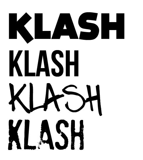
I have also added features which would attract my audience, one of these features is a contest to win tickets to the music festival ‘Download’ - this is a popular festival which would be recognised by people who like these types of bands. This feature would help to entice people to buy the magazine, as they may also win tickets to Download. The fonts and dark themes used throughout are also a throw-out to modern day rock albums and bands, the dark colours of the magazine fit in with the grungy and mentally dark themes of most of the songs. The fonts are also all selected to mimic fonts found on album covers or band logos usually seen in the rock and metal scene, these fonts and colours being used a lot means that the readers will have positive association with them as well, seeing the fonts and colours and being reminded of how they like the music, so they may like reading the magazine too.
These additions are used to catch the eye of the reader and try to convince them that the magazine is suited to them and worth the money being asked for it - overall they’re meant to try and have the reader associate the magazine to their music, and if they enjoy the style of music plus the way the magazine is going with it, then they will be more inclined to continuously purchase the next issues.
Question 6
What have you learnt about technologies from the process of constructing the product?
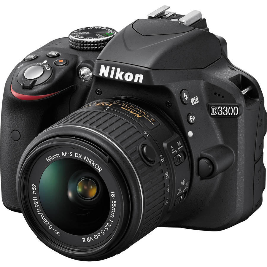
When using the DSLR camera for photographing the images I needed, I found that the camera was overall a very strong choice when it comes to taking high quality pictures for professional use. The camera’s automatic focus helped a lot when it came to capturing the images I needed, and pretty much carried me through the procedure of the photography process, without it it would have taken a lot more time for me to learn how to use it (this was a very large help to me). With the likes of Adobe Photoshop and Adobe InDesign, I learned a lot of new techniques from both of them - one of which being the 'layering' technique used in Photoshop in order to layer certain colours over other images to give them a certain tint or even to completely change the colour of some items. With InDesign I also completely learned how to use that from scratch, learning how to add anchors and move them around to morph text around background images, helping massively in the double page spread to make it look more authentic.
With InDesign, I also found it hard to make it do certain things that I would usually be able to easily accomplish in Photoshop, one example being that finding and moving layers was a lot harder for me within InDesign. One limitation I did find in the software was that layering colours over other images was very hard to find out how to do, and I ended up having to instead make the image look transparent and place it over the other I wanted to change the colour of. Photoshop was fairly easy to sue due to my experience with it before-hand, as stated above the layering was a big help with this, along with the magic wand tool which would automatically select certain things from within the image, which helped in a very big way when it came to cropping people out of my photo-shoot images.
Question 7
Looking back to your preliminary task, what do you feel that you have learnt in the progression from it to the full product?
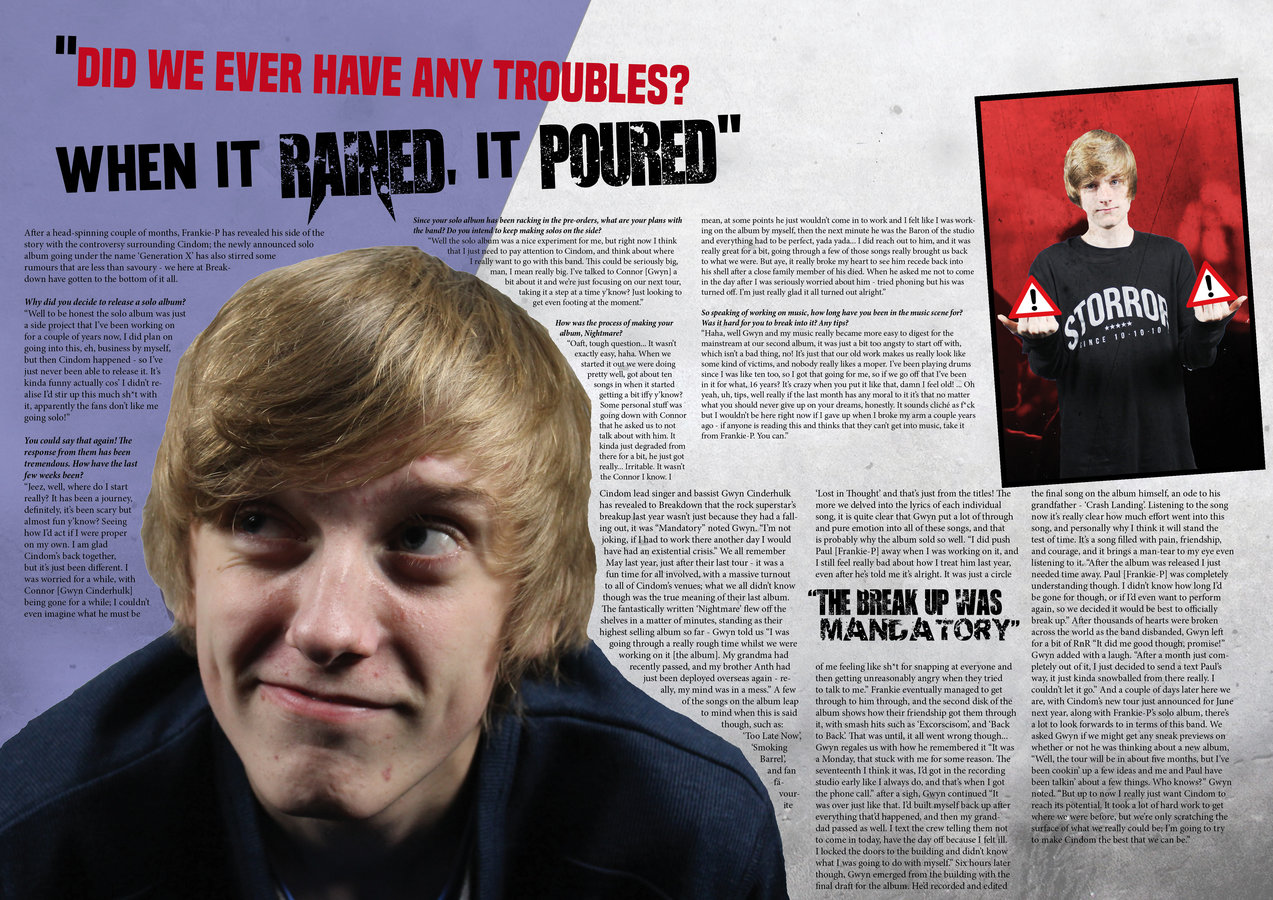
In the planning stage I was able to research deeply into the genre of my magazine, finding techniques, colours, and even the style of writing used in rock magazines - this was a large help when it came to actually typing out my article and making my house theme, as this would work to give it the authentic look that usually brings a magazine together. Flat plans and call sheets gave me a space to put down my thoughts and organise how I wanted my magazine to look, with example readily available to me so that I could make sure that it would look good before I began to spend actual time on it. My preliminary task and this task show stark contrasts between my skill level, an example of this would be that the only real tools I was able to use in the preliminary task was morphing tools and some recolouring - I also had very limited knowledge on how to manipulate text and layers. In my task now you can see that I have manipulated layers with the use of "layering" meaning I can place another image over a certain layer, making it so I could change colours of full layers, and combine some images together. In my task now you can even see good use of anchoring in my double page spread, making it so that I can morph the text from the article around my images in the background, whereas in my prelim I only made short sentences in straight lines. My usage of Photoshop has increased my skill level with it, with cropping now being easier to make look natural (no jagged edges) and recolouring layers being easier than before by a long shot. My skill level with InDesign has basically sky-rocketed, as before this task I had no idea how to use the program at all. I now feel more confident with DSLR cameras, as before this I did not know how to handle the camera and make it focus on different things - I now know slightly how the change of the aperture effect the picture, and can also effectively take images that are able to be used in my work. I feel that my completed product looks professional, and even magazine worthy in real life, but as a whole I feel that more effort could have been put in on my part in terms of researching techniques that I could use.
deck
By diggysean