Evaluation 1:
In what ways does your media product use, develop or challenge forms and conventions of real media products?
From my research...
Starting from my preliminary task, I found out the basics of a school magazine. This task soon transitioned to researching music magazines, which gave me a list of features that would normally be associated with this media product. Features such as plugs, mastheads, anchorage text and skylines were amongst the vast examples of magazine features that gave me an idea of what an ordinary, conventional music magazine appeared to be. This also helped me plan my own magazine later, accompanied by more thorough observations of existing music magazines; before recreating all the necessary elements from my own interpretation/ideas.
Images
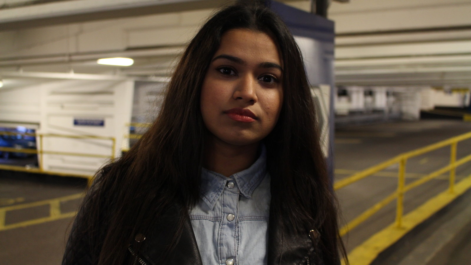
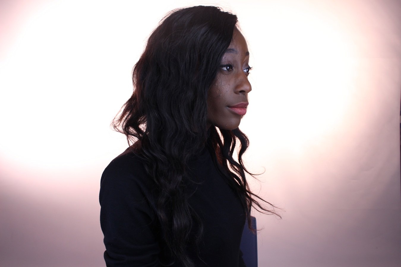
Images in a music magazine are matched with the genre the magazine specialises in
My media product tries to follow the magazine convention of having pictures of artists in a pose, who are dressed appropriately to the theme of the magazine. These images are further enhanced to match the magazine's genre through the use of lighting and location.
For my media product, I tried my best to replicate these conventions by taking pictures of my models within school and outside. By taking pictures inside the mock studio, I can manipulate light better; whilst the external locations added more "essence" to the photo.
MODELS
I asked my models to dress in their usual clothes as they are part of the generation that is most likely to listen to modern/alternative R&B (and conveniently, they do listen to the genre). PBR&B is stylish yet simplistic. They are often dark too, which matches the sultry and contemporary atmosphere PBR&B artists usually emit from their music videos. Their costumes are not necessarily an icon for the genre, but it provides a characteristic that a reader can identify and relate to. More importantly, this creates a more successful image for the magazine.
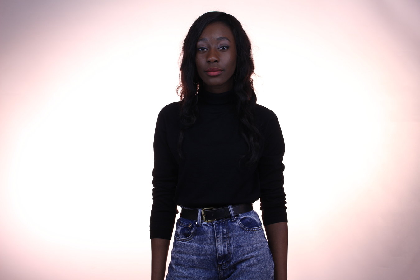
Artist How to Dress Well in comparison to Sarah's photo

Front Cover
Direct Mode of Address
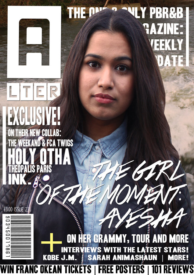
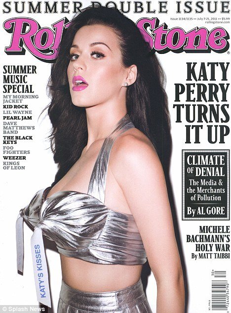
I decided to use the conventional technique of having a model creating a "direct mode of address" towards the reader. This is a typical magazine tactic, regardless of genre, which helps attract a reader and create some sort of connection with them. I decided to replicate this front cover with my own adjustments and interpretation: this one reflects Katy's femininity and sex appeal by making the renowned red Rolling Stone logo pink whilst maintaining a black and white theme to the front cover; this is further accompanied by a midshot of Katy's distracting costume and seductive pose.
For my magazine, I decided to adopt the same minimalist approach by using white text over a dark backdrop, however, my model was in less revealing clothing and in a medium close up because I feel this creates a more grasping connection with the reader without the use of a seductive pose and revealing clothing. The anchorage font is less formal and more contemporary, like a graffiti, to show the reader the key article of the magazine in a more modern and informal way - this is the key point of the magazine and it entices the reader to check it out.
Masthead
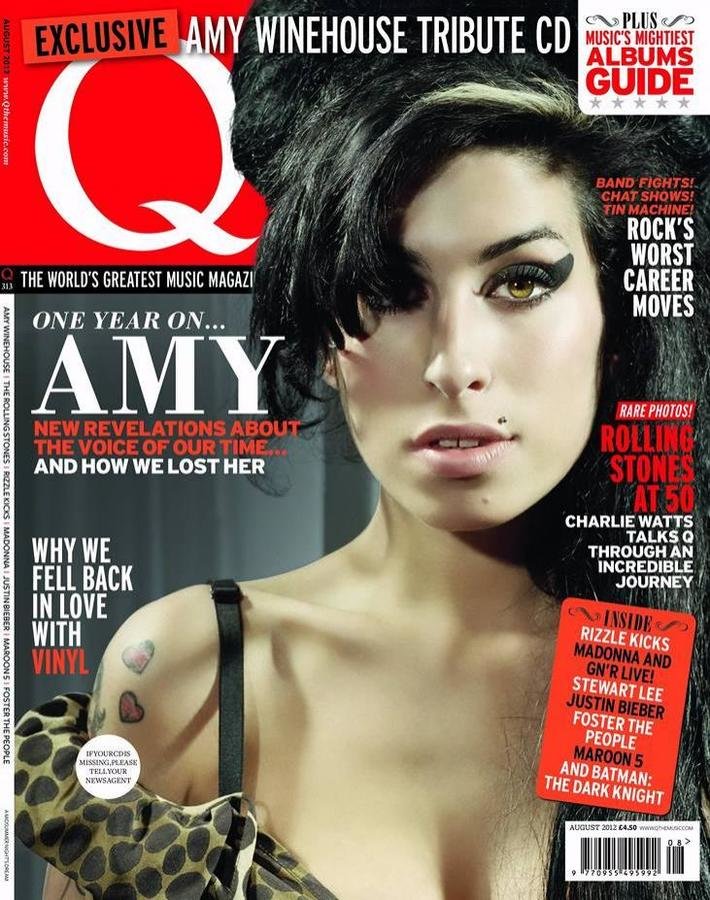
It was apparent from my research that the masthead is either placed on the top left corner of the front page or in the centre, which extends nearly all the space of the page (eg Rolling Stone). I decided to go against this convention to show a more signature look to my magazine, and adopt the style of Q Magazine, which is simply the letter Q in a red box at the left corner. I feel this is more effective and interesting when expressing new genres, as you need to create an identifiable trademark. I chose the main masthead to be "A" followed by the rest of the word "LTER" underneath it (the magazine is called Alter, which is shorthand for alternative PBR&B), as this further breaks the usual magazine convention and therefore helps create a signature look to my magazine. Using photoshop, the masthead was adjusted to have a dropshadow to make it more accentuated and off the page, making it the main focus of the magazine: it's bolder and almost 3D like - people will instantly notice it.



DPS & CONTENT
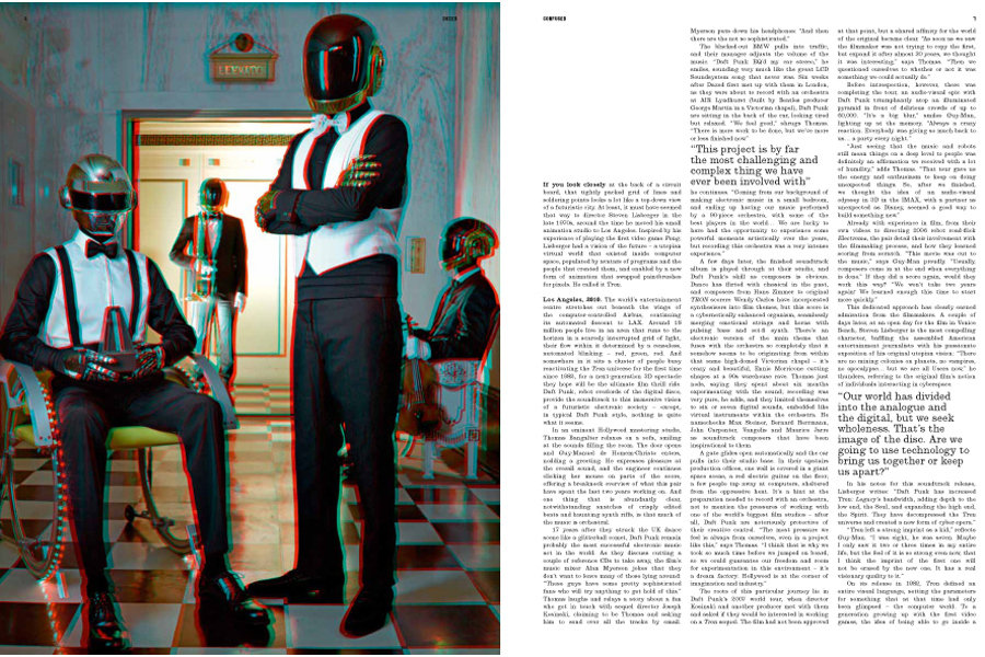
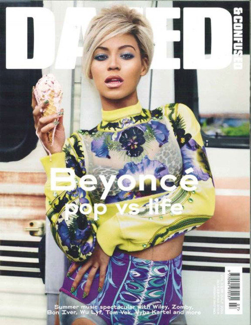
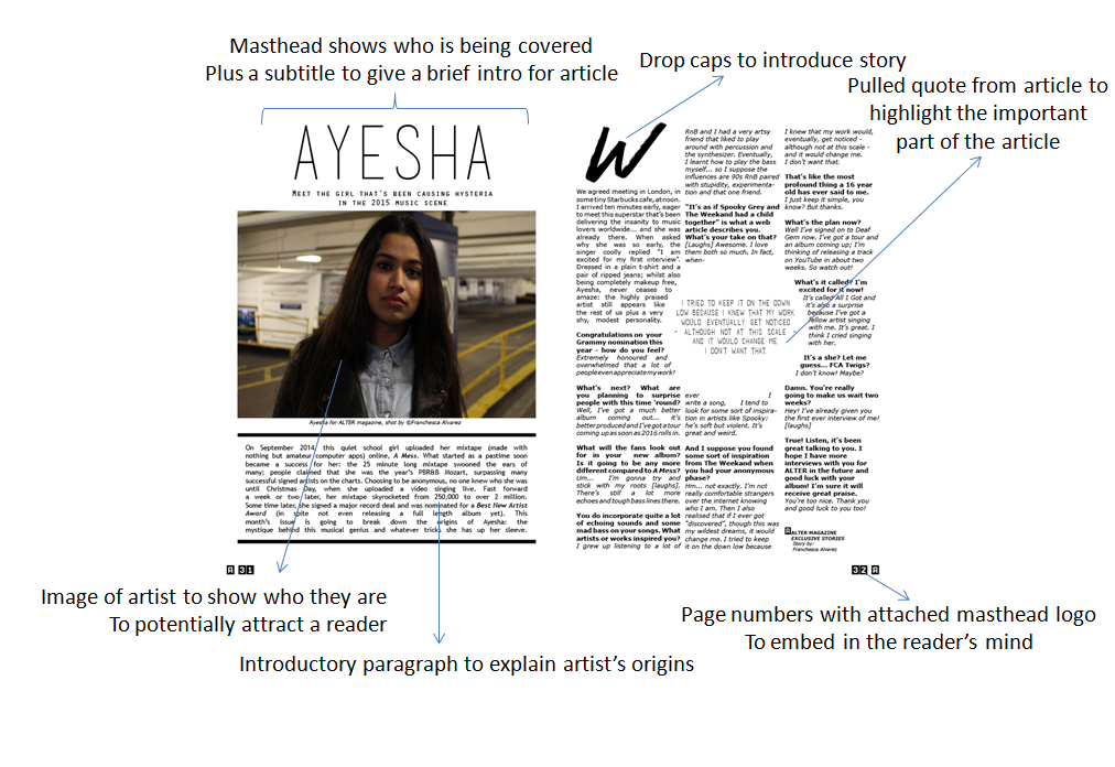
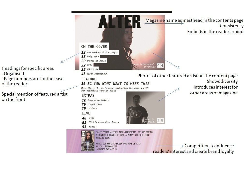
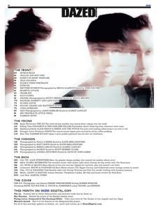
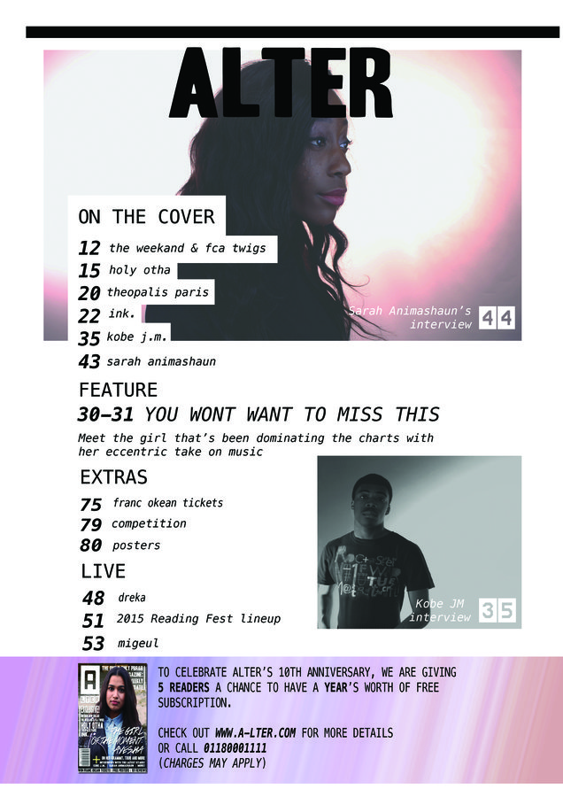
Within a magazine, a consistent theme needs to be maintained, not just to seem orderly but to also create a notable structure to your magazine that people will find appealing and easy to read. One of my many inspirations during the production of my magazine was Dazed & Confused or "Dazed". It is popular amongst the hipster subculture for its interesting, avant-garde take on music journalism. Below is an example of a Daft Punk spread. One would imagine a Daft Punk DPS would be more lively or eccentric to accompany the duo's signature sound - but Dazed has kept it simple. They also tend to have the same approach for their front page covers, which usually only has the main artist and the anchorage text. This creates more focus on the artist being featured and, although my front cover was more inspired by Katy Perry's Rolling Stone cover, I tried adapting the same technique of the Dazed DPS to my own.
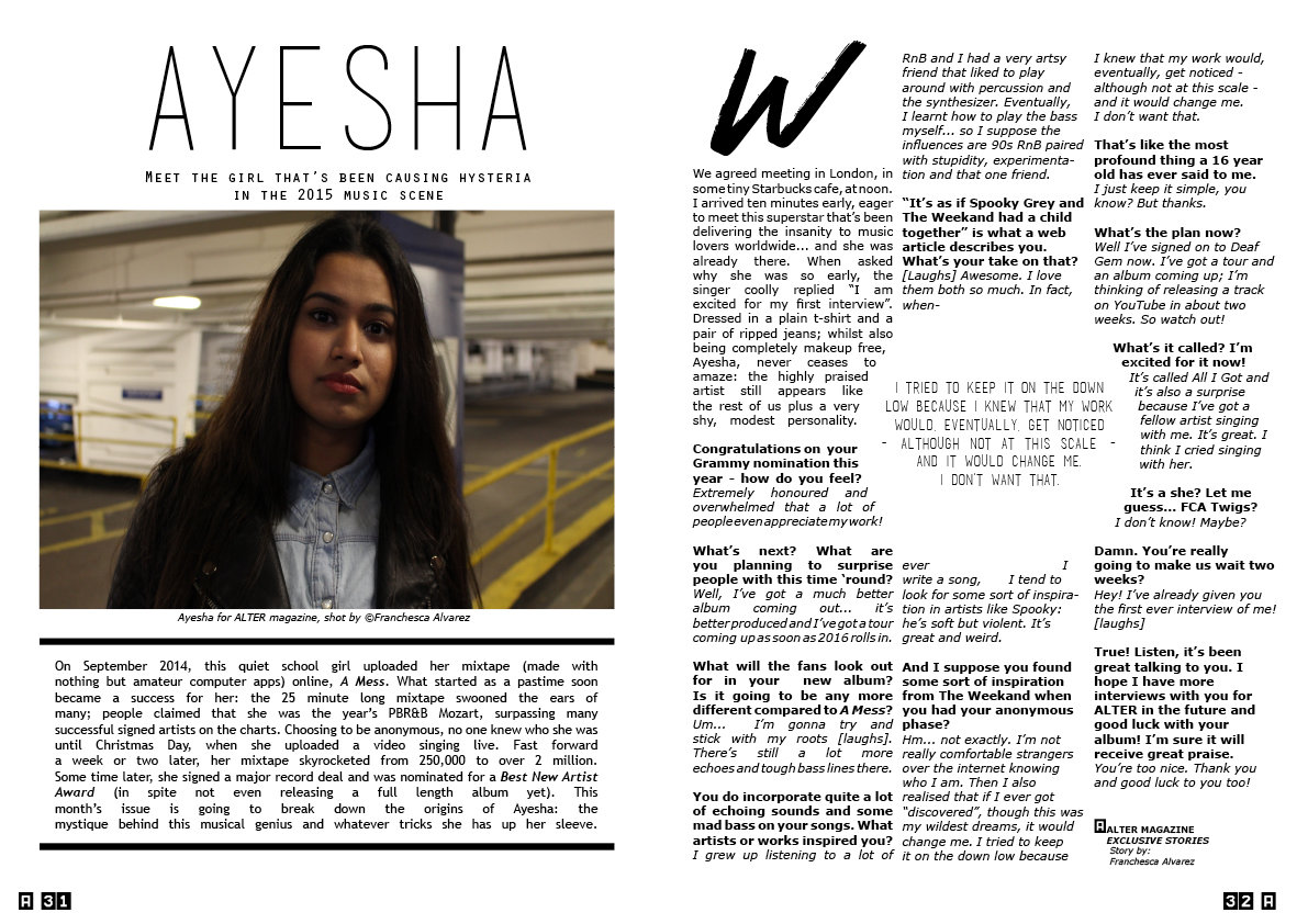
That was my DPS.
From my research and the examples on the side, you can see that music DPS tend to have hints of colour with the model posed at a pose that expresses their style of music. With my DPS, I decided to go against these conventions and adopt a more "unique" approach by having a monochromatic theme, much like the Daze article shown previously, as this creates a more modern and sophisticated look to it. Furthermore, the coloured photo of my model is accentuated further, unlike if it were featured against a backdrop that mimics the colours and drowns them out.
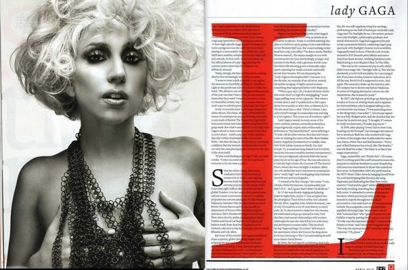
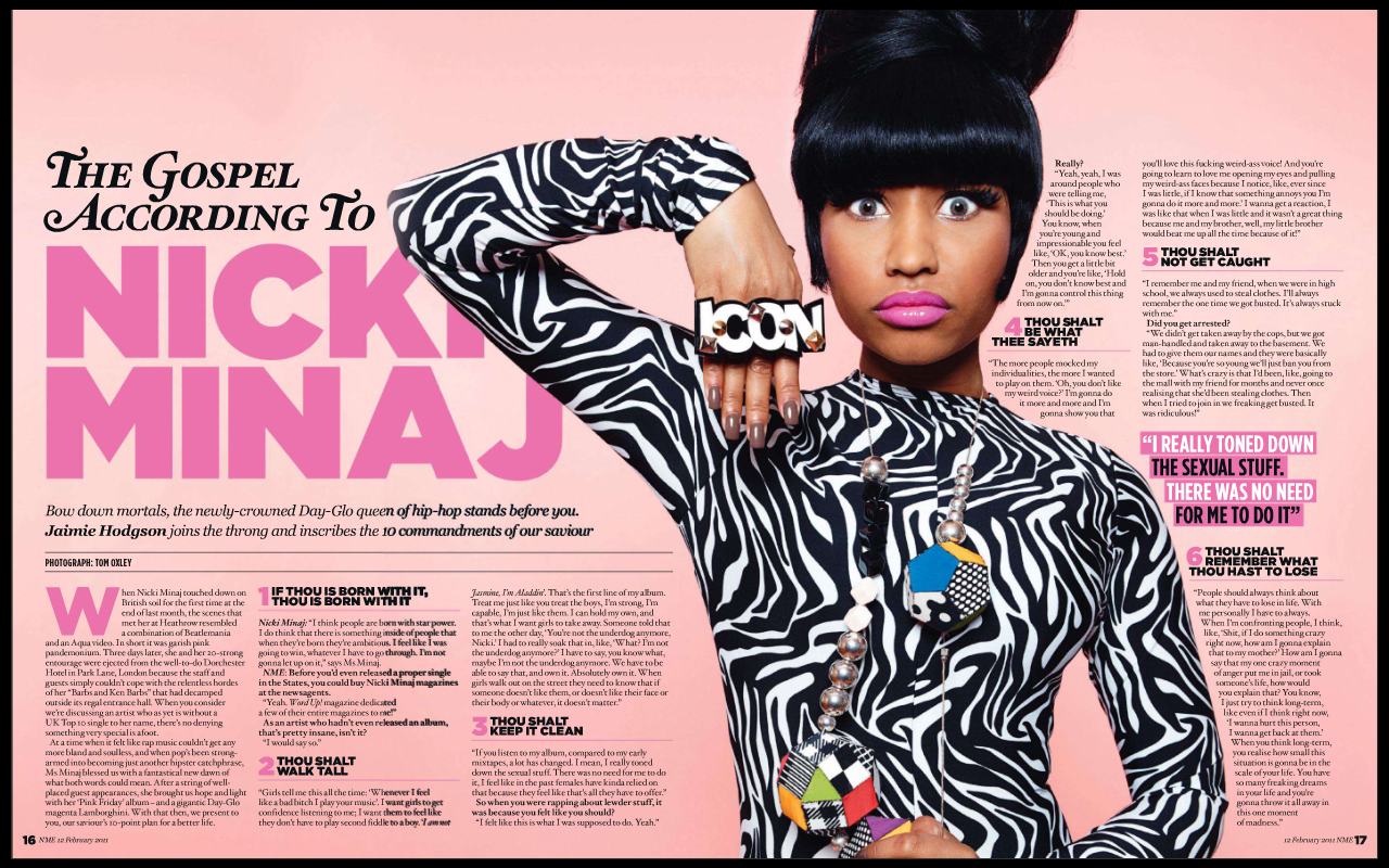
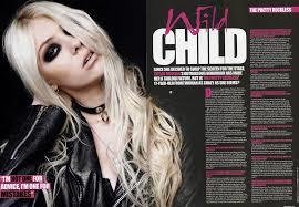
Inspiration
Minor Details
Language and other details
Though minor details do not account for the entirety of the magazine, they make it look realistic (in my case, anyway). Featuring links to websites or having a faux freebies mimics the magazine conventions of give-away products and their usual online presence or alternative digital viewing of the magazine. This further supports the modern aspect of my music magazine, as present day magazines all have an established website that people can visit and subscribe to; go backwards to the 90s and this was probably unavailable.
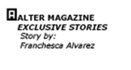
Another minor detail I included was crediting the photographer in captions or an end of article note saying who wrote the article - a usual feature for articles.


BUZZ WORDS
In a conventional music magazine, a lot of buzz words are used within the plugs and anchorage sections of the front cover page. This can be added further on the contents page. I tried replicating this on my magazine front cover by using words such as EXCLUSIVE, LATEST or even the phrase GIRL OF THE MOMENT creates excitement and interest for the reader.
Evaluations 1-4
By fran_alvz
Evaluations 1-4
- 1,610


