Mock Ups
Front Page
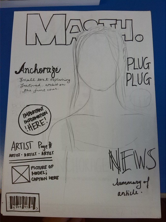
This is my first front cover plan. I wanted to feature conventional music magazine inputs like bubbles, flashy fonts and inserts to feature other artists. However, I find that my magazine has to be "cool" - as my genre is quite modern and hip. I find that taking a minimalist approach may suit my idea better, as it gives more focus to the content of my magazine and I want it to stand out from the generic music magazine styles: it's the first of it's kind and I want to make a simplistic but contemporary approach to my magazine... although this conventional magazine layout works well too (just not for my genre!)
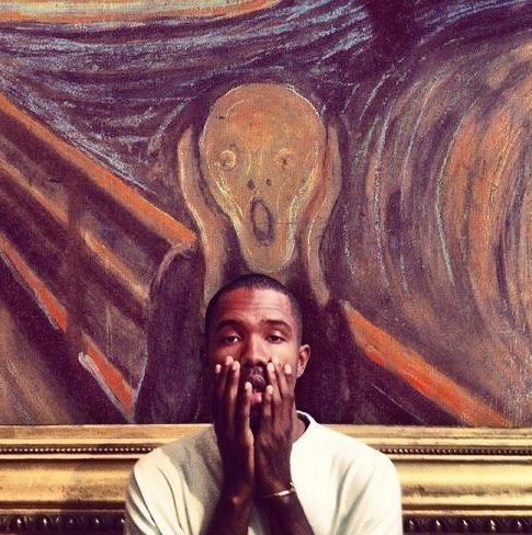
This is my most preferred magazine plan. I plan on taking a picture of my model and placing her on a frame that has a famous painting behind her to replicate the artistry of the genre and copy the picture below of prominent PBR&B aritst Frank Ocean. However, there is a problem! I can't use famous painting unless I use photoshop or take pictures of it myself - which either be time consuming or inefficient. So , I decided to go against it and try to adapt a new style that can somewhat imitate this plan but in a more convenient way.
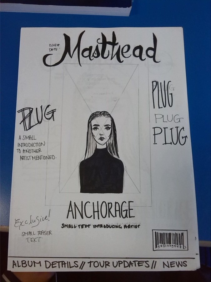
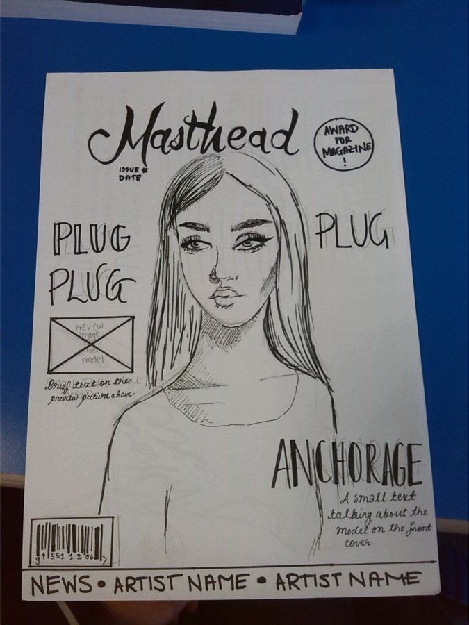
This one contains the traditional music magazine features: plugs, anchorages, inserts and a bubble. It also meets my minimalist requirements too. The model is featured at the centre to make sure she is the focal point of the front page, though the masthead slightly touches her. The masthead is also quite small in size compared to the usual magazine mastheads which are big and bold. I might change that, as it fails to grip the reader and give a successful impression to my magazine. The anchorage is also placed at too a low spot that it might not even grab the interest of the reader!
Double Page Spread
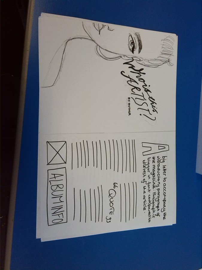
This DPS features the whole left side dedicated to a mid, half close-up shot of the model with the title "Who is...?" to create a visual representation of the artist being introduced (suppose they are new to the industry). On the other side, there is a box below that gives details of their album, which would intrigue the reader and may want to look more about it. In between the columns is an inserted quote that would be grabbed from the interview, to highlight the main topic.
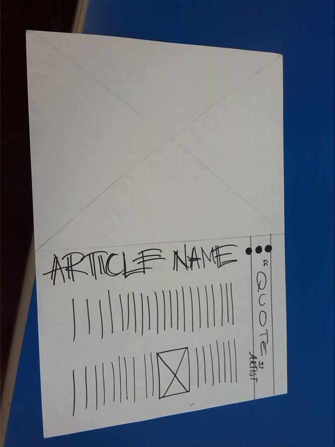
This one features a more odd layout: the title of the article is sideways, with the top of the page featuring a quote. I think this would work well, however the side title might become intersected by the spread or that it will eat up too much space that it won't leave any sufficient area that will cover the interview.
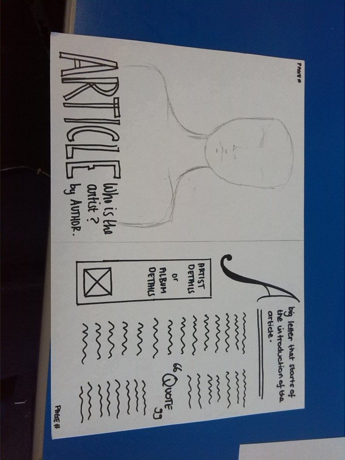
This DPS plan uses space more wisely. It has page numbers, which is often a small but important detail; a masthead by the artist's portrait that is placed underneath them to show superiority and dominance over the article. On the side features a significant amount of space that gives a brief history of the artist being interviewed, along with columns for the traditional interview and an intersecting quote that highlights the key point/topic of the DPS.
Mock Ups
By fran_alvz
Mock Ups
- 937


