Planning:
Task 8 - Fonts
Using dafont.com
The following examples are potential fonts that I will possibly use on my music magazine.
In this slide, I will discuss:
The pros & cons of each font
Why it is appropriate for my genre and audience
My final decisions
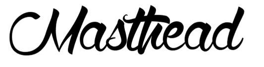
masthead
examples

Pros:
This font is bold and can be likened to graffiti. I like it because it creates a statement, especially if used in the front cover of a magazine and when people see it, they'll know straight away which magazine it is because it is one of a kind and unique.
Cons
I referred to the font as being graffiti like, however, PBR&B (a branch of R&B music, can also be known as contemporary R&B or "Hipster R&B") is quite a soulful and can be potentially with some artists and I feel like this font is a bit too harsh and can contradict that specific characteristic of the genre.
In relation to the audience...
The font is quite harsh and imposes the idea of aggression as it is all in uppercase and has really dark strokes. This might not appeal to some - however, it is quite a unique font that boasts a modern design that no other magazine usually has because most magazines opt for simplistic fonts that is usually thick or something that every person that could easily recognise or assume for a general magazine.

Pros:
I like this font because it portrays a "flow" between letters. If I decided to use this for my magazine's masthead, it is rather stylish but also simplistic at the same time - which plays "safe" and simplicity is often associated with elegance and poise.
Cons:
Since it is quite a simplistic design, it could not gather interest. The cursive writing may also promote more attention towards a female audience instead of an overall target for both genders.
In relation to the audience...
Much like the previous example, this font is quite modern. It helps illustrate the idea of what contemporary R&B is; the flow of writing may also help represent the music's characteristics.
However, like I said, the font might appeal to more females than males since it is quite feminine and stylish and males would probably have a hard time relating to the magazine if the masthead - which is the most prominent feature of a front cover - reminds them of a female magazine.
Pros:
The font creates a flow and can be likened to someone's actual handwriting: this creates a more personal effect to the magazine. No other magazine usually has this type of font, so people would be intrigued to check this magazine out.
cons:
Quite a "squashed" font. I could imagine that it doesn't take up the ideal space a masthead should. It lacks boldness and it could potentially not gather interest if the masthead isn't prominent enough on the front cover.
in relation to the audience...
Almost the same as the previous font, although it is modern and appeals to the audience as it lacks formality (ie mastheads of the London Times or Forbes won't appeal to teens), I feel like it would appeal more to a female audience more than males would.
Anchorage
examples
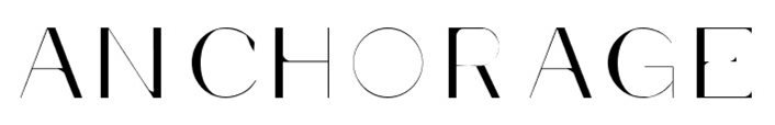
PROS:
Something that gives the impression of contemporary or modern art. Very minimalist but effective in portraying modern typography. The font is also quite graphic and gives an illusion, helping give a unique appeal if used on a page.
cONS:
Hard to see in some areas, some people might find it a nuisance if they can't read the important article (which is usually promoted by the anchorage).
In relation the audience...
Some part of my audience might find it appealing as it is unique and one of a kind. It will help gather attention to young adults (18+) as the font is quite formal and mature; however, I don't think it would settle well for younger audiences such as 16 year olds as they won't probably appreciate this kind of font - which is reminiscent to the likes of formal magazines (eg Vogue).
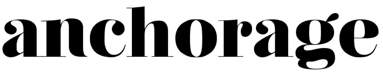
PROS:
Bold and fun font; neither informal nor formal - which helps create a good balance to the page. It is very easy to the eyes in spite its striking feature and it is also easy to read due to its size and spacing.
CONS:
Quite a standard font; usually something that you would associate with a newspaper.
In relation to the audience...
The audience won't probably mind this font since it is something that doesn't look too formal nor is it something that is informal - the font doesn't meet any of these extremes therefore it shouldn't really affect the audience so much. In terms of my genre, I think it would work well since it is quite striking to the eyes and easily promotes whatever information that will be featured on the front page since it is big and can be easily read.
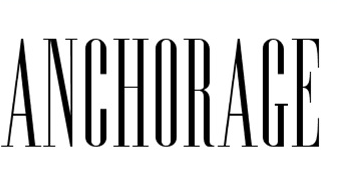
pros:
Uppercase letters proves effective in attracting attention; it is not highly distracting enough to divert attention from the masthead too. Very elegant and gives a timeless appeal if used on the front cover.
Cons:
Reminiscent to Vogue, which some readers might not like as it is usually associated with female audiences. The font is also quite formal, which might not suit my genre or music magazine.
Plug
examples

Pros:
A very modern font which can be easily relatable to audiences of this day and age. Easily replicates the genre's recent identification in the music scene and it is large and can be easily read.
cons:
Might take up too much space: the plug has to be short words in order to refrain from doing so. The thinness of each letter might not appeal to some readers as it can be quite problematic to read.
Content
(heading)
example

Pros:
A very stylish font that will dominate the content page - creates a good distinction from the rest of the page's contents, helping it become more easily identified and introduces the rest of its following texts in a stylish manner.
CONS:
Font should be a little bit more stretched in order to become more easily read, since the closeness of the letters might become troublesome for people to read. Moreover, its closeness may prove problematic in making the heading be prominent as it doesn't take up much space.
main
text
example
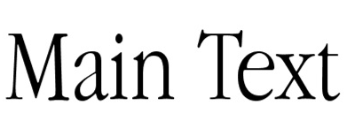
pros:
Something that everyone already expects from an article or a magazine. Sometimes, a simplistic take on a magazine proves elegance too.
cons:
Everyone expects this simple Times New Roman font. It's not refreshing and doesn't exceed the norm - can be interpreted as quite boring.
My final decision
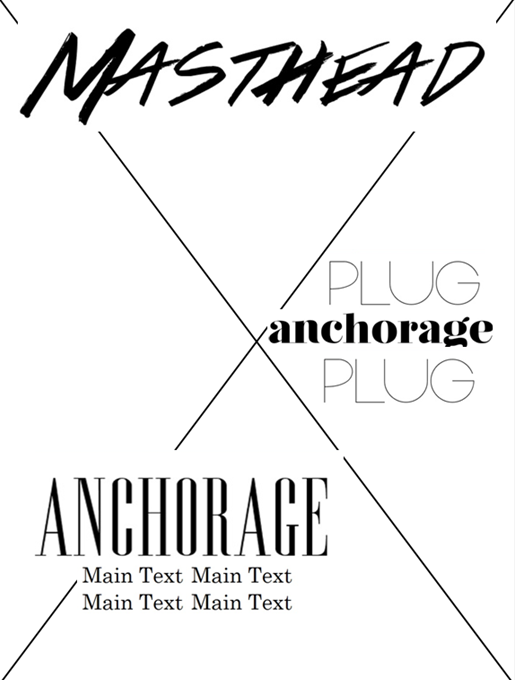
front cover
(This is not my final front cover design, it just an example to illustrate how the fonts would look like.)
MASTHEAD: I decided to use this font as my masthead because it brings a prominent look to the magazine: no other music magazine has a font such as this therefore I plan on using it for my own to create signature masthead that people can easily recognise. The graffiti like writing is a replica for modern age and the recent discovery of PBR&B music.
PLUGS: I decided to use one of my anchorage fonts as a plug to create alternate switches between the other one. This creates change and a break in theme; therefore not boring the reader.
ANCHORAGE: I opted for the formal font since this works well with the masthead - it creates contrast and balance.
Content page:
(this is not my final design, I just used it to show the fonts in example).
I decided to use that font as a masthead since it easily dominates the page in comparison to a simplistic body font. It is bold and the content page doesn't really hold much importance as the front cover or the double page spread, so I felt that by putting a bold masthead but with a simplistic page, this wouldn't "overload" the magazine with too much visual features - there should be some balance throughout and shouldn't reach the extremes of having "too much".

Task 8: Fonts
By fran_alvz
Task 8: Fonts
This slide is about potential fonts that I will use on my magazine.


