Effective Graphs
Basic issues with data visualization
Journal requirements
- dimensions
- fonts
- linewidths
- greyscale vs. color
Reader requirements
- clarity
- legibility
- aesthetics
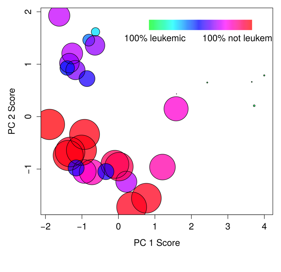
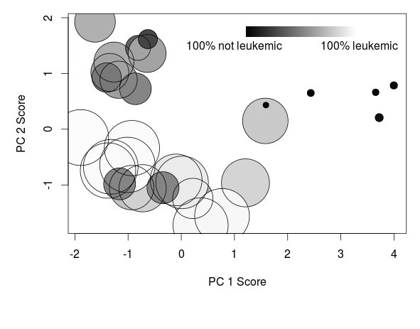
Extra dimensions!
- x
- y
- character size
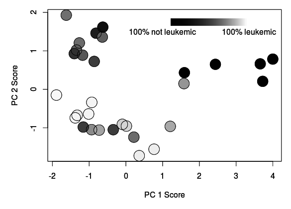
- color
- (plotting character)
- (transparency)
Raw Data and Model Fits
- Font size
- Line width
- Color (greyscale / colorblind/ clashy)
Functionalize and clearly label code for all plots
(may want to revise for talks)
Also check:
par / plot
Why use par / plot?
1. increased flexibility
2. linguistically consistent with the rest of R
I can build anything ggplot can build, with more flexibility and better control
Useful functions
lwd
(x/y)axt
las
border
Useful arguments
- layout() -- especially for asymmetric gridding
- rgb() -- especially "alpha" argument for transparency, and to precisely control color ramps
- axis()
- mtext() -- to label grid cells in lattice-like configurations
- polygon() -- to show model fits
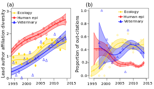
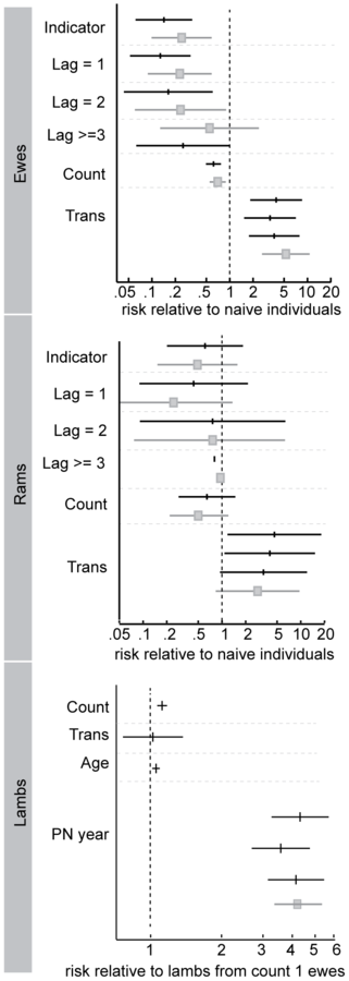
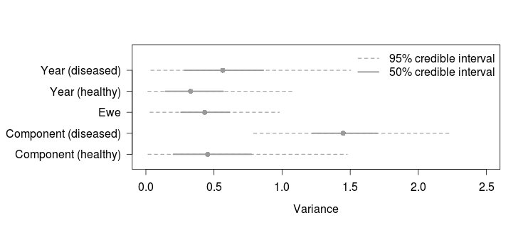
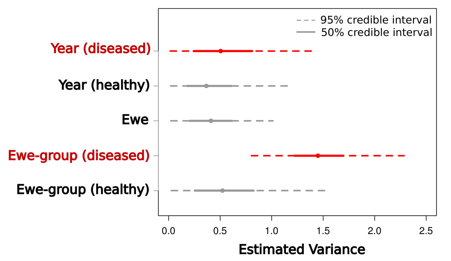
- segments() -- to build marginal boxplots / Gelman coefficient plots
Ideas and examples
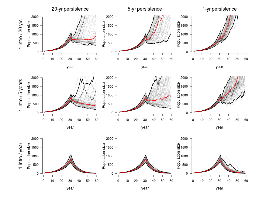
Parallel structures
- Limit dimensions
- Limit # panels
- Align axis of most important comparison
- Transformations:
- multiplicative vs. additive scales
Multiple versions

Main text vsn
Supp. info vsn
Not too busy
Give big points big visual impact
Low visual impact
High visual impact
Big data and small
Annotate!
Take-homes
1. R has lots of graphical flexibility, even using just plot()
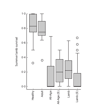
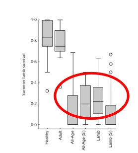
2. Graphics reinforce model results
3. Graphics clarify relationship between models and data
4. Designing and building effective graphics requires a little time / iteration
BUT it's worth it:
People pay attention to graphs
Plots in R
By Kezia Manlove
Plots in R
Bozeman area UseR on high-quality plotting in R


