Creating Accessible Documents
Accessible Technology Workshop Series
Presented by:
Kyle Chapman - CAFE
Andrea Bell - ASC
Agenda
- Introduction
- General Tips for Accessibility
- Creating Accessible Word Documents
- Software Demonstration
- Tips for Accessible PowerPoint Presentations
- Accessible PDF Documents
- Creating and Auditing Web Content for Accessibility*
- Tools & Resources
General Tips for Accessibility
Contrast
- Use high contrast colours to help differentiate text and background
- Otherwise you might end up with sections that look like this
- Black and dark blue are best on light backgrounds
- White and light yellows are best on dark backgrounds
Contrast
- Use high contrast colours to help differentiate text and background
- Otherwise you might end up with sections that look like this
- Black and dark blue are best on light backgrounds
- White and light yellows are best on dark backgrounds
Contrast
- Use high contrast colours to help differentiate text and background
- Otherwise you might end up with sections that are illegible
- Black and dark blue are best on light backgrounds
- White and light yellows are best on dark backgrounds
Font Colour
- Black and white will always be the easiest to read
- If you need colour, restrict it to titles and/or highlights
- Don't convey important information using colour; the colour should not be the message
Colourblindness
- Red-Green: 7 to 10% of men
- Dichromacy: 2.4% of men, 0.03% of women
- Anomalous Trichromacy: 6.3% of men, 0.37% of women
http://www.colour-blindness.com/general/prevalence/

Font Family
- Serif fonts have curly tips and "feet" on the letters
- Simple Sans Serif fonts are genenally easier to read

Font Family
- There isn't a "perfect" choice for font
- Arial and Verdana are good choices
- Trebuchet and Tahoma are okay
- Calibri isn't terrible, the size is small
- Avoid cursive or script fonts

Font Family
- Some fonts are more confusing than others for students with learning disabilities.
- Letters can get mixed up, turned around, or confused.
- Fonts like comic sans have easy-to-distinguish letters.

Font designed for people with dyslexia:
Dyslexia Simulation
Font Size
- Try for minimum 12 pt font (depending on the font)
- Consider the purpose and audience - presentation materials should have a larger size
- If the student has access to the raw file, they can manipulate the font and size according to their needs
Page Format
- Whether a document is printed or electronic, using pre-formatted columns can be helpful
- Text in columns requires less eye movement and less peripheral vision

Creating Accessible Word Documents
Use Built-in Styles

- Using styles improves structure and readability
- It's especially important for people using screen-reading software
- Style formatting can be customized (colour and size can be changed while keeping the structure)
Alternate Text on Images

Right-click image, choose "Format Picture", click "Alt Text"
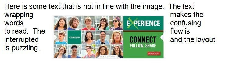
Other Image Concerns
- Use in-line images rather than another text wrapping style
- WordArt/SmartArt is not accessible for screen-readers
- Watermarks and background images can't be read by screen-readers and can cause contrast problems
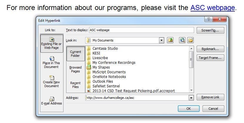
Descriptive Links
- URLs in Word are usually recognized as a hyperlink
- URLs don't usually make good names for links
- Consider editing the link so it has a descriptive name
- Bad names include click here or this
- Avoid using the same name repeatedly
- Some additional description/context is a good idea
Other Considerations
- Use the built-in list tools for bullets and numbered lists; these maintain structure in the document
- A table of contents is very helpful for long documents; consider the built-in table of content feature (in the references tab)
- Avoid text boxes; these are a nightmare for screen-readers
- Insert tables with identified rows and columns instead of repeated spaces or tabs
- Don't worry about making content fit better, especially for electronic documents; avoid using differently spaced headings, etc.
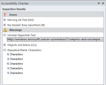
Accessibility Checker
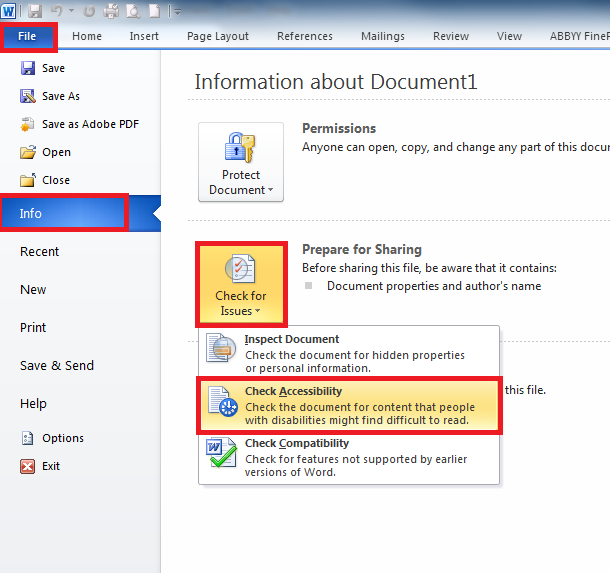
Microsoft has its own tool for checking accessibility:
Accessibility Checker
Software Demonstration
- Word Doc - Accessible vs Not Accessible
- JAWS (Job Action With Speech)
- Read & Write Gold
Practice Activity
- If you've got a Windows laptop handy, try opening a document in Word and using the Accessibility Checker
- If you don't have a laptop, work with someone else
- If you have a mac laptop, try finding the accessibility issues on your own
- Ideally, choose a document you use often
- What issues do you see?
Tips for Accessible PowerPoint Slides
General Accessibility
- PowerPoint is generally not very accessible
- For a screen-reader to work, it needs to select text, and this is difficult when every text box and image is in a separate space that one must click to access
- Try a tool that allows you to select all text on the screen at the same time
- We're using slides.com, free and accessible!
Working Around This
- When sharing slides with your audience, consider also (or instead) saving as a Word or PDF document
- The handouts option for Word doesn't solve every problem, but it helps
Similar to Word...
...use styles and headings
...put alternate text on images
...give links descriptive names
...try the Accessibility Checker
Text Format
- Some screen-readers have trouble with angled text
- It's also harder to read
- Use a large font size
- If you need a small font size, you have too much text on the slide!
Contrast
- Contrast is often a bigger issue for presentations
- Certain projectors can make contrast problems more obvious
- Black and white is usually best (unless there's a good reason that won't work)

Animations/Transitions
- Avoid
Paragraph 1
Lorem ipsum dolor sit amet, consectetur adipiscing elit. Proin urna odio, aliquam vulputate faucibus id, elementum lobortis felis. Mauris urna dolor, placerat ac sagittis quis.
Paragraph 2
Lorem ipsum dolor sit amet, consectetur adipiscing elit. Proin urna odio, aliquam vulputate faucibus id, elementum lobortis felis. Mauris urna dolor, placerat ac sagittis quis.
Lorem ipsum dolor sit amet, consectetur adipiscing elit. Proin urna odio, aliquam vulputate faucibus id, elementum lobortis felis. Mauris urna dolor, placerat ac sagittis quis.
Lorem ipsum dolor sit amet, consectetur adipiscing elit. Proin urna odio, aliquam vulputate faucibus id, elementum lobortis felis. Mauris urna dolor, placerat ac sagittis quis.
Lorem ipsum dolor sit amet, consectetur adipiscing elit. Proin urna odio, aliquam vulputate faucibus id, elementum lobortis felis. Mauris urna dolor, placerat ac sagittis quis.
Embedding Videos
Videos may not have captioning: affects Deaf/Hard of Hearing students, ESL students, LD students, and those sitting near the back of the class that can't hear.
Consider: use a link to YouTube and enable the captions
or
Try adding your own captions using this free tool:
STAMP add-in for PowerPoint
Presentation Concerns
- Don't completely avoid text on slides
- Consider students with difficulty understanding auditory information (LD, deaf, hard of hearing, ESL...)
- Consider students with difficulty understanding written information (LD, blind, low vision, back of the room...)
- Everyone needs access to your information
Presentation Concerns
- Provide a copy of your slides - before the presentation is preferable
- Modified slides are OK, but complete slides are more inclusive
Consider:
If you were doing readings in class; would you expect the students to bring their books?
Discussion
- Is it okay to post inaccessible PowerPoint slides?
- Can we expect our audience to know the information from these slides?
- Can we expect our audience to know material from slides we haven't posted?
Accessible PDF Documents
About PDFs
- Intended to be portable, meaning they appear the same on any computer
- Generally they're created from another kind of document
- If you've made your document accessible in Word (or another software) and publish to PDF, generally it will be accessible too!
Acrobat Professional Can Be Used to Edit a PDF...
...use tags (which are basically styles)
...put alternate text on images/figures
...give links descriptive names
...a table of contents is a good idea
Acrobat Professional can be requested from I.T. for your workstation at no cost
Kinds of PDFs
- PDFs can be locked; locked PDFs can't be used with screen-readers and create a huge access issue
- PDFs can be raster; this is usually a scanned document and shows an image-only (text can not be selected)
- PDFs can be tagged; this is accessible!
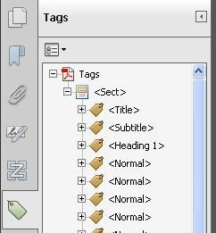
Viewing Tags
The Tags pane allows you to see how your text and other sections have been tagged.
Tags help with navigation, much the same way that styles/headings do.
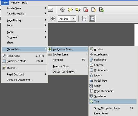
image source: http://www.queensu.ca/accessibility/how-info/accessible-documents/creating-accessible-pdfs-windows
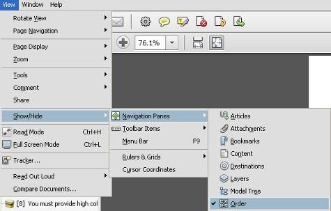
Reading Order
The Order pane allows you to view and specify the order that the blocks of text (or images) should be viewed in.
This is very important for anyone using a screen-reader but also essential for any PDF form that should be filled in.
Accessibility Check
You can access this by selecting Tools, then Advanced, then Accessibility, then Full Check
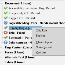
image source: http://helpx.adobe.com/acrobat/using/create-verify-pdf-accessibility.html
Creating Accessible Web Content
DC Connect
- Any material on DC Connect that isn't a file you've uploaded directly is HTML (web) content
- The majority of web content we think our participants will need is DC Connect-related, so we'll focus on that
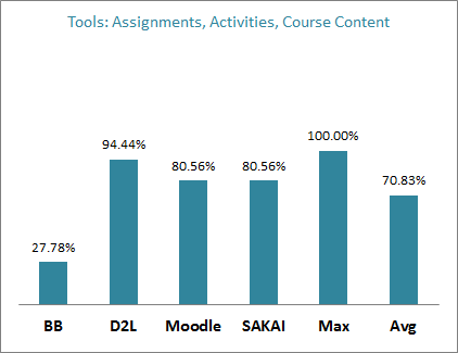
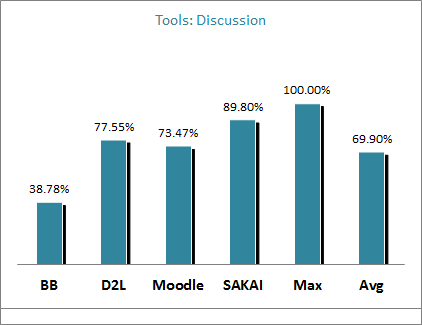
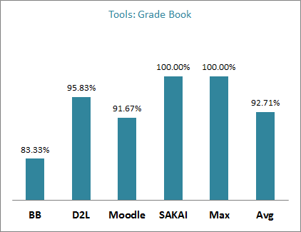
D2L Accessibility
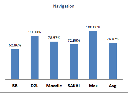
source: http://blog.bargirangin.com/2013/03/a-comparison-of-learning-management.html
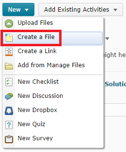
Create a File
Embedded documents are quick and easy to post but
- they load quite slowly
- they may not work on every kind of device
- the text can't be selected
- they don't work with screen-readers
The Create a File option avoids these issues.
DC Connect's HTML Editor
This editor takes fairly good care of big accessibility concerns, so don't panic when you're using it!
Of course, we have tips regardless.
Similarly to Word...
...use styles and headings
...put alternate text on images/figures
...give links descriptive names
...bulleted lists and tables are useful for grouping information
...be aware of font size, style and colour
Create a File
- Posted documents are still useful, especially when they have a lot of complex formatting and/or images
- Otherwise, it can be fairly effective to copy a Word document and paste into DC Connect's HTML editor
- Many features, like tables and headings, are preserved!
- Other formatting (e.g. font styles) can get messed up but you can fix it after if needed
Styles
Styles in HTML work much the same as in Word.
By default, this menu says "Paragraph": that is the name of the default style.
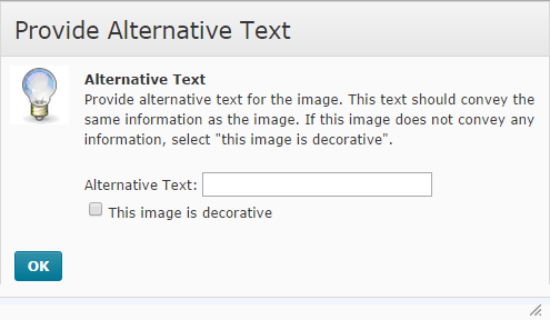
Alternate Text
DC Connect actually forces you to enter alternate text for every image!
You must enter alternative text for an image unless you specify that the image is decorative.
No image that has meaning should be marked decorative!
Contrast in DC Connect
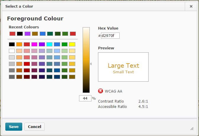

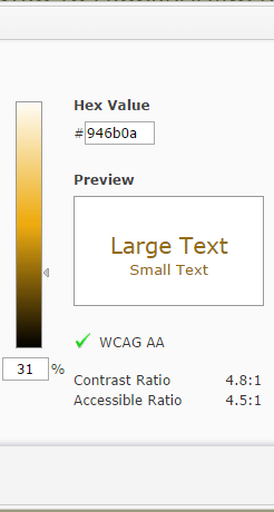
WCAG: Web Content Accessibility Guidelines
Bad Contrast
Better
Good
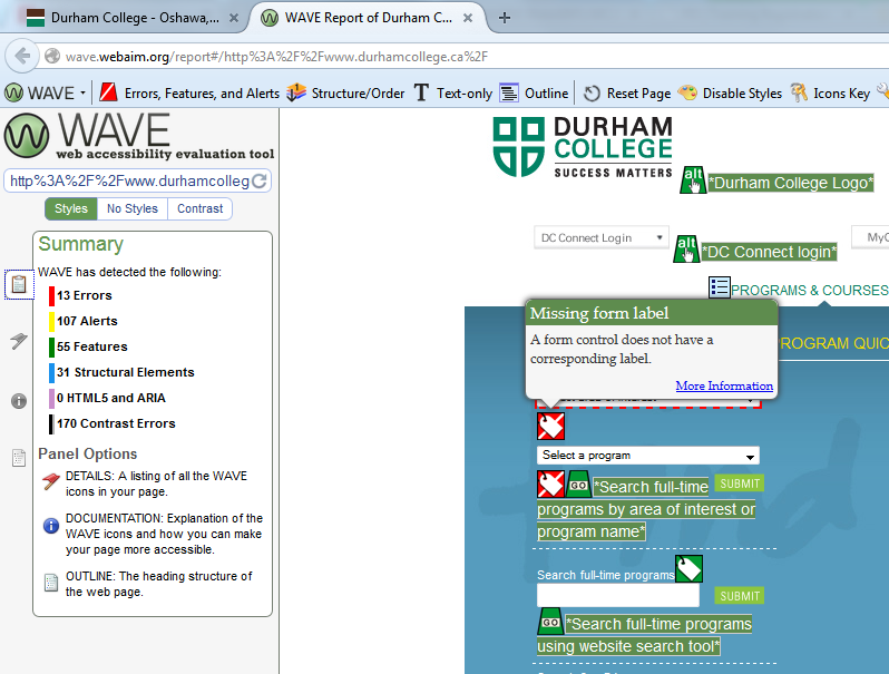
Auditing Web Accessibility
- There are a lot of tools and organizations that help check web accessibility
- We really like WebAIM.org's WAVE toolbar for Firefox

Auditing Web Accessibility
Practice Activity
- If you've got a laptop handy, try opening the DC Connect HTML Editor, perhaps by using Create a File under Content
- If you don't have a laptop, work with someone else
- Try taking a Word document and pasting it into the HTML Editor
- What changes do you notice?
- What stays the same?
Tools & Resources
WebAIM
- Web Accessibility In Mind (link)
- Training, Information, Resources
- Tools: WAVE toolbar, colour contrast checker, Adobe Acrobat Plug-in
- Simulations
AODA
- Accessibility for Ontarians with Disabilities Act (link)
- Information about standards, compliance, penalties, key dates, and more
- The target date for reaching 100% accessibility in Ontario is January 1, 2025
Other Websites for Accessible Documents
- MS Office: Creating Accessible Word Documents (link)
- MS Office: Creating Accessible PowerPoint Presentations (link)
- Adobe: Creating Accessible PDF Files (link)
- W3.org: Making Presentations Accessible to All (link)
- Accessible Campus: Accessible Digital Documents & Websites (link)
Key Take-away Points
- Use the Accessibility Checker
- Use styles
- Change fonts to Arial, size 12pt
- Provide the raw digital file
- Design for extremes to include everyone
Thank you!
Please direct any questions to:
andrea.bell@durhamcollege.ca
kyle.chapman@durhamcollege.ca
Summary Activity
- We're going to go to SW117 and let you try using some assistive software!
- If you're feeling brave, try running JAWS and/or ZoomText
- Check out a document (preferably your own) and some web content
Creating Accessible Documents
By Kyle Chapman
Creating Accessible Documents
Discusses general concerns with accessible documents, and a few specific to Word, PowerPoint, PDF and HTML. For the Accessible Technology Workshop Series. Intended time: approximately 2 hours with demonstrations and questions