Creating Accessible Documents
(Abridged)
Based on the Accessible Technology Workshop Series
Agenda
- Introduction
- General Tips for Accessibility
- Accessibility Tips for Microsoft Word
- Some Quick Notes About PDFs
- Discussion and Questions
General Tips for Accessibility
Contrast
- Use high contrast colours to help differentiate text and background
- Otherwise you might end up with sections that look like this
- Black and dark blue are best on light backgrounds
- White and light yellows are best on dark backgrounds
Contrast
- Use high contrast colours to help differentiate text and background
- Otherwise you might end up with sections that are illegible
- Black and dark blue are best on light backgrounds
- White and light yellows are best on dark backgrounds
Font Colour
- Black and white will always be the easiest to read
- If you need colour, restrict it to titles and/or highlights
- Don't convey important information using colour; the colour should not be the message
Colourblindness
- Red-Green: 7 to 10% of men
- Dichromacy: 2.4% of men, 0.03% of women
- Anomalous Trichromacy: 6.3% of men, 0.37% of women
http://www.colour-blindness.com/general/prevalence/

Font Family
- Serif fonts have curly tips and "feet" on the letters
- Simple Sans Serif fonts are genenally easier to read

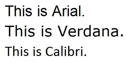
Font Family
- Arial and Verdana are good choices
- Trebuchet and Tahoma are okay
- Calibri isn't terrible
Font Family
Some fonts are more confusing than others for students with learning disabilities.
Letters can get mixed up, turned around, or confused.
Fonts like comic sans have easy-to-distinguish letters.

Font Size
- Try for minimum 12 pt font - this can vary between fonts though
- Consider the purpose and audience when choosing a font size - presentation materials should have bigger fonts
- If the student has access to the raw file, they can enlarge the font to their desired size
Page Format
- Whether a document is printed or electronic, using pre-formatted columns can be helpful
- Text in columns requires less eye movement and less peripheral vision

Accessibility Tips for Microsoft Word
Use Styles

- Using styles improves structure and readability
- It's especially important for people using screen-reading software
- You can even mark things as a certain style and adjust the formatting afterwards if you don't like it
Alternate Text on Images

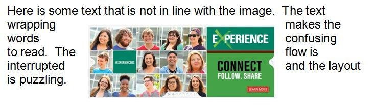
Other Image Concerns
- Use in-line images rather than another text wrapping style
- WordArt/SmartArt is not very accessible
- Watermarks and background images can't be read by screen-readers and can cause contrast problems
Descriptive Links
- URLs in Word are usually recognized as a hyperlink
- URLs don't usually make good names for links
- Consider editing the link so it has a descriptive name
- Bad names include click here or this
- Avoid using the same name repeatedly
- Some additional description/context is a good idea
Bulleted Lists
- Use the built-in list tools for bullets and numbered lists
- These are much easier to use and easier to read than alternatives
Other Considerations
- A table of contents is very helpful for long documents; consider the built-in table of content feature
- Avoid text boxes; these are a nightmare for screen-readers
- Tables are strongly recommended over repeated spaces or tabs to separate information
- Don't worry about making content fit better, especially for electronic documents; avoid using differently spaced headings, etc.
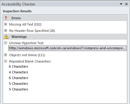
Accessibility Checker
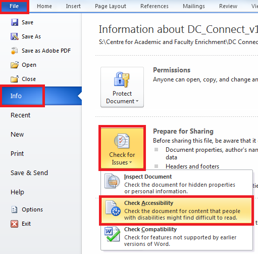
Accessibility Checker
Practice Activity
- If you've got a laptop handy, try opening a document in Word and using the Accessibility Checker
- If you don't have a laptop, work with someone else
- Ideally, choose a document you share with students
- What issues do you see?
Some Quick Notes About PDFs
About PDFs
- Intended to be portable, meaning they appear the same on any computer
- Generally they're created from another kind of document
- PDFs aren't bad for accessibility, but never as good as the same document in Word format
Kinds of PDFs
- PDFs can be locked; locked PDFs can't be used with screen-readers and create a huge access issue
- PDFs can be raster; this is usually because they're a scanned document, and these are inaccessible
- PDFs can be tagged; this is what we want!
- If you've made your document accessible in Word (or another software) and publish to PDF, it will be tagged and, generally, it will be accessible!
Discussion
- Would you rather create new documents with accessibility in mind, or would you rather "retrofit" your old documents?
- Why?
- Which takes more time?
- Which requires more knowledge?
Creating Accessible Documents (Abridged)
By Kyle Chapman
Creating Accessible Documents (Abridged)
Discusses general concerns with accessible documents, and a few specific to Word documents and PDFs. Based on slides used for the Accessible Technology Workshop Series. Intended time: approximately 30 minutes with questions