The Basics
Intro to Web Development

Full screen? Down there.
Lesson 7: Flexbox
Flexbox

#7
Index
Tools
Slides

Using Classes Review


<div>
   <p>this is a p tag</p>
</div>
<div>
<p class="">this is a p tag</p>
</div><div>
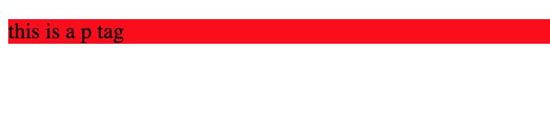
<p class="could-be-anything">this is a p tag</p>
</div>.could-be-anything{
background-color:red;
}CSS
NOTE:
Using Classes in CSS
You need to use
.
Create Element
Add class attribute
Name class attribute
Parent Child Review
<body class="planet-earth">

<div class="grandmom-bertha">

  <div class="daughter-evelyn mom-eve">
    <p class="grandchild-lenny son-lenny brother-lenny">Hi, I'm Lennyroy</p>
    <p class="grandchild-ailyn daughter-ailyn sister-ailyn">Hi, I'm Ailyn</p>
  </div>

</div>

<div class="some-other-person">Hello other person!</div>

</body>


body
grand-parent
parent
child
child
class="grandmom-bertha"
class="mom-eve"
class="son-lenny"
class="daughter-ailyn"
class="planet-earth"
Display Property
<div class="content-1">

 <p>This is the content</p>

</div>
.content-1{
  display:block;
}
.content-1{
display:inline;
}.content-1{
display:inline-block;
}.content-1{
display:flex;
}When we create an HTML element, it is a `block` element by default.
Block elements take up the whole screen, and you can not put another element to its right.
Changing the `display` property changes this default behavior!
Values
display: block
display: inline
display: none
display: flex
Creates a line break, takes up whole area
Displays inline, will only be as big as its contents
The element is removed entirely
:)
display: inline-block
Same as inline, but you can add width & height
Using Display Property
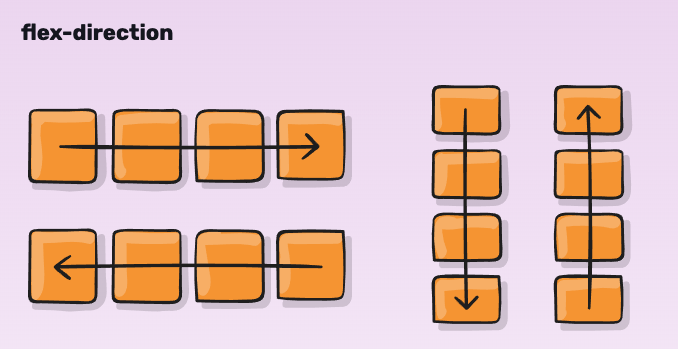
What is Flexbox?
Justify Content
justify-content:
flex-start
flex-end
center
space-bewtween
space-around
Parent
Child
Using Justify Content
justify-content:
flex-start
flex-end
center
space-bewtween
space-around
Justify Content
justify-content:
flex-start
flex-end
center
space-bewtween
space-around
Flexbox Froggy

Flexbox froggy is a great way to learn about how flexbox works.
We will be completing the game in this class and taking breaks to learn the syntax.
Click on the link to get started!
Cheat Sheet
Create a Header
Set our Header
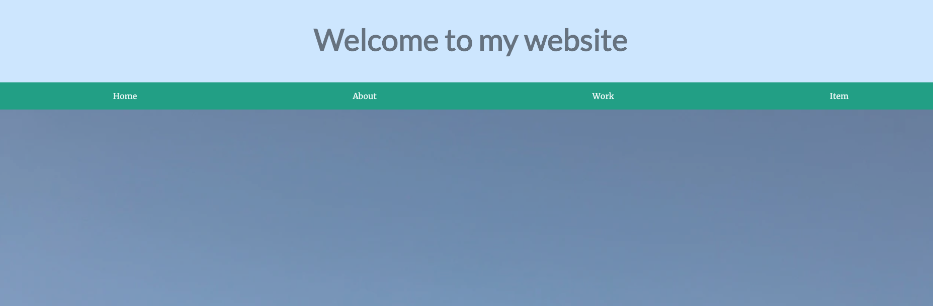
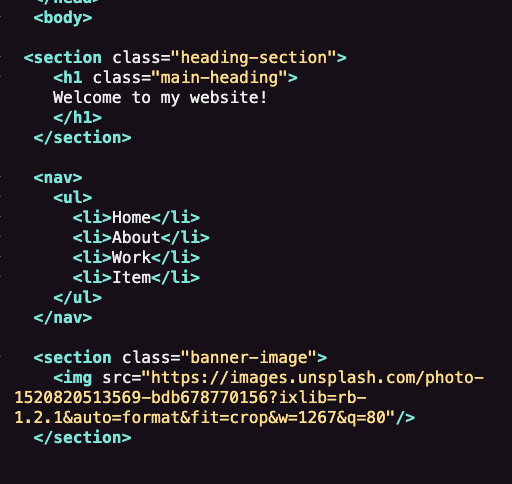
 <section class="heading-section">
    <h1 class="main-heading">
    Welcome to my website!
    </h1>
  </section>
First, we are going to create our heading.
Write the following code as the first item
in our index.html file
Notes:
section has a class, and the h1 has a class
.heading-section is a parent
Set our Navigation
  <nav>
    <ul>
      <li>Home</li>
      <li>About</li>
      <li>Work</li>
      <li>Item</li>
    </ul>
  </nav>
Now we will create our page navigation
Create a <nav> tag and include everything
Notes:
the <nav> is a grandparent in this case
no classes on these elements..
watch for the </ul>, easy to forget it
Create our Banner Image
  <section class="banner-image">

    <img src="https://images.unsplash.com/photo-1520820513569-bdb678770156?ixlib=rb-1.2.1&auto=format&fit=crop&w=1267&q=80"/>

  </section>
Lets create our banner image
Create a section and embed our image as
a direct child.
Notes:
<section> has a class
<img> is a self closing tag ' /> '
src="" takes a url to the image
<img> tag has NO width and height attributes
What we have so far

Global Styles
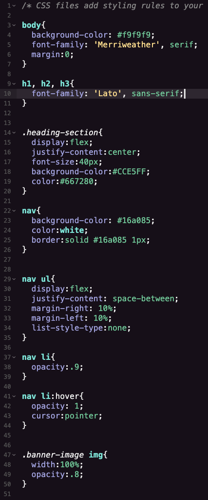
body{
  background-color:#f9f9f9;
  font-family: 'Merriweather', serif;
  margin:0;
}

h1, h2, h3{
  font-family: 'Lato', sans-serif;
}
Lets set styles our global styles
Set the tone for the rest of our styles!
Notes:
font-family takes a font name in single quotes
don't forget the semi colons ' ; '
h1, h2, h3 are separated by commas, the style will apply to all, this is how you can save time
Styling Our Header
.heading-section{

  display:flex;
  justify-content:center;
  font-size:40px;
  background-color:#CCE5FF;
  color:#667280;

}
Styling our header
The flexbox will allow use to move our header left and right easily.
Notes:
don't forget the semi colons ' ; '
we are increasing the font-size of a regular h1
don't forget the ' .' for classes!
Styling Our Nav #1
nav{
  background-color: #16a085;
  color:white;
  border:solid #16a085 1px;
}

nav ul{
  display:flex;
  justify-content: space-between;
  margin-right: 10%;
  margin-left: 10%;
  list-style-type:none;
}
Styling our Nav
Tip: keep your project open and see the changes line by line !
Notes:
the nav rules here are pretty easy
the <ul> inside of the nav tag gets more interesting
set to flex and add space-between to its elements
add a little bit of space on left and right with margin
list-style-type removes the annoying bullets
Styling Our Nav #2
nav li{
  opacity:.9;
}

nav li:hover{
  opacity: 1;
  cursor:pointer;
}
Styling our Nav #2
The :hover effect is very cool
Notes:
set the <li> within the <nav> to be slightly dimmer with opacity
when you hover over that element, the opacity will shoot up
this creates a nice effect and brings focus to the element
also turn that cursor to a pointer
Flexbox In Depth
Exploring documentation is key to web development
Homework
1. Fully explore the guide
2. Try to complete Flexbox Froggy
3. Complete Optional Courses
Give it a try! See how far you get
Contact Info
The next slide will be the last slide :)
Lesson 8: Responsive Design
Next Lesson
Lesson 7: Flexbox
By lennyroyroy


