WEBSITE DEVELOPMENT
MAKING DECISIONS
For my artist website I've decided to use the colours of inner digipak panels. I also wanted to use same font styles as the digipak; i found the main 'Impact' font, however, there was no 'Kefa' or 'Noteworthy' so I found a very similar one to 'Kefa' (handwritten) to make the website design more attractive.
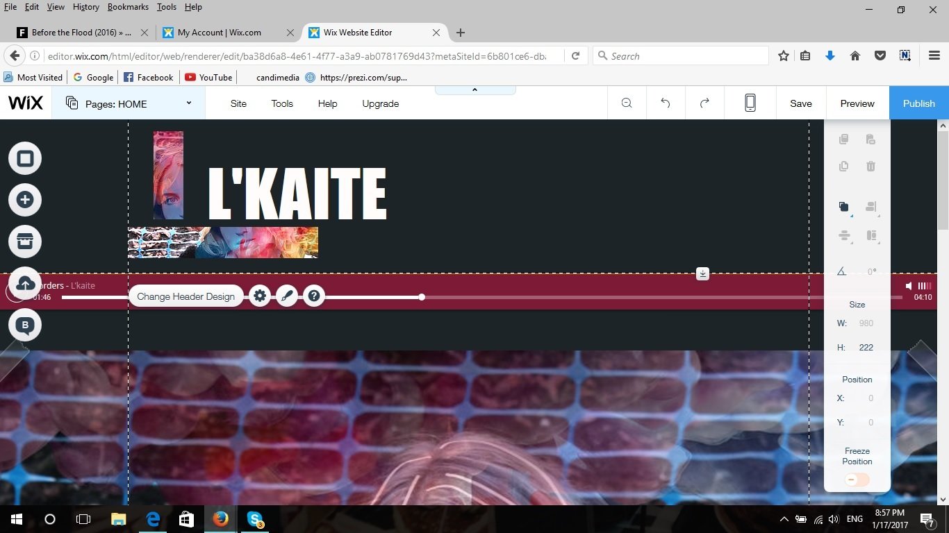
Firstly, I tried to use more cherry and black combination as it would create a link with the cover of the digipak, just to see how it would look like. I wasn't satisfied with the outcome, so I started changing it.
I also added the music bar and set it to play the 'Borders' song on loop. Underneath the top bar I added the same picture that appears on the CD cover, but for me all this starting design looked too overcrowded.
The picture I used for the Page Title design is the same I used for the inner pannels, but once again it was way too much pink colour and didn't create a good synergy with our music video anymore.
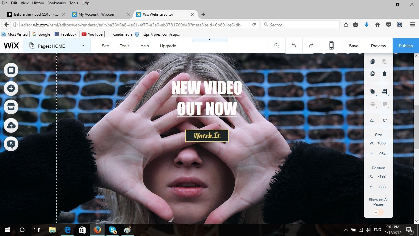
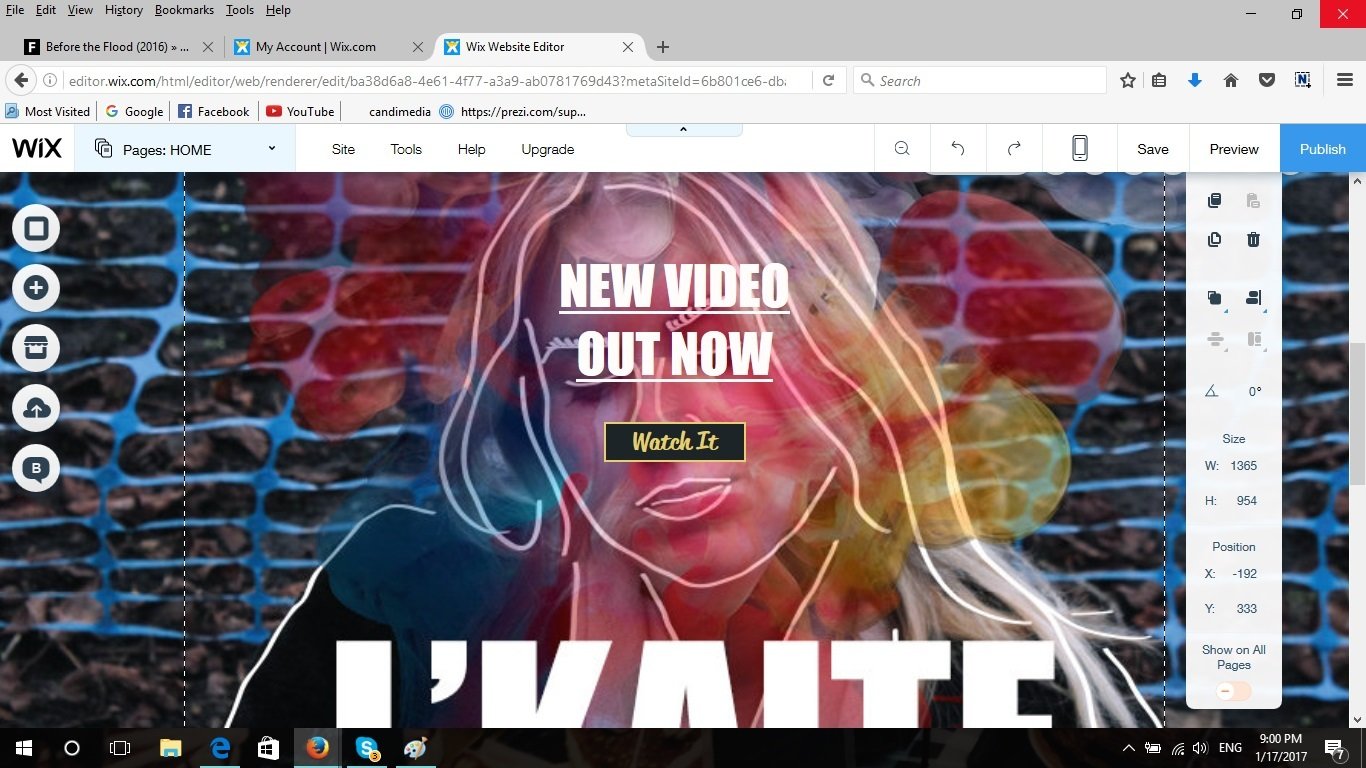
I tried using different images for the music video advert, but couldn't find anything that would look good enough. The simple picture would make the website look too plain and the design that I used for digipak would make it look too overcrowded with the whole massive text underneath it.
I then tried different background pictures and thought that the white one would be most suitable with the green/blue tones. I only made the media and gallery page backgrounds in black as it contrasts more with the images.
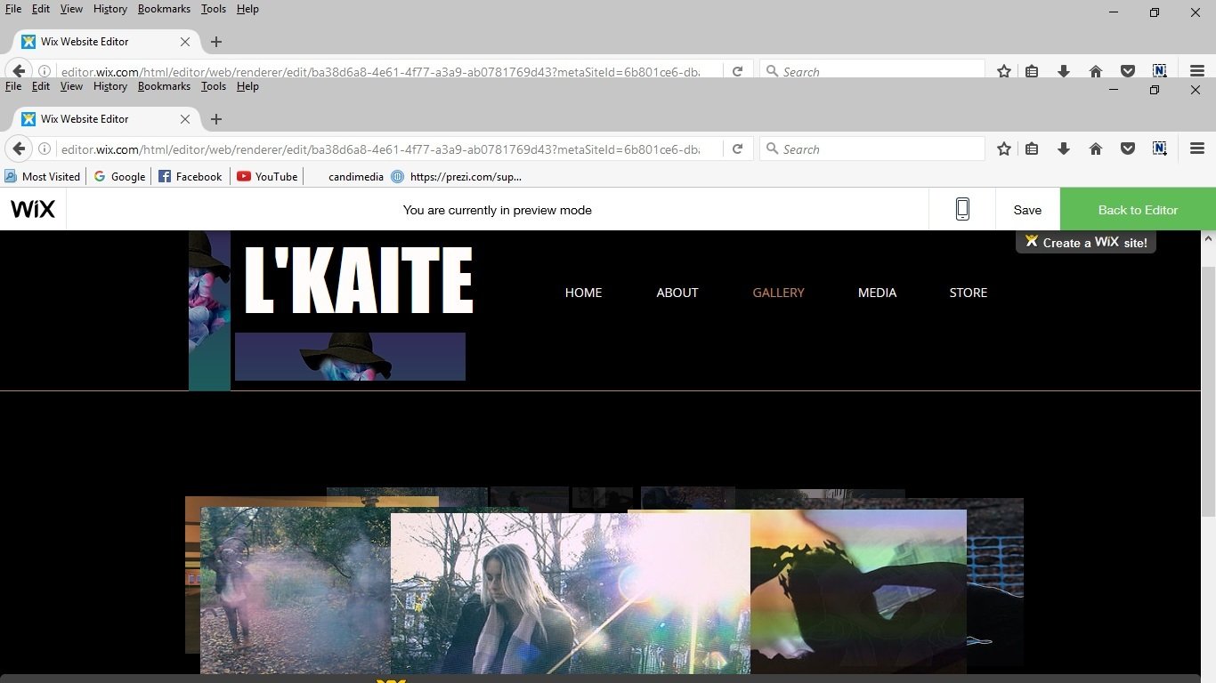
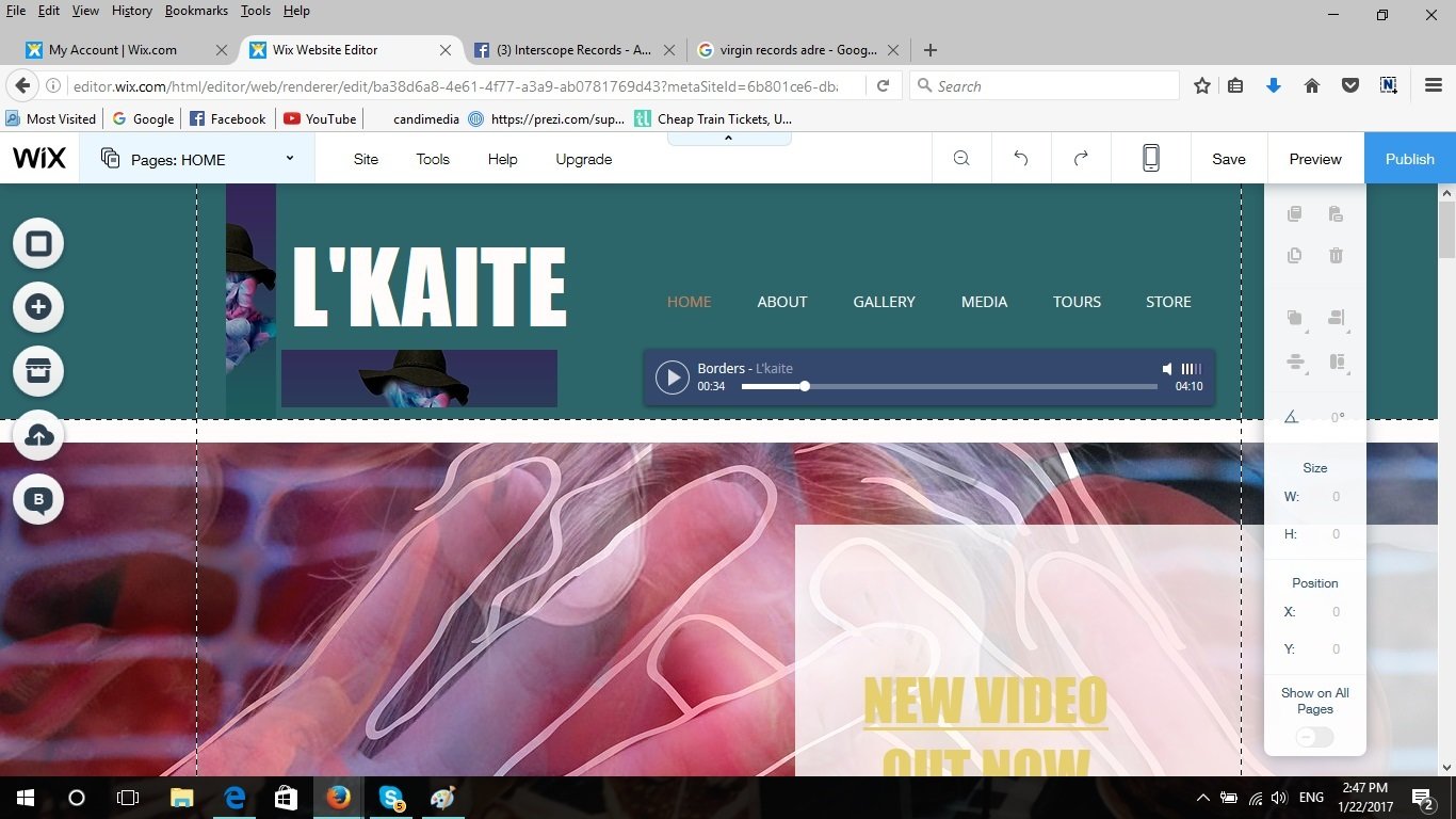
I also changed the top headline design by adding the same image that appears on CD instead of the one with the smoke, this just like my initial plan makes the website link to the inner panels of my digipak.
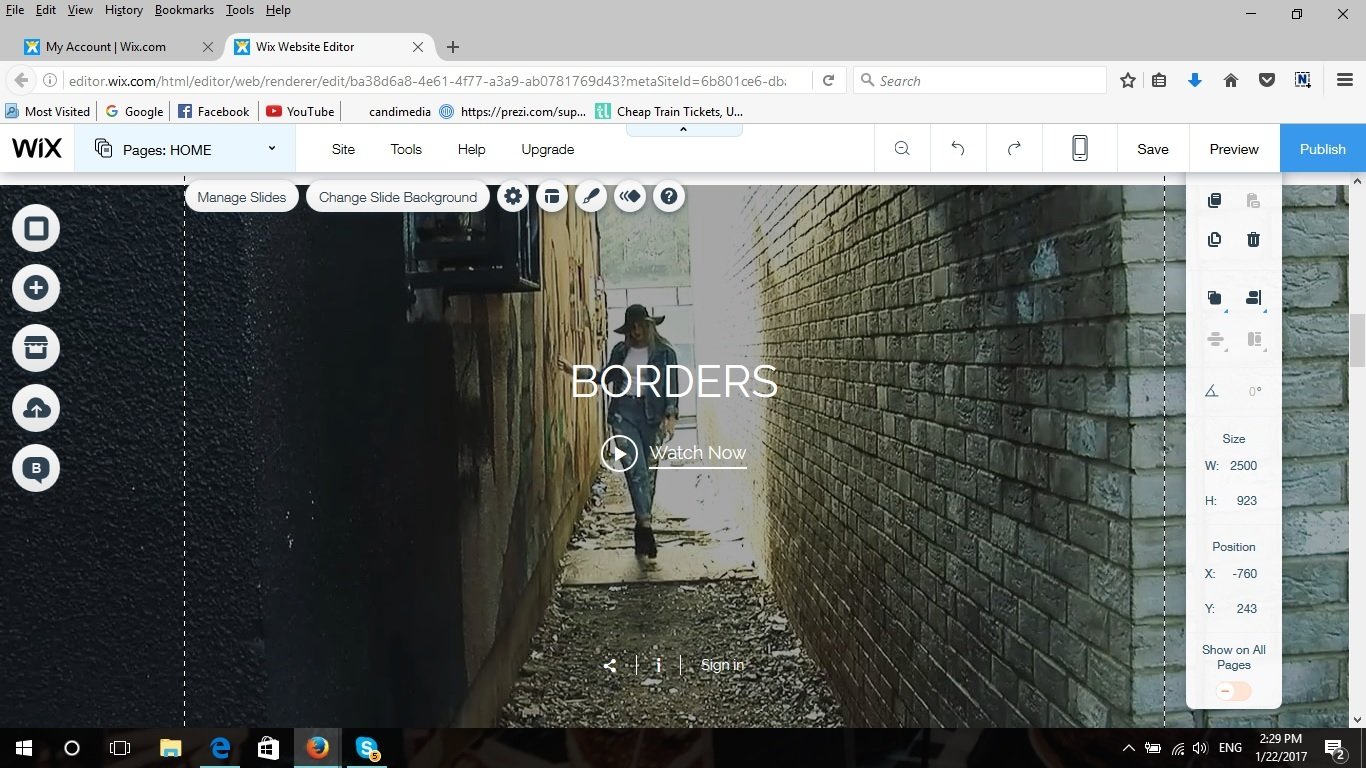
As I meantioned before I didn't really like the main image for the website that advertises the music video, so I came up with a new idea. I combined both plain (just with line drawing on top picture) and the colour smoke images and placed them into a slide so that they automatically change every second, the text that appers on them are exatly the same with a link to media page.
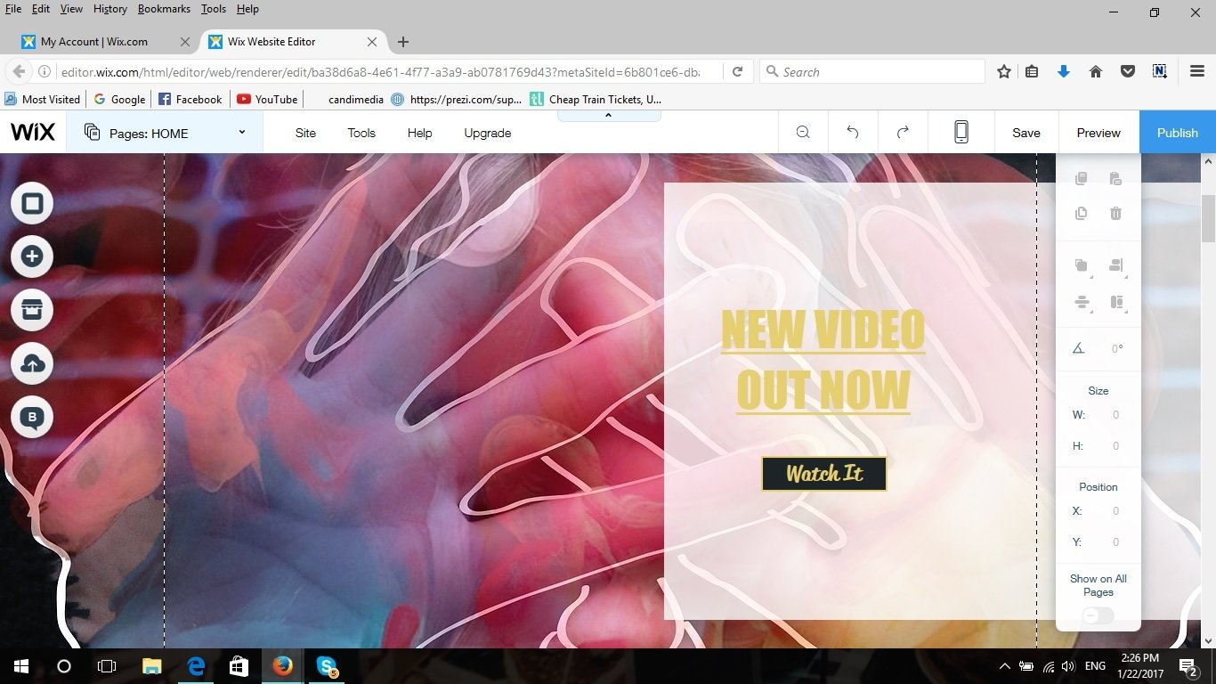
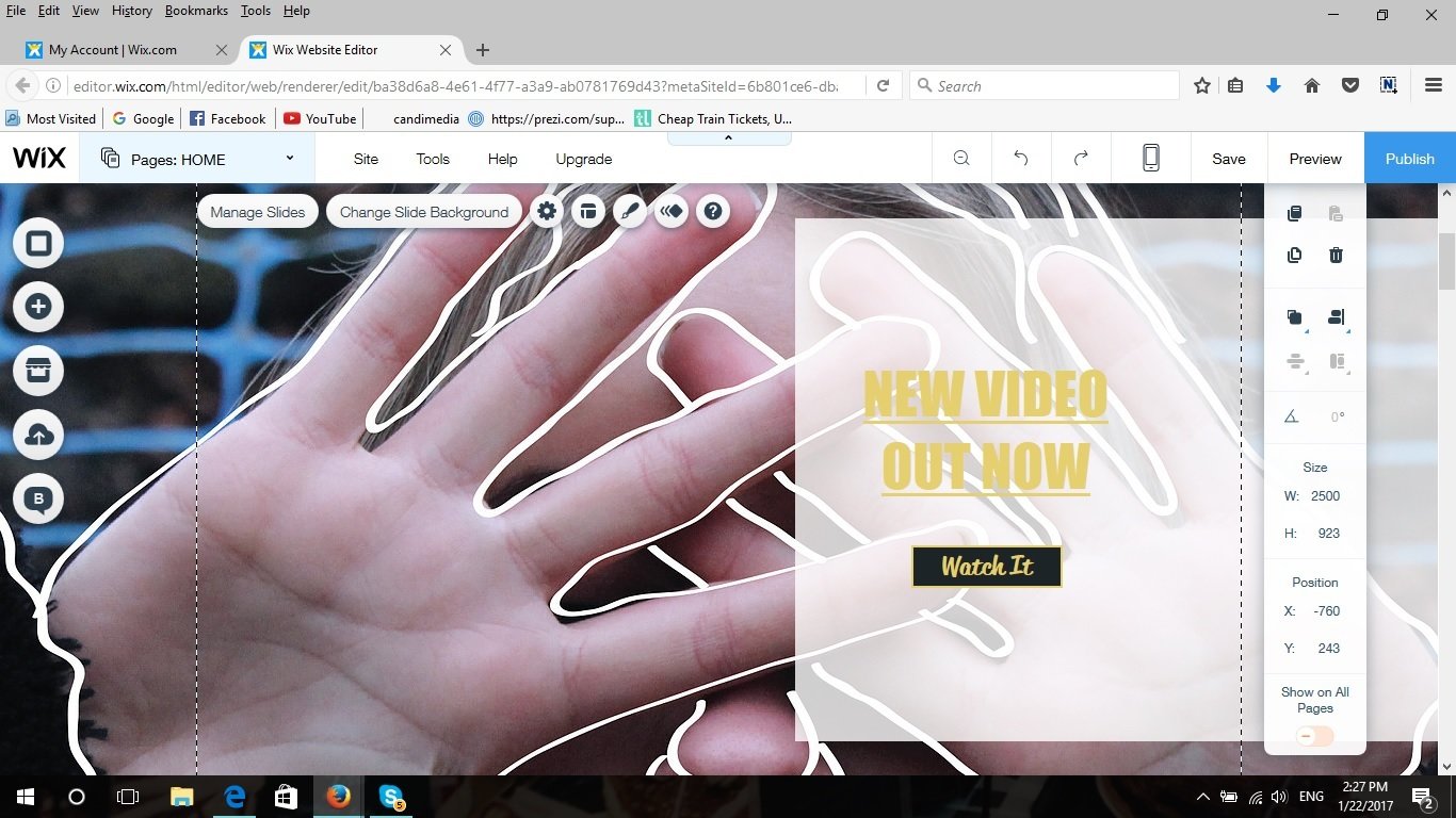
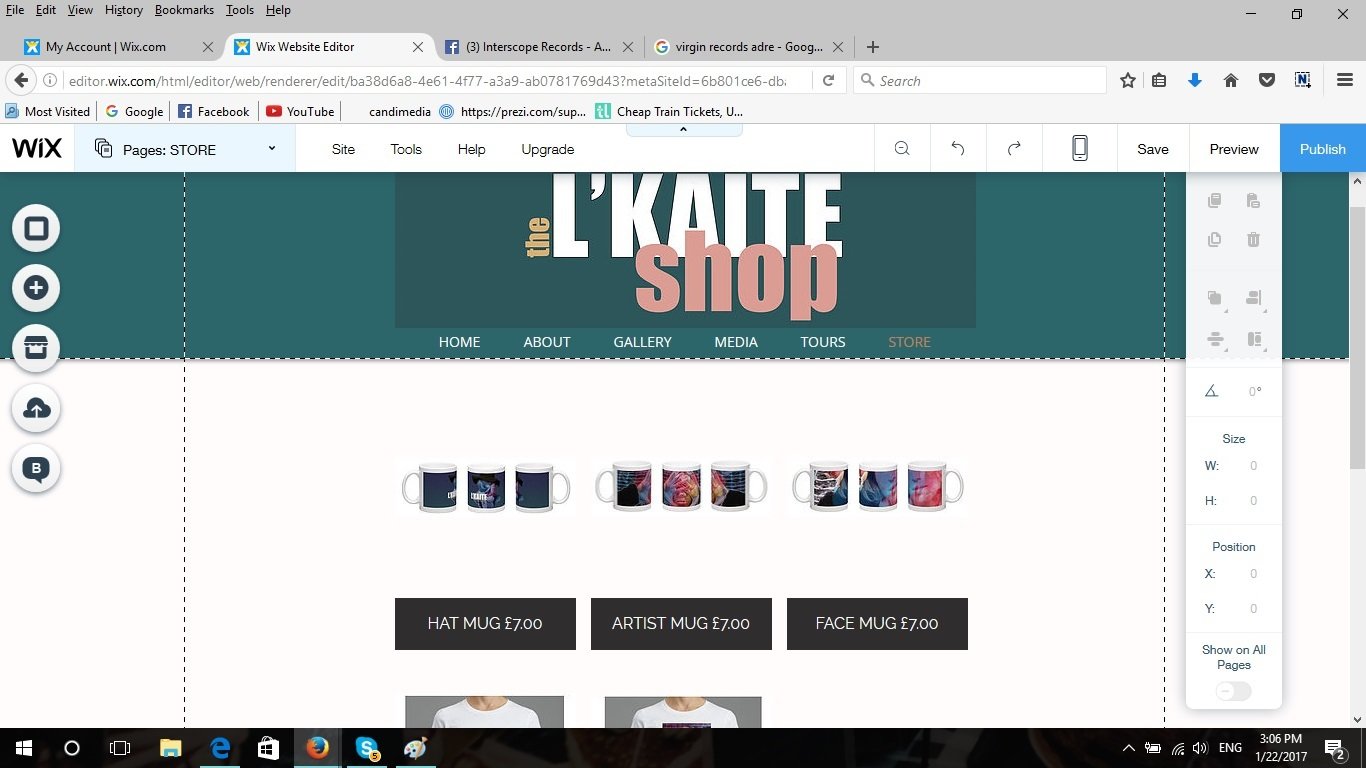
I then started working on the online shop design. At the beggining I though that pink would look nice with all the other images I placed on the home page with links to the other pages such as galleries, media, about and tours.
However, it didn't look as good as I expected so I changed the main box colour of the shop design to the same one as the header of the home page.
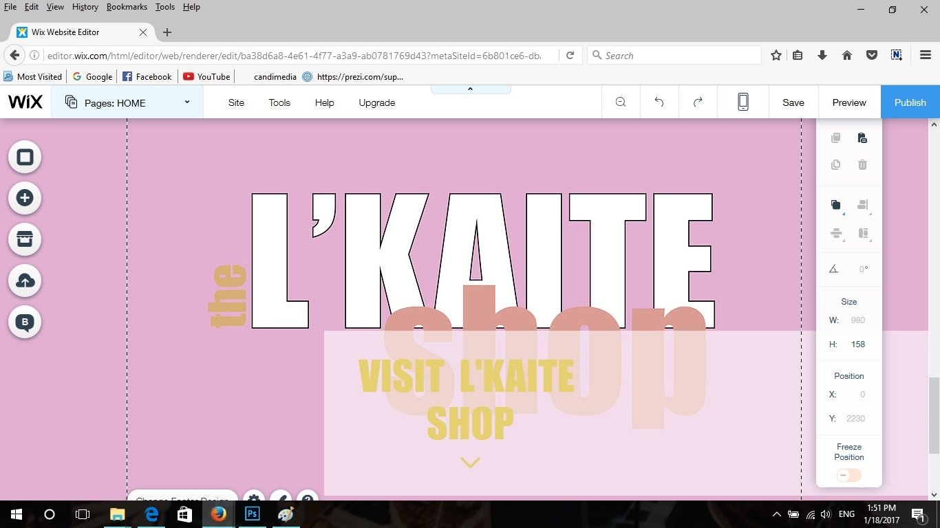
I used Adobe Illustrator to create these designs.
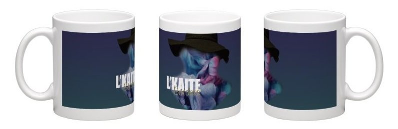
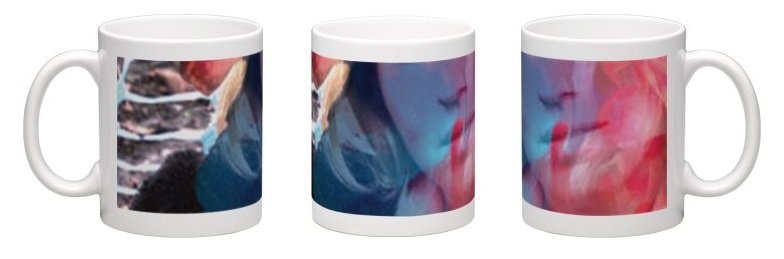
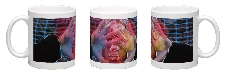
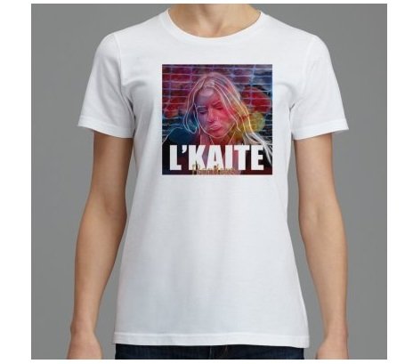
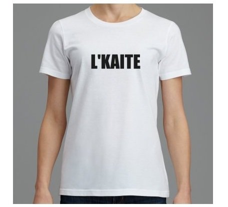
I used online shops that personalise gift in order to create my merchandise. I did a few mug and t-shirt designs for the online shop.
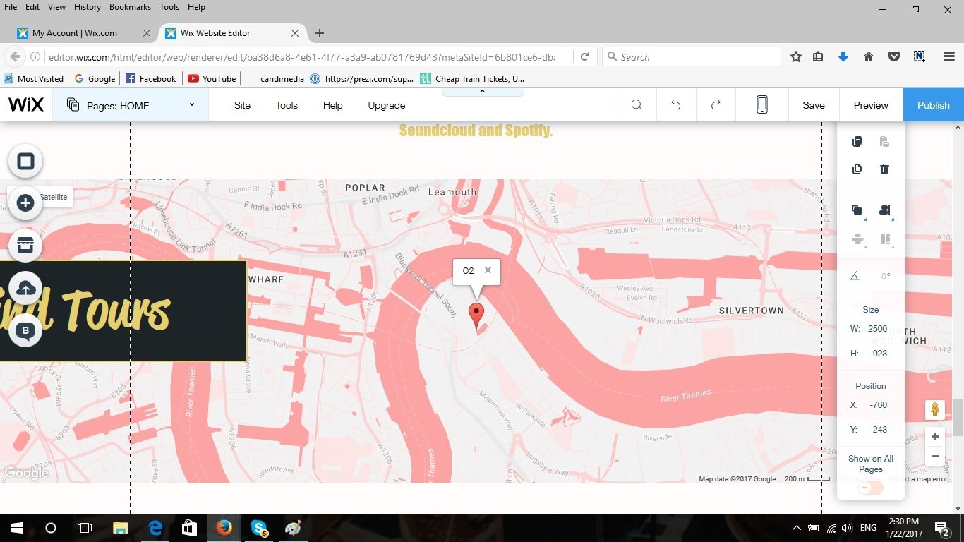
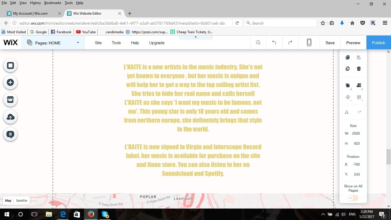
After I showed my website to one of the teachers I was told that my home page should contain more stuff, even though I already have them on the other website pages. So I copied most of the things from my other pages and placed everything on the main home page. I changed the designs and layout so that everything would look beeter when next to each other.
deck
By Monika L'kaitė