Creative Critical Analysis Part 1 - How does your product use or challenge conventions? And how does it represent social groups and issues?
Codes are objects or symbols, which have a consensual meaning; in addition, less obvious things such as lighting and camera angles qualify as codes because they too have a dominant meaning. Images do not, however, merely use formal codes to communicate meaning, but use codes that a large audience will be familiar with.
Conventions are the meanings derived from codes. They give us more information about how we are supposed to read the image to gain meaning.
Codes and conventions therefore combine to create a recognisable system of analysis. It is similar to Genre in the sense that there are certain codes and conventions that must be followed in order for the audience to assign a common reading or meaning thus creating conventions.
My Print As media task was to produce a wedding magazine and its sub genre was wedding lifestyle magazine.
Keeping in mind all these rules/codes and conventions, I produced my Bridal Magazine, and in this presentation I will present a breakdown of the various codes and conventions I did or did not follow.
My Magazines Size
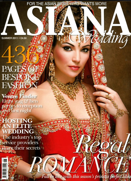
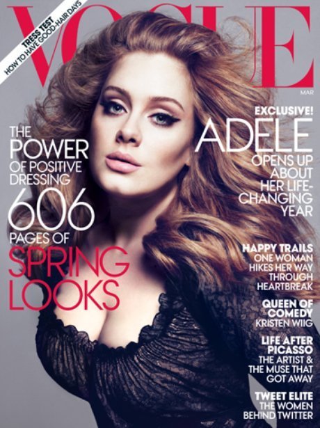
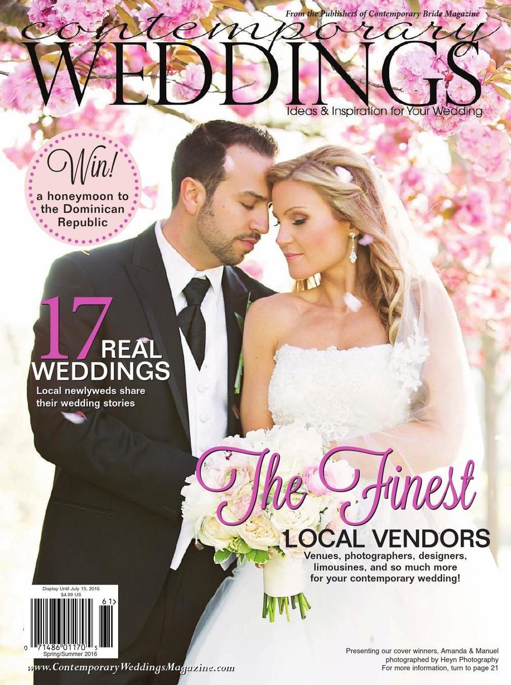
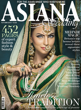
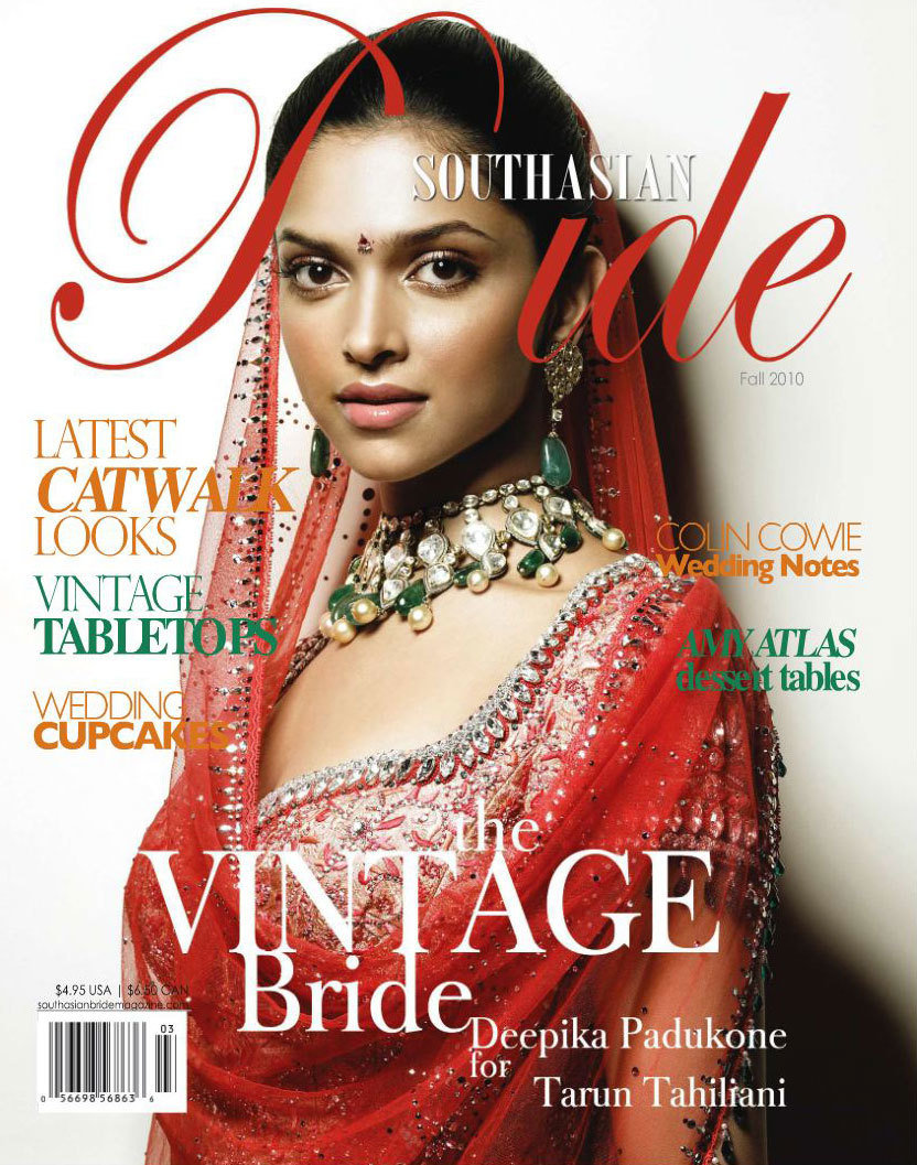
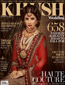
My magazine's size is 8.3/10.7 which is the most economical magazine size. It is same as vogue magazine, Asiana and weddings magazine's size which are all famous magazine companies. My magazine size does not break any codes or conventions.
The Masthead
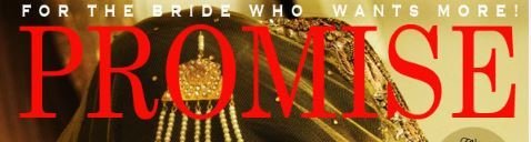
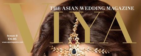
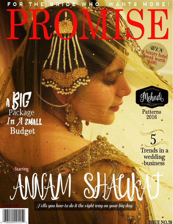
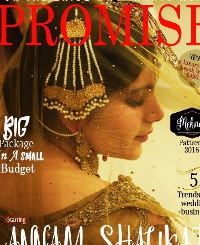
My Masthead does not challenge or break any conventions as seen in the images on the right side. My magazines main image does not hide any aspect of the masthead since its on the top.
I chose a Red colour for the title so that it was neutral and did not clash with any other colour in the image or other fonts. It is bold and allows the text to stand out. I put a lot of thought into the formation of my masthead. The title both breaks some codes while following other established conventions.The fonts chosen are also bold and thick, allowing the masthead to dominate the cover page without empowering it.
I used Promise as my magazines masthead which is a very different and unique name. I haven't added a 'Wedding or Marriage' in my masthead which breaks wedding magazine's conventions.
Main Image
Normally, there is an eye contact in all the wedding magazine’s I have seen and the brides aren’t smiling they have a very serious look on their faces. The camera shots are either mid close ups, mid shots or a long shot and the picture is taken from the front. My magazine challenges this as the bride is not making an eye contact. Not just this she has a smile on her face and the picture has been taken from the back. The trend is to choose a zero size model for your magazine. The one who is very slim and all her curves and features are prominent. I did not choose a zero size model, I chose a model with a full figure which is a challenge.
She does not have to be size zero to look beautiful.
The Typography
I used both Serif and Sans Serif fonts on my cover page for all the cover lines. I changed the font of some words into an italic font style so the audience notices it. I haven't used very bright colours. My colour scheme throughout the magazine consisted of black, white and red colour. I used these three colours to make sure that my text is visible on the dull golden background.
I have not seen a wedding magazine with so many cover lines and little details so I think that this breaks the codes and conventions.
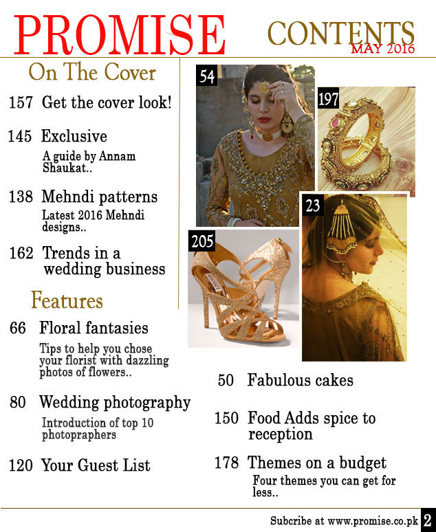

I placed the barcode on the bottom left of the magazine and that is usually where every magazine places it. But as far as the date is concerned, I placed it right on top of the barcode which breaks the conventions of my genre since date is usually displayed under the masthead.
Not only have I used the conventional pugs and puffs to display important deals and information, but by using bright colours and geometric shapes I have also brought specific aspects of the magazine to the readers attention.
I also made separate boxes for some texts, which distinguishes them from the background. They allow some of the fonts to be easily read, especially if they overlap a busy background.
Layout
The cover page is arranged in an O shaped layout, with most of the articles arranged on the right side of the page. There is enough space between articles and texts so that the cover image does not seem over crowded.
Photographs are an important part of the branding of a new magazine, as the use of familiar faces on the cover will attract new audiences. The cover image was the most important of all the photographs as it represented the character, genre and style of my magazine. Like most wedding magazine covers, there is a slight glow to the model used, as can be seen in my photograph.
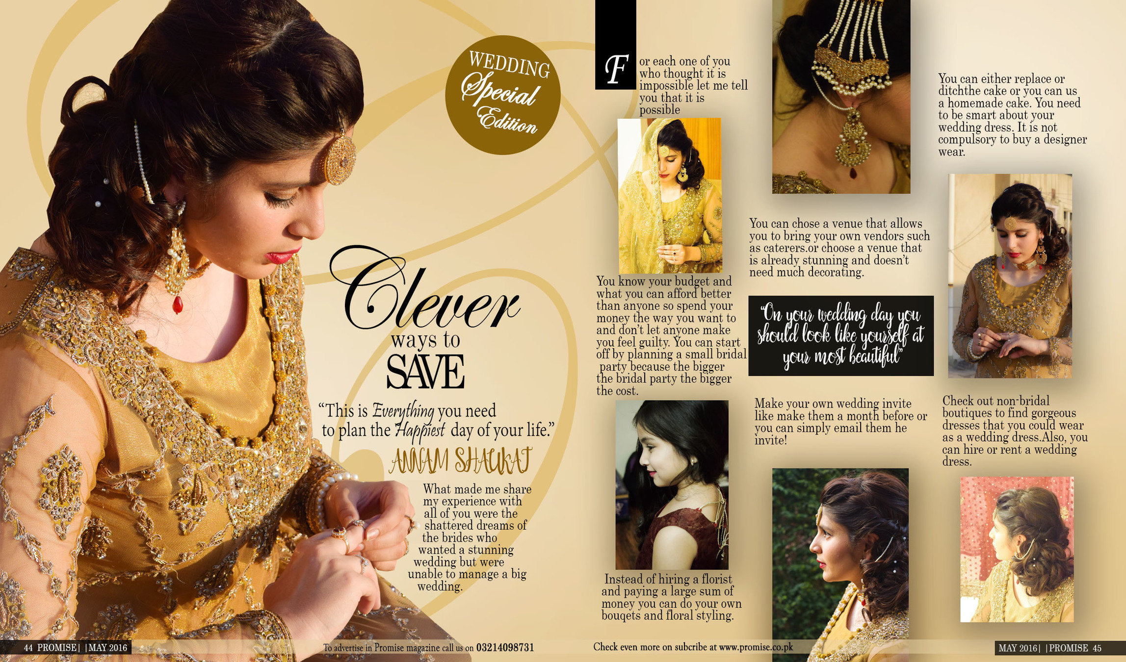
Mise en Scene and Setting
The background is plane and simple and I did not do anything special for it. The synchronizing of colours between the setting and costume brings about continuity in the overall colour scheme of the cover page. The use of a gold colour scheme presents royalty and wealth representing the bride.
Costume and Props
The costume worn represents the genre of the magazine, as the model is wearing a bridal wear. However, this does not break the codes and conventions since every asian bridal magazine looks like this.
The sequin work on the costume is highlighted against the light which brings even more emphasis on it due to the different shades and colours. Her makeup and hair also contribute to the overall image of her attire.
On the cover image, there is no use of prop other than her understated earrings and head piece, as like most magazines the focus is on the clothes and the person who is wearing them.
The images featured on the double spread and content page also follow a similar theme,
Creative Critical Analysis Part 2 - How do your products engage with the audience and how would they be distributed as real media products?
By ramsha