Digipak
Analysis

Ariana Grande - My Everything
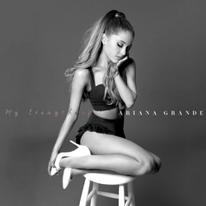
My Everything is the second studio album of American singer Ariana Grande. The album was released on August 25, 2014 by Republic Records.
The Front
The two colours used are a combination of black and white. The two colours signify more of the genre of her music which is pop as well as contemporary RnB. Also since in the old days, before there was no colour on television, the use of the two colours black and white may illustrate that Ariana’s songs are timeless.
Even though Ariana is not a teenager, her songs are easily relatable to teenagers since her songs are mainly aimed at teenagers and young adults.
His songs could be aimed at a mass audience such as teenagers, young adults, adults etc.
When it comes to the typography , an italic font is used as well as a bold font to emphasise her name therefore everyone is easily able to identify who the singer is. Along with this, it emphasises the genre of her music which is pop.
Even though Ariana is dressed in short clothes, and the colours of the album are black and white, the album still shows simplicity. This connotes that her personality as well as her songs are similar to her album cover.
The best theory for this particular album would be Laura Mulvey’s theory-The Male Gaze. This is because Ariana is shown wearing short, revealing clothes which can not only attract women as it will influence them to dress like her but it will attract men too.
When it comes to mise en scene, Ariana’s outfit is fully black as well as short which emphasises more of her social class which is high class since she is wearing white high heels.
Inside the Digipak
The CD emphasises more of her album in various ways. For example, it shows her winking at the camera, with the title of the album on top called ‘My Everything’. This connotes that she is rather mysterious and secretive because she could be talking about a person who is special to her but trying to be secretive about it.
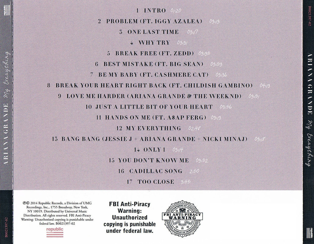
The Back
The side panels include Ariana’s name as well as the name of the album which is ‘My Everything’.
Unlike the front cover, the entire track list has a bold simple sans serif font. This particular font was used on the track list in particular in order to make it stand out and recognisable by the fans who buy the album.
The back cover also includes a barcode along with the record label name which has signed Ariana Grande.
The back cover is quiet simple and plain exactly like the front cover of the album.
Digipak Analysis
By ramsha